Below are some case studies (from clients currently using Navi+ Menu Builder) that have improved the navigation quality of their websites on Shopify. Click on the images to experience it yourself, or scan the QR code on your phone to try it out. Wishing you success!


Scan QR to test on your mobile
This website creatively utilizes Navi+ Menu Builder by moving the entire product catalog to the bottom bar, significantly enhancing customer navigation. Customers can effortlessly scan, select products, and browse categories with intuitive, professional visuals and easy interaction, even with just one hand.
You can see how the use of colors seamlessly aligns with the website's theme. The menu load speed is incredibly impressive, almost instantaneous.
You can see that the navigation provided by Navi+ Menu Builder offers an indispensable solution for customers visiting this website. You can definitely apply this idea to your own website.
Deeply appreciated.


Scan QR to test on your mobile
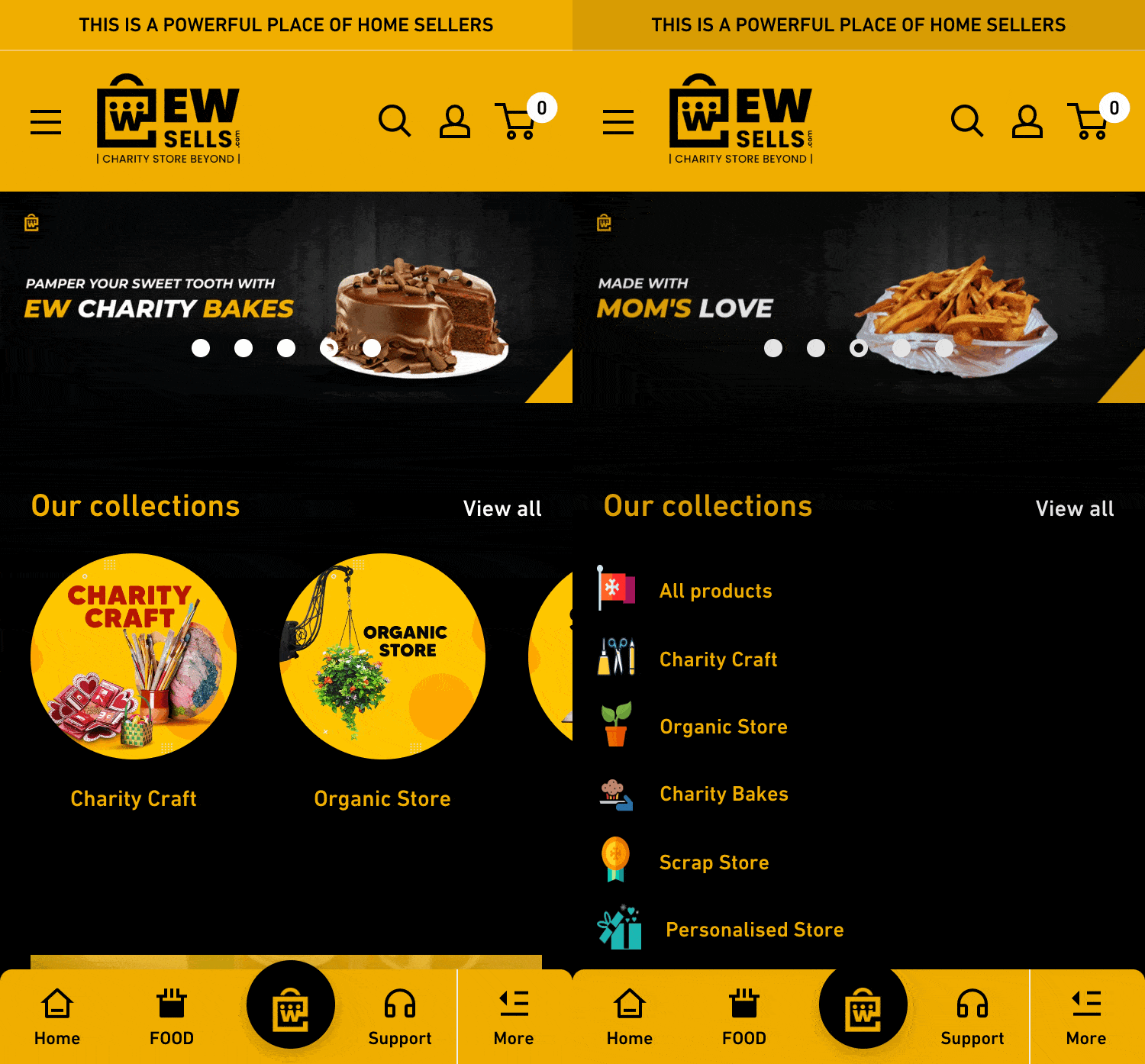
This is a household goods website that uses a very distinctive yellow and black color scheme. The website has used Navi+ Menu Builder to create a tab bar with a yellow tone and black icons and text, harmonizing with the website's overall color theme. All the main navigation elements are placed at the bottom, close to the user's fingers, making interaction more convenient.
The website still uses a hamburger menu for other menus, but as you may experience, using a hamburger menu can be challenging due to its length. The menu is overly long with multi-layered categories and too many support pages, which is a problem that Navi+ Menu Builder helps solve, as you can see in this example.