

Motion in Navigation: The Risk and the Reward
Motion and video backgrounds in navigation represent one of the highest-risk, highest-reward creative decisions in store design. Done well, they communicate brand energy, seasonal mood, and product aspiration in a way that static backgrounds cannot — a navigation category for activewear that shows a brief loop of fabric in motion has more emotional impact than a static color block. Done poorly, they make menus feel garish, distract from the navigation labels visitors need to read, and add enough page weight to measurably slow the experience.
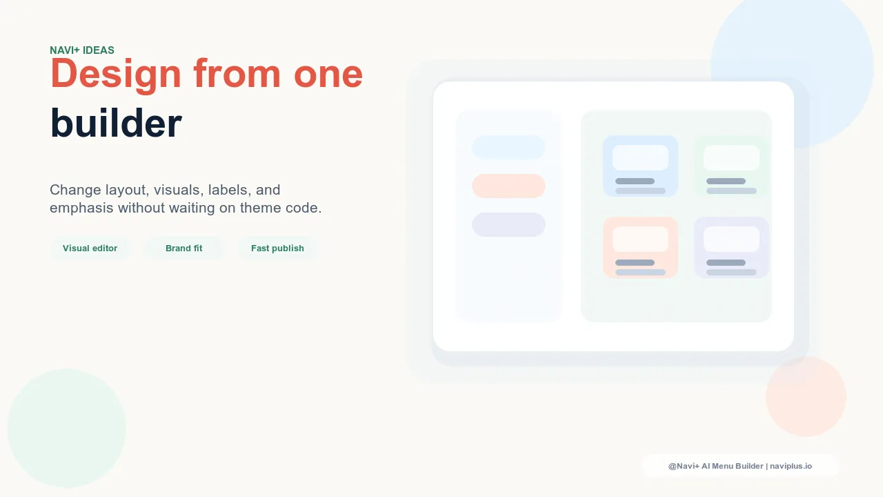
The discipline of motion in navigation is not about choosing between "motion" and "no motion" — it's about matching the right type of motion to the right context, and executing it with the technical restraint that separates effective brand motion from decoration that undermines conversion. The most common mistake is conflating "impressive" and "effective": a navigation background that earns compliments for its visual sophistication while reducing click-through rates because visitors are watching the animation instead of clicking category links is not a navigation success, regardless of how beautiful the motion is.
"We tested three versions of our Mega Menu background: static brand color, a slow gradient shift in our brand palette, and a looping product video. The static version performed best for overall navigation clicks, but visitors who engaged with the gradient version had 15% higher average order values — they were spending more time in the navigation and discovering more categories. The video version actually reduced navigation clicks; visitors were watching the video. That taught us: motion that shows brand mood converts; motion that shows a story distracts. We kept the gradient and retired the product video."
— A Navi+ customer, premium cosmetics brand
Types of Navigation Motion and When They Work
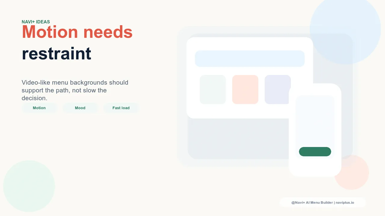
CSS gradient animations: highest safety, solid brand impact. Animated CSS gradients — a slow, smooth transition between two or three brand colors — are the most reliable form of navigation motion. They add zero media file weight (CSS-only, no image or video files), have no impact on navigation response speed, respect the user's prefers-reduced-motion accessibility preference natively, and communicate brand mood through color movement rather than content movement. A gentle gradient animation in the Slide Menu header — a 12-second loop shifting from deep navy to midnight blue, for example — creates the impression of a living, breathing brand presence without adding cognitive load or visual competition with navigation labels. This is the appropriate starting point for any store exploring navigation motion.
Short SVG or CSS micro-animations on hover. Navigation hover states — the visual response that occurs when a desktop visitor moves their cursor over a navigation link — are an underused motion opportunity. A navigation link that shifts from standard weight to bold on hover is functional; a navigation link whose icon rotates 10 degrees on hover is engaging. SVG and CSS-based micro-animations (transforms, opacity transitions, path morphing) on navigation hover states add interaction delight without performance cost. They communicate that the interface is responsive and refined, signaling design care at the exact moment the visitor is deciding which category to enter.
Short looping WebM video in Mega Menu columns: high reward, requires discipline. A Mega Menu column that features a brief (3–6 second), silently looping WebM video — a product in use, a material in natural light, a lifestyle scene relevant to the category — can dramatically increase the emotional impact of a navigation category. The reward is real: category links accompanied by relevant motion content can generate higher click-through rates than static images for categories where the product's experiential qualities are difficult to communicate in a still image. The discipline requirements are strict: the video must be muted (sound in navigation creates immediate user hostility), compressed to under 400KB for WebM (use ffmpeg with CRF 35+ for navigation-size videos), and sized appropriately for the column (320×200px or smaller, not full-screen). Video in navigation is a premium choice for premium stores; it requires editorial restraint and technical care.
| Motion Type | Performance Cost | Brand Impact | Best Use Case |
|---|---|---|---|
| CSS gradient animation | Zero (no file weight) | Mood, color personality | Slide Menu header, all stores |
| SVG/CSS micro-animation | Minimal (CSS only) | Interaction refinement | Desktop hover states |
| Short looping WebM | Medium (requires compression) | Product aspiration, lifestyle | Mega Menu featured column |
| Autoplay background video | High (bandwidth + attention) | Distraction risk | Not recommended for navigation |
The Motion Hierarchy for Navigation
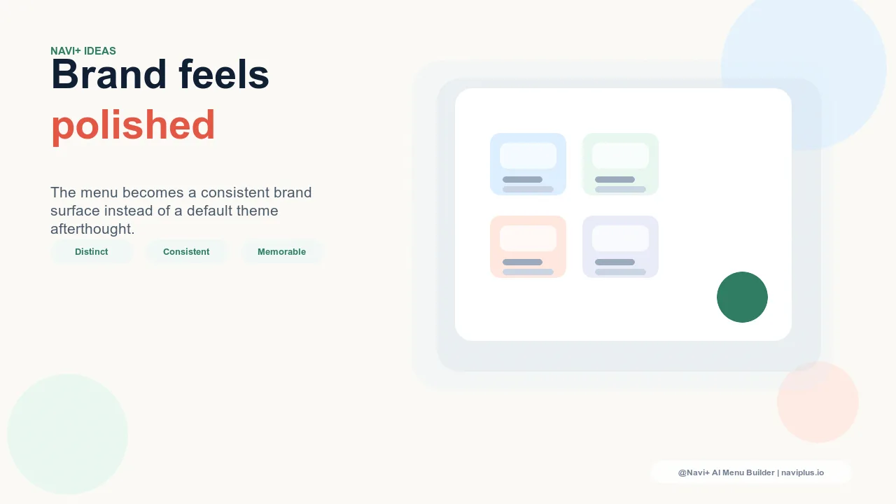
The guiding principle for navigation motion is hierarchy of attention: motion should never compete with the navigation labels that visitors need to read to make their category choices. The motion level in the background should always be lower than the visual weight of the navigation labels in the foreground. This means motion that is slow enough not to catch the eye on its own (gradients below 3 degrees of hue shift per second, video with no fast cuts or sudden movement), low-contrast enough not to create visual noise behind text (dark backgrounds with dark text are the enemy of background motion readability), and optional enough to degrade gracefully when reduced motion preferences are active. Navigation motion done with this discipline creates stores that feel alive and expressive without sacrificing the clarity that navigation requires to do its conversion job.
無料で試す — コード不要、開発者不要
Shopify、WordPress、またはあらゆるウェブサイトに数分でインストール。