

The Post-Cart Moment Is Undervalued
Most e-commerce stores are designed to funnel visitors as quickly as possible from add-to-cart to checkout. The navigation logic is: the visitor has committed to a purchase, so minimize the friction between that commitment and payment completion. This logic is correct if the only goal is completing the current transaction. But it misses a significant revenue opportunity: the post-cart visitor is the highest-purchase-intent visitor in the store, and sending them directly to checkout forecloses the possibility of discovering additional products that would increase the order value.
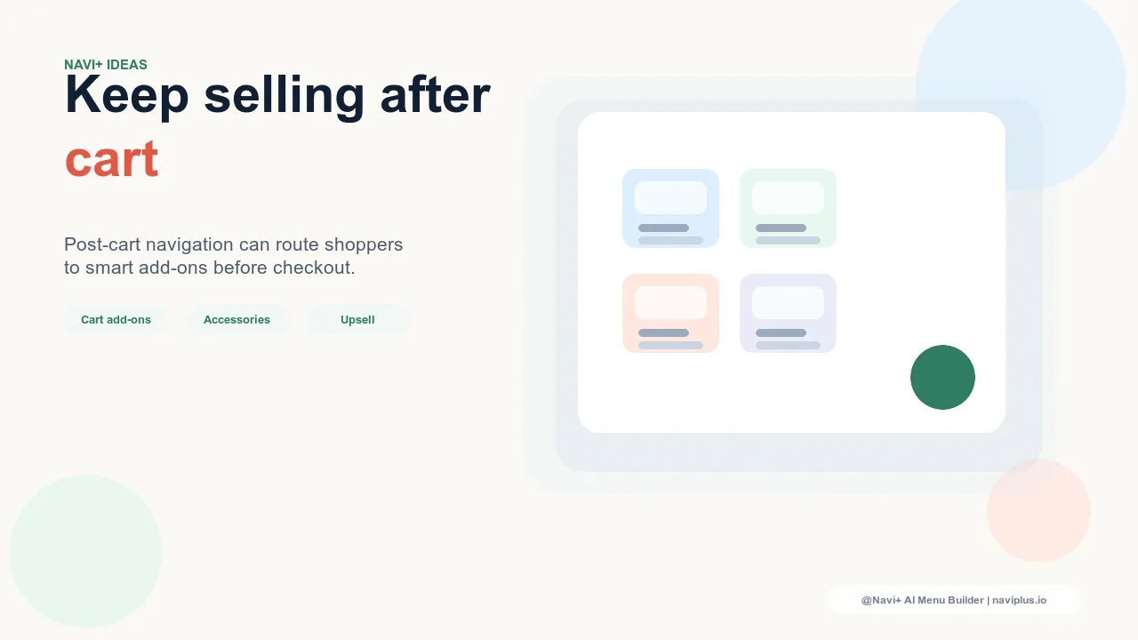
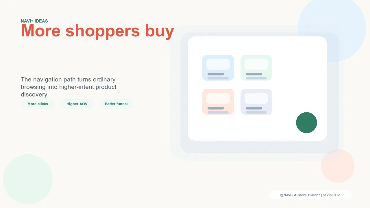
Post-cart navigation — the navigation experience after a visitor adds a product to cart but before they proceed to checkout — can increase average order value by keeping the visitor in the browsing mode long enough to discover one more item. The data from stores with well-designed post-cart experiences consistently shows that 15–25% of customers add a second product when given an easy opportunity to do so after the first add-to-cart. The navigation design challenge is keeping checkout visible and accessible (so the visitor never feels like they've been trapped) while also making continued browsing easy and rewarding (so the visitor who wants to keep shopping can do so with minimal effort).
"We changed our mobile navigation to show a 'You might also like' section in the Slide Menu that appears after a visitor adds to cart. It shows 4 products from the same category they just purchased from, with a 'Keep Shopping' button and a 'Checkout' button equally prominent. About 18% of mobile visitors who see this section add a second item before checking out. Our mobile AOV went up by about 12% within the first month of implementing this. The key was making checkout equally easy from both options — we weren't trapping anyone, just offering a clear opportunity to keep shopping."
— A Navi+ customer, women's lifestyle brand
Post-Cart Navigation Design Principles
Make checkout always one tap away. The cardinal rule of post-cart navigation is that checkout must always be reachable in one tap. A visitor who adds a product and then encounters navigation that makes checkout harder to find than it was before the add-to-cart will conclude that the store is trying to trick them into more browsing — a perception that damages trust and increases cart abandonment. The Tab Bar cart icon with a badge count (showing the number of items in cart) solves this: checkout is persistently accessible from the Tab Bar regardless of what other post-cart navigation the visitor encounters. The cart badge signals "your item is saved, you can checkout anytime" — reassurance that allows the visitor to continue browsing without anxiety about losing their cart.
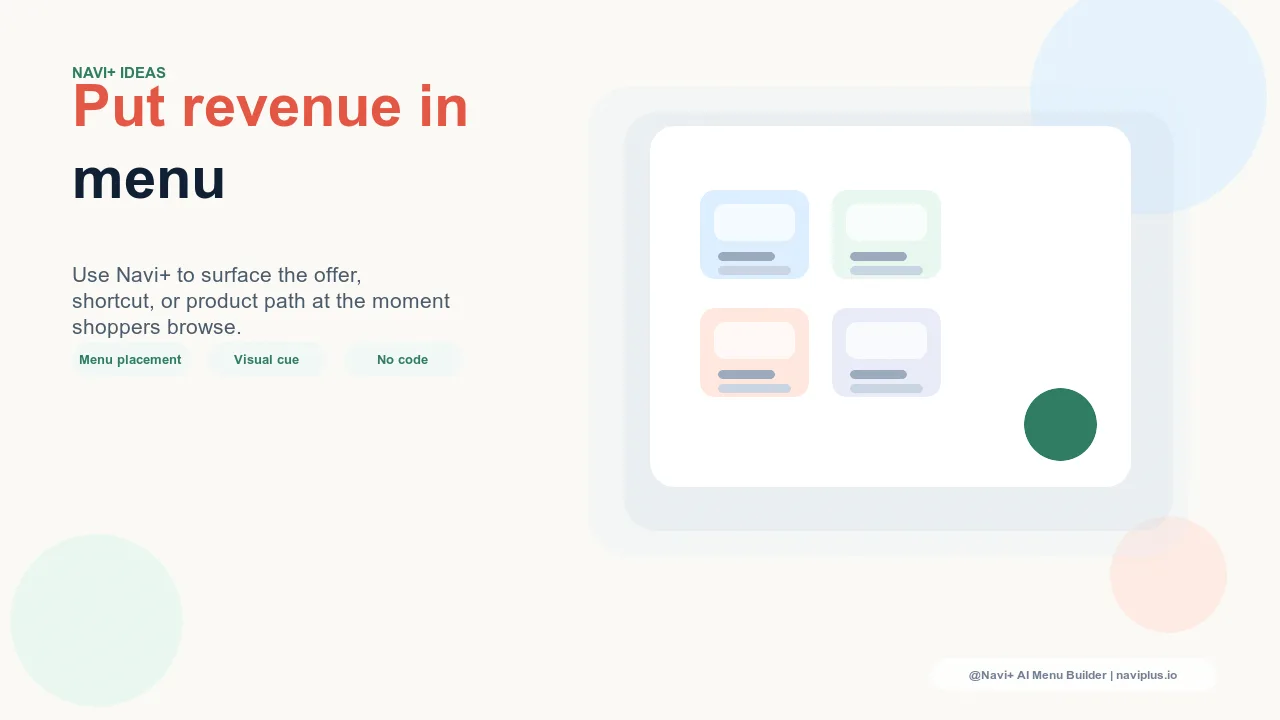
Surface related categories through the Slide Menu after add-to-cart. The Slide Menu can be configured to show a featured section — "Complete Your Look," "You Might Also Like," "Customers Also Bought" — that appears as a prominent section when the menu is opened after an add-to-cart event. This section can link to categories related to the item just added, to the store's bestsellers, or to a cross-category curated collection. The featured section appears after the primary navigation categories, so it doesn't disrupt the menu structure for retrieval-mode visitors but creates a high-visibility discovery opportunity for post-cart visitors who open the menu after adding to cart.
Use the Floating Action Button to surface post-cart value thresholds. A Floating Action Button that appears after add-to-cart showing "Add $X more for free shipping" — where X is the difference between the cart value and the free shipping threshold — creates a value-driven incentive to keep shopping that's connected to a concrete benefit the visitor already wants. This navigation element is not passive: it gives the visitor a financial reason to continue browsing and keeps the category navigation accessible for finding the additional item. FABs that quantify the gap to a shipping threshold have shown conversion rate improvements on the additional purchase that exceed the conversion rate of generic "keep shopping" prompts by a significant margin.
| Post-Cart Navigation Element | Function | AOV Impact |
|---|---|---|
| Cart badge in Tab Bar | Reassure visitor checkout is accessible | Enables continued browsing without anxiety |
| Slide Menu "You Might Like" section | Surface related discovery | 15–25% second-item add rate |
| Free shipping threshold FAB | Value-driven incentive to add more | High for stores near average cart threshold |
| Return-to-category navigation | Easy path back to browsing | Reduces post-cart abandonment |
Balancing Upsell Opportunity with Checkout Friction
The post-cart navigation strategy is calibrated at a specific tension point: maximize the opportunity for additional purchases while never making the primary checkout path harder than it was before add-to-cart. Any navigation change that reduces checkout accessibility — hiding the cart button, requiring additional taps to reach checkout, inserting interstitial screens before the checkout flow — will produce cart abandonment that exceeds any upsell gains. The design test for any post-cart navigation element is: "if a visitor wants to checkout immediately after seeing this, can they?" The answer must always be yes, and the path must be no harder than it was before the add-to-cart event. Given that constraint, post-cart discovery navigation that doesn't impede checkout — a persistent cart badge, a Slide Menu featured section that doesn't reorganize the primary navigation, a value-framed FAB — produces consistent AOV improvements at minimal conversion risk.
無料で試す — コード不要、開発者不要
Shopify、WordPress、またはあらゆるウェブサイトに数分でインストール。