

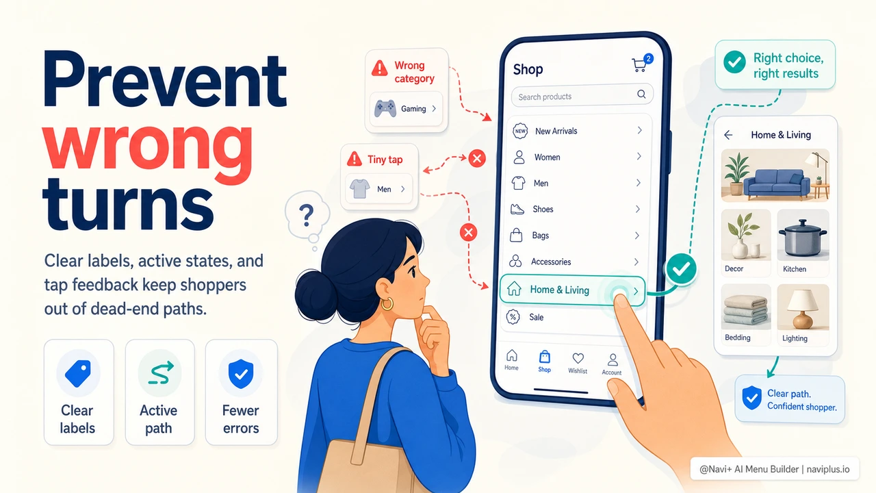
The Best Navigation Error Is the One That Never Happens
Most stores think about navigation mistakes only after they happen: a shopper lands on a zero-results page, opens the wrong category, taps a tiny mobile link by accident, or gets stuck in a menu panel with no obvious way back. Recovery matters, but prevention is cheaper. Every wrong turn adds doubt, breaks browsing momentum, and makes the store feel harder to use than it really is.
Navigation error prevention means designing the menu so shoppers are less likely to choose the wrong path in the first place. It is the difference between a menu that says "good luck" and a menu that quietly guides the shopper toward the right decision.
"We used to treat bad navigation clicks as normal browsing. They were not. Customers were opening the wrong category, backing out, searching, and then leaving. Once we renamed categories and made our mobile menu states clearer, fewer people needed recovery paths because fewer people were getting lost."
— A Navi+ customer, specialty retail brand
Where Navigation Mistakes Start
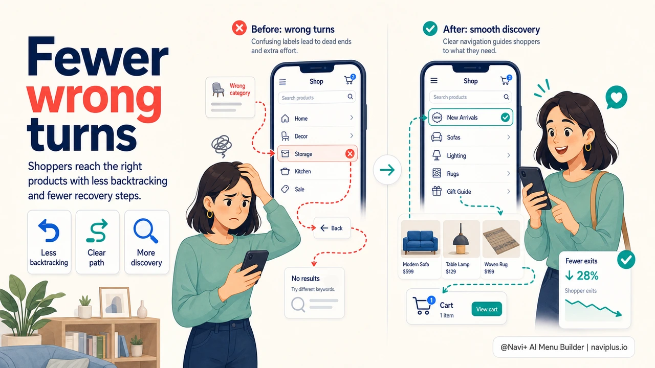
Most navigation mistakes begin with unclear signals. A label is too clever. A category is too broad. A dropdown opens slowly. A disabled item still looks clickable. A mobile tap has no feedback, so the shopper taps twice. None of these failures are dramatic, but they compound.
| Navigation Risk | What Shoppers Do | Preventive Fix |
|---|---|---|
| Vague labels | Guess, click wrong, backtrack | Use shopper language and predictable category names |
| Tiny mobile targets | Mis-tap neighboring links | Use larger tap areas and spacing |
| No active state | Lose track of current section | Show selected category, tab, or menu path |
| Slow menu feedback | Tap again or abandon | Respond instantly with pressed/loading states |
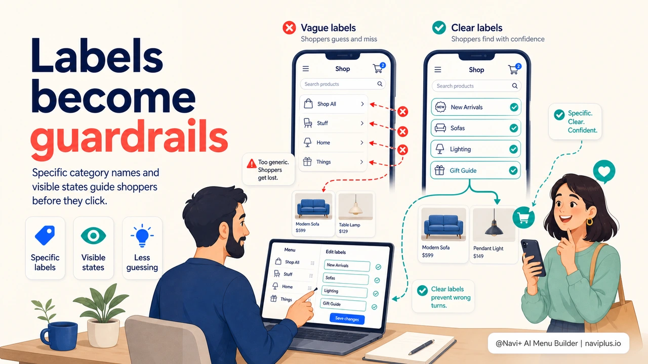
Use Labels as Guardrails
A menu label should prevent the wrong click. That means it should be specific enough for the shopper to predict what is behind it. "Collections" might sound elegant internally, but "New Arrivals," "Best Sellers," or "Outdoor Furniture" tells the shopper more. Clever labels can work for brand voice, but only when the meaning stays obvious.
One practical test: show the menu labels without the page design and ask whether a first-time visitor can explain what each link contains. If they need to guess, the label is doing brand work at the expense of navigation work.
Prevent Mobile Mis-taps
Mobile navigation errors are often physical, not conceptual. The shopper knows what they want, but the interface makes the target too small or too close to another target. A dense hamburger drawer with narrow rows may look tidy in a screenshot, but it creates accidental taps in real use.
Navi+ Tab Bar and Slide Menu patterns help by giving high-value paths dedicated, thumb-friendly targets. Instead of burying every action in one vertical list, the store can keep search, cart, categories, and top revenue paths within reach with enough spacing to feel confident.
Make State Visible
Shoppers make fewer mistakes when they can see where they are. Current category states, active Tab Bar items, visible breadcrumb paths, and pressed states all reduce uncertainty. The menu should answer: "Where am I, what did I tap, and what can I do next?"
Error prevention is not about adding more instructions. It is about making the interface self-explanatory. When labels, spacing, hierarchy, and feedback are clear, shoppers take fewer wrong turns and spend more time moving toward products.
無料で試す — コード不要、開発者不要
Shopify、WordPress、またはあらゆるウェブサイトに数分でインストール。