

Navigation as the First Trust Test
Trust in e-commerce is established in layers: first through visual impression, then through navigation structure, then through product quality, then through reviews, and finally through the checkout process. Most store owners focus on reviews and product photography as their primary trust-building tools. Both matter enormously — but they're encountered only by visitors who've already passed the first trust test: the navigation.
The navigation is the first interactive element most visitors encounter. Before a product image loads, before a price is evaluated, before a review is read, the visitor's visual system has already processed the navigation and formed an initial quality assessment. A navigation that looks confident — clear hierarchy, consistent visual weight, purposeful structure — communicates that the store behind it is professionally operated. A navigation that looks uncertain — inconsistent capitalization, misaligned items, three different font sizes in the same menu — communicates amateurism, and for unfamiliar brands, amateurism is a proxy for risk. In e-commerce, perceived risk reduces purchase probability, and navigation is a significant source of that perception.
"We ran a survey of customers who purchased versus visitors who abandoned without purchasing. The single most common description of our store from non-purchasers was 'looked unprofessional.' When we dug into what they were seeing, the feedback was almost entirely about the navigation — 'the menu was confusing,' 'the categories didn't make sense,' 'it looked like it wasn't finished.' Our products were the same. The navigation was communicating a level of care we hadn't applied to it. When we rebuilt the navigation to match the quality of our product photography, the abandonment rate from first-time visitors dropped significantly."
— A Navi+ customer, premium homewares brand
The Five Components of Navigation Trust Hierarchy
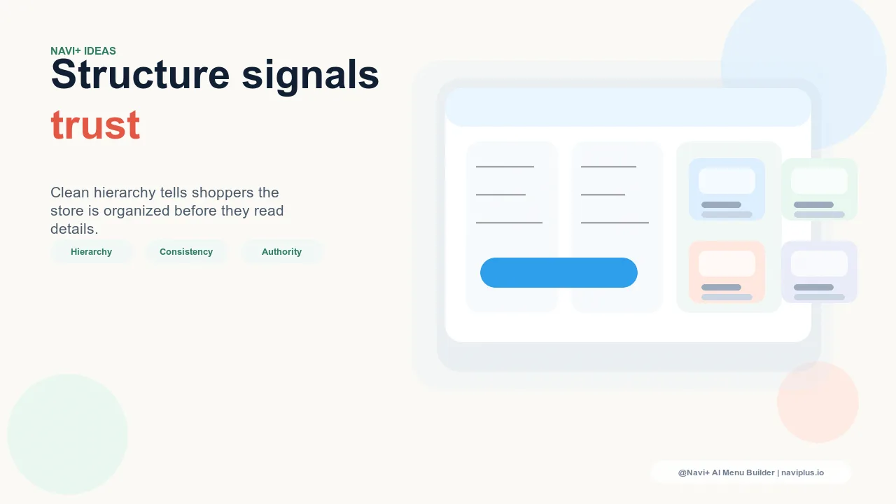
1. Visual consistency: every element follows the same rules. Trust is communicated through consistency. A navigation where all category labels use the same capitalization (either all title case or all sentence case, never mixed), the same font weight, and the same visual treatment signals that the store is controlled by someone who cares about detail. Mixed capitalization — "Women's Clothing" next to "mens shoes" next to "Accessories & more" — signals that the navigation has been assembled by different people at different times without a governing standard. This inconsistency is not invisible to visitors; it registers as a quality signal, just a negative one.
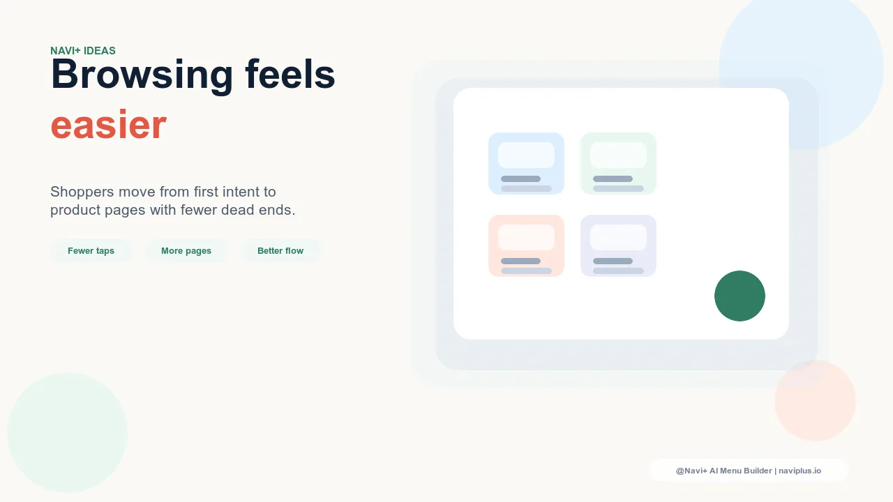
2. Category completeness: the navigation covers what it should. A navigation that's missing obvious categories — a jewelry store with no "Earrings" category, a clothing brand with no "Sale" section — creates the impression that the catalog is incomplete or the store is newly launched. Visitors who can't find a category they expect to exist conclude either that the store doesn't carry that product type (a missed sale) or that the navigation wasn't thought through (a trust reduction). Navigation that covers the expected breadth of the store's catalog communicates that the store is established and well-organized, even before a single product page is visited.
3. Naming clarity: categories mean what they appear to mean. Trust is built by predictability. When a visitor clicks a navigation category and lands on exactly what the label suggested, their confidence in the store increases. When they click "Gifts" and land on a page labeled "Collections" with no gift-specific framing, or click "New Arrivals" and see products from six months ago, the navigation has made a false promise. False promises in navigation erode trust faster than almost any other UX issue because they're experienced as small deceptions rather than neutral friction. Clear, accurate category names — labels that precisely describe their contents — are the foundation of navigation trust.
4. Structural depth appropriate to the catalog. A navigation whose structure matches the catalog's complexity signals that the store operator understands their own inventory. A store with 800 SKUs across 12 product categories that presents a flat navigation with 5 top-level categories and no subcategories signals either poor organization or a navigation that hasn't been updated since the catalog was much smaller. Visitors who can see that the navigation has been thoughtfully organized — with the right number of categories for the catalog size, and subcategory depth that matches the product variety within each category — trust that the operator is on top of their business.
5. Account and policy navigation: visibility of standard store infrastructure. Visitors assessing a store's trustworthiness look for signals that the store has standard consumer protections in place: return policies, customer service access, account management. A navigation that includes easy access to "Returns & Refunds," "Contact Us," and "Account" in the Slide Menu or footer navigation signals that the store is operated responsibly. These links are rarely the highest-conversion destinations in the navigation, but their presence — or absence — is noticed by first-time visitors evaluating whether to make a purchase from an unfamiliar brand.
| Navigation Element | Trust Signal When Done Well | Trust Cost When Done Poorly |
|---|---|---|
| Label consistency | Professional, controlled, detail-oriented | Assembled carelessly, multiple authors |
| Category completeness | Established, comprehensive catalog | Incomplete, new, or disorganized |
| Naming accuracy | Predictable, honest, reliable | Misleading, bait-and-switch feel |
| Policy links visible | Responsible operation, consumer-friendly | Hiding something, hard to contact |
Building Navigation Trust Into the Store Build Process
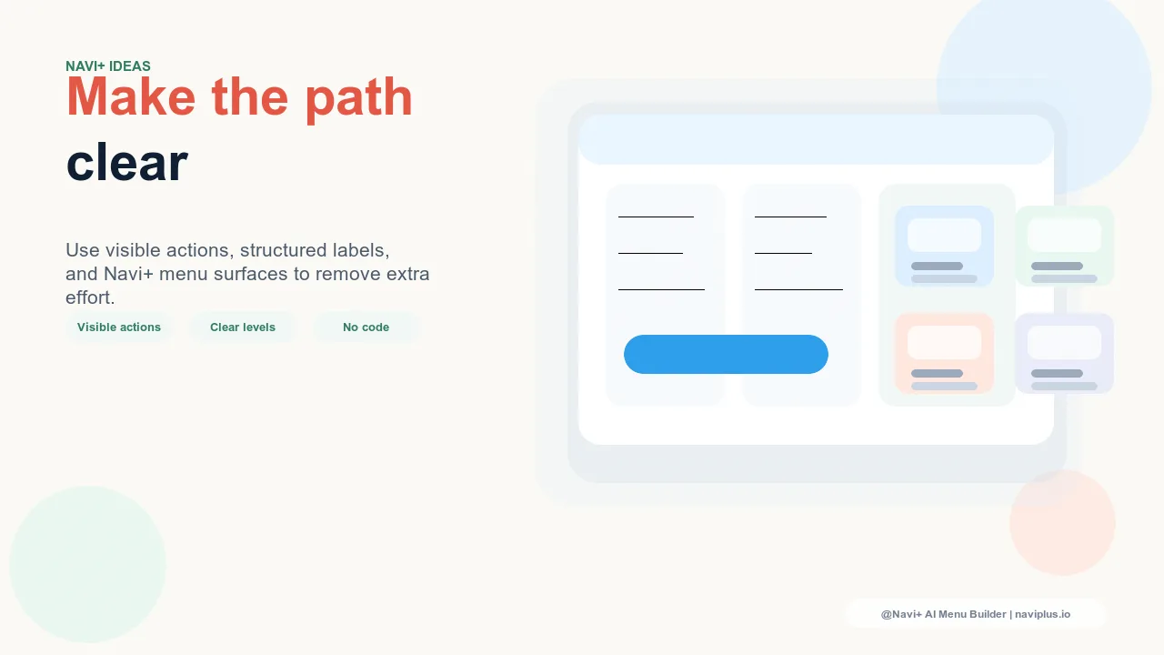
Navigation trust is most efficiently built as part of the initial store configuration rather than retrofitted after conversion problems surface. The standard to apply is: would a visitor who has never heard of this brand, encountering this navigation for the first time, conclude that it was built by a professional? If the answer is uncertain, the navigation needs work. The specific interventions — standardizing label capitalization, ensuring category breadth matches catalog breadth, adding policy links to the Slide Menu — are individually small. Together, they communicate the quality of store execution that turns skeptical first-time visitors into confident first-time buyers.
無料で試す — コード不要、開発者不要
Shopify、WordPress、またはあらゆるウェブサイトに数分でインストール。