A floating action button — usually shortened to FAB — is a circular or pill-shaped button that stays fixed in place as the shopper scrolls, floating above the page content instead of sitting inline with it. It’s a small UI element, but it’s also one of the easiest to get wrong: useful when it protects one important action, irritating when it becomes a second thing competing for attention next to your Tab Bar.
- A FAB works best when it protects exactly one high-value action, not several.
- 44×44px is the practical minimum tap target — smaller and Fitts's Law works against you.
- The most common failure mode is a FAB that covers content or stacks with a cookie banner or chat widget.
What a FAB is actually for
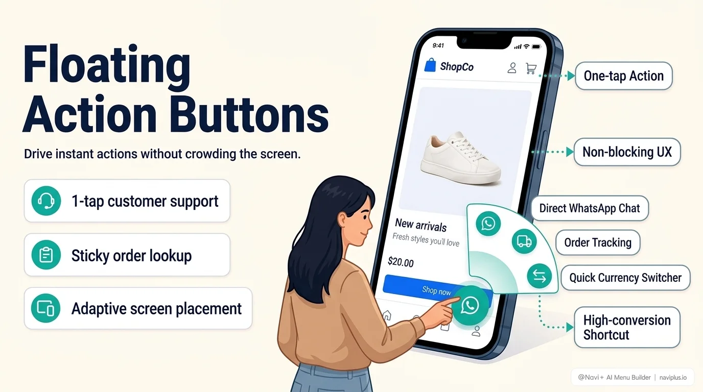
The concept comes from Google’s Material Design system, where the floating action button represents the single most important action available on a screen — traditionally rendered as a circular button, usually anchored bottom-right or bottom-center, that stays visible regardless of scroll position.
On an ecommerce store, that “one important action” is usually one of a short list:
- Quick add-to-cart or checkout, so the primary conversion action never requires scrolling back up
- Live chat / support, kept one tap away without occupying a permanent slot in the main navigation
- A time-limited promotion or sale, given more visual weight than a regular menu item deserves
- Back-to-top, on very long category or content pages
The common thread: a FAB is for something you want available everywhere, without spending a permanent slot in your Tab Bar or header for it.
The rule that gets broken most: pick one
The single most common FAB mistake is running more than one at a time — a chat bubble in one corner and a cart button in another, both floating, both competing for the same limited screen space. Each additional floating element dilutes the others: if everything floats, nothing feels important enough to tap.
If a store genuinely needs both a support entry point and a quick-cart shortcut, the better pattern is usually one FAB plus the second action folded into the Tab Bar — not two floating buttons fighting for the same visual weight.
Sizing and placement, not just design polish
Tap target size. WCAG 2.5.5 sets 44×44 CSS pixels as the practical minimum touch target, matching Apple’s Human Interface Guidelines. This isn’t an arbitrary accessibility checkbox — it’s grounded in Fitts’s Law, the well-established finding from human-computer interaction research that the time to accurately hit a target is a function of its size and distance. A FAB shrunk down to “look cleaner” is a FAB that gets mis-tapped on a real thumb.
Placement discipline. Bottom-right is the conventional default because it sits inside the natural thumb zone for right-handed, one-handed use — the same reasoning behind bottom navigation generally. Bottom-center works when a store already has a Tab Bar and needs the FAB to sit clearly above it rather than crowding one end.
Don’t cover what it’s floating over. A FAB anchored low-right on a product page can sit directly on top of pricing, a size selector, or a “buy now” button on smaller screens. If a shopper has to scroll or nudge the FAB out of the way to complete the actual purchase, the button is actively working against the page’s job.
Related readingHow Tab Bar, Mobile Menu, and FAB divide the work between them →
The stacking problem nobody designs for
A FAB rarely gets tested against everything else that also floats on a live storefront: a cookie-consent banner, a newsletter popup, a chat widget from a separate app, a sticky “added to cart” toast. Each of these is usually built by a different app, with no awareness of what else is anchored to the same corner of the screen. The result — two floating elements overlapping, or one silently covering the other — is one of the most common “why isn’t my button working” support tickets, and it’s almost never visible in a quick desktop check because most of these elements only render on mobile viewports.
Fast checkLoad your store on a real phone with every app installed (chat, reviews, cookie consent) active at once — not just the one feature you're testing in isolation.
Where Navi+ fits
Navi+ treats the Floating Button as one of its five core menu types — sized and placed to WCAG/HIG tap-target standards by default, and configured to avoid stacking blindly on top of whatever else your theme or other apps already anchor to the screen.
Where to start
Before adding a floating button to a store:
- Name the one action it protects — if you can’t name just one, you likely need two separate decisions, not one FAB
- Check what else already floats on your storefront (chat, consent banners, sticky bars)
- Test tap accuracy on a real phone, not a mouse cursor in a design tool
A FAB earns its permanent spot on the screen by doing one job extremely well. The moment it’s doing two or three jobs, it’s usually doing none of them properly.
Frequently Asked Questions
Can a FAB trigger multiple actions like WhatsApp and email?
Yes, an expandable FAB (speed-dial) displays a clean single button at rest, but expands into multiple contact channels (WhatsApp, phone, live chat) upon tapping, keeping the screen clutter-free.
Will a FAB block my product checkout or 'Add to Cart' button?
Navi+ includes intelligent screen clearance and page rules. You can adjust horizontal and vertical offsets (e.g. 20px above bottom bar) or auto-hide the button on cart and checkout pages.
Does a FAB work on desktop as well as mobile?
Yes. In Navi+, you can configure device targeting to show the FAB on mobile only, desktop only, or both with independent position and styling controls.
Add a quick contact Floating Action Button today
Connect WhatsApp, phone, email and live chat in one corner button that never blocks checkout.