An icon menu — a grid of image or icon tiles, each representing a category, laid out for scanning rather than reading — is how most shopping apps handle top-level browsing once you look past the Tab Bar. It’s a different tool from a text-based dropdown or mega menu, built for a different moment: when a shopper wants to browse by what things look like, not search for a specific word.
- An icon grid works best for visually distinct categories — fashion, beauty, home goods — not abstract or overlapping ones.
- Tiles need real tap targets: 44×44px minimum, per WCAG and Apple's HIG.
- This is a different problem from "icons vs text labels" — a grid is a browsing layout, not a labeling choice.
A different question from “icons or text”
It’s worth separating two questions that get conflated. Whether a navigation label should use an icon, text, or both is a labeling decision — Nielsen Norman Group’s research there is clear that most icons aren’t self-explanatory without a text label attached. An icon menu, in the sense this article means, is a different thing entirely: a grid layout for top-level category browsing, where each tile carries a product image or category icon plus a short label, sized for scanning rather than reading line by line.
Related readingIcons vs text in navigation labels — the research-backed answer →
When a grid beats a list
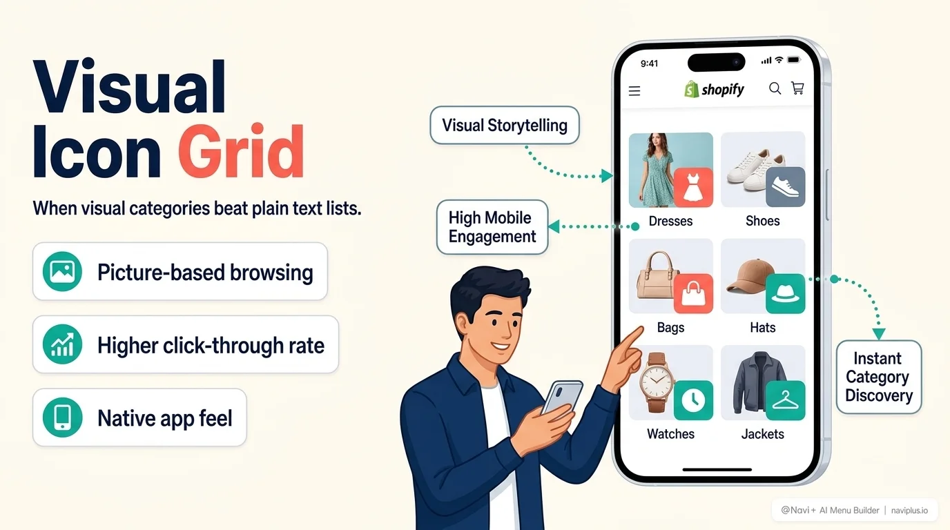
A text dropdown asks a shopper to read. A visual grid asks them to recognize — and recognition is faster than reading when the categories themselves are visually distinct. This is why the pattern shows up constantly in fashion, beauty, and home-goods stores: “Dresses,” “Shoes,” “Accessories” are categories a shopper can identify from a thumbnail almost instantly, faster than scanning a text list for the right word.
The pattern works less well for categories that don’t photograph distinctly — B2B parts catalogs, categories that overlap heavily, or stores where the differentiator is a spec rather than an appearance. A grid of near-identical product photos with different labels underneath just becomes a text list with extra loading time.
Sizing tiles like tap targets, not thumbnails
The most common mistake with icon grids is treating them purely as a visual design decision and forgetting they’re also interactive elements. The same tap-target guidance that applies to any other navigation applies here: 44×44 CSS pixels minimum, per both WCAG 2.5.5 and Apple’s Human Interface Guidelines. A visually striking grid with tiles packed edge-to-edge for aesthetic density is a grid that mis-taps on a real thumb — the exact failure mode Fitts’s Law predicts when target size shrinks.
A comfortable grid, in practice:
- 2–3 columns on mobile, enough that each tile is still a real thumb-sized target
- Consistent aspect ratio across tiles, so the grid doesn’t feel uneven as images load
- A visible label under or over each tile — recognition helps, but it isn’t a replacement for confirmation once the shopper has narrowed their guess
Where it fits alongside your other menus
An icon grid isn’t usually a store’s only navigation — it’s a browsing entry point, often used on a homepage or as a landing section, working alongside a Tab Bar for persistent core actions and a Mega Menu or drawer for the full category depth. Treat it as one tool solving one problem (fast visual browsing at the top of the funnel), not a replacement for structured navigation everywhere else.
Fast checkLook at your grid from arm's length, slightly blurred (or just squint). If you can still tell the categories apart, the visuals are distinct enough to carry the pattern. If everything blurs into the same shape, a text list will serve shoppers better.
Frequently Asked Questions
Do icon grids load slower than text menus on mobile?
Not when properly optimized. Navi+ loads images in next-gen WebP format with lazy loading and explicit width/height attributes, ensuring zero Cumulative Layout Shift (CLS) and no impact on PageSpeed.
Should I use category icons or actual product photos?
For apparel and lifestyle goods, clean photography of hero products converts best. For technical or multi-vendor stores, standardized vector line icons reduce visual noise.
Can I embed an icon grid inside a mobile drawer or mega menu?
Yes. In Navi+, the Grid Menu kind can be rendered as an inline section on landing pages or embedded directly into desktop mega menu panels and mobile slide drawers.
Where Navi+ fits
Navi+ builds this as the Icon Menu — one of its five core menu types, with tap targets sized to WCAG/HIG standards by default and the same drag-and-drop editor used for every other menu type, so a visual grid doesn’t require separate tooling from the rest of the store’s navigation.
Where to start
Before building an icon grid:
- Check whether your top categories are visually distinct enough to recognize at a glance, not just labeled differently
- Keep tiles at a real tap-target size — resist packing more in for density
- Use it as one entry point among several, not as the store’s only path to category pages
Done well, an icon grid trades a moment of reading for a moment of recognition — and for the right kind of catalog, that trade is a clear win.
Transform your Shopify navigation with Navi+
Build visual mega menus, mobile tab bars, and floating contact buttons in under 5 minutes.