

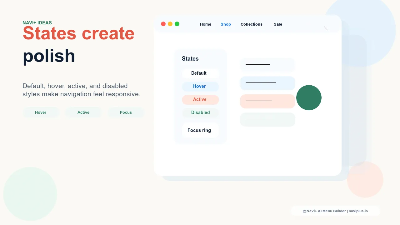
Polished Menus Are Built From States
A navigation menu is not one design. It is a set of states: default, hover, focus, active, current, disabled, loading, expanded, collapsed. Stores often spend time choosing colors and layout, then leave these states inconsistent or undefined. The result is a menu that looks acceptable at rest but feels unfinished during use.
State design is what makes navigation feel responsive and deliberate. Shoppers may not name it, but they feel it when a menu item reacts instantly, a selected category stays highlighted, or a disabled campaign link clearly communicates that it is not available yet.
The States Every Menu Needs
| State | What It Communicates | Common Failure |
|---|---|---|
| Default | This is clickable | Links look like plain text |
| Hover | You are targeting this item | Color shift is too subtle |
| Focus | Keyboard position is here | Outline removed for aesthetics |
| Active | The tap or click registered | No feedback on mobile |
| Current | You are in this area now | Shopper loses orientation |
| Disabled | This path is unavailable | Looks broken or clickable |
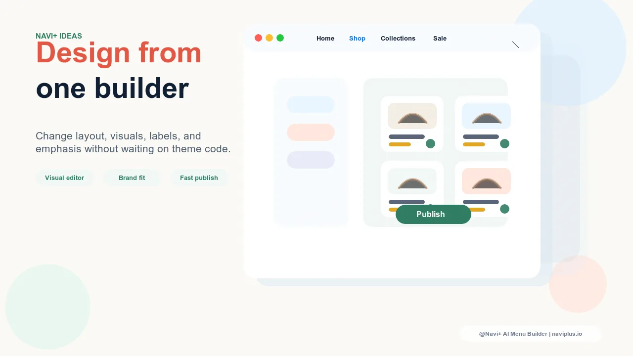
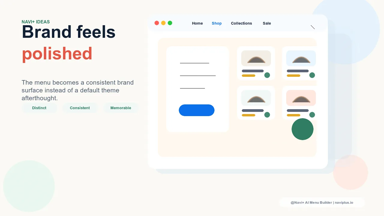
Use State Design to Express Brand
States are functional, but they also carry brand expression. A premium brand might use a quiet underline and precise color shift. A playful brand might use a soft background pill. A high-energy brand might use stronger contrast and snappier movement. The key is consistency: the same state logic should appear in the header, Mega Menu, Slide Menu, Tab Bar, and FAB.
"The menu design was already nice, but it felt flat. Once we added proper hover, active, and current states, customers stopped hesitating. The store felt more expensive without changing the product pages."
— A Navi+ customer, design-led ecommerce brand
Mobile Needs Active Feedback
Hover does not exist on touch screens. That makes active and current states more important on mobile. A Tab Bar item should show when it is selected. A Slide Menu row should respond when tapped. A FAB should visibly open and close. Without these signals, mobile shoppers may wonder whether their action worked.
How Navi+ Helps
Navi+ gives store owners visual control over menu style without requiring custom CSS for every interaction. That matters because state design is usually where theme customization becomes tedious. With Navi+, merchants can create polished, consistent navigation across multiple menu types without turning every hover or active state into a developer task.
Pruébalo gratis — sin código, sin desarrollador
Instálalo en minutos en Shopify, WordPress o cualquier sitio web.