Bottom navigation — a fixed bar of icons pinned to the bottom of the screen — is the pattern behind almost every app you use daily. Instagram, Amazon, TikTok, your banking app: open any of them and the same row of 4–5 icons sits at the bottom, always there, never requiring a tap to reveal itself. On Shopify, this same pattern is usually called a Tab Bar. This guide covers what it actually is, when it’s worth adding to a store, and the implementation details that separate a bottom nav that feels native from one that feels bolted on.
- Bottom navigation keeps 3–5 core paths visible on every page, no tap required.
- Baymard's 2025 benchmark rates 67% of mobile sites "mediocre to poor" on navigation — worse than desktop's 58%.
- The details that matter most are tap target size, safe-area spacing on notched phones, and not fighting your theme's existing sticky elements.
What bottom navigation actually is
Bottom navigation is a horizontal bar fixed to the bottom of the viewport, holding a small number of icon-and-label destinations — typically Home, Categories, Search, Cart, and Account. Unlike a hamburger menu, it doesn’t require a tap to open: the main paths are visible on every single page, all the time.
This isn’t a new invention specific to ecommerce. It’s the standard pattern in Apple’s Human Interface Guidelines and Google’s Material Design, which is exactly why it feels familiar the moment a shopper lands on a store that uses it — they’ve already learned the pattern from every other app on their phone.
Related readingWhy the hamburger menu falls behind on mobile, and where the thumb zone comes in →
Why it’s worth the screen space
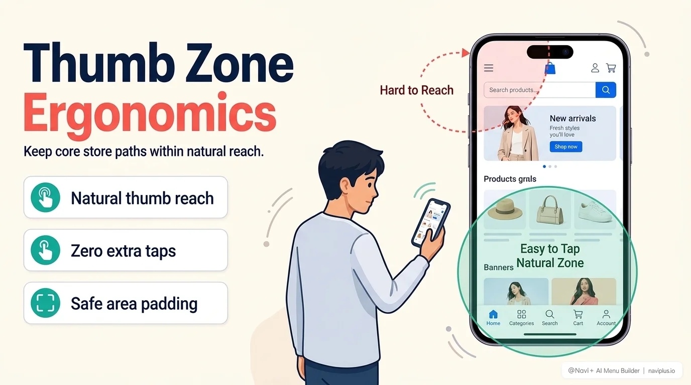
Giving up a strip of screen real estate at the bottom permanently is a real cost, so it’s fair to ask whether it’s worth it. The research says yes, for most stores:
- Baymard Institute’s 2025 UX benchmark found that 67% of mobile ecommerce sites rate “mediocre to poor” on Homepage & Category Navigation, compared to 58% of desktop sites — mobile navigation is the harder problem, not the smaller one.
- Nielsen Norman Group’s usability testing found hidden navigation used only 57% of the time on mobile, versus 86% for combo navigation that keeps some core links visible at all times. Hiding your main paths behind a tap measurably reduces how often shoppers use them.
- Steven Hoober’s thumb-zone research (based on observing 1,300+ real phone interactions) found the bottom and middle of the screen is where a thumb rests naturally — exactly where bottom navigation lives, and exactly the opposite of where a hamburger icon sits.
None of this means bottom navigation is mandatory. A five-page brochure site doesn’t need it. But once a store has more than a handful of categories and mobile traffic makes up the majority of sessions — true for most Shopify stores in 2026 — the case for it is strong.
How many items, and which ones
Both Apple’s Human Interface Guidelines and Google’s Material Design converge on the same range: 3 to 5 items. Fewer than that and you’re wasting the space; more than that and tap targets shrink below a comfortable size and the bar starts to look like a second hamburger menu in disguise.
For most stores, the shortlist looks like:
- Home — the anchor point
- Categories / Shop — your product taxonomy, or a Mega Menu triggered from here
- Search — increasingly the first move for returning shoppers
- Cart — always visible, always current
- Account / Wishlist — for stores with a strong repeat-purchase motion
If you have more candidates than slots, that’s a sign your top-level categories need trimming, not that you need a sixth tab.
The implementation details that actually break bottom navigation
Most bottom navigation bars that “feel off” fail for boring technical reasons, not design ones:
Tap target size. Both Apple HIG and the WCAG 2.5.5 accessibility guideline set 44×44px as the practical minimum touch target. Cramming in extra icons to avoid a “Categories” overflow almost always means undersized targets that get mis-tapped on real thumbs, not design-tool cursors.
Safe-area spacing. iPhones with a home indicator reserve space at the very bottom of the screen. A bottom bar that ignores env(safe-area-inset-bottom) either gets covered by the home-swipe gesture area or sits with an ugly gap depending on the device — this is one of the most common “why does it look broken on iPhone” bugs.
Conflicts with your theme’s existing UI. Many Shopify themes already anchor something to the bottom of the screen — a sticky “Add to Cart” bar on product pages, a cookie consent banner, a chat widget bubble. A bottom nav that doesn’t account for these ends up stacked on top of them, or hidden behind them. This is the single most common integration bug, and it only shows up on real devices, not desktop preview.
Page-load layout shift. A bottom bar that renders after the rest of the page, or shifts height once fonts/icons load, hurts Cumulative Layout Shift — one of Google’s three Core Web Vitals. Get this wrong and a UX improvement becomes an SEO regression.
Fast checkOpen your store on an actual iPhone with a home indicator, not a browser DevTools simulator — that's where safe-area and stacking bugs actually show up.
Frequently Asked Questions
Will adding a bottom navigation bar slow down my Shopify store?
No, if implemented as a lightweight standalone script like Navi+ (~25KB gzipped loaded via global edge CDN). Navi+ renders after critical DOM paint without blocking Largest Contentful Paint (LCP) and prevents layout shift (CLS = 0).
Do I need to edit Liquid code in my Shopify theme?
Zero code required. Navi+ uses Shopify App Embed technology (OS 2.0). When you install or uninstall the app, no residual code is left in your theme files.
How does bottom navigation handle floating chat widgets or sticky Add-to-Cart buttons?
Navi+ includes automatic collision detection that automatically offsets popular Shopify chat widgets (Shopify Inbox, Gorgias, Tidio) and theme sticky buttons above the tab bar, avoiding overlapping UI elements.
Where Navi+ fits
Navi+ builds the Shopify Tab Bar as one of its five core navigation types, configured separately from desktop, with safe-area spacing and Core Web Vitals handled by default — so the implementation details above aren’t something you have to solve by hand. It also detects and works around common theme conflicts (sticky Add to Cart bars, chat widgets) rather than blindly stacking on top of them.
Ready to add a mobile Tab Bar to your Shopify store?
Build an app-like bottom navigation with live cart count, 20+ templates, and zero theme code in under 2 minutes.
Where to start
Bottom navigation is one of the highest-leverage, lowest-effort changes available to a mobile-first Shopify store — but only if the details are handled. Before adding one:
- Confirm you can name your 3–5 most important destinations without hesitating
- Check what’s already anchored to the bottom of your theme’s mobile layout
- Test the result on a real notched phone, one-handed, not in a desktop simulator
Get those three right, and a bottom nav bar tends to pay for the screen space it takes almost immediately.
Add a native-feeling mobile Tab Bar with Navi+
Built specifically for Shopify mobile shoppers: thumb-zone tap targets, iPhone safe-area padding, badge counters, and automatic collision detection with chat widgets.