
Add a mega menu to Shopify's Origin theme — Navi+ setup
Origin is Shopify's free reference theme for Online Store 2.0 (dawn family). On the live demo store: the hamburger trigger is #Details-menu-drawer-container; Mega Menu inserts cleanly below the header — this theme has no horizontal overflow issues (headerInsertSafe = true). The selector table and setup guides below are specific to this theme.
1 Theme analysis
dawn matches expected2 Navigation anatomy — selector map
Selectors confirmed unique (matchCount = 1) on the live demo store. Role present only if found.
| Role | CSS selector | Platform | Used for |
|---|---|---|---|
| Navi+ mount targets | |||
| Hamburger trigger | #Details-menu-drawer-container |
Mobile | Navi+ binds here to activate Slide Menu |
| Header | .section-header |
Mobile + Desktop | Insert Mega Menu below the header of Origin |
| Main menu | .header__inline-menu |
Desktop | Navi+ Mega Menu replaces the desktop nav contents |
| Logo | .header__heading-link |
Mobile + Desktop | Fallback — insert trigger icon before logo when no hamburger |
| Panel triggers | |||
| Hamburger trigger | #Details-menu-drawer-container |
Mobile | Tap to open native mobile drawer |
| Search icon | .header__icon--search |
Mobile + Desktop | Tap to open search panel / overlay |
| Cart icon | #cart-icon-bubble |
Mobile + Desktop | Tap to open cart drawer / panel |
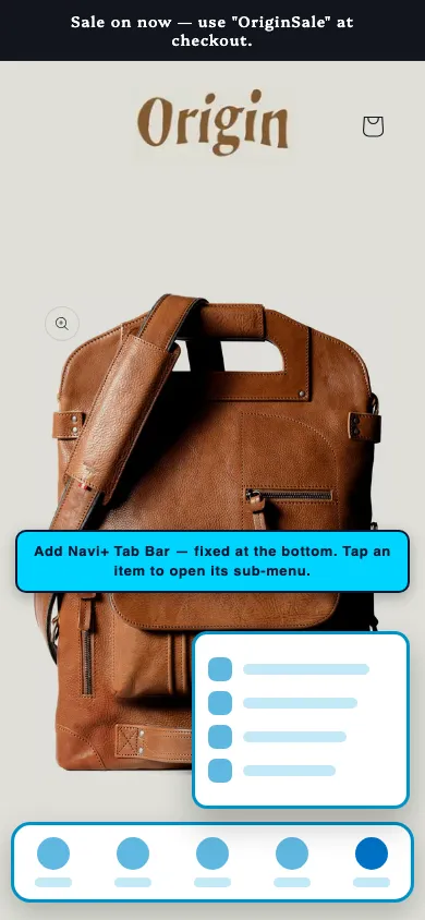
Add a Navi+ Tab Bar to the Origin Shopify theme
A Tab Bar pins a fixed navigation strip to the bottom of the screen on mobile — right where the thumb rests. Origin shoppers reach your menu, search and cart from any page without scrolling back to the header.
- App-style navigation — a native feel for the mobile web
- One-tap cart access to lift mobile checkout rate
- Sits below the Origin header — never competes with the theme's own navigation
Each tab's Link field accepts a normal URL, open:NaviMenu(EMBED_ID) to open another Navi+ menu, or a built-in open action that triggers Origin's own panels. Navi+ keeps the theme's drawer, search and cart — the tab simply opens them.
#Details-menu-drawer-container.header__icon--search#cart-icon-bubble- In Navi+, create a new menu and choose Tab Bar.
- Add your tabs — name, icon, cart-count badge and link each one (e.g. Home, Shop, Search, Cart, Menu).
- To open Origin's native drawer, search or cart, set the tab link to the matching open action. To open a Navi+ Slide or Mega menu instead, use
open:NaviMenu(EMBED_ID). - Open Publish, enable sticky mode, and set the device filter to Mobile.
Replace the Origin mobile drawer with a Navi+ Slide Menu
A Slide Menu replaces Origin's default mobile drawer with a richer multi-level panel — icons, images and custom grouping — opened by the same hamburger your shoppers already use.
- Unlimited multi-level navigation with icons and images
- Same button, same position — shoppers never notice the swap
- Ideal for catalogs with many collections to organize on mobile
The hamburger trigger #Details-menu-drawer-container was confirmed unique on the live Origin demo, so Navi+ opens the Slide Menu from the exact button shoppers already tap.
- In Navi+, create a new menu and choose Slide Menu.
- Add your categories with icons, colors, images and as many levels as you need.
- Open Publish, enable the menu, then set the trigger to
#Details-menu-drawer-container— Origin's hamburger selector. - Save. The Slide Menu now opens from that button. Append
(M)to keep it mobile-only.
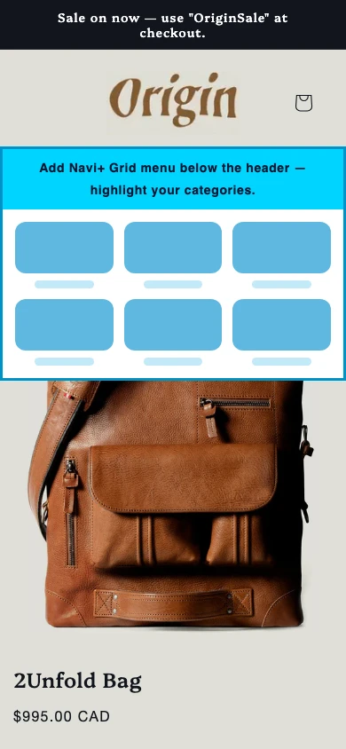
Add a Navi+ Grid Menu to the Origin theme
A Grid Menu shows your collections as a grid of images — an app-style launcher that lets shoppers jump straight to any collection in one tap.
- Visual, image-first — shoppers see the collection before reading its name
- No Origin selector required to mount
- Great for stores with many collections to browse quickly
A Grid Menu can be inserted at a fixed spot in any Origin page (point it at a CSS selector), or opened on demand from a FAB or a Tab Bar tab — your choice.
- In Navi+, create a new menu and choose Grid Menu.
- Add collections: thumbnail image, display name and link, ordered the way you want them on the grid.
- In Publish, enable Insert/Replace method, enter the target CSS selector, and choose Insert After or Replace.
- Prefer a pop-up? Skip the selector and open it from a FAB or tab with
open:NaviMenu(EMBED_ID).
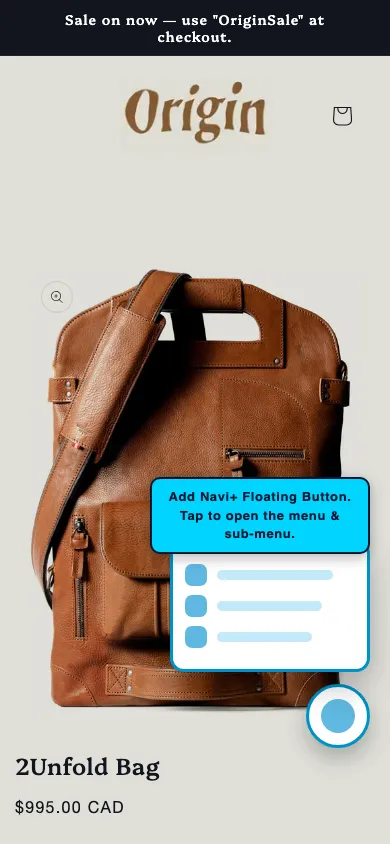
Add a Navi+ floating button (FAB) to the Origin theme
A FAB (Floating Action Button) is a floating button that stays visible while scrolling — a fast shortcut to any page or action. No theme selector, deployed in minutes.
- Never conflicts with any part of Origin
- Flexible: link to the cart, a contact page, a promo, any URL
- Works on both desktop and mobile
A FAB mounts completely on its own — no CSS selector from the Origin theme needed. Set it up and publish without testing any selector.
- In Navi+, create a new menu and choose FAB.
- Pick the icon, background color and size — use a built-in icon or upload your own.
- Choose a position: bottom-right (most common), bottom-left, or any fixed corner.
- Set the action: link to a collection, cart, contact or promo page, or open another menu (Grid, Slide…) with
open:NaviMenu(EMBED_ID). - Open Publish and enable sticky mode. The FAB works on all devices.
Add a Navi+ mobile Mega Menu to the Origin theme
On mobile, a Mega Menu shows as a multi-level panel — letting shoppers browse your whole catalog on a phone with clear hierarchy, images and banners.
- Multi-level menu with icons and images on small screens
- Open it under the header or from a Tab Bar tab
- Great when a store has many categories to surface on mobile
A mobile Mega Menu is a Section menu. Insert it directly under the Origin header, or open it from a Tab Bar tab — both work without binding to the theme's own menu.
- In Navi+, create a new menu, choose Mega Menu, and design the multi-level columns (categories, featured images, banners).
- In Publish, enable Insert/Replace method, enter
header(M)and choose Insert After — drops under the mobile header. - Prefer to open it from a tab? Leave it unpublished here and point a Tab Bar "Menu" tab at it with
open:NaviMenu(EMBED_ID). - Keep the device filter on Mobile.
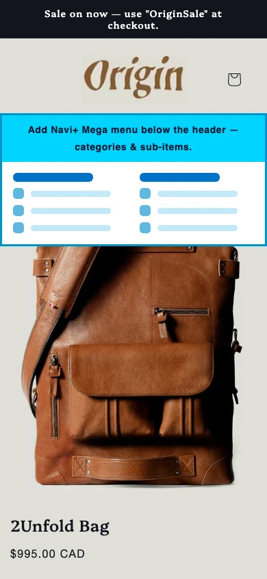
Insert a Navi+ Mega Menu below the Origin header
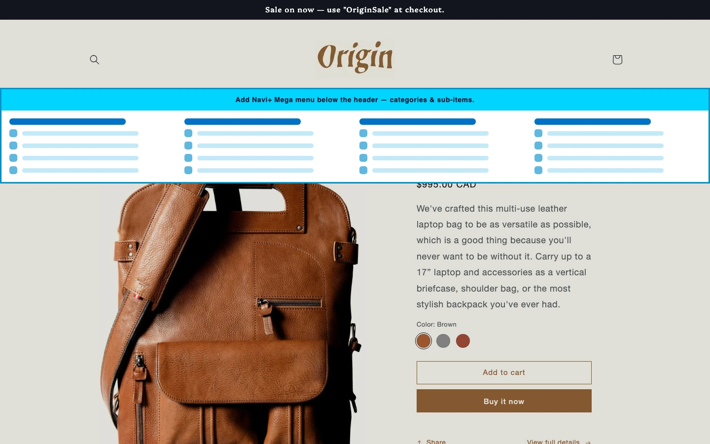
Insert a Mega Menu below the header — a multi-column dropdown bar that appears right under the Origin header on hover, with zero changes to the theme's Liquid.
- Multi-column dropdown with images and featured links
- Leaves the theme's own menu untouched — both menus coexist
- The cleanest way to mount when the theme supports insert
Origin is headerInsertSafe = true — a Mega Menu inserts below the header with no horizontal overflow, and the native menu stays put.
- In Navi+, create a new menu, choose Mega Menu, and design the dropdown columns (categories, featured images, products, banners).
- In Publish, enable Insert/Replace method.
- Enter the selector
.section-header(D)and choose Insert After — the mega bar appears directly below the Origin header. - The device suffix
(D)keeps it desktop-only.
Replace the Origin desktop menu with a Navi+ Mega Menu
Replace mode swaps the native menu inside the header entirely — Navi+ renders straight into that container, keeping the Origin header layout intact.
- Keeps the menu's place in the header — no extra bar added
- Best when you don't want two rows of navigation
- Works on any theme, even without
headerInsertSafe
The main-menu selector .header__inline-menu was confirmed — Navi+ renders the Mega Menu exactly where the native menu sits in the Origin header.
- In Navi+, create a new menu, choose Mega Menu, and design the dropdown columns.
- In Publish, enable Insert/Replace method.
- Enter the desktop nav selector
.header__inline-menu(D)and choose Replace — Navi+ renders in place of the native Origin menu. - After choosing Replace, optimize for flash-free loading — see the publish guide.
Insert a trigger icon before the Origin logo
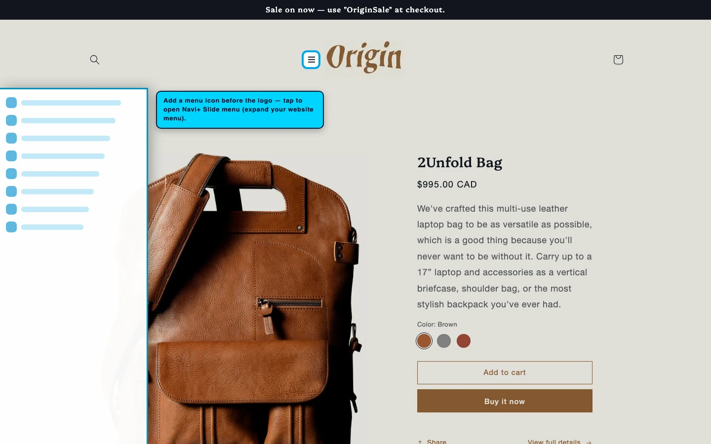
Add a trigger icon before the logo — a custom hamburger right next to the Origin logo for themes with no default mobile hamburger, or as a second entry point into your Slide / Mega menu.
- Creates a new trigger point without editing Liquid
- Natural placement — right beside the logo, familiar to shoppers
- Great for desktop-first themes with no mobile hamburger
The logo selector .header__heading-link was confirmed on Origin, so Navi+ can insert a trigger icon right before it.
- An advanced pattern — for themes with no mobile hamburger, or to add a second entry point.
- Build a small single-item menu (a one-item Mega/Slide) whose item opens your main Slide Menu with
open:NaviMenu(EMBED_ID). - In Publish, enable Insert/Replace method, enter
.header__heading-link(M)and choose Insert Before — icon appears before the Origin logo. - A little custom CSS aligns it; reach out to support if you need a hand.
11 How to add a Navi+ menu to Origin
Every menu type on this page follows the same three steps. Enable the app once — then each new menu is just design and publish. No Liquid editing required.
- Enable Navi+ once. In Shopify admin go to Online Store → Themes → Customize → App embeds and switch on Navi+. This loads the app on your Origin storefront and covers every menu you build. Install guide →
- Design the menu in the Navi+ editor — items, icons, images, columns and colors.
- Publish it. Open the menu's Publish panel. Floating menus (Tab Bar, FAB) just need the publish toggle; slide and section menus point at a CSS selector from the table above.
Add (M) or (D) to any selector to target mobile-only or desktop-only — e.g. header(D). Not sure of a selector? Open yourstore.com/#navidebug-on, hover an element and press Ctrl/Cmd + C to copy it.
Frequently asked questions — Navi+ on the Origin Shopify theme
How do I add a Navi+ menu to the Origin Shopify theme?
How do I add a tab bar to the Origin Shopify theme?
#cart-icon-bubble).How do I add a mega menu to the Origin Shopify theme?
.section-header(D) with Insert After — no theme code editing.How do I replace the Origin mobile menu with a slide-out menu?
#Details-menu-drawer-container. The slide menu then opens from the same button shoppers already tap, replacing the native drawer.Do I need to edit Origin's theme code to add a menu?
Does Navi+ work with the Origin Shopify theme?
Other dawn-family themes
Add Navi+ menus to other Shopify themes
Selector reference
Panel containers and supplementary selectors — used for state detection or hiding native elements.
| Role | CSS selector | Platform | Used for |
|---|---|---|---|
| Slide drawer | — | Mobile | Native drawer — hidden when Navi+ Slide Menu is active |
| Search modal | .search-modal |
Mobile + Desktop | Search panel container — detect open/close state |
| Cart drawer | cart-drawer |
Mobile + Desktop | Cart drawer container — detect open/close state |
| Mega menu | — | Desktop | No native mega menu — Navi+ inserts one instead |