The drawer menu — a panel that slides in from the side, usually opened by a hamburger icon — gets blamed for a lot of mobile navigation problems that are actually about what’s hidden behind it, not the drawer pattern itself. A drawer holding your full category tree, cleanly organized, with the most important paths kept visible elsewhere, is a completely reasonable piece of navigation. A drawer holding everything, in no particular order, as the only way to browse, is where it goes wrong. This guide is about the difference.
- Nielsen Norman Group's own research recommends a hybrid: 4 or fewer top items visible, everything else in the drawer.
- A drawer with unlimited depth is a drawer nobody finishes scrolling through.
- The slide-and-push animation (not slide-over) helps shoppers keep their sense of place.
The drawer isn’t the enemy — being the only nav is
Nielsen Norman Group’s usability testing compared fully hidden navigation, fully visible navigation, and a hybrid “combo” approach where some links stay visible and the rest sit behind a menu icon. The finding: on mobile, hidden navigation was used only 57% of the time versus 86% for combo navigation — and NN/g’s own recommendation is explicit: keep 4 or fewer top-level items visible, and use a drawer only for what’s left over.
That’s the core reframe. The question isn’t “hamburger or no hamburger” — it’s whether the drawer is carrying navigation duty alone, or whether it’s doing the one job it’s actually good at: holding secondary and overflow items that don’t need to be visible on every page.
Related readingCombining Tab Bar and drawer: how the two should split the work →
Depth is where drawers actually fail
A drawer that mirrors a deep desktop mega menu — category, then eight subcategories, then more sub-subcategories, all nested in expandable rows — is a drawer shoppers give up on before reaching what they wanted. On a small screen, every extra level of nesting is a full-screen tap-and-wait, not a glance.
A workable rule of thumb: two levels deep, three at the absolute most. If your catalog genuinely needs more structure than that, a search bar inside the drawer (not just a “close and use the main search” instruction) does more work than a fourth nesting level ever will. Shoppers who already know what they want will type; shoppers who are browsing only need the first two levels to orient themselves.
Push, don’t cover
There are two common animation patterns for a drawer opening: it slides in over the page content, or it slides in and pushes the page content aside, with the underlying page still partly visible at the edge. The push pattern is the better default — because the page content stays partially visible, shoppers keep a stronger sense of where they are and how to get back, compared to a full-screen overlay that visually replaces everything.
This is a small detail, but it compounds with depth: a shopper three taps deep into a nested drawer is already at risk of losing their place. An overlay that fully hides the page removes the last visual anchor they had.
What actually belongs in the drawer
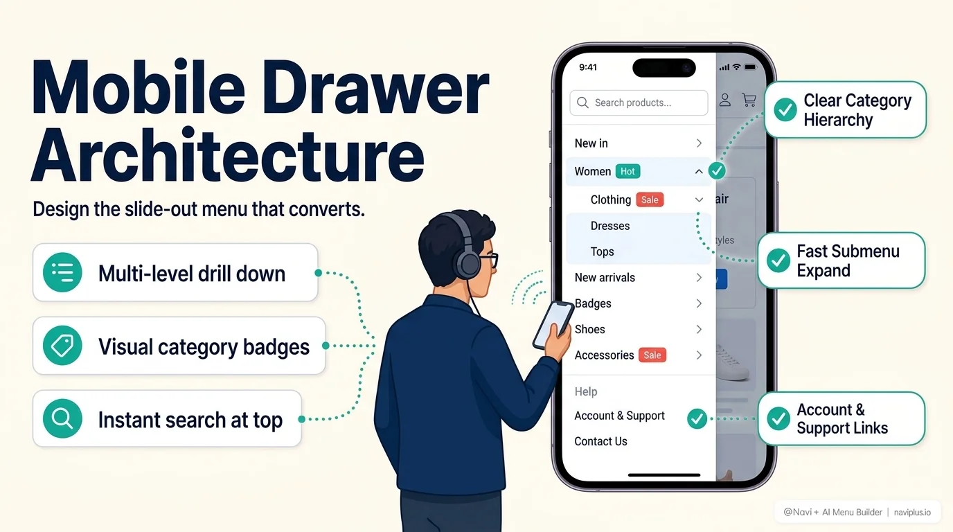
Once the 3–5 highest-value paths are pulled out into a Tab Bar or visible header links, what’s left for the drawer is genuinely secondary material:
- The full category tree, beyond the top-level items already visible elsewhere
- Account, order history, and support links
- Policy pages — shipping, returns, terms
- Store info that matters occasionally, not on every visit
If something in that list feels too important to bury, that’s a sign it belongs in the visible tier instead — not a sign the drawer needs to get bigger.
Fast checkTime yourself finding a mid-depth category through your own drawer menu, on a phone, without already knowing where it is. If it takes real hunting, a shopper who's never seen your site won't finish the search.
Where Navi+ fits
Navi+ builds the drawer as a Mobile Menu — with icons, images, and badges available at every level, a depth that stays visually manageable, and the option to combine it with a Tab Bar and Floating Button so the drawer only has to carry what’s actually secondary. Structure changes made once carry over even when the store’s theme changes later.
Where to start
Before restructuring a drawer:
- Pull your true top 3–5 destinations out into always-visible navigation first
- Check your deepest nesting level — if it’s more than three, that’s the first thing to fix
- Add in-drawer search if your catalog has more categories than fit comfortably in two levels
A drawer done well isn’t a compromise — it’s the correct home for everything that doesn’t need to be visible every time. The mistake was ever asking it to hold everything else too.
Frequently Asked Questions
Should I use a slide-in drawer or a full-screen overlay menu?
A slide-in drawer (push or partial overlay) is superior because it leaves a visible margin of the underlying page. Shoppers maintain their sense of spatial location and can easily tap outside to dismiss the menu.
How many sub-levels should I allow in my mobile drawer?
Maximum 2 to 3 levels. Any deeper nesting causes cognitive fatigue and high bounce rates on mobile. If your catalog is huge, embed an instant search input inside the drawer header.
Can I combine a bottom Tab Bar with a side drawer menu?
Yes, this is the gold-standard 'hybrid navigation' pattern used by Amazon and Instagram. The Tab Bar keeps high-frequency links (Home, Cart, Search) 1-tap away, while one tab triggers the full category drawer.
Ready to upgrade your mobile store navigation?
Replace clunky theme drawers with Navi+ Mobile Menu and bottom Tab Bar. 100% no-code.