


The App Gap — and Why Most Stores Can't Close It
The most-used shopping apps in the world share a common interface pattern: a persistent bottom Tab Bar with icons for Home, Shop, Search, Cart, and Account. Users have internalized this pattern so deeply that navigating without it feels effortful and unfamiliar. When they visit a mobile website that uses a hamburger menu instead, the experience registers as inferior — even if the products are the same.
This creates what you might call the App Gap: a perceptual difference in experience quality between native shopping apps and mobile websites. Shoppers who regularly use apps like Amazon, ASOS, or Nike expect that navigation pattern everywhere. When your Shopify store doesn't provide it, you're not just offering a different experience — you're offering a demonstrably worse one by comparison.
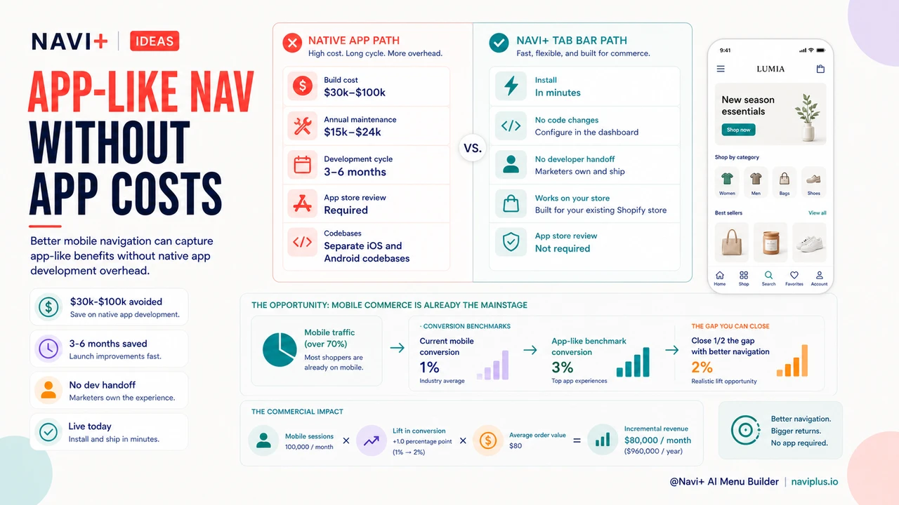
The obvious solution — build a native app — is off the table for most stores. Custom iOS and Android apps cost between $30,000 and $100,000 to develop from scratch. Annual maintenance typically runs another $15,000–$24,000. App store submission fees, ongoing updates for new OS versions, and separate codebases to maintain add further overhead. For a growing store generating $500,000 in annual revenue, a native app represents 6–20% of revenue before it generates a single dollar of incremental sales.
"We had a developer quote us $45,000 for a custom app. We weren't ready to commit that kind of capital, but we were watching our mobile session metrics and knew the experience wasn't where it needed to be. Adding Navi+'s Tab Bar closed most of the gap. Our mobile conversion improved significantly and we didn't have to build or maintain anything."
— A Navi+ customer, home goods and lifestyle brand
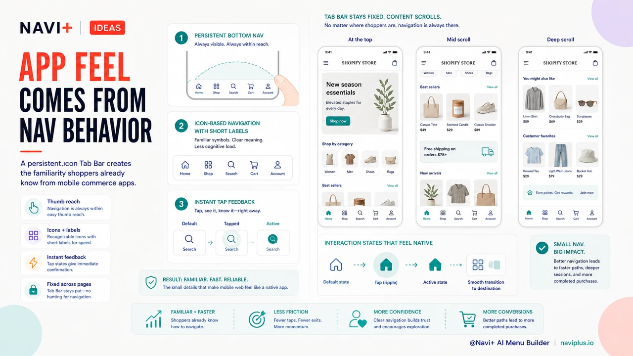
What Makes App Navigation Feel Like an App
It's worth understanding precisely what separates the "app feel" from a standard mobile website experience. The difference isn't the platform — it's the navigation behavior. Three specific patterns account for most of the perceived gap:
Persistent bottom navigation. In every major shopping app, the navigation bar stays fixed at the bottom of the screen, regardless of scroll position. Users don't have to scroll back to the top, open a drawer, or hunt for a menu. The navigation is always within thumb reach. This single pattern is responsible for more of the "app feel" than any other UX element — and it's entirely replicable on a mobile website with the right tool.
Icon-based navigation. Apps use icons with short labels rather than text-only menus. This visual shorthand is faster to scan, takes less vertical space, and communicates purpose more immediately than a list of text links. Users recognize a shopping cart icon, a search magnifying glass, and a home icon without reading anything.
Instant feedback and immediate response. App navigation responds to interaction without page-reload delays. Good mobile web navigation should match this: the Tab Bar should be visually responsive to taps, with smooth transitions rather than abrupt page changes that signal "you're on a website."
How Navi+ Delivers the App Experience on Your Shopify Store
Navi+ AI Menu Builder's Tab Bar replicates all three of these patterns on your Shopify mobile experience — without requiring a native app. It installs as a Shopify app block, requires no code changes to your theme, and launches on your live store in minutes.
The Tab Bar sits at the bottom of the mobile screen, fixed in position across all scroll depths on all pages. You configure which destinations appear — typically Home, Shop/Categories, Search, Cart, and one custom destination (a sale section, a loyalty program, or a featured collection). Icons are paired with short labels for instant recognition. Taps navigate within your store using Shopify's routing, which means transitions are as smooth as your theme supports.
The result is a mobile browsing experience that feels structurally identical to a native app — because the navigation pattern is structurally identical. Shoppers who have trained on Amazon, ASOS, or any major retail app will immediately recognize the interface and navigate it fluently, without needing to learn the conventions of your specific website layout.
| Capability | Native App | Navi+ Tab Bar |
|---|---|---|
| Persistent bottom navigation on mobile | Yes | Yes |
| Icon + label navigation tabs | Yes | Yes |
| Visible on all pages at all scroll depths | Yes | Yes |
| Development cost | $30,000–$100,000 | Monthly subscription |
| Ongoing maintenance | $1,500–$2,000/month | Included |
| App store submission required | Yes (Apple + Google) | No |
The Math on App-Level Navigation
The commercial case for Navi+'s Tab Bar isn't just that it's cheaper than a native app — it's that it delivers most of the conversion benefit at a fraction of the cost, and the benefit is immediate rather than delayed by a 3–6 month development cycle.
Mobile commerce now accounts for more than 70% of all e-commerce traffic in most markets. If your store is currently converting mobile visitors at a 1% rate while app users in your category typically convert at 3%, closing even half of that gap is worth more annually than the total cost of a year of Navi+. The calculation is straightforward: better navigation costs less than an app, installs today, and compounds as your mobile traffic grows.
Navi+ installs in minutes. The Tab Bar is live on your store immediately after configuration, requiring no approval process, no app store review, and no developer handoff.
Try it free — no code, no developer needed
Install in minutes on Shopify, WordPress, or any website.