


Navigation Is the Funnel Mechanism
The conversion funnel — Awareness, Consideration, Decision, Action — is usually discussed in terms of marketing channels and page-level content. But there is a structural layer that sits beneath all of it: navigation. Navigation is the mechanism that moves a visitor from one funnel stage to the next. Without a clear path from the homepage to a category, from a category to a product, from a product to a cart, and from a cart to checkout, the funnel collapses regardless of how well-designed each individual page is.
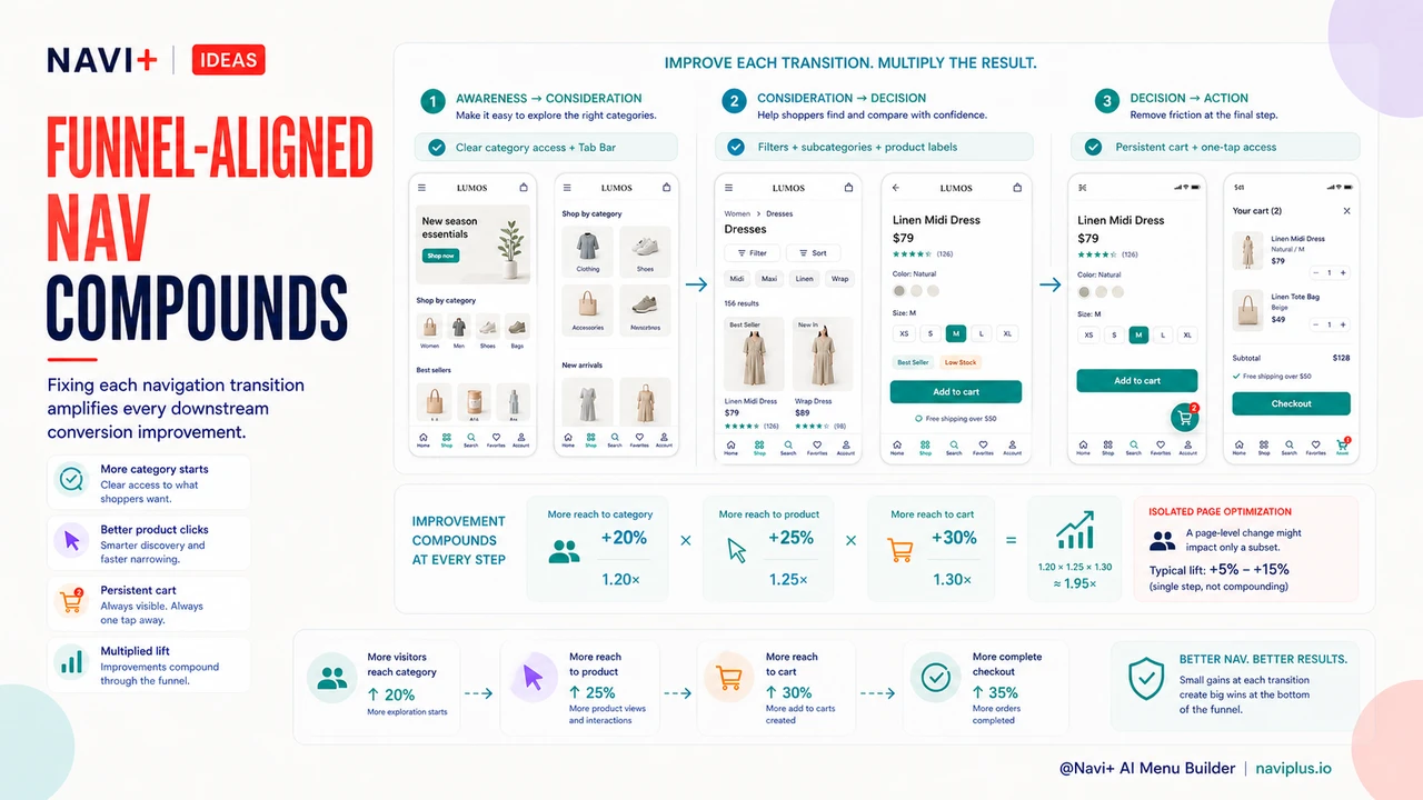
Each funnel transition maps to a specific navigation interaction. Awareness-to-Consideration is the homepage-to-category move: a visitor arrives and needs a navigation structure that helps them understand what the store carries and where to start exploring. Consideration-to-Decision is the category-to-product move: a visitor browsing a category needs navigation tools — filters, subcategory links, contextual sorting — that help them narrow down to a specific product. Decision-to-Action is the product-to-cart move and then cart-to-checkout: once a visitor has decided on a product, navigation must make it trivially easy to complete the purchase without losing their place or their intent. Treating each transition as a navigation problem — not just a content problem — changes where optimization effort gets directed.
Where Most Stores Lose Visitors: The Consideration-to-Decision Gap
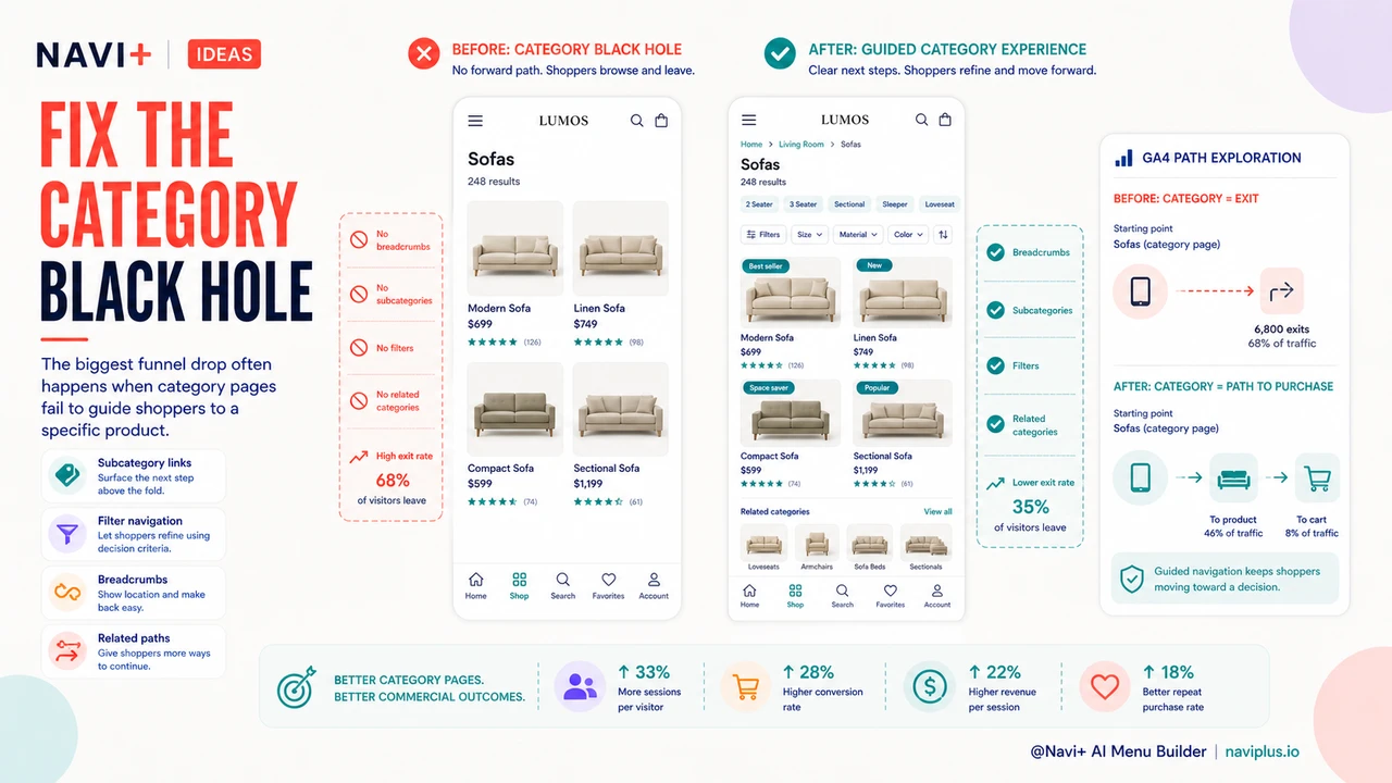
Of the four funnel transitions, the drop from Consideration to Decision is typically the largest. Visitors reach category pages — they've signaled interest by navigating past the homepage — but they don't proceed to product pages. They browse the category, scroll through product thumbnails, and leave. The category page failed to move them forward.
The most common navigation failure on category pages is an unclear relationship between the category and its products. When category navigation doesn't offer sub-filters, price range controls, or sorting that matches how shoppers actually think about the category, visitors can't efficiently find a product worth clicking. The result is that category pages function as exit pages rather than consideration pages — visitors confirm the store has products in the category they want, then go find a better-organized competitor.
Navigation that makes the product-category relationship clearer — through visible subcategory links, filter panels that reflect real shopper decision criteria, and product card labels that distinguish products at a glance — directly reduces the Consideration-to-Decision drop. This is a navigation problem with a navigation solution, not a product photography or pricing problem.
Navigation Black Holes: Category Pages with No Exit Strategy
A specific variant of the Consideration-to-Decision drop deserves its own name: the navigation black hole. A category page becomes a black hole when it offers no forward navigation path beyond the product thumbnails themselves. No subcategory navigation. No related category links. No "back to category" breadcrumb visible from the product page. No "customers also browsed" links. Visitors who arrive at a category page that doesn't match their intent — or who exhaust the visible products without finding a match — have no obvious next step. The browser's back button and the store's exit become equivalent options.
The fix is not a page redesign. It's navigation additions: subcategory links surfaced above the product grid, a breadcrumb trail that shows the visitor where they are in the store hierarchy, and cross-category links that offer an alternate path for visitors whose intent wasn't served by the current category. These are navigation elements that prevent dead-end pages from forming in the first place. A store with good category navigation turns a browsing session into a guided exploration rather than a series of dead ends.
Measuring Funnel Stage by Navigation Path in GA4
GA4's path exploration report makes it possible to see which navigation sequences lead to purchase and which lead to exit. The analysis is more actionable than aggregate funnel reports because it shows the specific page types — and in some implementations, the specific navigation elements — that precede conversion or abandonment.
The setup is straightforward. In GA4, open Explore and select Path exploration. Set the starting point to your homepage (or a campaign landing page), then follow the most common subsequent pages. The branching structure shows where visitors go after each page type. Sessions that reach a product page and then a cart page and then a checkout confirmation are the converting paths. Sessions that reach a category page and then exit — without visiting a product page — are Consideration-to-Decision failures.
Look specifically for: category pages with high exit rates relative to product page click-through; product pages with high "back to homepage" navigation (indicating the visitor didn't find what they wanted but tried to restart rather than continue browsing); and cart pages with high abandonment before checkout initiation (often a sign that cart page navigation makes it difficult to continue, not that the visitor changed their mind about the product). Each of these signals points to a specific navigation fix rather than a page-level content issue.
"Our GA4 path analysis showed that visitors who used the category filters were converting at nearly three times the rate of visitors who didn't — but the filters were buried below the fold on mobile and most visitors never saw them. Moving the filter panel to a sticky position in the navigation immediately lifted our category-to-product click-through rate. Nothing on the product page changed."
— A Navi+ customer, home goods brand founder
Fixing Awareness-to-Consideration: Better Category Navigation Above the Fold
The Awareness-to-Consideration transition — homepage to category — is the first navigation test a visitor faces. A homepage that presents unclear or overwhelming category options fails this test immediately, producing single-session bounces before the visitor ever reaches a product. The navigation visible above the fold on the homepage is the primary tool for passing this test.
Clearer category labels, a hierarchy that matches how visitors think about the store's product range (not how the internal team organizes inventory), and a Tab Bar that surfaces the four to five highest-traffic categories directly in persistent navigation all reduce first-session bounce. The Tab Bar is particularly effective for mobile visitors, who represent the majority of traffic for most stores and for whom a hamburger menu behind a tap requires more navigation commitment than many visitors are willing to make on a first visit. Surfacing category options without requiring a deliberate navigation action lowers the threshold for Awareness-to-Consideration conversion.
Fixing Consideration-to-Decision: Filters as Navigation
Filters are usually implemented as a page feature — a sidebar or collapsible panel that modifies the product grid. The more useful mental model is to treat filters as navigation: they are the mechanism by which a visitor moves from a broad category to a specific product subset, and then to an individual product. When filters are hard to find, slow to respond, or poorly matched to how visitors think about the category, they fail as navigation and the Consideration-to-Decision transition breaks down.
The integration of filters into navigation — making them persistent, mobile-accessible, and scoped to the category's actual decision criteria — is one of the highest-leverage changes available at the Consideration stage. Related category links from product pages serve a complementary function: when a visitor reaches a product page and finds it's not quite right, a link to the parent category or a related category gives them a navigation path forward rather than a dead end. Breadcrumbs that show category context serve the same purpose — they tell the visitor where they are and make it easy to go one level up rather than all the way back to the homepage.
Fixing Decision-to-Action: Persistent Cart Access in Navigation
The Decision-to-Action transition is the one most store owners assume is handled by the checkout flow. But a common friction point occurs before checkout even begins: visitors who have added a product to their cart and then continued browsing can't easily find their way back to the cart. A navigation layer that doesn't make cart access persistent — visible and one tap away at all times — introduces "where did my cart go?" friction at exactly the moment when the visitor's purchase intent is highest.
A sticky Tab Bar with a cart icon that shows the current item count solves this completely. The cart is always visible, always accessible, and the item count provides a constant reminder of purchase intent. For stores running Navi+, this is a standard Tab Bar configuration rather than a custom development project. The effect on Decision-to-Action conversion is measurable: visitors who can see their cart status at all times are more likely to return to it and complete checkout than visitors who need to remember how to navigate back.
Navigation vs. Page-Level Optimization Across Each Funnel Stage
The case for prioritizing navigation fixes over page-level content optimization is strongest when viewed through the funnel stage lens. Page-level optimization at the Awareness stage — better hero images, more compelling homepage copy — only affects visitors who are paying attention to homepage content. Navigation optimization at the Awareness stage — clearer category access, a visible Tab Bar — affects every visitor who arrives at the homepage, regardless of what they engage with. The addressable audience for navigation optimization is always larger.
The same logic applies at every stage. At Consideration, better product photography on the category page helps visitors who are evaluating product thumbnails; better filter navigation helps every visitor who is trying to narrow their options. At Decision, stronger product page copy helps visitors who are reading descriptions; persistent cart navigation helps every visitor who has already added a product. Navigation improvements operate on the full population at each funnel stage; page-level improvements operate on the subset that engages with specific content elements. This is why navigation is often the root cause of conversion problems that appear to be content problems — and why navigation fixes frequently produce larger overall conversion lifts than equivalent investment in page-level optimization.
| Funnel Stage | Navigation Optimized per Stage | Generic Navigation |
|---|---|---|
| Awareness Conversion Homepage → Category |
Tab Bar surfaces top categories instantly; clear hierarchy reduces homepage bounce | Hamburger menu requires deliberate action; category structure not visible above the fold |
| Consideration Conversion Category → Product |
Filters integrated as navigation; subcategory links; breadcrumbs show context; related category paths prevent dead ends | Filters buried or absent on mobile; no subcategory navigation; visitors dead-end and exit |
| Decision Conversion Product → Cart |
Breadcrumb context keeps visitor oriented; related category links offer forward paths if product doesn't match | No category context on product page; visitors who don't convert have no navigation path except back button or exit |
| Action Conversion Cart → Checkout |
Persistent cart icon in Tab Bar with item count; cart always one tap away regardless of browsing depth | Cart accessible only from header; visitors who browse after adding item lose the cart from their mental navigation map |
The Compounding Effect of Funnel-Aligned Navigation
Navigation improvements at each funnel stage compound with each other because each stage feeds the next. Fixing Awareness-to-Consideration increases the number of visitors entering the Consideration stage — which means any Consideration-to-Decision improvement operates on a larger base. Fixing Consideration-to-Decision increases the number of visitors reaching the Decision stage — which means any Decision-to-Action improvement likewise operates on a larger base. Unlike page-level optimizations that affect isolated stages, navigation improvements that span the full funnel generate a multiplied effect: each fixed transition amplifies the impact of every downstream fix.
This compounding dynamic is why stores that approach navigation as a funnel-level problem — rather than a visual design preference — see disproportionate overall conversion gains relative to the investment. The goal is not a prettier navigation menu; it is a navigation system that removes friction at every funnel transition and keeps visitors moving toward purchase.
Try it free — no code, no developer needed
Install in minutes on Shopify, WordPress, or any website.