


The Connection Most Store Owners Miss
When a customer sends an email asking "where is my order?" or "how do I return this?", the natural assumption is that it's a customer service problem. You route it to your support queue, pay an agent to respond, and move on. What you rarely ask is why the customer emailed in the first place.
In a large share of cases, the answer is not that they had a complex problem requiring human assistance. The answer is that they looked for the information on your site and couldn't find it. They checked the menu. They scanned the footer. They tried searching. Nothing surfaced the answer quickly enough, so they gave up and sent a ticket. The support ticket was not a support failure — it was a navigation failure that became a support cost.
This distinction matters because navigation failures and support failures have very different solutions. Support failures require better agents, better scripts, better response times. Navigation failures require better menus. The fix is faster, cheaper, and permanent — and it reduces load on your support team rather than just managing it.
The Economics of a Deflected Ticket
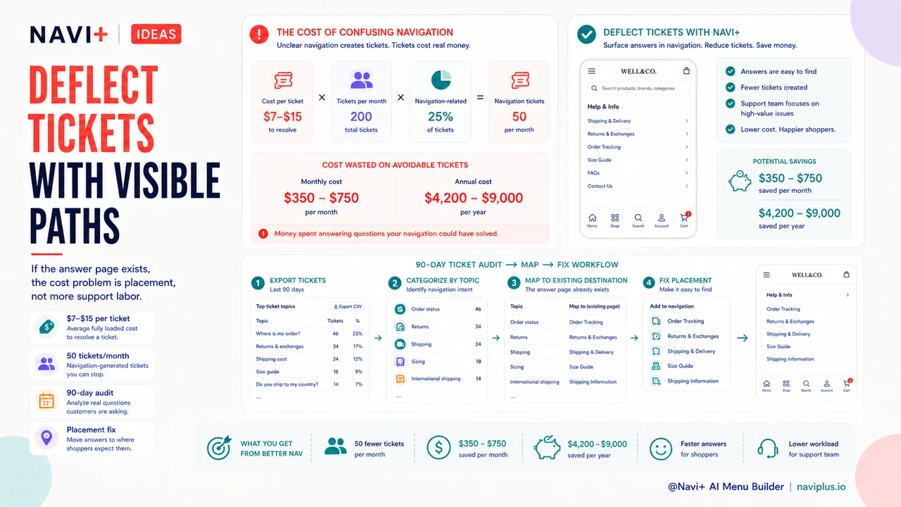
A customer support ticket costs between $7 and $15 to resolve when you account for agent time, tooling overhead, and queue management. The exact number depends on your staffing model, but even at the low end, the math compounds quickly.
A store receiving 200 support tickets per month where 25% are navigation-generated is spending $350–$750 per month — $4,200–$9,000 per year — on questions that should have been answered by a visible return policy link or a persistent account button. That's not a cost of doing business. It's a recoverable inefficiency with a clear, inexpensive fix.
Navigation improvements that deflect 50 tickets per month save $350–$750 per month. At the cost of a Navi+ subscription, the payback period on better navigation is measured in weeks, not months or years. No other single store improvement has that ratio of cost to recovered labor spend.
"After we added an Account tab to our mobile nav and put the Returns link in the footer with a real label, our support volume dropped by about 30% in the first two months. Those were almost entirely 'where is my order' and 'how do I return this' tickets. They didn't disappear — visitors just started finding the answers themselves."
— A Navi+ customer, apparel store owner
The Four Categories of Navigation-Generated Support Load
Not all support tickets trace back to navigation. But the categories that do are predictable, and they tend to cluster around the same four destinations that stores routinely hide behind unclear menus.
Policy information
Return policies, shipping timelines, and exchange procedures are among the most frequently asked questions in ecommerce support. Visitors who can't locate these pages — because they're buried three levels deep in a generic "Info" dropdown or labeled with internal jargon — send a ticket instead. The policy exists; the navigation just doesn't surface it.
Account access
Login links are frequently deprioritized in store navigation, especially on mobile. When a returning customer can't find where to sign in to check their order history or manage their subscription, "I can't find my account" tickets follow. This is entirely a navigation exposure problem, not an account functionality problem.
Product findability
"Do you carry X?" and "Where is Y category?" tickets frequently indicate that the store's category structure or search visibility has gaps. Visitors who don't find a product assume it doesn't exist and ask. Improved category navigation and search surfacing reduces this category significantly.
Order tracking
"Where is my order?" is the single most common support question in ecommerce. Most stores have an order status page — it's just not visible enough. When the order tracking link lives in a confirmation email that the visitor has lost, or behind an account login that they can't find, the ticket volume goes up. A persistent, visible order tracking link in the Tab Bar is the single highest-impact change for this ticket category.
How to Identify Navigation-Caused Tickets
The audit starts with your ticket history. Export the last 90 days of support tickets and categorize them by topic. Most helpdesks make this straightforward — if yours doesn't, a manual sample of 50–100 tickets is enough to establish the pattern.
Once you have topic categories, trace each one back to a destination: is there a page on the store that answers this question? If yes, was that page discoverable from any standard navigation path — main menu, footer, Tab Bar, search? If the page exists but the navigation path is broken or absent, you have a confirmed navigation-generated ticket.
The most common finding in this audit is that the store has the right information pages — return policy, FAQ, account login, order tracking — but those pages are not in any navigation slot that a visitor would naturally check. The fix is placement, not content creation.
The Fix: Dedicated Navigation Slots for High-Support Destinations
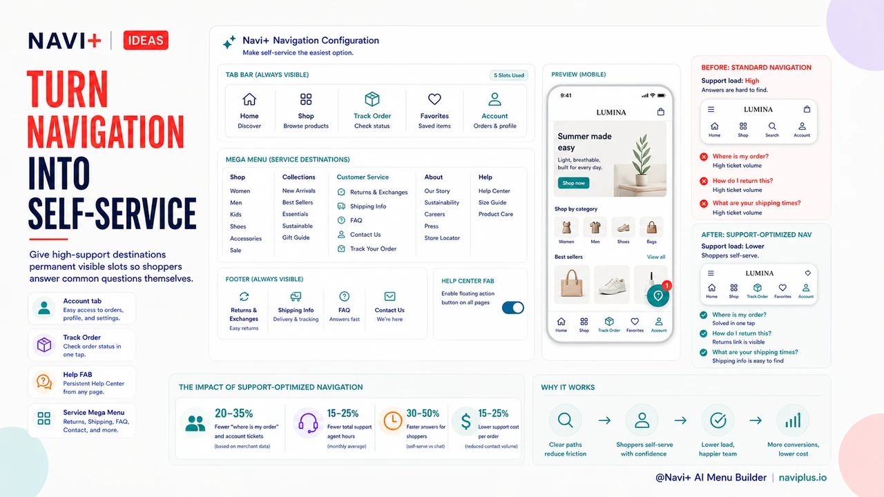
The navigation pattern that reduces support load is straightforward: identify the four to six destinations that generate the most tickets, and give each one a permanent, visible slot in the navigation structure. Not buried in a dropdown. Not labeled with internal shorthand. Visible, labeled clearly, and available on every page.
For most stores, the highest-priority placements are:
Account access in the Tab Bar. Stores that add an Account tab to their mobile Tab Bar see a 20–35% reduction in "where is my order" and "I can't find my account" ticket volume. The account icon becomes the persistent entry point for order history, returns, and subscription management — all the questions that otherwise generate tickets.
Order tracking as a named Tab Bar slot. Rather than relying on visitors finding the link in their confirmation email, a dedicated Track Order tab in the mobile navigation puts the answer one tap away. This is the highest-leverage change for the most common ticket category in ecommerce.
Return and shipping policy in a visible footer. Not "Policies" — not "Info" — but "Returns" and "Shipping" as discrete, labeled links. Visitors scanning a footer for policy information look for those exact words. Abstract labels are invisible to a visitor in problem-solving mode.
A dedicated customer service section in the Mega Menu. For stores with a Mega Menu, a named column for customer service links — Returns, Shipping, FAQ, Contact, Track Order — consolidates all support destinations in one discoverable location. Visitors who are confused about anything know exactly where to look.
Self-Service Navigation Design
The goal of support-optimized navigation is self-service: making the information architecture of the store answer questions so that agents don't have to. This requires treating navigation not just as a merchandising tool but as a support infrastructure. Every visible navigation slot is an opportunity to deflect a ticket.
A FAB (Floating Action Button) pointed at a help center or FAQ is one of the highest-visibility self-service interventions available on mobile. A persistent button that follows the visitor through the store and links directly to structured answers removes the friction that converts confusion into a support ticket. Navi+'s FAB component is configurable to point at any destination — help center, FAQ page, chat widget, or order tracking.
The principle is that every time a visitor has to ask a human a question that the store could have answered with a link, you've paid for a navigation failure in agent time. Self-service navigation design treats that as an addressable cost, not an acceptable overhead.
Navigation with Support-Optimized Destinations vs. Standard Navigation
| Dimension | Support-Optimized Navigation | Standard Navigation |
|---|---|---|
| Ticket Deflection Rate | 20–35% reduction in common ticket categories | No structural deflection mechanism |
| Account Access Visibility | Persistent Tab Bar slot, always visible | Header icon only, easily missed on mobile |
| Order Tracking Findability | Named Tab Bar entry, one tap from any page | Buried in confirmation email or account menu |
| Policy Page Discoverability | Labeled links in footer and Mega Menu column | Generic "Policies" dropdown or footer link |
| Customer Frustration Points | Low — answers available without agent contact | High — visitors forced to email for basic information |
| Labor Cost per Month | $350–$750 lower (50 fewer tickets at $7–$15 each) | Full ticket volume absorbed by support team |
What Navi+ Provides for Support-Deflecting Navigation
Navi+ includes the specific navigation components that make support-optimized navigation practical to implement without developer work. The Account slot in the Tab Bar is a first-class configuration option — one toggle adds a persistent account entry point across all mobile pages. The FAB component is configurable to point at any URL, including help center and FAQ pages. The Mega Menu supports dedicated columns, making it straightforward to build a visible customer service section distinct from the product catalog.
These are not workarounds or hacks — they're the standard building blocks of navigation that reduces support overhead. For stores spending $500–$1,000 per month on support agent time handling questions that better navigation would answer, the economics of Navi+ are straightforward. The subscription pays for itself from ticket deflection alone, before any conversion improvement is counted.
Try it free — no code, no developer needed
Install in minutes on Shopify, WordPress, or any website.