


Why Theme Navigation Is Designed to Be Generic
Shopify theme developers face a fundamental design constraint: their navigation must work for every possible type of store that might purchase the theme. A theme sold on the Shopify Theme Store might be used by a jewelry brand, a software company, a food supplier, a clothing retailer, and a home goods store — all with different catalog depths, different customer behaviors, and different navigation requirements. The only navigation design that accommodates all of these use cases is a generic one: a flat top menu, a hamburger icon for mobile, and a basic dropdown system that handles two levels of categories.
This design is not bad. It's functional for most stores, most of the time. But it is, by design, the minimum viable navigation that covers the widest possible range of use cases. It was not designed to be the best navigation for your specific store, your specific catalog, or your specific customer behavior. It was designed to not be wrong for any store — which is a very different goal than being optimally right for your store.
The cost of this generic design is real, even if it's diffuse and hard to attribute directly. Visitors who don't find what they're looking for fast enough leave. Mobile visitors who struggle with a hamburger menu abandon. Category structures that made sense when the store launched but don't reflect the current catalog send visitors to dead ends. None of these generate an error message or a support ticket — they just result in abandoned sessions.
"We'd been on the same premium Shopify theme for three years. The theme itself is genuinely good — great design, fast loading. But the navigation was clearly built to be a baseline that no one would complain about, not a navigation that would perform well. Adding Navi+ on top of the theme gave us a Mega Menu with category images, a Tab Bar for mobile, and a proper Slide Menu — all without touching the theme code. The theme still looks exactly the same; the navigation now actually works."
— A Navi+ customer, accessories brand
The Specific Limits of Theme Navigation
Understanding where theme navigation falls short helps in deciding which improvements to prioritize:
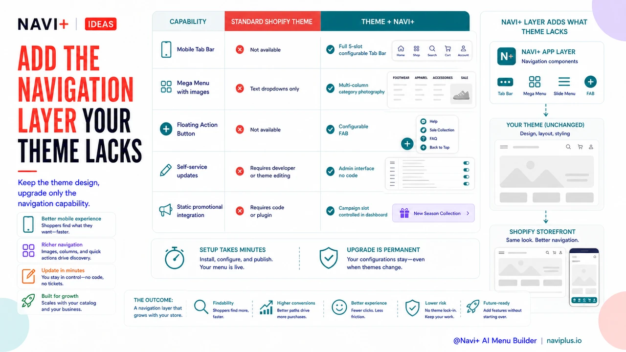
No mobile Tab Bar. Every major consumer mobile app uses bottom Tab Bar navigation as the primary navigation paradigm. Shopify themes universally use top hamburger menus. This is a significant ergonomic mismatch — the hamburger is harder to reach, requires more steps, and is less familiar to mobile-native shoppers than a bottom Tab Bar. Theme navigation has no Tab Bar equivalent.
Limited Mega Menu capability. Most themes support simple dropdown navigation — a second level of text links. Few support true Mega Menus with category images, multi-column layouts, featured products, or promotional banners. Large catalogs, fashion brands, and any store where visual browsing is important are constrained by text-only dropdowns.
No Floating Action Button. The FAB — a persistent, always-visible shortcut floating over the page content — doesn't exist in any standard Shopify theme. It's a common pattern in mobile app design but absent from theme-based e-commerce navigation. Stores that want a persistent shortcut to a high-priority destination (a sale, a bestseller collection, a live chat) have no native way to add one.
Static promotional integration. Theme navigation has no mechanism for time-limited promotional elements — a "Holiday Sale" category that appears in December and disappears in January, or a campaign-specific Tab Bar slot. Every promotional navigation element requires theme code changes or a separate plugin.
| Navigation Feature | Standard Shopify Theme | Theme + Navi+ AI Menu Builder |
|---|---|---|
| Mobile Tab Bar | Not available | Full 5-slot configurable Tab Bar |
| Mega Menu with images | Text dropdowns only | Multi-column with category photography |
| Floating Action Button | Not available | Configurable FAB with custom destination |
| Self-service updates | Requires developer or theme editing | Admin interface, no code required |
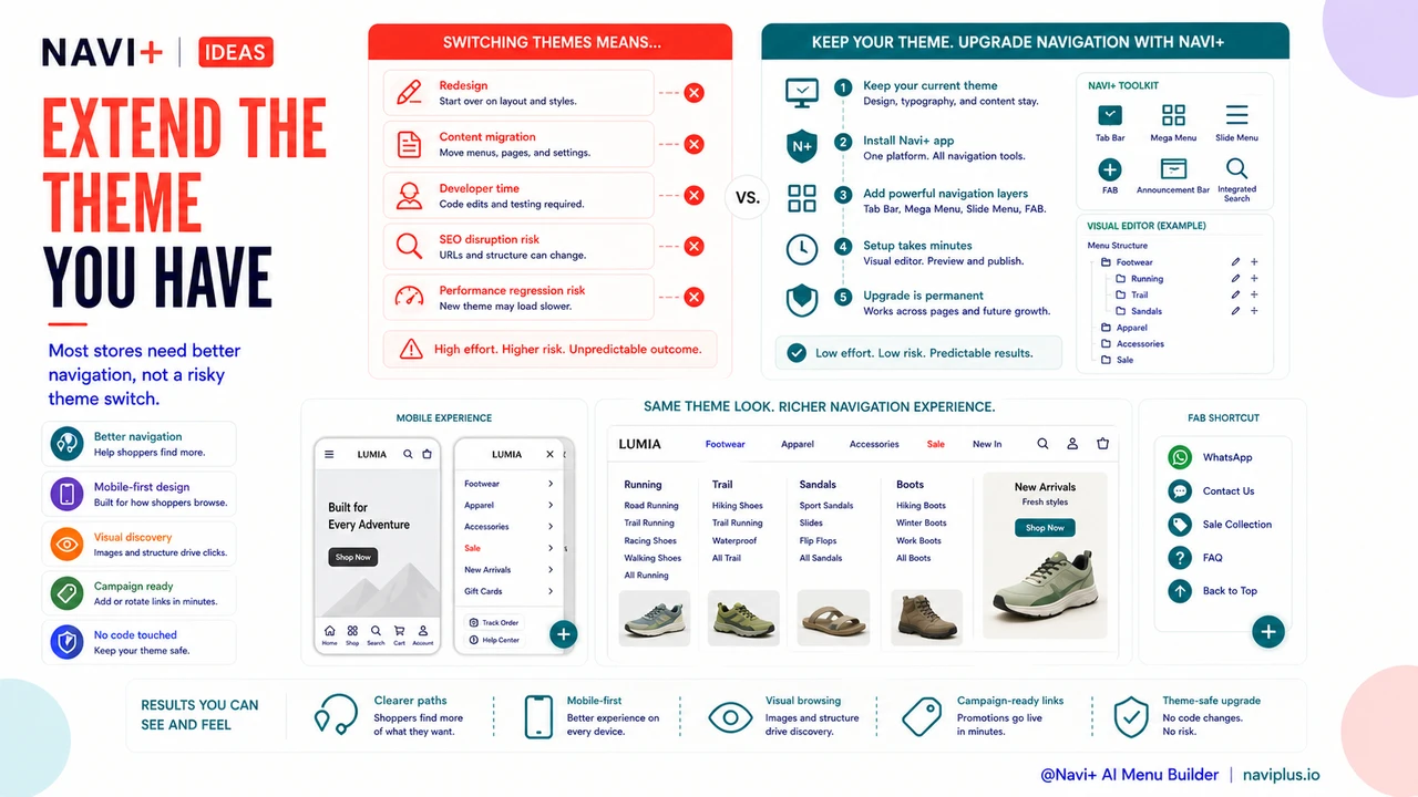
Extending the Theme You Have
The practical implication is that most store owners don't need a new theme — they need better navigation capabilities on top of the theme they already have. Switching themes is expensive (redesign, content migration, developer time) and risky (SEO disruption, performance regression). Adding a navigation layer that works on top of the existing theme captures most of the navigation benefit without any of the theme-switching risk.
Navi+ installs as a Shopify app and adds navigation components — Tab Bar, Mega Menu, Slide Menu, FAB — that layer on top of the existing theme. The theme's design, typography, and content structure stay exactly the same. Only the navigation improves. Setup takes minutes; the upgrade is permanent.
Try it free — no code, no developer needed
Install in minutes on Shopify, WordPress, or any website.