

Navigation Design Communicates Before Products Do
When a visitor arrives at your store for the first time, the navigation is one of the first things they see and interact with. Before they've read your product descriptions, before they've seen your pricing, before they've looked at your reviews — they've already formed an impression of your brand based on how the store feels to navigate. That impression is shaped by the visual design of your navigation as much as by your logo or hero imagery.
A premium brand with a cluttered, generic hamburger menu sends contradictory signals. The product photography might say "luxury" while the navigation says "default Shopify template." A fashion brand with a navigation that uses the same flat text links as a commodity electronics store is missing an opportunity to differentiate through design. Navigation styling is brand work — it deserves the same level of deliberate attention as packaging, photography, and copy.
The stores that build strong brand recognition fastest are the ones where every touchpoint — including navigation — reinforces the same identity. A minimal, high-whitespace navigation with thin typefaces communicates premium positioning. An energetic, color-forward navigation with bold labels communicates youth and vitality. A sophisticated, image-forward Mega Menu communicates that this is a store with editorial sensibility. The navigation is not neutral. Every design choice communicates something.
"Our brand is built on premium minimalism — clean lines, muted palette, nothing excessive. Our old navigation looked like every other Shopify store because the theme's defaults were generic. With Navi+, we redesigned the Mega Menu to match our brand system: same font, same spacing, same color tokens. Now the navigation feels like it belongs to us. Customer satisfaction scores for site experience went up noticeably."
— A Navi+ customer, premium home goods brand
The Elements of Navigation That Shape Brand Perception
Brand-aligned navigation design isn't just about colors. It spans several visual and structural dimensions:
Typography. The font used in your navigation should match your brand's typographic system. A brand with an editorial identity that uses a serif for headlines loses consistency when the navigation renders in a default sans-serif that was chosen by the theme developer, not the brand owner.
Color and contrast. The background, text, and hover colors in your navigation should come from your brand palette — not from theme defaults. The difference between a navigation that uses your exact brand colors and one that uses a close-but-not-quite approximation is visible to attentive shoppers and signals either careful brand control or its absence.
Category imagery. A Mega Menu that uses category photography styled consistently with your product photography reinforces a cohesive visual identity. Category images shot in the same style as your product images tell a visual story; stock images or inconsistently styled category photos undermine it.
Language and tone. The way categories are named is a brand decision. "Women's" vs. "Her" vs. "For Women" carries different tone implications. "New In" vs. "New Arrivals" vs. "What's New" signals different brand personalities. Navigation copywriting is brand copywriting — it should go through the same editorial voice guidelines as your product descriptions.
How Navi+ Enables Brand-First Navigation Design
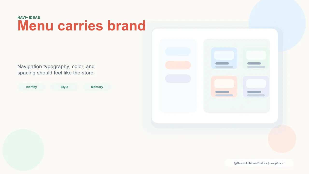
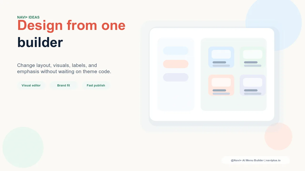
Navi+ AI Menu Builder provides granular visual controls for every navigation component — giving brand owners the ability to align navigation design with their existing brand system without requiring custom code.
The Mega Menu supports custom background colors, text colors, font settings, and category image placement. You can build a multi-column menu that uses your brand's grid system and typographic hierarchy rather than a generic template. Category images can be uploaded and cropped to match your brand's imagery style.
The Tab Bar on mobile supports icon customization, label styling, and background and border color settings. A Tab Bar in your brand's primary color with custom icon styles reads as an intentional design decision — not a plugin that was bolted onto the store after launch.
For stores with strong visual identities, these controls allow the navigation to become an extension of the brand rather than a functional afterthought — which is where navigation design should sit in a well-built store.
| Navigation Element | Generic Default | Brand-Aligned with Navi+ |
|---|---|---|
| Menu typography | Theme default sans-serif | Brand font, size, weight |
| Color palette | Theme defaults, not brand-matched | Custom brand colors throughout |
| Category imagery in Mega Menu | None or generic | Brand-styled category photography |
| Mobile Tab Bar style | Default plugin appearance | Icon style, color, label aligned to brand |
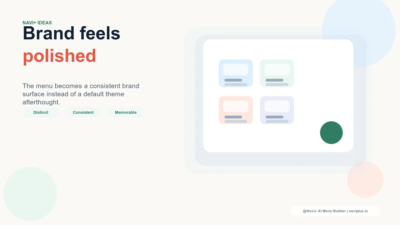
Navigation as a Brand Investment
Strong brand navigation doesn't just look better — it performs better. Visitors who experience a store as visually coherent and professionally designed trust the brand more, stay longer, and buy at higher rates. The navigation is one of the most-seen elements in any store session; making it a brand asset rather than a functional placeholder pays dividends on every session your store receives.
Navi+ installs in minutes. The visual configuration tools allow brand-aligned navigation to be built in a single afternoon — no developer, no CSS overrides, no fighting with theme files.
Try it free — no code, no developer needed
Install in minutes on Shopify, WordPress, or any website.