

Color Is Not Decoration in Navigation
In most areas of web design, color is a combination of aesthetic and brand expression. In navigation, color additionally serves a functional communication role. Navigation color communicates: which elements are interactive, which element is currently active, which destination has elevated priority, and what kind of element is being interacted with. When navigation color is applied only aesthetically — to match the brand palette — these communication functions are often left unfulfilled, and visitors must work harder to orient themselves in the navigation structure.
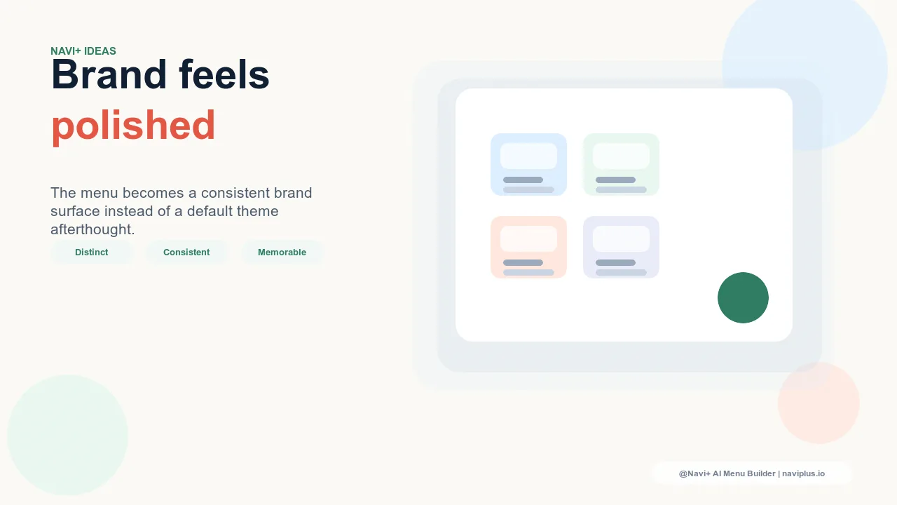
The most effective navigation color systems serve both functions simultaneously: they're beautiful expressions of the brand palette and they communicate state, hierarchy, and interactivity clearly. Achieving this dual purpose requires intentional use of color tokens — specific color values assigned to specific navigation roles — rather than a single brand color applied inconsistently across all navigation elements.
"We use a deep forest green as our primary brand color. When we first configured Navi+, we used the same green everywhere — Tab Bar background, active state, icon color, text. It looked on-brand but it was confusing: everything being the same color meant color gave no information about which element was active or interactive. When we differentiated — using the deep green for the background, a lighter complementary green for active states, and white for standard text — the navigation suddenly communicated clearly what was selected and what wasn't. Same palette, entirely different information density."
— A Navi+ customer, sustainable outdoor brand
The Color Roles in Navigation
Each color in a navigation system should be assigned a specific communicative role rather than applied ad hoc:
Background color: brand context. The background color of navigation components — the Tab Bar, the Slide Menu, the Mega Menu panel — establishes the brand context. It's the canvas that all other elements sit on. For brand-forward stores, this is where the signature color has the most impact: a brand green Tab Bar, a deep navy Slide Menu, a warm cream Mega Menu background. The background color should be consistent enough to feel intentional but can vary between components if the brand system supports different treatments.
Primary text color: readability and hierarchy. Navigation text that's primary (category names, main links) should have sufficient contrast against the background — meeting the 4.5:1 WCAG ratio as a minimum — and be consistent enough that it signals "this is a navigation link" at a glance. Secondary navigation text (subcategory names, helper text, breadcrumb labels) can use a slightly lighter shade of the same color to communicate that it's present but subordinate to the primary navigation level.
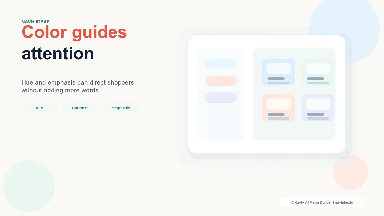
Active state color: orientation. The active state — the color applied to the currently selected Tab Bar item, the current page in the breadcrumb, the open panel in the Mega Menu — is the most functionally important color in the navigation system. It tells visitors where they are. This color should be clearly distinct from the inactive state without being so visually heavy that it dominates the navigation aesthetically. A lightened version of the brand color, an accent color from the palette, or a simple white-on-colored-background treatment all work well as active state signals.
Accent color: emphasis. One destination in the navigation can be given an accent color treatment to signal elevated priority — a "Sale" tab with an accent red background, a "New" badge in accent orange, a FAB in the brand accent color. Used sparingly, accent colors in navigation direct attention to high-priority destinations without requiring the visitor to read every label to find the one that's most urgent. Overused, accent colors lose their salience; restrict them to one or two elements.
| Color Role | Navigation Element | Communication Function |
|---|---|---|
| Background color | Tab Bar, Slide Menu, Mega Menu | Brand context — this is your navigation |
| Primary text color | Navigation links, category names | Readability + "this is interactive" signal |
| Active state color | Selected tab, current breadcrumb | Orientation — "you are here" |
| Accent color | Sale badge, FAB, featured item | Emphasis — "this deserves your attention first" |

Building a Navigation Color System in Navi+
Navi+ exposes individual color controls for all navigation components — background color, text color, active state color, icon color, border color, and badge color — allowing precise construction of the navigation color system described above. Rather than the blunt instrument of a theme's single "primary color" applied everywhere, Navi+ allows each color role to be assigned independently.
The practical starting point is to identify four colors from the brand palette: one for navigation backgrounds, one for primary text (or use white/near-white on a colored background), one for active states, and one accent color for emphasis elements. Assigning these four colors to the correct navigation roles in Navi+'s configuration produces a navigation color system that communicates clearly while remaining fully on-brand — the dual function of navigation color fulfilled with the brand's own palette.
Try it free — no code, no developer needed
Install in minutes on Shopify, WordPress, or any website.