

The Dark Mode Reality in E-Commerce
Dark mode adoption has grown substantially since Apple introduced it to iOS in 2019 and Android followed. Survey data from 2023–2024 consistently finds that 35-45% of smartphone users have dark mode enabled by default — and the proportion is even higher among younger demographics. For e-commerce stores whose target audience skews younger or who have audiences with high mobile engagement, the likelihood that a meaningful portion of visitors are shopping in dark mode is high.
Most Shopify themes were not designed with dark mode in mind. When a browser renders a light-mode website in a dark-mode system environment, the result depends on browser behavior — some browsers auto-invert elements, others leave the site rendering in its original light palette against a dark system environment. Neither outcome is typically what the store designer intended. Navigation components — the Tab Bar, the hamburger menu, dropdowns — are particularly prone to dark mode rendering issues because they layer on top of the main content and may inherit different rendering contexts.
For brand-conscious stores, this rendering inconsistency is a brand quality problem. A navigation that looks polished in light mode and broken in dark mode communicates that the store's design wasn't built to the same standard that attentive shoppers hold their other apps to.
"Our brand identity is built on dark, moody aesthetics — deep blacks, rich jewel tones, minimal white. When we saw what our navigation looked like on customers' phones in dark mode, it was jarring — the Tab Bar appeared with a washed-out background that completely broke the visual identity we'd built. Configuring Navi+ with our intended dark palette for the Tab Bar and Slide Menu meant that dark mode users actually got a better experience than light mode users. It felt completely on-brand."
— A Navi+ customer, premium jewelry brand
Designing Navigation Specifically for Dark Mode
Dark mode navigation design is not simply inverting a light mode palette. Several design principles specific to dark environments apply:
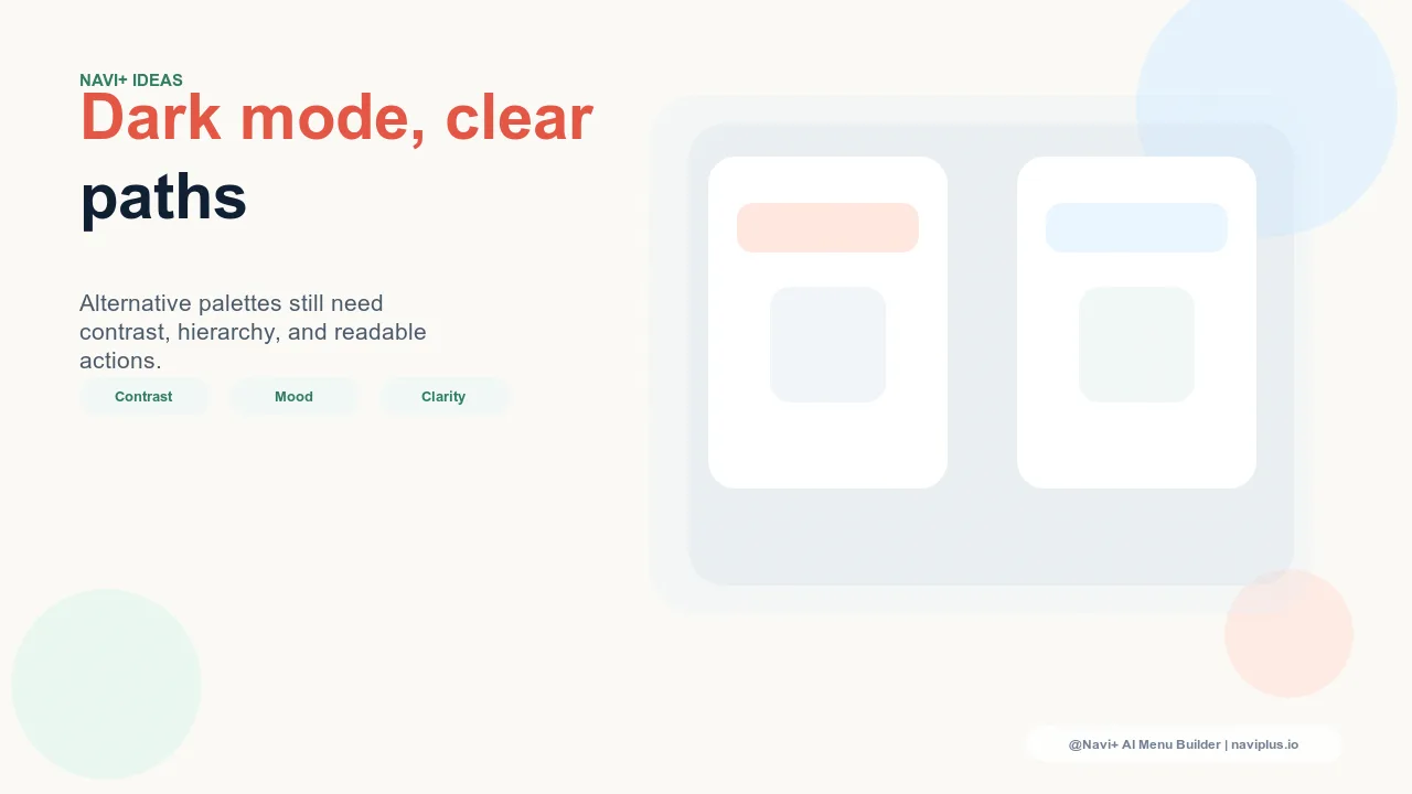
Background luminance, not pure black. Pure black (#000000) backgrounds in navigation components are rarely the right choice even for dark-mode-first brands. Pure black creates harsh contrast with lighter text and can make the navigation feel heavy and aggressive rather than refined. Dark backgrounds that use deep grays, dark blues, or very dark charcoals (in the #0A0A0A to #1A1A2E range) feel more intentional and are easier to read for extended browsing.
Adjusted contrast ratios. WCAG accessibility guidelines require a minimum 4.5:1 contrast ratio for text on background. In dark mode, this means light text must be light enough relative to the dark background — which seems obvious but is easy to get wrong when color tokens from a light mode palette are naively transposed to a dark background. Navigation designed for dark mode should have its contrast ratios validated specifically in the dark configuration.
Brand color preservation. The signature colors that define a brand in light mode often behave differently in dark mode. A brand green that looks vibrant against white can look washed out against dark gray. Dark mode navigation design may require slightly adjusted saturation or brightness on brand color tokens to maintain the intended visual impression in the dark context.
Icon visibility. Navigation icons — particularly in the Tab Bar — need to be visible against dark backgrounds. Thin, light-colored outline icons work well on dark backgrounds; solid dark icons that work on white backgrounds may become nearly invisible in dark mode without adjustment.
| Navigation Dark Mode Approach | Visual Quality for Dark Mode Users | Brand Consistency |
|---|---|---|
| Unmodified light mode theme | Poor — potentially broken rendering | Breaks brand visual system in dark context |
| Browser auto-inversion | Variable — uncontrolled results | Unpredictable brand rendering |
| Intentionally designed dark palette (Navi+) | High — designed for the dark context | Brand-controlled even in dark environment |
Dark Mode as a Brand Statement
For brands with dark, moody, or premium-minimalist aesthetics, dark mode navigation is not a concession to a user preference — it's an expression of the brand's visual identity. A Tab Bar with a deep charcoal background, a narrow white border, and icons in the brand's accent color looks better in dark mode than in light mode for these brands. Dark mode is the native environment for their visual system.
Navi+ provides full color control for all navigation components — background color, text color, border color, icon color, and active/inactive state colors. This control allows precise dark mode configuration: a Tab Bar and Slide Menu that look intentional and on-brand regardless of whether the user's device is in light or dark mode. For brand-forward stores, this is not a minor technical detail — it's the difference between a navigation that looks designed and one that looks like an oversight.
Try it free — no code, no developer needed
Install in minutes on Shopify, WordPress, or any website.