

What Side Panels Can't Do
The slide-in side panel is the default mobile menu pattern in e-commerce for good reason: it preserves context (the page is still partially visible), it's familiar to users across platforms, and it closes intuitively with a swipe. For most stores, most of the time, it's the right choice.
But the side panel has a visual ceiling. At 320–360px wide — the typical slide panel width on a mobile screen — navigation is navigational but not expressive. Category labels appear in a narrow column, the brand's background color fills a strip rather than a canvas, and any imagery or typographic ambition is constrained by the geometry. The side panel says "here is the navigation"; it cannot say "here is who we are."
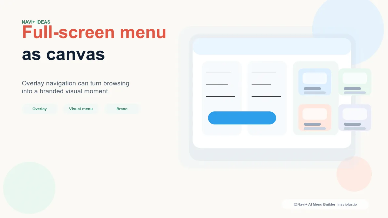
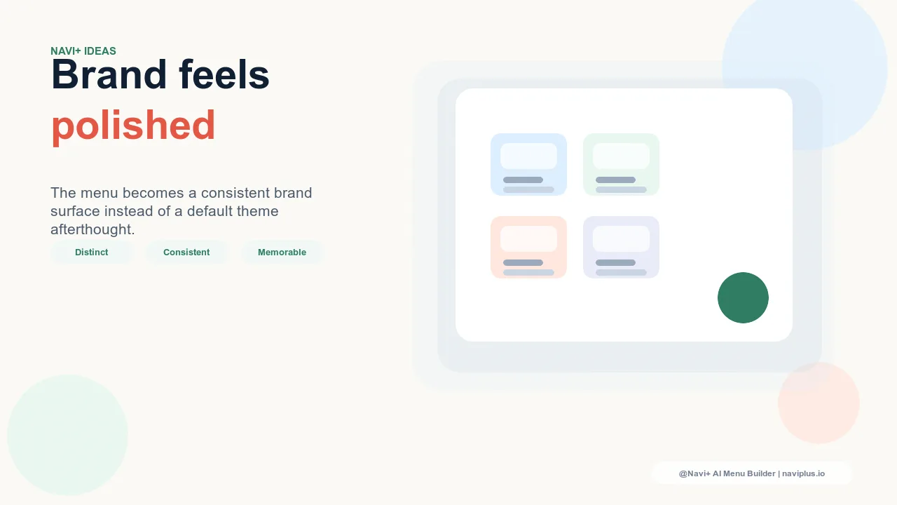
Full-screen overlay navigation says both simultaneously. When the menu opens and the entire screen becomes the navigation — full-width, full-height, the brand's color or typography filling the display — the navigation interaction becomes a brand moment. The transition from product browsing to menu is an intentional pause, a reveal, a statement. For brands where the navigation experience is itself part of the brand expression, this isn't gratuitous — it's deliberate design.
"We're a fashion brand and presentation is everything. Our product photography is art-directed, our packaging is designed to be kept, our stores are considered spaces. The narrow slide panel felt incongruent — like we'd invested in every brand touchpoint except the digital one customers use most. When we moved to a full-screen menu with large typographic category links on our signature black background, customers started commenting on 'the experience' of the website specifically. The menu is now a brand element, not just a navigation tool."
— A Navi+ customer, contemporary fashion label
Design Principles for Full-Screen Navigation
Full-screen overlay navigation has different design requirements than a side panel. The expanded canvas is an opportunity, but it demands more intentional composition:
Large, confident typography as the primary navigation element. When the entire screen is available, navigation labels should be large enough to function as the menu's visual architecture — typically 24–36px for category names, which reads as deliberately large on a phone screen. The whitespace (or brand-color space) around each link is part of the composition, not wasted space. Full-screen navigation that packs small links into a narrow column center misses the point of the format; the labels should breathe and occupy the screen with intention.
Minimal links: surface the most important destinations only. A side panel can accommodate 10–15 navigation links because the format implicitly communicates "here is the full navigation structure." A full-screen menu with 15 links looks like a list; a full-screen menu with 5–7 links looks like a navigation. The expanded canvas rewards fewer, more considered choices. If the store has more than 7 meaningful top-level destinations, a combined approach works better: full-screen for primary navigation with a secondary row of smaller links or a "More" disclosure for additional categories.
Strategic use of the background. The full-screen menu background is the largest single brand surface in the digital store experience. It can use the brand's signature color, a gradient, a subtle texture, or a full-screen background image that changes by season or campaign. Luxury brands with dark brand palettes — black, deep navy, forest green — find full-screen navigation particularly effective because the dark background gives large white or light-colored category links maximum contrast and presence. The menu background should be chosen with the same deliberateness as any editorial photograph.
An open/close transition that communicates intention. The animation that opens a full-screen menu is part of the experience. A slide-up reveal, a fade-in, a panel-wipe from the logo — each communicates a different character. A slow, theatrical open (400–600ms with an easing curve) communicates luxury and deliberateness. A faster, sharper open (200–300ms) communicates modernity and efficiency. The close animation should mirror the open with similar timing; a menu that opens slowly and closes instantly creates a jarring inconsistency. Navi+'s Slide Menu supports the full range of transition timing and easing configurations to match the brand's intended character.
| Format | Brand Expression | Best For |
|---|---|---|
| Side panel (standard Slide Menu) | Functional — efficient, familiar, contextual | Most e-commerce contexts; the safe, well-performing default |
| Full-screen overlay | Expressive — brand immersive, typographically bold | Fashion, luxury, lifestyle brands where the navigation IS the brand |
| Hybrid: Tab Bar + full-screen secondary | Both — instant primary access + expressive full navigation | Brands with distinct primary and secondary navigation needs |
When Full-Screen Navigation Is Not the Answer
Full-screen navigation suits brands where brand immersion is a core value proposition. It is less appropriate for utility-forward stores (grocery, tools, commodity products) where navigation efficiency matters more than brand expression, and for stores with large, complex catalogs where the menu must display many links simultaneously — a full-screen menu with 20 categories works against the format rather than with it. The litmus test: if opening the navigation should feel like entering the brand's world, full-screen is right. If opening the navigation should feel like using a useful tool, a well-configured side panel or Tab Bar serves better.
Try it free — no code, no developer needed
Install in minutes on Shopify, WordPress, or any website.