

Why Flat Navigation Is the Default, Not the Ideal
Flat backgrounds became the dominant trend in UI design in the early 2010s as a reaction to skeuomorphic interfaces that had become cluttered and dated. The "flat design" movement correctly identified that excessive gradients, shadows, and textures created visual noise without adding usability. But it overcorrected in some applications — navigation, particularly mobile navigation, was flattened to the point where the background color carries no brand information beyond the base hex value. A flat #1A1A2E background on a Tab Bar communicates the color but none of the depth or dimension that the same color in a subtle gradient would convey.
The design pendulum has moved since then. The interfaces that feel most premium and considered today — in luxury retail, in high-end app design, in editorial digital experiences — use gradients deliberately. Not the heavy, rainbow-spectrum gradients of early web design, but subtle, controlled transitions: deep navy shifting 12 degrees to midnight blue, warm cream transitioning to cool off-white, forest green moving to a slightly more saturated teal at the edges. These gradients communicate that the background was designed with intention — that someone chose not just a color but a range of colors — which visitors register as a signal of design quality even when they can't identify the gradient explicitly.
"Our brand identity uses a very specific gradient — a deep burgundy that shifts toward a warm copper — on all our print packaging. It's a signature of the brand. When we applied the same gradient to the Slide Menu background in Navi+, customers started commenting that the website felt more 'premium' and 'consistent with the packaging.' The gradient was doing the same brand recognition work digitally that it did physically. Flat burgundy was just a color; the gradient was a brand signal."
— A Navi+ customer, luxury chocolate and confectionery brand
Types of Gradient and Texture in Navigation
Navigation backgrounds can use several types of non-flat treatments, each with different brand implications:
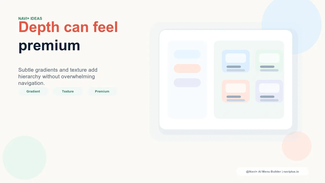
Subtle linear gradients within a single hue. The most universally applicable gradient approach for navigation is a linear transition within the same hue — the same color, shifting slightly in saturation or lightness from one edge to the other. Deep navy to slightly lighter navy. Forest green to a marginally brighter green. Warm charcoal to cool charcoal. These transitions are subtle enough that visitors don't consciously register "this is a gradient" but do register "this feels more considered than a flat background." The brand signal is quality without ostentation — appropriate for almost any premium or mid-premium brand category.
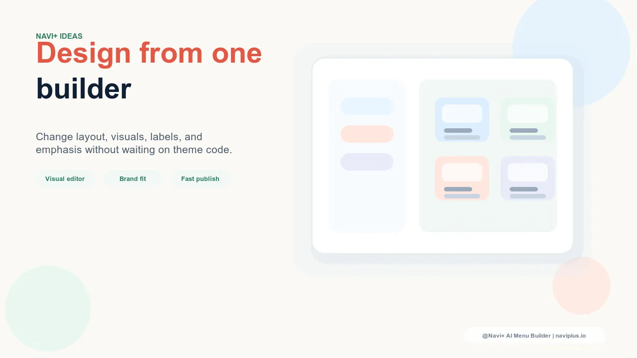
Two-tone gradients using adjacent palette colors. A stronger gradient treatment transitions between two distinct brand colors — a burgundy to copper, a forest green to dark teal, a midnight blue to deep purple. This treatment is more overtly gradient and requires that the transition is harmonious — colors too far apart produce a muddy middle. When done well, a two-tone gradient in navigation is a signature element that communicates brand distinctiveness. When done poorly (incompatible colors, too wide a range, too much contrast at the edges), it reads as dated or design-by-committee. The test: does the gradient exist in your brand's print materials? If yes, extending it to digital navigation is a coherence decision. If no, it needs careful development and testing.
Subtle texture overlays. Navigation backgrounds can incorporate very subtle texture — a fine noise texture at 3–5% opacity, a barely-visible linen or grain pattern, a faint paper texture for artisanal brands — that communicates material quality without overriding readability. Texture in navigation is appropriate for brands whose product quality is material-dependent (leather goods, fine paper, artisan food) because it creates a material resonance between the navigation surface and the products being navigated. The texture must be subtler in digital than in print because screens have less depth to work with — what reads as elegant in print can read as pixelated on screen at the same intensity.
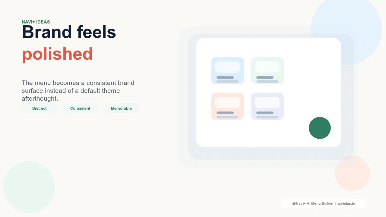
Radial and directional gradients for specific components. The Floating Action Button, active state indicators, and featured labels benefit from directional gradients that create a sense of dimension without applying the treatment to the entire navigation surface. A FAB with a radial gradient centered on its most prominent point looks three-dimensional in a way that enhances its role as the primary call-to-action. An active Tab Bar indicator with a subtle gradient reads as illuminated rather than simply colored. These component-level gradients are lower-risk than full navigation backgrounds because they're contained and can be adjusted without affecting the overall navigation aesthetic.
| Gradient Type | Brand Signal | Best For |
|---|---|---|
| Subtle same-hue linear gradient | Refined quality, design consideration | Any premium or mid-premium brand; low risk of looking dated |
| Two-tone brand color gradient | Brand distinctiveness, signature visual identity | Brands with established gradient identity in print/packaging |
| Subtle texture overlay | Material quality, artisan character | Craft, artisan, luxury brands where material texture resonates |
| Component-level radial gradient | Dimension and depth without overcommitting | FAB, active states, featured badges — safe for any brand |
When to Stay Flat
Not every brand benefits from gradient navigation. The flat background is the correct choice when: the brand aesthetic is explicitly minimal (gradients introduce visual complexity that contradicts the brand's communication of restraint); the product photography contains significant color variation (a gradient background creates color clashes with product imagery that flat backgrounds avoid by staying neutral); or the gradient being considered doesn't yet exist in the brand's wider design system (introducing a gradient exclusively in navigation is inconsistent with the rest of the brand experience).
The decision to use gradients in navigation should follow the same question as any brand design decision: does this serve the brand's communication to its specific audience? For brands where depth, dimension, and material quality are part of the brand's value proposition, a carefully chosen gradient in navigation is a brand signal that costs nothing to apply and communicates everything the flat version cannot.
Try it free — no code, no developer needed
Install in minutes on Shopify, WordPress, or any website.