

What Grid Navigation Actually Is
Grid navigation replaces the traditional single column of text links with a two- or three-column grid of image tiles — each tile representing a category, with a label and sometimes a short descriptor underneath. Think of an Instagram grid, but each square is a navigation destination rather than a post. The structural difference sounds simple, but the behavioral difference for visitors is significant.
In a text-only navigation list, each category is represented by words. The visitor reads the words, interprets them, decides whether the category sounds relevant, and either clicks or moves to the next item. In an image grid, each category is represented by a visual — a kitchen filled with a specific ceramic collection, a coastline living room in blues and whites, a flat-lay of summer dresses in this season's palette. The visitor's eye lands on a tile that appeals to them before they have finished reading the label. The image pre-qualifies the click.
This matters most for stores where the product visually communicates its appeal faster than words can. Fashion, home decor, food and beverage, beauty, outdoor gear — any category where showing the product is more compelling than describing it is a candidate for grid navigation.
The Discovery Advantage Text Navigation Cannot Match
Grid navigation surfaces the breadth of a catalog visually and simultaneously. A visitor looking at a 3x3 grid of category tiles sees nine distinct product worlds at once — before making a single click. A visitor looking at a text list sees nine category names that require interpretation before any emotional response can form.
Consider a home decor store with a "Coastal" category. A text link that reads "Coastal" tells the visitor a style name they may or may not have a clear mental image of. A tile showing a sun-washed bedroom with whitewashed wood furniture, linen bedding in salt-and-sand tones, and a woven hanging on the wall answers the question "is this for me?" in less than a second — without the visitor having to map their own taste onto a style label. The image communicates what the text only approximates.
This discovery advantage compounds at the catalog level. A store that uses text navigation requires visitors to already know what they want by name. A store that uses grid navigation can surface categories that visitors didn't know they were looking for — because a tile can catch an eye even when a label would not have caught attention.
"We restructured our Mega Menu to show category image tiles in a 2x3 grid layout for our home collections. Categories that had been consistently overlooked in our text-only navigation became some of our most-clicked destinations within two weeks of the change. The images were doing discovery work that the labels hadn't been doing."
— A Navi+ customer, home decor brand
How Visitors Scan Grids Differently Than Lists
The scanning behavior difference between text navigation and image grid navigation is not a matter of degree — it is a difference in kind. Text lists are scanned linearly: the eye starts at the top, moves down, reads each item in sequence, and either finds something relevant or exhausts the list. The cognitive load is consistent and sequential. Items near the bottom of a text list are structurally disadvantaged because fewer visitors reach them.
Image grids are scanned spatially. The eye does not start at the top left and move systematically to the bottom right. It jumps to whatever catches attention first — a color, a composition, a product that resonates. Visitors who are drawn to warm tones will land on the tile that has warm tones, regardless of whether it's in the top row or the bottom row. The grid removes the position bias that punishes categories placed later in a text list.
This spatial scanning behavior also means that grid navigation is self-sorting by affinity. Visitors who respond to minimalist, neutral aesthetics will cluster around those tiles. Visitors who respond to bold color and pattern will find those tiles first. The grid allows different visitors to have different navigation experiences within the same interface — each one following their own visual instinct rather than a common reading order.
Implementation Patterns for Grid Navigation
Grid navigation can be implemented at several levels of scope, depending on the store's design goals and technical constraints:
Full-screen overlay grid. When a visitor opens the menu, the entire viewport fills with a grid of category tiles — typically 3x3 or 4x3. This pattern gives each category maximum visual space and creates a strong brand moment. It works best for stores with a relatively flat category structure and strong hero photography for each category. It is most common in fashion and high-end home brands where the navigation itself is intended to be part of the brand experience.
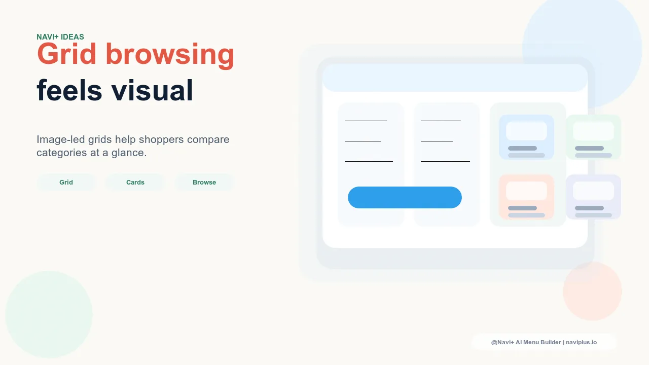
Mega Menu grid panel. The Mega Menu opens to reveal a panel that contains a grid of image tiles alongside or instead of a text link list. This is a more contained implementation that maintains familiar Mega Menu behavior while adding visual richness. The grid panel can occupy a column within the Mega Menu layout, leaving space for featured content, promotions, or secondary navigation alongside it. Navi+ Mega Menu's image column feature supports this pattern directly — each column in the Mega Menu can include an image with label and subcategory links, effectively creating a row of visual category entries across the full panel width.
Slide menu grid. In mobile-first or simplified navigation patterns, a slide-out menu replaces the standard text list with a 2-column image grid. This is the most common grid navigation pattern on mobile, where the standard text list is functional but visually underwhelming. A 2-column grid of category tiles transforms the slide menu from a utility panel into a browseable visual catalog — and increases the surface area of categories a visitor will consider before selecting one.
When Grid Navigation Increases CTR — and When It Doesn't
Grid navigation typically increases category page CTR for image-forward categories by 20–40% over text-only navigation. That range is meaningful, but it carries a conditional that matters: the images have to be good.
Grid navigation fails when category images are stock photos. A home decor store that populates its grid with stock images of rooms that bear no relationship to the actual products in the store creates a navigation experience where the images are misleading — visitors click through expecting to find what the image suggested, and find something else entirely. That mismatch damages trust and increases bounce. Stock photography in grid navigation performs worse than text navigation, not better, because it creates an expectation the catalog cannot fulfill.
Grid navigation requires authentic, specific imagery for each category. The image should show products that are actually available in that category, in a setting that reflects the actual brand aesthetic. Visitors who click a tile for "Outdoor Dining" should arrive at a category page that looks like what the tile showed them — same tones, same style register, same products or comparable ones. When the tile and the category page are visually continuous, the grid navigation builds trust. When they're discontinuous, it erodes it.
Stores without strong category-level photography are better served by a well-structured text Mega Menu than by a grid navigation filled with images that don't represent the catalog honestly. The upgrade path is to build the photography library first, then implement grid navigation second.
Image Requirements for Grid Navigation
Three requirements determine whether a category image will perform in a grid navigation context:
Specificity. The image must show products or settings that are representative of the category's actual inventory — not lifestyle models, not abstract textures, not aspirational scenes that could belong to any brand. A tile for "Ceramic Tableware" should show ceramics that are available in the store. The visitor who clicks that tile is implicitly expecting to find what the tile showed them.
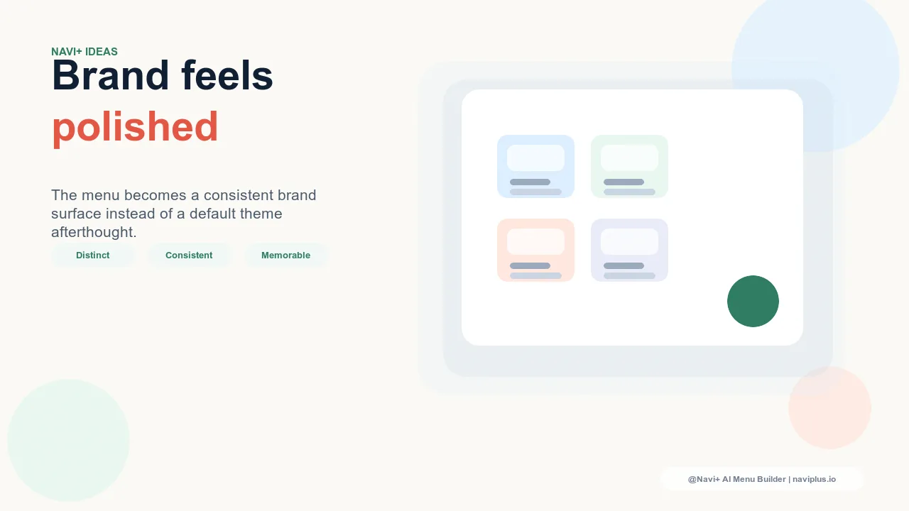
Consistent aspect ratio. Grid navigation requires all tiles to share the same aspect ratio — typically square (1:1) for uniform grids or landscape (4:3 or 3:2) for grids with more visual breathing room. Images that are cropped inconsistently, or that have different compositional weights across tiles, make the grid feel unplanned. The visual coherence of the grid is part of its navigational clarity — visitors use the regularity of the grid to process tiles quickly.
Fast loading. Each tile in a grid navigation loads an image. A 3x3 grid loads nine images simultaneously when the menu opens. Images that are not optimized will visibly delay the grid rendering — the tiles will appear as gray placeholders before images load, which interrupts the spatial scanning behavior that makes grid navigation effective. Category images for grid navigation should be in WebP format and under 100KB per tile. At that file size, a 9-tile grid loads under 900KB total — acceptable on any connection.
Navi+ Mega Menu's Image Column as Partial Grid Navigation
Navi+ Mega Menu's image column feature implements a form of grid navigation within the Mega Menu panel structure. Each column in a Mega Menu panel can include a category image at the top, a label, and a list of subcategory links below — creating a visual-and-text hybrid that captures most of the discovery benefits of grid navigation while retaining the hierarchy of subcategory links that deep catalogs require.
When a Mega Menu has three or four columns, each with an image at the top, the top row of the panel becomes a visual grid of categories. Visitors scan those images first, select the column that matches their intent, and then use the subcategory links below to navigate within that category. The image does the first-level navigation work; the text links do the refinement work. This two-tier pattern is well-suited to stores with deep catalogs where a full image grid would require too many tiles to be scannable.
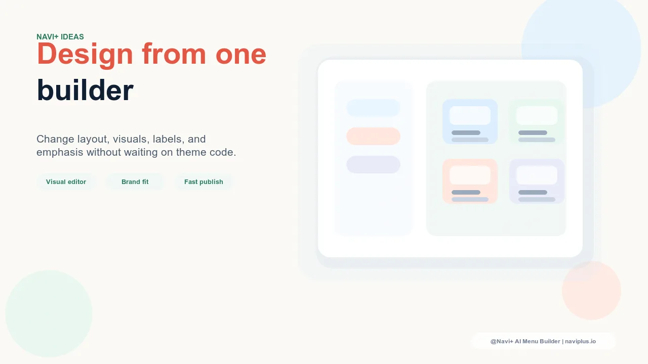
The image columns in Navi+ Mega Menu can be updated through the admin interface — no developer involvement and no theme edits required. Category images can be swapped seasonally, updated for promotions, or changed to reflect new product drops in a single configuration session.
| Navigation Pattern | Discovery Appeal | Image Quality Dependency | Mobile Usability |
|---|---|---|---|
| Text list navigation | Low — categories must be read and interpreted | None — works without any imagery | Medium — functional but visually flat |
| Image-column Mega Menu (Navi+) | High — images anchor each column visually | Medium — one image per category, forgiving crop | Medium — Mega Menu panels collapse to mobile list |
| Full image grid navigation | Highest — spatial scanning, all categories visible at once | High — requires authentic, consistent imagery for every tile | High — 2-column tile grid is native to mobile interaction patterns |
Try it free — no code, no developer needed
Install in minutes on Shopify, WordPress, or any website.