

The Hamburger Menu's Original Problem
The hamburger icon — three horizontal lines representing a collapsed menu — was introduced in the 1980s for screen-constrained interfaces and revived in mobile web design around 2012 as smartphones proliferated and designers needed to hide navigation to preserve screen space. It solved a real problem elegantly: on a 3.5-inch phone screen, a full navigation menu takes up too much space. Collapsing it behind a small icon saves space and keeps the content visible.
The problem the hamburger created is that hidden navigation is navigation visitors don't use. Studies across multiple platforms and contexts have consistently shown that hamburger menus receive fewer interactions than visible navigation alternatives — particularly on first visit and from users unfamiliar with the convention. The icon doesn't communicate "tap here to find everything in this store" to visitors who aren't already primed to look for it. For a significant portion of mobile visitors, the hamburger is invisible in a functional sense: they don't see the navigation, don't explore categories, and either reach their intended destination through search or leave without discovering what the store actually offers.
"We A/B tested our hamburger menu against a Tab Bar configuration with the same five categories for three weeks. The Tab Bar version had 3.4× more navigation interactions — visitors clicked on category links far more often when they could see them. More importantly, the sessions that started from a Tab Bar navigation click had a higher add-to-cart rate than sessions that started from a hamburger menu click. The navigation was doing a better job of routing visitors to relevant products because they could see the options before deciding to tap."
— A Navi+ customer, beauty and cosmetics brand
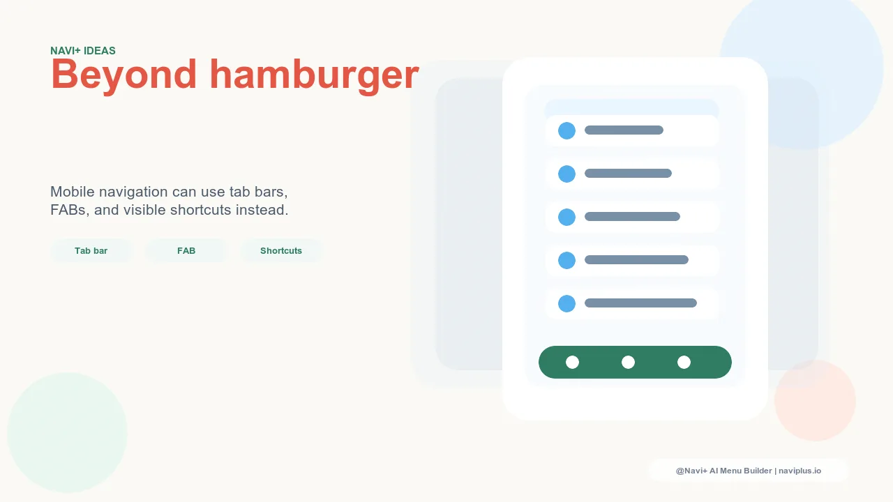
Navigation Patterns That Replace or Supplement the Hamburger
The alternatives to hamburger-only navigation in mobile e-commerce address the visibility problem without sacrificing the screen space that motivated the hamburger's use:
The Tab Bar: persistent, visible, always accessible. A Tab Bar — the row of 4–5 icon-labeled navigation slots at the bottom of the screen — is the most comprehensively tested hamburger alternative. Native mobile apps have used Tab Bar navigation for over a decade because it performs well: all primary navigation destinations are visible without interaction, they're reachable with one tap regardless of scroll position, and they're positioned at the bottom of the screen where the thumb naturally rests. Transferring this pattern to mobile web navigation produces the same benefits. The Tab Bar's bottom position is key — it keeps primary navigation accessible without competing with content at the top of the screen, and it's ergonomically aligned with single-handed use on large-screen phones where header navigation has become genuinely difficult to reach.
The Floating Action Button: always-accessible navigation entry point. For stores that can't reduce their navigation to 4–5 primary destinations (because the catalog depth requires more), the Floating Action Button provides a persistent, visible entry point to the full navigation without consuming any fixed screen real estate. The FAB floats above content, moves with scroll, and opens the full Slide Menu with one tap. The critical difference from the hamburger: the FAB is more visually salient (it's a circle, often with a brand color, not a minimal three-line icon), and it's positioned at the bottom of the screen in the thumb reach zone rather than the top-left corner that requires a reach. Visitors who might not notice a hamburger icon in the top-left notice a brand-colored circle floating near their thumb.
The hybrid: Tab Bar plus accessible Slide Menu. The most capable mobile navigation architecture combines both: a Tab Bar with the five most important navigation destinations visible at all times, and a Slide Menu triggered from a Tab Bar "More" slot or FAB for comprehensive navigation. This gives visitors immediate access to primary destinations with no interaction required, and full catalog navigation with one additional tap. The Slide Menu is no longer the primary navigation — it's the comprehensive reference. This hybrid is what well-designed native apps use, and it transfers directly to web navigation through Navi+'s combined Tab Bar and Slide Menu components.
The labeled hamburger: visibility improvement with minimal structural change. For stores not ready to restructure navigation entirely, replacing the three-line icon with a labeled button — "Menu" or "Browse" — significantly increases tap rates. The label communicates the button's function to visitors who don't recognize the three-line convention. This is the lowest-effort intervention with a meaningful return: studies show labeled hamburgers receive 20–40% more taps than icon-only hamburgers, simply by communicating what the button does.
| Pattern | Visibility | Best Use Case |
|---|---|---|
| Standard hamburger icon | Low — invisible to non-initiated visitors | Legacy only; has better alternatives in all contexts |
| Tab Bar (4–5 slots) | Maximum — all primary destinations always visible | Stores with 4–5 clear primary navigation destinations |
| Floating Action Button | High — salient, thumb-zone, scroll-independent | Stores needing full catalog access without Tab Bar constraints |
| Tab Bar + Slide Menu hybrid | Maximum primary + full catalog one tap away | Best overall pattern for mid-to-large catalog stores |
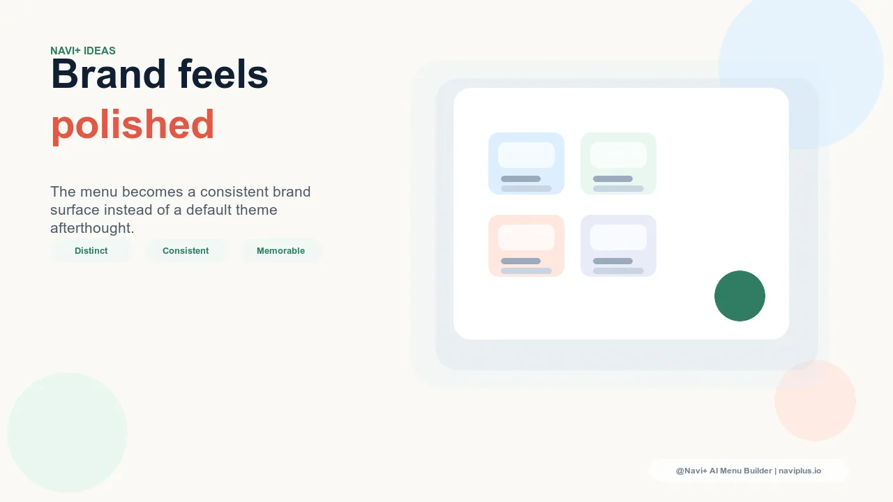
The Creative Dimension of Hamburger Alternatives
Replacing the hamburger isn't just a usability decision — it's a brand expression decision. The Tab Bar, FAB, and Slide Menu are fully styleable navigation components that can reflect the store's brand identity in a way that a three-line icon cannot. A brand-colored FAB, a Tab Bar with custom icons and the store's accent color for active states, a Slide Menu with the brand's typographic system applied to category labels — these are navigation experiences that feel like the brand rather than generic mobile infrastructure. The hamburger, by design, communicates nothing; its alternatives communicate everything the brand wants navigation to say.
Try it free — no code, no developer needed
Install in minutes on Shopify, WordPress, or any website.