

The Problem
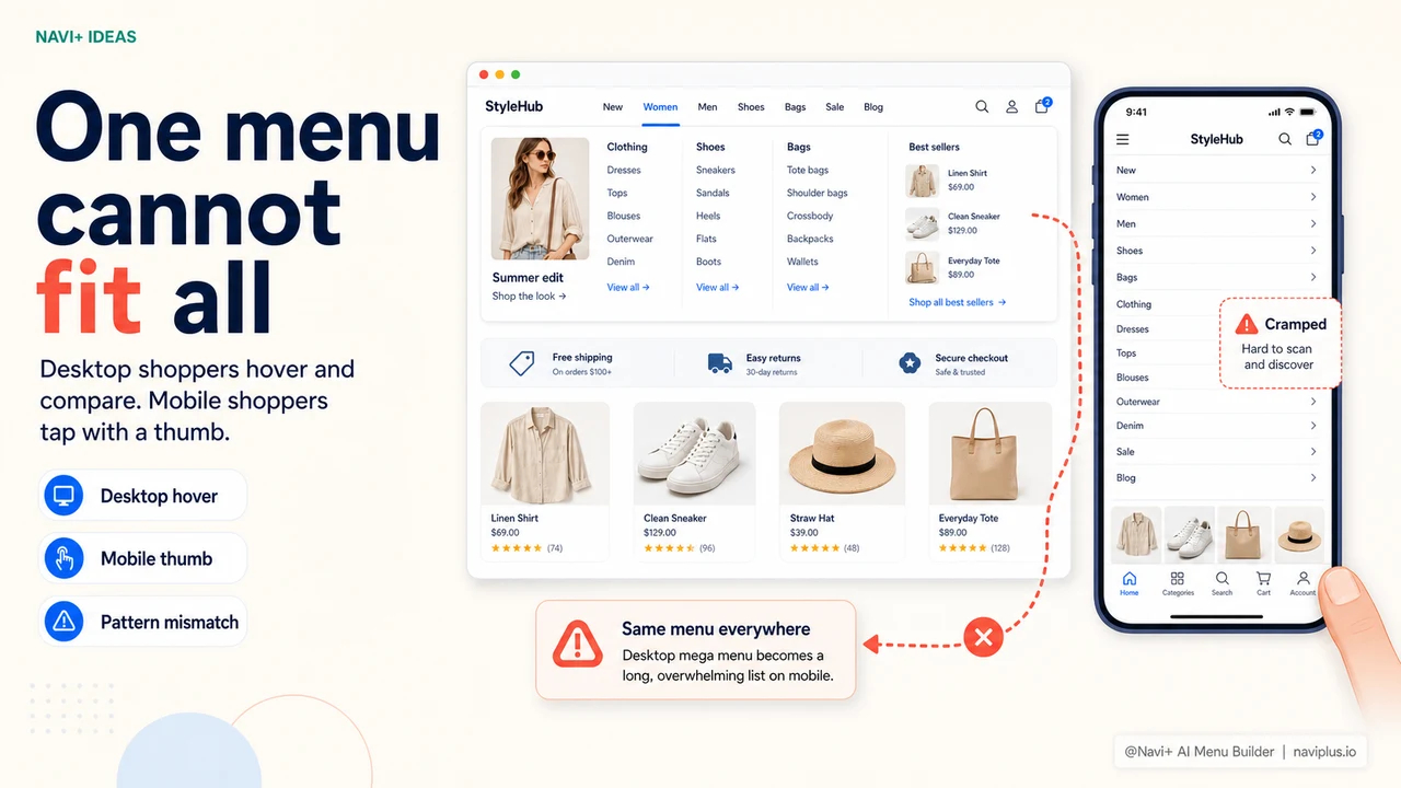
Desktop and mobile shoppers navigate differently. On desktop, a visitor moves a mouse across your top navigation, hovers to reveal a mega menu with columns, category images, and featured links, and clicks precisely on what they want. They have a large screen, fine-grained cursor control, and the patience to browse a structured layout. On mobile, the same visitor taps with a thumb from a 6-inch screen, needs large tap targets, and wants the most important destinations visible without opening anything.
Most stores solve this by choosing one mode and accepting a degraded experience on the other. The theme's mega menu collapses into a hamburger icon on mobile — technically functional, but a significant downgrade. Or the store installs a mobile-first navigation app that gives a great mobile experience but adds nothing to the desktop experience. Either way, at least half of your traffic gets navigation that wasn't designed for the way they're actually browsing.
The underlying assumption is that you can't design for both contexts without building separate tools, maintaining separate configurations, or paying for two different solutions. That assumption is wrong — but it's baked into how most navigation tools are structured, so store owners accept it and move on. The cost is real: visitors browsing on a context that got the lesser navigation experience convert at lower rates, browse fewer pages, and return less often.
The gap between how people browse on desktop vs. mobile
"We had a beautiful mega menu on desktop — columns, images, everything. On mobile it collapsed into a hamburger that barely worked. Over 65% of our traffic was mobile. We were essentially running two different stores: one with professional navigation and one without. After Navi+, both experiences felt intentional."
— A Navi+ customer
Why one-size navigation fails both audiences
The behavioral differences between desktop and mobile shoppers are well-documented and consistently predictable. Desktop visitors hover and explore. Mobile visitors tap and scroll. Desktop sessions tend to be longer, with more pages viewed and more deliberate category exploration. Mobile sessions tend to be shorter and more goal-oriented — visitors know roughly what they want and navigate toward it directly, or they don't navigate at all and bounce.
Forcing both audiences through the same navigation structure creates predictable failure modes:
- A collapsed mega menu on mobile removes visual hierarchy. The columns, images, and organized sections that make a mega menu useful on desktop disappear into a flat list when the menu collapses. Mobile visitors see the same undifferentiated list of text links that every other store shows — no better than no mega menu at all.
- A mobile-optimized slide menu underperforms on desktop. Slide menus are efficient on mobile but feel cramped and under-designed on a 1440px screen where you have room for columns, images, and a full-width layout.
- Tab Bars are only for mobile. A persistent tab bar at the bottom of the screen is the right pattern for mobile thumbs. On desktop, it occupies space that's better used for content and looks out of place.
- Split configurations mean double the maintenance. Stores that do try to run separate desktop and mobile navigation typically manage them in separate tools, which means every update needs to be made twice — and often one lags behind the other.
- The gap compounds over time. A mobile experience that was "good enough" when traffic was 40% mobile becomes a significant revenue problem when mobile reaches 70% or more — which is the direction e-commerce has been moving for years.
How Navi+ AI Menu Builder solves this
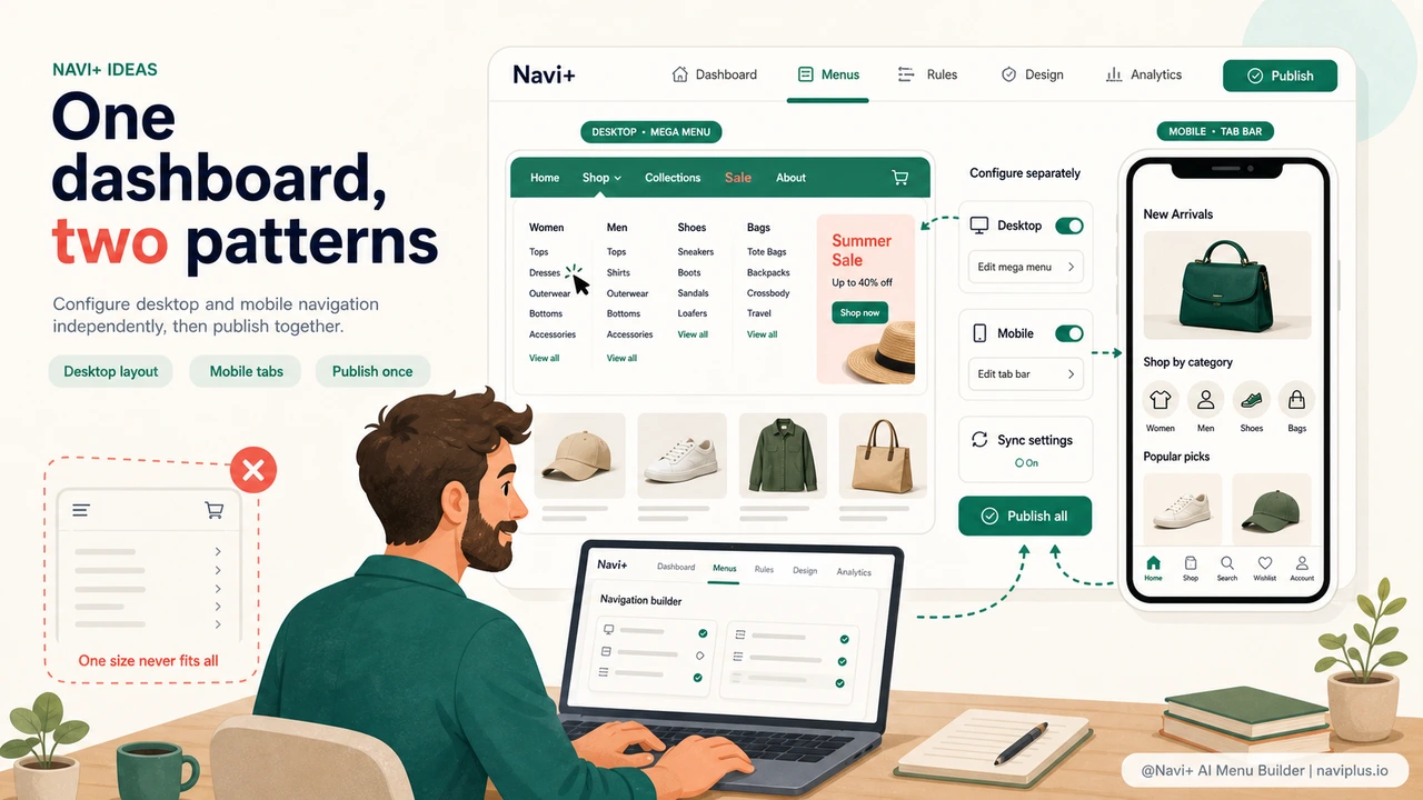
Navi+ is built around the concept that desktop and mobile navigation are distinct design problems that deserve distinct solutions — and both can be configured from the same dashboard without duplication. When you set up Navi+, you choose which menu type to show on desktop and which to show on mobile. These are independent configurations: your desktop mega menu has its own column layout, category images, and hover effects; your mobile Tab Bar has its own icons, link selection, and color scheme. Neither affects the other.
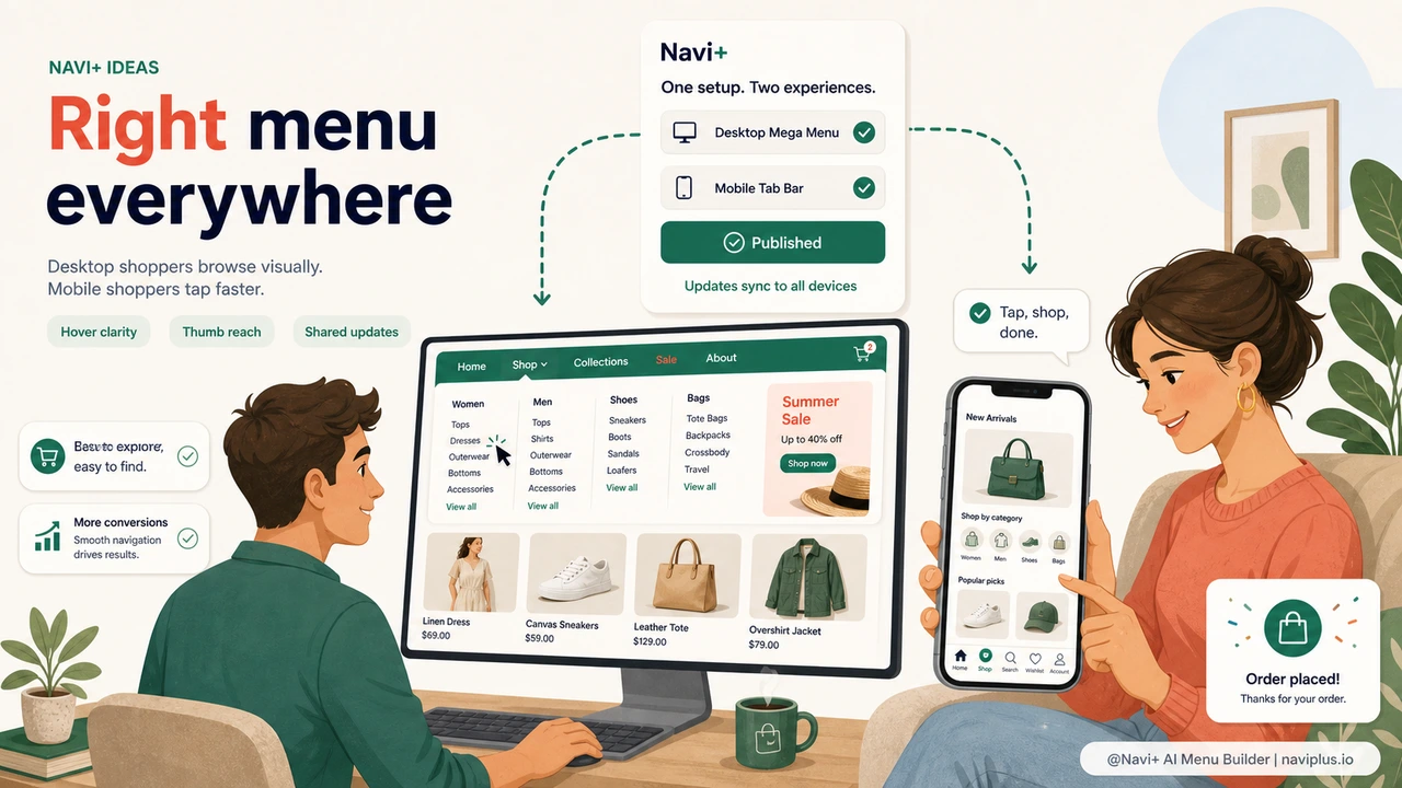
On desktop, the Mega Menu gives you full control over a multi-column dropdown. You drag category groups into columns, set column widths, add image blocks for featured products or seasonal banners, and style the hover state for each item. Visitors on desktop hover your top navigation and see a polished, visual layout that surfaces your catalog structure clearly. On mobile, those same visitors see the Tab Bar at the bottom of the screen — four or five key destinations, icon-labeled, always visible, reachable with a single thumb tap. The full slide menu is still available if they need deeper navigation.
Both configurations are managed from one login. When you add a new product category, you update the mega menu column on desktop and decide whether it belongs in the Tab Bar on mobile — two decisions made in the same editing session, published together. No separate tools, no second login, no risk that one platform is showing outdated navigation while the other is current.
One tool vs. separate desktop and mobile navigation
| Feature | Default / Without Navi+ | With Navi+ AI Menu Builder |
|---|---|---|
| Purpose-built desktop mega menu | ✗ Theme-dependent, limited customization | ✓ Multi-column, images, hover effects |
| Persistent Tab Bar on mobile | ✗ Not available in standard themes | ✓ Pinned bottom nav, always visible |
| Separate configs for desktop and mobile | ✗ Same menu scaled down | ✓ Independent layouts, one dashboard |
| Update both in one session | ✗ Separate tools, double the work | ✓ Single login, publish together |
| No code or developer required | ✗ Theme edits or custom dev needed | ✓ Visual builder, live in minutes |
| Works on Shopify, WordPress, and web | ✗ Platform-specific solutions | ✓ One tool, all platforms |
What you get
The most visible outcome is that every visitor gets navigation that was designed for how they're actually browsing. Desktop visitors see a structured mega menu that uses the available screen real estate. Mobile visitors see a Tab Bar that requires no menu-opening tap and places key destinations at thumb reach. Both experiences feel intentional rather than inherited from a theme decision made years ago.
A practical starting configuration for most stores: on desktop, build a Mega Menu with one column per major product category, a featured image column for your current campaign, and a top-level "Sale" link styled in a distinct color. On mobile, configure a Tab Bar with Home, Shop All, Cart, Search, and your current top promotion. This covers the core navigation needs of both device types and requires about 20 minutes of initial setup in the Navi+ dashboard.
The operational advantage compounds over time. When your seasonal campaign changes, you update the desktop mega menu's image column and swap the Tab Bar promotion tab — both in one editing session. When you add a new product line, you add it to the desktop column layout and decide whether it warrants a Tab Bar slot. The two configurations stay in sync because they're managed together, not in separate tools that drift apart.
Try it free — no code, no developer needed
Install in minutes on Shopify, WordPress, or any website.