

When Mobile Is the Brand
Industry-wide, mobile accounts for approximately 60–75% of e-commerce traffic. For brands whose audience skews younger, engages primarily through social media, or shops in short-session bursts rather than extended desktop browse sessions, mobile traffic proportions can reach 85–90% or higher. For these stores, the mobile navigation experience isn't an adaptation of the "real" store experience — it is the experience. The vast majority of brand impressions happen on a 6-inch screen, navigated by a thumb, in sessions averaging under 4 minutes.
The design philosophy most stores use — design for desktop, adapt for mobile — produces mobile navigation that is smaller and more constrained than the desktop version, often with the same structural logic but fewer visible elements. Mobile-first design inverts this: start with the constraints and affordances of the mobile screen, design the best possible experience for that context, and then consider how to represent the same information on a larger screen where space is less constrained. These two approaches produce meaningfully different navigation architectures, and for brands with mobile-dominant audiences, the mobile-first approach produces demonstrably better mobile conversion outcomes.
"88% of our traffic is mobile — we know this because we look at it every week. For years we designed the website on a desktop and 'made it work' on mobile. When we flipped the process — designed everything for the phone first, then let the desktop version be a wider version of that — everything got better. The navigation especially. We stopped trying to fit a desktop menu into a mobile screen and just built the mobile menu we actually wanted. Desktop is now fine too, but it's not where the work is."
— A Navi+ customer, social-native fashion brand
What Mobile-First Navigation Looks Like
Mobile-first navigation architecture starts from different assumptions than desktop-adapted navigation:
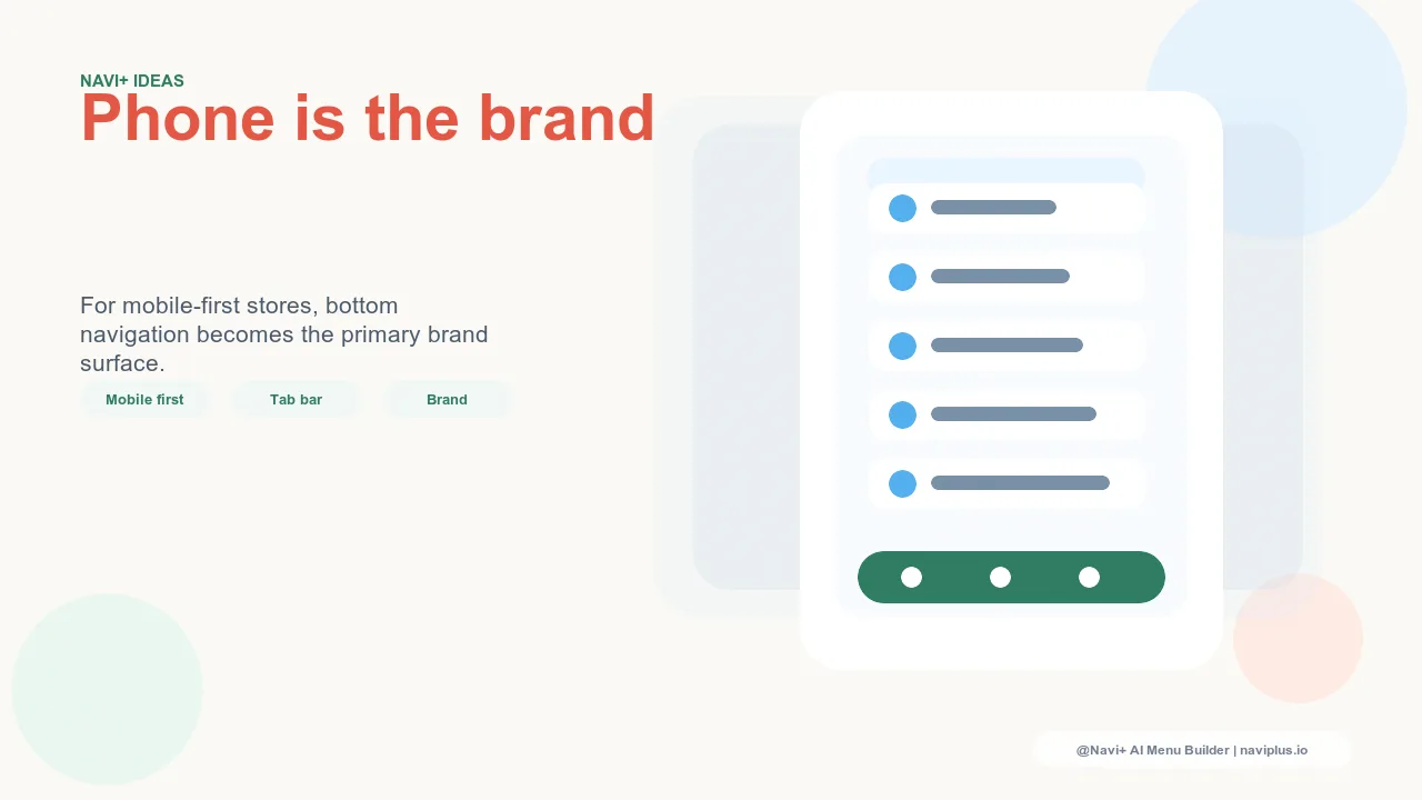
The Tab Bar as primary navigation, not secondary. In desktop-adapted mobile navigation, the hamburger menu is primary — all categories are in the hamburger. The Tab Bar, if present, is secondary — a supplemental navigation layer. Mobile-first navigation inverts this: the Tab Bar is primary, containing the five most important navigation destinations, and the Slide Menu is secondary — a comprehensive navigation layer for deeper browsing. The primary navigation is immediately visible; the comprehensive navigation is one tap away. This inversion matches how native mobile apps handle navigation, and it produces the same performance improvements in web contexts.
Navigation designed for thumb reach. On a mobile device, the natural thumb reach zone covers the bottom two-thirds of the screen. The top of the screen — where headers and hamburger menus live — is the hardest part of a phone to reach for single-handed navigation. Tab Bars at the bottom of the screen exploit the natural thumb reach zone. Slide Menus that open from the left or right (the typical position) are reachable. Navigation designed for thumb ergonomics produces fewer navigation errors and faster navigation interactions.
Minimal text, maximum scannability. Mobile navigation labels are read in a few hundred milliseconds. The visitor isn't reading — they're scanning. Navigation labels that can be understood at a glance (short, unambiguous, category-appropriate) serve mobile visitors better than longer, more descriptive labels that require reading. This is a different tradeoff than desktop navigation, where slightly longer labels are less costly because the visitor has more screen space and typically a more comfortable viewing position.
Scroll-independent navigation. Desktop navigation that's sticky at the top of the screen works well because the top of the screen is always accessible on a desktop. On mobile, a sticky header navigation becomes inaccessible when the user has scrolled down a long product page — the header is at the top of the screen, and the thumb is at the bottom. A Tab Bar navigation is scroll-independent by design: it sits at the bottom of the screen regardless of scroll position, always accessible, always visible. This persistent accessibility is the feature that most directly explains Tab Bar's performance advantage over header-only navigation on mobile.
| Navigation Pattern | Desktop Experience | Mobile-First Experience |
|---|---|---|
| Primary navigation location | Top header (natural for mouse) | Bottom Tab Bar (natural for thumb) |
| Comprehensive navigation | Mega Menu dropdown | Full-screen Slide Menu (easier to read/navigate) |
| Navigation accessibility while scrolling | Header stays visible (sticky) | Tab Bar always at bottom (persistent) |
| Label length | Moderate — space allows description | Short — scan-optimized, unambiguous |


Mobile-First as Brand Commitment
For brands with mobile-dominant audiences, committing to mobile-first navigation design is a brand commitment as much as a UX decision. It says: we know where our customers are, and we've built for them specifically rather than building for a theoretical desktop user that represents 12% of our traffic. The navigation experience that results — faster, more ergonomic, more brand-consistent — is also a better representation of the brand because it was designed with intention rather than adapted from a different context. Navi+ was built for this mobile-first philosophy: the Tab Bar and Slide Menu aren't adaptations of desktop navigation patterns, they're purpose-built mobile navigation components that happen to work well at all screen sizes.
Try it free — no code, no developer needed
Install in minutes on Shopify, WordPress, or any website.