

Flat vs. Layered Navigation Design
The dominant navigation aesthetic of the past decade has been flat design: navigation panels with solid color fills, no shadows, minimal borders, and no visual distinction between the navigation layer and the page content layer. Flat navigation communicates a clean, modern minimalism that aligns well with brands that prioritize simplicity and directness. It's also very easy to implement: flat design requires no shadow values, no blur effects, and no z-axis composition thinking.
Depth-layered navigation takes the opposite approach: it treats the navigation as a physical object floating above the page content, with visual cues — shadows, elevation, backdrop blur, layered transparency — that communicate its three-dimensional position in the interface. This design language, borrowed from material design principles and the frosted glass aesthetic popularized by Apple's interface design, creates the perception of a premium, carefully crafted interface. When executed well, depth-layered navigation feels substantial — like a physical object you're interacting with rather than a flat graphic overlay. That tactile quality is difficult to articulate but consistently noticed by visitors as a signal of quality and care in the brand's execution.
"We changed our Slide Menu from a flat white panel to a frosted glass panel — using a backdrop-filter: blur effect so the page content shows through slightly, blurred, behind the menu. The menu background became a translucent off-white rather than solid white. The change took about 15 minutes to implement. Visitors started describing our store as 'high-end' and 'Apple-like' in reviews where they mentioned the experience. We sell premium kitchen tools; the navigation's depth cue aligned with what our products communicate. It felt like the brand got more cohesive even though only the navigation changed."
— A Navi+ customer, premium cookware brand
Depth Techniques for Navigation Design
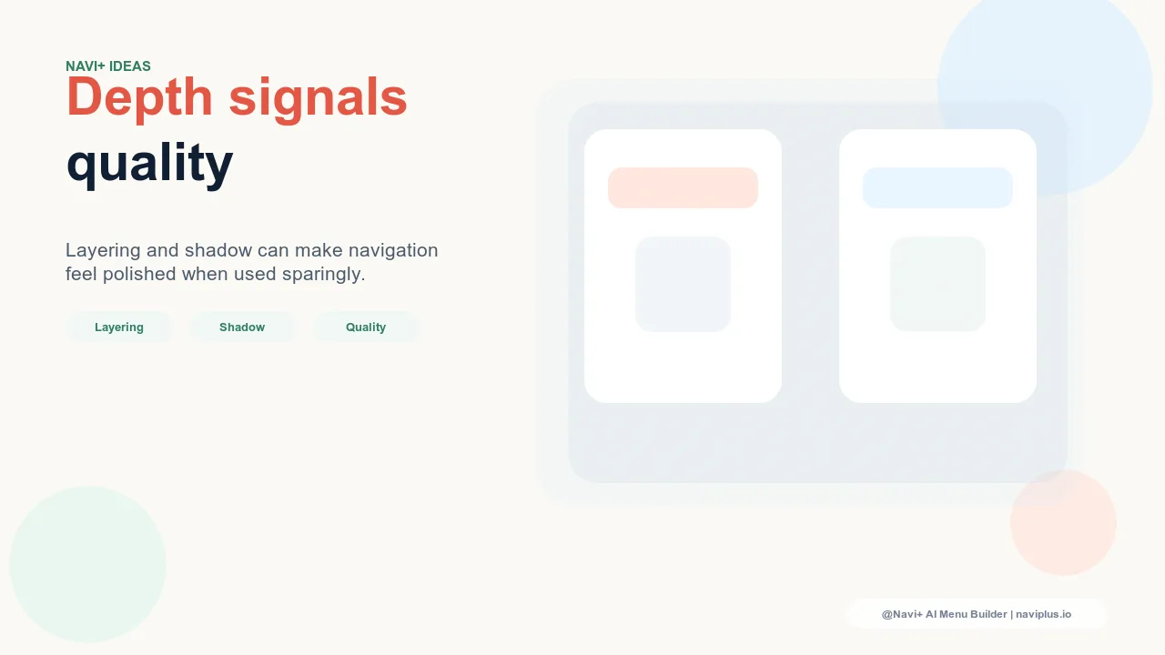
Drop shadows for elevation signaling. A drop shadow applied to the navigation panel — the Slide Menu, the Tab Bar, or the Mega Menu dropdown — signals that the panel is elevated above the page content. The shadow's parameters communicate how high the elevation is: a small, sharp shadow (2px spread, 0.1 opacity) communicates low elevation and minimal separation; a larger, softer shadow (8px spread, 0.15 opacity) communicates significant elevation and clear separation from the page layer. The shadow's color matters too: black-tinted shadows read as generic; shadows tinted with the brand's primary color read as intentional and add a subtle brand personality layer to the elevation cue.
Backdrop blur for frosted glass navigation. CSS backdrop-filter: blur() creates the frosted glass effect: the navigation panel's background blurs the page content visible through a semi-transparent panel fill, creating the visual impression of translucent material floating above the page. The effect requires the panel to have a semi-transparent background (rgba with alpha below 1.0) rather than a solid fill. The blur radius determines the glass effect's intensity: 8–12px produces a subtle softening that communicates transparency; 20–30px produces the strong frosted glass effect associated with Apple's interface design. Backdrop blur communicates modernity and premium quality; it's also a visual signal that the brand's design system was actively designed rather than assembled from defaults.
Layered z-index composition for visual hierarchy. Depth-layered navigation uses z-axis composition deliberately: the Tab Bar is elevated above the page content layer, the Slide Menu is elevated above the Tab Bar when open, and modal overlays are elevated above the Slide Menu. This hierarchy communicates to visitors which elements are controls (navigation) versus content (page) versus system (alerts), reducing the cognitive overhead of parsing the interface's structure. When the z-axis hierarchy is visible — when shadows and elevation make each layer's position in the stack clear — visitors navigate more confidently because the interface communicates its own structure through visual physics.
| Depth Technique | Visual Effect | Brand Signal |
|---|---|---|
| Drop shadow on navigation panel | Menu floats above page content | Elevated, premium, considered |
| Backdrop blur (frosted glass) | Page shows through blurred panel | Modern, translucent, Apple-like |
| Semi-transparent panel fill | Navigation integrates with page context | Sophisticated, editorial, ambient |
| Layered z-index composition | Clear visual stack of interface elements | Organized, professional, deliberate |
When Depth Design Is Appropriate
Depth-layered navigation aligns with brands that communicate premium, craftsmanship, or modern design as core values: luxury goods, high-end consumer electronics, premium food and beverage, design-forward home and lifestyle brands. For these brands, the depth cues in navigation reinforce the brand's positioning by communicating that the same attention to detail that went into the products went into the interface design. For brands where directness, efficiency, and accessibility are the primary values — budget retailers, utilitarian tools, professional services — depth effects can communicate the wrong brand personality (premium when the brand values value) and are appropriately avoided. The depth question is always: does this design choice reinforce or contradict what this brand is actually trying to communicate?
Try it free — no code, no developer needed
Install in minutes on Shopify, WordPress, or any website.