

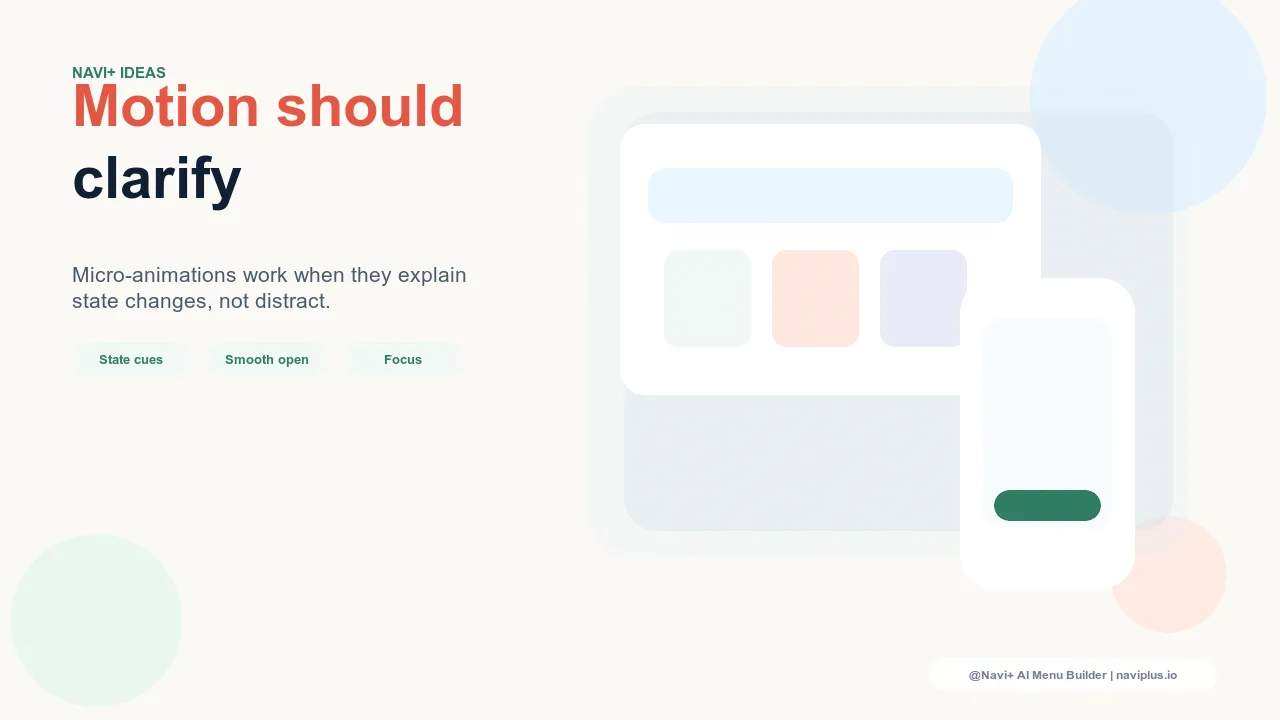
What Motion Does in Navigation
Animation in digital interfaces serves two fundamentally different purposes, and confusing them leads to navigation that feels either sterile or overwrought. The first purpose is functional: motion communicates spatial relationships, confirms that an interaction was registered, and guides the eye to where attention belongs next. The second purpose is decorative: motion adds visual polish, creates personality, and reinforces brand identity. Both are legitimate — but only functional motion belongs in the critical path of navigation, and decorative motion must never come at the cost of functional clarity.
Navigation is the most interaction-dense surface in any store. Visitors open menus, switch tabs, expand and collapse categories, and scroll through items in rapid succession during an active browsing session. Every animation that runs in this surface has to earn its presence: it must either communicate something the user needs to know, or it must be so brief and unobtrusive that it adds personality without adding wait time. The standard for motion in navigation is stricter than the standard for motion elsewhere in the interface.
Research on motion in user interfaces consistently finds that animations above 300ms are perceived as "loading" rather than "transitioning" — the user stops waiting for a page change and starts wondering why the interface is slow. Navigation animations should target 150–250ms for opening and closing motions, and under 100ms for feedback animations like active state indicators. These are not aesthetic choices — they're the thresholds at which animation stops feeling responsive and starts feeling sluggish.
"We went through three iterations of navigation animation before we got it right. The first version had beautiful 500ms transitions — smooth, cinematic, felt premium when we demoed it. In real use, customers thought the app was slow. We cut it to 200ms and added a subtle slide-in for the Slide Menu. Users stopped mentioning speed at all, and our UX reviews started using words like 'smooth' rather than 'slow.' The lesson was that animation that feels good in a demo reel feels bad in a task-completion context."
— A Navi+ customer, luxury fashion brand
Animations That Add Clarity
Several specific animation patterns in navigation reliably add clarity rather than noise:
Slide-in for the Slide Menu. A lateral slide animation when opening and closing the Slide Menu communicates the spatial metaphor: the menu exists off to the side of the main content, slides in when summoned, and slides back when dismissed. This communicates the relationship between the menu and the page content in a way that a static appearance/disappearance does not. The animation teaches the spatial model — that this is a drawer, not a popup — which reduces confusion about where the user is after the menu closes.
Active indicator transition on the Tab Bar. When a user taps a Tab Bar item, an active state indicator — an underline, a filled background, a color shift — that transitions rather than snaps communicates that the tab state is changing in response to the tap, not jumping arbitrarily. A smooth 80–120ms transition on the active indicator is a feedback confirmation that the interaction registered, even before the page content updates.
Expand/collapse for accordion navigation. Mega Menu panels or accordion-style category navigation that expand and collapse with a smooth height animation communicate the hierarchical relationship between parent and child categories better than a hard show/hide. The expansion animation says: this content was folded, and it is unfolding — the spatial relationship is preserved. At 150–200ms, this animation is both informative and fast enough to feel immediate.
FAB entrance animation. A Floating Action Button that slides or fades into position on page load — rather than appearing instantly — reduces the visual jarring of a persistent element appearing on every page. A brief 200ms entrance on first appearance, followed by a persistent static state on subsequent pages, is the balanced approach: the entrance is signaled, subsequent appearances are non-disruptive.
Animations That Detract
Equally important is the class of animations that consistently degrade navigation usability:
Animated hover states on navigation items. Elaborate hover animations on menu items — rotating icons, scaling effects, color cascades — add cognitive load at precisely the moment the user is trying to read and choose. Hover states in navigation should provide immediate, clear confirmation that an item is interactive; anything beyond that competes with the text the user is trying to read.
Staggered entrance animations for menu items. Navigation menus that reveal their items one by one, with each item appearing with a slight delay, look polished in a design preview and feel interminably slow in real use. The user who opens a menu to find a specific item is involuntarily forced to wait while items cascade in. This pattern is particularly damaging on repeat interactions — the animation that seemed delightful on first encounter feels like an obstacle by the twentieth.
Bouncy or elastic easing. Spring-physics animations that overshoot their destination and spring back look playful and differentiated. In navigation, the bounce creates a brief moment of visual ambiguity — the element appears to be in two positions simultaneously, which the brain processes as an anomaly. For brand contexts where playfulness is appropriate, limit bouncy easing to decorative elements, not functional navigation components.
| Animation Pattern | Clarity Impact | Recommended in Navigation |
|---|---|---|
| Slide-in menu (150–200ms) | High — communicates spatial model | Yes — core interaction feedback |
| Active tab indicator transition (<120ms) | High — confirms tap registration | Yes — critical feedback mechanism |
| Staggered item entrance (250ms+) | Negative — delays content legibility | No — avoid on repeat interactions |
| Elaborate hover effects | Negative — distracts from item text | No — simple color state change only |
Configuring Motion in Navi+
Navi+'s navigation components are built with purposeful animation defaults: the Slide Menu slides in and out with a 180ms ease-out transition, the Tab Bar active state updates with an 80ms indicator transition, and the Mega Menu panels open with a 200ms fade-and-translate. These defaults were calibrated through usability testing to sit at the threshold where animation feels immediate rather than delayed.
For brands where motion is a core part of the identity — fashion, luxury, lifestyle — the animation timing and easing can be configured to express more personality while remaining within usability bounds. The key principle: invest motion budget in the slide-in and the active state, where motion communicates; not in the item entrance or hover effects, where motion decorates at the cost of performance. The best navigation animation is the animation users notice only in its absence.
Try it free — no code, no developer needed
Install in minutes on Shopify, WordPress, or any website.