

The Counter-Intuitive Logic of Monochrome Navigation
The instinct in navigation color design is often to use the brand's full color palette: primary color for the background, secondary color for hover states, accent color for active items, neutral for labels, and perhaps another color for promotional elements. The result is a navigation that uses all the brand's colors but doesn't create a strong impression with any of them. The colors compete, the eye doesn't know where to settle, and the navigation ends up feeling visually busy rather than cohesive.
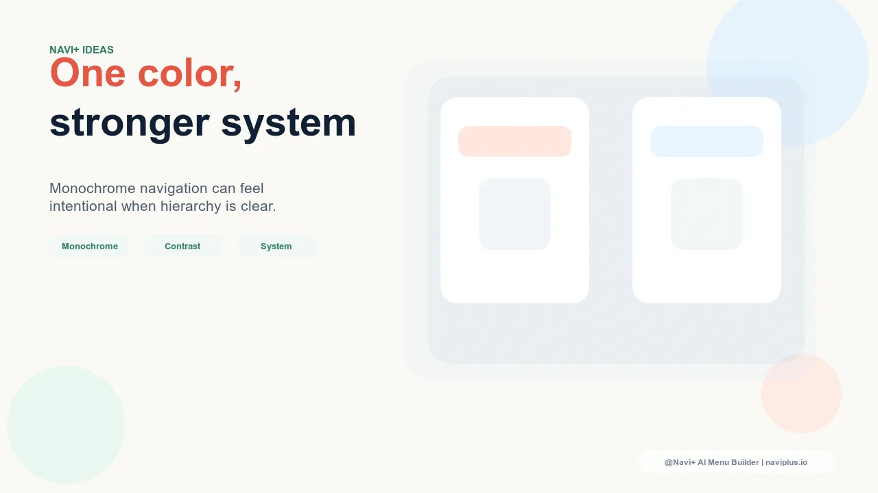
Monochrome navigation takes the opposite approach: it builds the entire navigation color system from a single hue and its tints (lighter versions), shades (darker versions), and tones (desaturated versions). A deep forest green as the primary color generates a light sage for background fills, a medium green for active states, a pale green tint for hover backgrounds, and a high-contrast white for labels — all from one color. The result is a navigation that is visually unified, immediately distinctive, and strongly associated with the brand's primary color in the visitor's memory. Monochrome navigation doesn't look simpler than multi-color navigation; it looks more intentional.
"Our brand color is a specific deep terracotta. Before we redesigned our navigation, we were using terracotta for the logo, grey for the navigation bar, white for the Slide Menu, and black text for labels — four colors in the navigation zone, none of them the terracotta. The navigation looked unrelated to our brand. When we rebuilt it with terracotta as the Tab Bar background, a lighter terracotta tint for the Slide Menu header, and white labels throughout, the navigation finally looked like it belonged to the brand. Visitors started identifying us by color in ways they hadn't before. The monochrome commitment was what made the color recognizable."
— A Navi+ customer, ceramics and home goods brand
Building a Monochrome Navigation Color System
Start with the brand's primary hue and build five values. A complete monochrome navigation color system requires five values from the same hue family: a deep shade for primary backgrounds and dominant surfaces (the Tab Bar, the Slide Menu header); a medium value for active states and selected items; a light tint for hover backgrounds and secondary sections; a very light tint approaching white for neutral backgrounds within the navigation; and a maximum contrast value — either pure white or near-black depending on the dominant hue — for all label text. These five values are sufficient to create visual hierarchy, interactive states, and section differentiation entirely within one color family.
Test contrast ratios before finalizing the palette. Monochrome navigation's primary accessibility risk is insufficient contrast between text labels and their backgrounds. When all colors are in the same hue family, it's easy to create combinations where the contrast ratio falls below the 4.5:1 minimum required for WCAG AA accessibility. Every text-background combination in the navigation must pass this test before the palette is finalized. The typical failure mode in monochrome navigation is medium-value labels on medium-value backgrounds — the hue family disguises the contrast deficiency that a hue contrast test would catch immediately. Testing with a contrast checker tool takes five minutes and prevents accessibility problems that would affect a significant portion of the store's visitors.
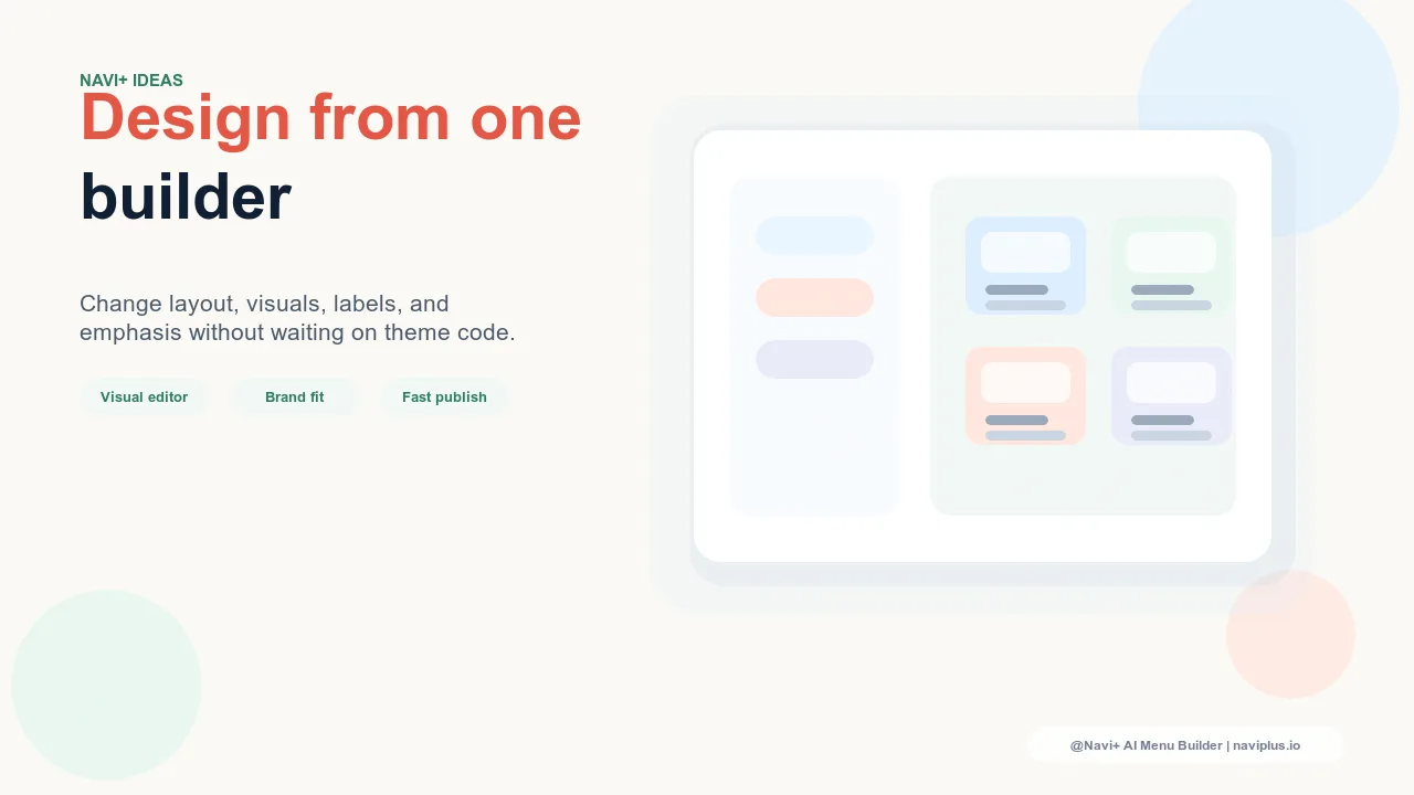
Use texture and weight variations within the monochrome system. Monochrome navigation can feel flat if color value is the only differentiator between elements. Adding texture (a subtle noise or grain in the background), weight variations (heavier typography for primary categories, lighter for secondary), and slight opacity variations (semi-transparent fills for dropdown backgrounds) creates visual richness within the monochrome constraint. The navigation remains single-color but gains the visual complexity that makes it engaging rather than visually sparse.
| Navigation Element | Multi-Color Approach | Monochrome Approach |
|---|---|---|
| Tab Bar background | Primary brand color | Deep shade of primary hue |
| Active Tab Bar item | Accent color (different hue) | Light tint of primary hue + bold weight |
| Slide Menu background | White or neutral grey | Very light tint of primary hue |
| Hover state | Secondary color | Medium value of primary hue |
Monochrome Navigation and Brand Memorability
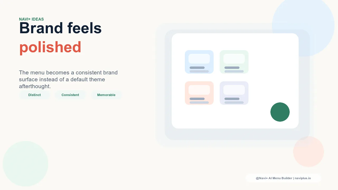
The strategic value of monochrome navigation extends beyond aesthetics into brand recall. Memory research on color association shows that single-color brands are more memorable than multi-color brands: the brain forms a stronger association between a brand and a color when that color is used consistently and dominantly. Navigation that uses the brand's primary color across all its elements — rather than using it as an accent among other colors — trains the visitor's visual memory to associate that specific color with the store. Visitors who return to the store recognize it immediately by color, before reading any text. Visitors who encounter the brand color elsewhere (in social media content, advertising, packaging) have a stronger brand recall response. Monochrome navigation is not just a design choice — it's a memorability investment that compounds through every session and every external brand impression the store creates.
Try it free — no code, no developer needed
Install in minutes on Shopify, WordPress, or any website.