

Navigation as Spatial Composition
Navigation is typically designed as a list. The default mental model for most navigation implementations — and most navigation design advice — treats menus as ordered lists of items: a vertical stack in a Slide Menu, a horizontal row in a desktop nav bar, a grid in a Tab Bar. This list-based thinking produces functional navigation but misses a significant dimension of navigation's communicative potential: spatial composition.
Spatial composition in navigation uses the physical relationships between elements — their position, size, grouping, alignment, and the space between them — to communicate meaning beyond the label text. A primary navigation link that's set in a larger typeface than secondary links doesn't just look different; it signals hierarchy, telling the visitor's scanning eye where to look first. A navigation group with generous whitespace around it doesn't just appear calmer; it signals that the group is visually independent from adjacent groups, helping the visitor parse the menu's structure before reading any labels. A navigation section that breaks alignment with the rest of the menu doesn't just look distinctive; it signals that this section is categorically different — a "Featured" section, an "On Sale" section, a "New" section — that deserves separate attention.
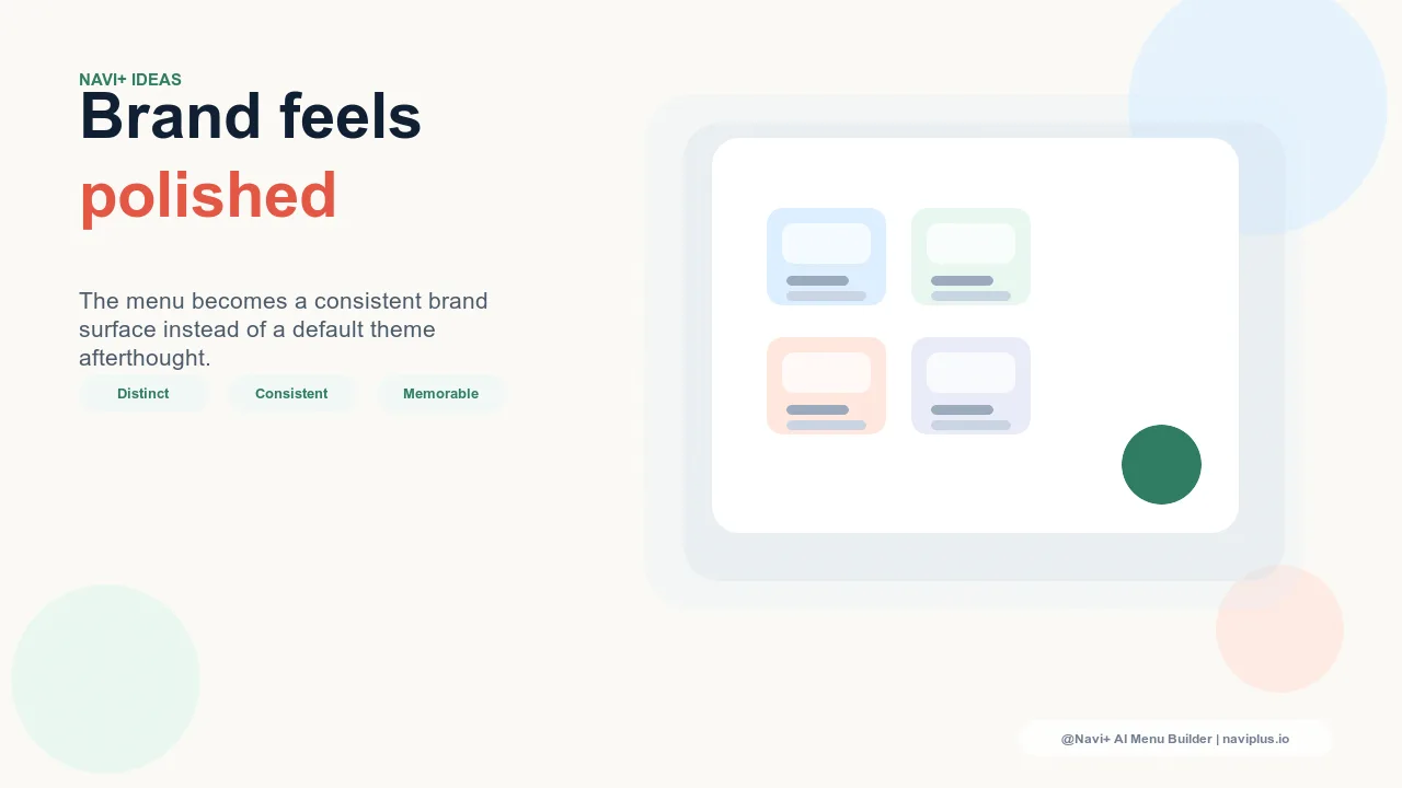
"We spent a lot of time on our product photography and brand typography, but our Slide Menu was still just a list of links at the same size with the same spacing. When we worked with a designer to create a spatially layered Slide Menu — larger type for primary categories, a clear visual separator between 'Shop' and 'About,' a featured collection block with an image at the top — it started feeling like the rest of our brand. Visitors would comment that the 'whole site' felt more considered. It was the navigation that changed, not the products. Spatial design made the difference."
— A Navi+ customer, lifestyle and apparel brand
The Spatial Design Principles for Navigation
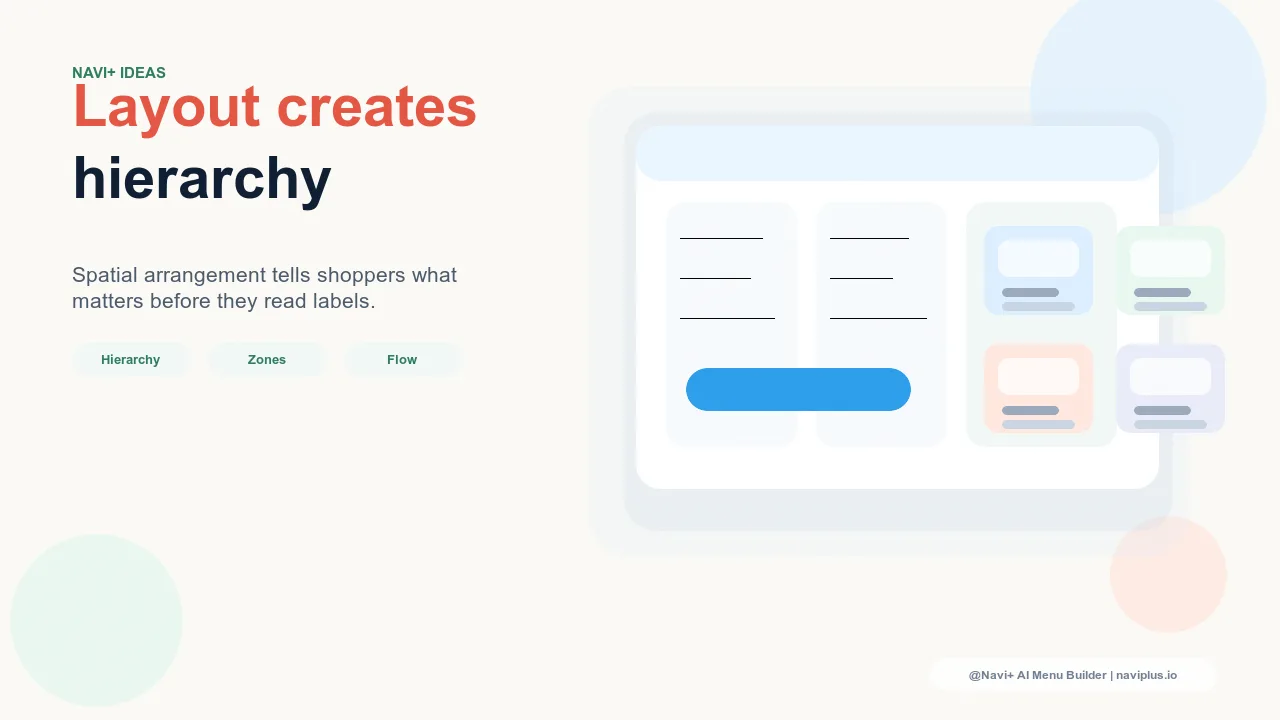
Hierarchy through scale and weight. Visual hierarchy in navigation is communicated most directly through typographic scale and weight. Primary navigation categories — the destinations visitors use most or that carry the most conversion value — should be visually distinct from secondary items through larger font size, heavier weight, or both. The human eye scans for the largest element in a visual field first; navigation that uses scale to signal hierarchy guides that scan in the direction you want. A Slide Menu where all items are the same size forces the visitor to scan every item with equal attention to determine which ones matter; a Slide Menu where primary categories are 18px and secondary items are 14px communicates the hierarchy before a single label is read.
Grouping through spatial proximity and separation. Gestalt psychology's law of proximity states that elements close together are perceived as belonging to the same group. Navigation spatial design exploits this: a cluster of navigation links with tight spacing, followed by a gap, followed by another cluster, immediately communicates two distinct groups without requiring a divider line or section header. The visitor's visual system parses the spatial relationship and infers the grouping. Adding a subtle divider at the group boundary reinforces this perception; the combination of spatial gap and visual divider creates groupings that feel natural and clear.
Position as priority signal. The position of a navigation element within the available space carries its own meaning. Elements at the top of a Slide Menu are perceived as highest priority; elements at the bottom are perceived as supplementary. Elements at the left edge of a Mega Menu column are perceived as the column's title or most representative entry. In a Tab Bar, the center position (on 5-slot bars) typically receives the highest visual attention from the eye's natural center-seeking behavior. Using these positional conventions intentionally — placing your highest-conversion category at the top of the Slide Menu, your most important action in the Tab Bar center — aligns visual attention with business priority.
Whitespace as brand signal. The density of a navigation layout communicates brand personality. Compressed, dense navigation with minimal whitespace signals efficiency, practicality, and comprehensiveness — appropriate for technical, professional, or value-focused brands. Spacious navigation with generous whitespace between elements signals calm, premium, or editorial qualities — appropriate for lifestyle, luxury, or design-forward brands. The whitespace in navigation is not wasted space; it's a deliberate typographic and spatial choice that communicates the same brand positioning as the typeface selection and color palette.
| Spatial Element | Design Choice | Meaning Communicated |
|---|---|---|
| Typographic scale | Large primary, small secondary | Hierarchy and scanning priority |
| Element grouping | Tight clusters with clear gaps | Categorical structure without explicit labels |
| Position within space | Top = primary, edges = key actions | Priority and brand emphasis |
| Whitespace density | Generous vs. compressed | Brand personality (premium vs. efficient) |
Applying Spatial Design in Navi+ Components
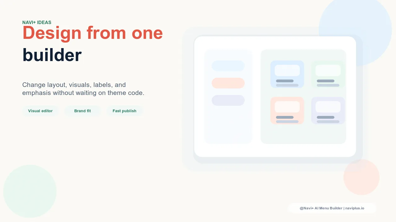
Navi+'s Slide Menu, Mega Menu, and Tab Bar all support customization at the spatial design level — font sizes, padding, spacing between items, and section structure are configurable without CSS expertise. The Slide Menu in particular offers a vertical canvas that rewards spatial design thinking: it extends across the full mobile screen height, giving designers the space to create visible hierarchical zones (primary categories at the top with larger type, secondary items below with smaller type, account and utility links at the bottom with minimum visual weight) that make the menu's structure visible before any label is read. This spatial layering is achievable through the visual editor in under an hour and produces the same sense of visual care that visitors attribute to the store's broader design system — because spatial design in navigation is a design choice, not just a content choice.
Try it free — no code, no developer needed
Install in minutes on Shopify, WordPress, or any website.