

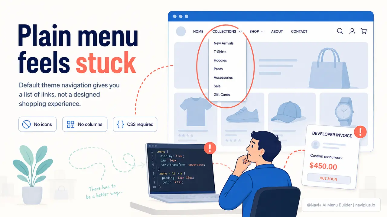
The Problem
Open your Shopify or WordPress theme's default menu editor and you'll find the same thing every store owner finds: a bare list of links, a text field for the label, and a URL field. That's the entire toolbox. No column layout. No icons. No badge that says "New" next to a just-launched collection. No control over hover color, font weight, or spacing. Your navigation looks exactly like every other store running the same theme — because it is built from the same component, with zero customization.
The moment you want anything beyond that default list — a two-column dropdown with featured images, a sticky tab bar for mobile, a mega menu that groups your 40 product categories into readable sections — you're outside the theme's territory. Your options become: write custom CSS and Liquid yourself (and test it across every browser, device, and theme update), or hire a developer. Developer quotes for navigation work typically start around $150 for small changes and go up quickly for anything layout-intensive. And once they're done, you still can't update it yourself without breaking something.
The result is a navigation that never changes, even when it should. Customers open the menu, see a wall of undifferentiated text links with no visual hierarchy, and close it. They don't know which category is most important. They don't see the seasonal sale section you wanted to highlight. They leave. The problem isn't that professional navigation design is inherently hard — it's that the tools available to store owners without coding skills have historically been either non-existent or inadequate.
First Impressions
"I spent two years just leaving the menu the way it was because every time I wanted to change it, I had to ask someone. I didn't even realize how bad it looked until I saw a competitor's store with a proper mega menu and realized their navigation made mine look like a draft."
— A Navi+ customer
Visual design in navigation matters more than most merchants realize
Navigation is not just a utility — it's your store's information architecture made visible. The way it looks communicates how organized your catalog is, how much you care about the shopping experience, and whether visitors can trust that what they're looking for is actually here. A poorly designed menu actively costs you:
- Higher bounce rates on mobile. When tap targets are small, labels are cramped together, and there's no visual grouping, mobile users quit within the first interaction. Navigation friction is the leading reason mobile visitors leave without browsing.
- Invisible categories. A flat link list with 12 items in alphabetical order means items 7 through 12 get less than a quarter of the clicks items 1 and 2 get. Categories buried in a plain list effectively don't exist in terms of traffic.
- Lost promotional real estate. Your menu is the one element on your site that every visitor sees. A default menu wastes that space. A well-designed mega menu can promote your best-sellers, highlight a sale, or feature a new collection — without a single extra click from the visitor.
- Perceived quality gap. Shoppers judge store quality within seconds. A navigation that looks thoughtfully designed signals that the products are thoughtfully curated. An unstyled default menu signals "I didn't put much effort into this."
- Developer dependency on every update. Even if you paid once for a custom menu, you're now locked into asking your developer for every future change. That bottleneck means your navigation stops reflecting your actual catalog, often within weeks of the first update.
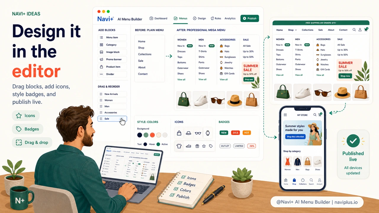
How Navi+ AI Menu Builder solves this
Navi+ replaces the theme's default navigation entirely with a visual builder that gives you full design control — without touching code. When you install Navi+, you choose a menu type to start with: Tab Bar for a mobile-first bottom navigation, Mega Menu for a desktop dropdown with columns and images, Slide Menu for a drawer-style sidebar, FAB for a floating action button, or Grid Menu for a structured icon-based layout. These are not just cosmetic skins over the same link list — they are distinct layout systems, each built for a specific browsing context.
Inside the builder, every element is configurable through point-and-click controls. You select a menu item and a panel opens with options for icon (from a built-in library), badge text ("New", "Sale", custom label), link color, hover color, and font weight. For mega menus, you drag items into columns, set column widths, and add section headers. The live preview updates in real time as you make changes — what you see in the editor is exactly what visitors see. There's no deploy step, no test-and-refresh loop, and no CSS to write.
Setup takes under ten minutes for a typical store. Install the app, connect it to your existing navigation links, choose a menu type, configure the design, and publish. Navi+ runs independently from your theme, so updates to your theme don't reset your menu configuration.
Without Navi+ vs. with Navi+
| Feature | Default / Without Navi+ | With Navi+ AI Menu Builder |
|---|---|---|
| Column layouts and visual grouping | ✗ Not available | ✓ Drag-and-drop column editor |
| Icons, badges, and highlight labels | ✗ Requires custom CSS | ✓ Built-in icon library and badge editor |
| Custom colors per item and on hover | ✗ Theme-wide only, needs code | ✓ Color picker per item, no code |
| Mobile-specific layout (Tab Bar, FAB) | ✗ Same menu as desktop | ✓ Separate mobile menu type |
| Update menu design without a developer | ✗ Developer required for any style change | ✓ Fully self-service from the dashboard |
| Menu survives theme updates | ✗ Custom code can break on theme update | ✓ Runs independently from theme |
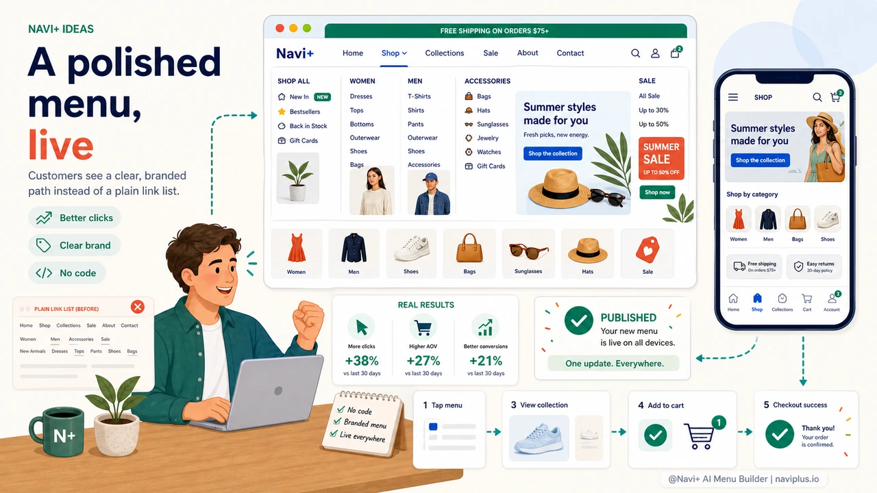
What you get
After switching to Navi+, the most immediate change store owners notice is not technical — it's the reaction from customers. Navigation that has clear visual hierarchy, grouped categories, and appropriate icons reads as intentional. Visitors spend more time exploring the menu because there's more to find and it's easier to scan.
A practical starting point: if you sell across multiple product categories, try building a Mega Menu with one column per major category group. Add a simple icon to each top-level item from Navi+'s built-in library. Mark your current promotional category with a badge ("Sale" or "New"). This takes about 15 minutes in the editor and the difference in visual clarity compared to a flat link list is significant.
If most of your traffic is mobile, start with a Tab Bar instead. Pin your four most important destinations — Home, Shop, Sale, Cart — as bottom navigation tabs. This single change reduces the navigation friction mobile shoppers experience from the first tap. You can run the Tab Bar on mobile and a Mega Menu on desktop simultaneously, both configured from the same Navi+ dashboard.
Every element you configure — colors, icons, layout, column structure — is saved and editable at any time. If your brand direction changes, you update the colors. If you add a new product category, you add the link. No developer, no invoice, no waiting.
Try it free — no code, no developer needed
Install in minutes on Shopify, WordPress, or any website.