

Why Seasonal Navigation Color Works
Most visitors never consciously notice navigation color. That's precisely why changing it seasonally is so effective. When navigation reflects the time of year — a deep red Tab Bar in December, sage greens in spring, warm ambers in fall — the store registers as actively curated rather than static. It's a peripheral signal, absorbed subconsciously, that tells the shopper: someone is paying attention here, the inventory is current, this is a living store.
Compare this to a store whose navigation looks identical in December as it did in July. Seasonal promotions may be running, collections may have changed, banners may be updated — but if the navigation palette is frozen, the experience lacks the ambient seasonality that shoppers feel everywhere else in their lives: in shop windows, in packaging, in social media feeds. Navigation is a missed opportunity to participate in that ambient seasonal signal.
The emotional resonance here is real. A deep burgundy and forest green palette in December doesn't just look festive — it creates a subconscious alignment between the shopping moment and the visual environment. That alignment makes the shopper more receptive to seasonal offers and more confident that the store is in the same season they are.
"We updated our Tab Bar to deep red and gold for December — took about fifteen minutes in Navi+. The following week, a customer mentioned in a review that the site 'felt festive.' They weren't describing our banner. They were describing the ambient color of the navigation they used every time they visited. That stuck with me."
— A Navi+ customer, home goods brand
The Light Touch Principle
Seasonal navigation color works because it's subtle. It's not a full site redesign — no layout changes, no new fonts, no restructured collections. It's a shift in the menu palette, three or four color values, that the visitor registers as seasonal freshness without ever consciously registering that they've noticed the navigation at all.
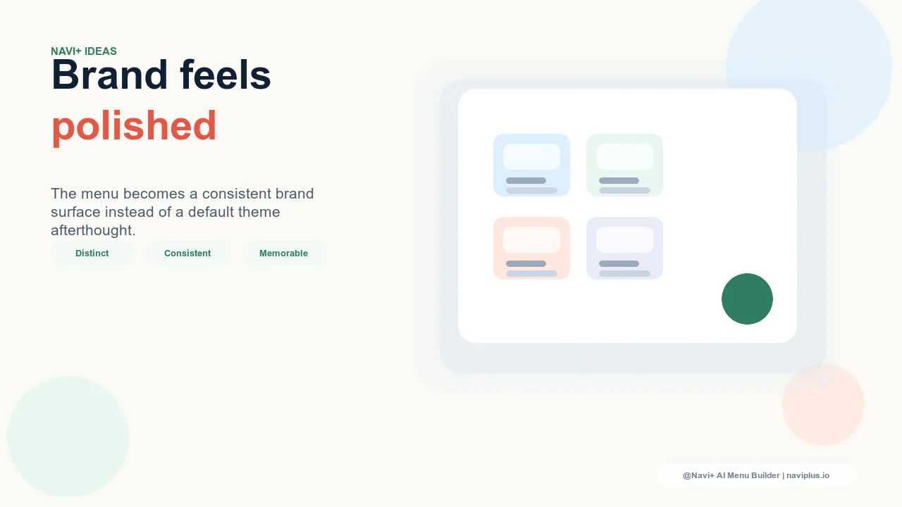
This subtlety is the feature, not a limitation. A full seasonal redesign would require design resources, would risk disrupting familiar navigation patterns, and would feel like the store has changed in ways that require re-orientation. A seasonal palette update bypasses all of this. The structure is identical — the same categories, the same layout, the same fonts — so visitors navigate with their existing mental model. The palette change works at the level of feeling rather than cognition.
The implication is also that the change needs to be cohesive, not aggressive. A neon red Tab Bar on a December store doesn't feel festive — it feels like a mistake. Seasonal palettes work when they reference the visual vocabulary of the season: the deep, rich tones of December, the soft brightness of spring, the warm earthiness of fall. Seasonal doesn't mean garish; it means resonant.
What to Change
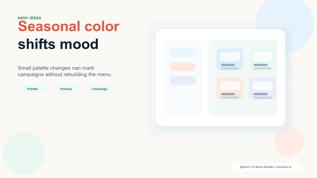
A seasonal navigation color update requires changing only a small set of values. In Navi+, four elements cover the entire navigation surface:
Tab Bar background color. This is the single highest-leverage change in a seasonal update. The Tab Bar appears on every page of the store. Changing its background color changes the ambient color of the entire shopping experience — one value, sitewide impact. This is where the seasonal palette should be most prominent: a deep navy in December, a warm sage in spring.
Active state accent color. The color applied to the currently selected tab and active navigation element reinforces the seasonal palette on every page load. Updating this from the standard brand accent to a seasonally appropriate accent — gold in December, coral in summer — completes the seasonal Tab Bar treatment without requiring any additional changes.
FAB color. The Floating Action Button, if used, is a persistent element across the mobile experience. Updating its color to align with the seasonal palette extends the seasonal feel to the mobile surface and keeps the FAB visually coherent with the updated Tab Bar.
Mega Menu panel background tint. For stores using Mega Menu navigation on desktop, a subtle tint on the panel background — a light wash of the seasonal palette — extends the seasonal feeling into the expanded navigation state. This is the most optional of the four changes but adds depth to the seasonal treatment for desktop visitors.
These four values — Tab Bar background, active accent, FAB color, Mega Menu tint — are sufficient to create a coherent seasonal feel across the entire store navigation without touching anything else.
What Not to Change
Seasonal color updates work because the underlying structure is unchanged. The following elements should remain fixed through any seasonal palette update:
Category labels and navigation structure. Visitors have a mental model of your navigation built over prior visits. Seasonal color is absorbed subconsciously; structural changes require conscious re-learning. Never rename categories or reorganize navigation sections for a seasonal update — the palette change provides freshness without the disorientation of structural change.
Typography and font choices. Font is a core brand signal. Seasonal palette changes work in part because every other brand element remains constant — the seasonal color is the only variable. Changing fonts alongside color multiplies the visual disruption without adding seasonal resonance.
Navigation component layout. The position, size, and behavior of navigation components should be stable across seasonal updates. Visitors should be able to navigate with zero re-learning. The seasonal palette should feel like a familiar space that's been decorated for the occasion — not a new space.
Seasonal Palettes for E-Commerce
The following palettes are reference starting points, not rigid rules. Adapt them to the brand's existing color vocabulary — the goal is resonance, not costume.
December / Holiday. Deep red (#8B1A1A), forest green (#1E4D2B), and gold (#C9A84C) on a dark navy base (#0D1B2A). The richness of these tones communicates premium and festive without requiring any holiday imagery in the navigation itself.
Valentine's Day. Blush (#F2C4CE), rose (#C9485B), and burgundy (#6B1E2E) on a soft off-white or warm gray base. More intimate and personal than holiday palettes — works well for stores with gift or lifestyle positioning.
Spring. Sage (#7D9E7D), lavender (#B8A5C8), and warm cream (#F5EFE0) on a light background. Soft, open, and airy — the palette communicates freshness and newness, which aligns with spring collection launches.
Summer. Ocean blue (#1E6B8C), coral (#E8785A), and warm sand (#D4B896) on a light or white base. Energetic and warm without being aggressive — works for active, outdoor, and lifestyle categories.
Fall. Amber (#C98A2A), terracotta (#B85C38), and deep forest (#2C4A2E). Rich and grounded — pairs well with harvest and cozy positioning, and provides a strong contrast for white or light text.
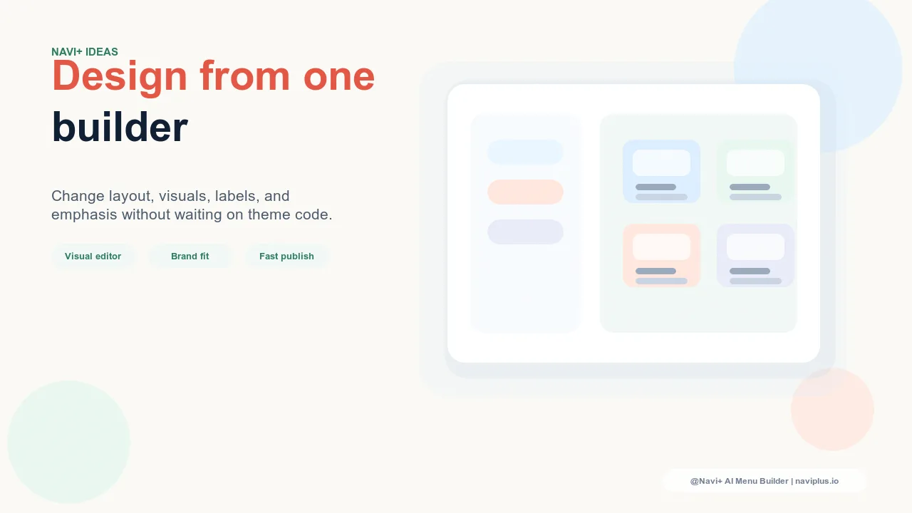
Executing Without Design Skills
The practical barrier to seasonal navigation color updates is usually the perception that it requires design expertise. It doesn't. The decision-making involved — selecting a seasonal palette — can be done with three inputs: a reference image from a mood board or seasonal campaign, the brand's existing hex values as anchors, and one of the palettes above as a starting template.
The execution in Navi+ is direct: identify the three or four hex values for the season, open the Navi+ color configuration, and update Tab Bar background, active state accent, FAB color, and Mega Menu tint. Most stores can complete this process in under 20 minutes. No CSS, no developer involvement, no design file required.
The visual check before publishing is equally simple: activate each navigation component and confirm that text remains readable against the updated background (aim for at least 4.5:1 contrast), that the active state is visually distinct from the inactive state, and that the FAB is visible and coherent with the Tab Bar. These three checks take two minutes and cover the functional requirements of the updated palette.
The Limited-Edition Feeling
Seasonal navigation color does something beyond aesthetics: it reinforces the limited-time nature of the current moment in the store. When the navigation palette signals December, it implicitly signals that December collections and offers are also present — and also time-limited. The visual cue primes the shopper for the urgency that holiday commerce requires.
This is the deeper value of seasonal navigation color: it makes the store feel like it's in the same moment as the shopper. When the shopper is in gift-buying mode, the navigation is in gift-season mode. The alignment reduces the psychological distance between the shopper's intent and the store's posture — and that alignment converts.
Year-round static navigation, by contrast, makes no claim on the moment. It offers the same visual experience in December as in July. The shopper in gift-buying mode must bring all their own seasonal urgency to a store that signals no urgency at all. Seasonal navigation color is one of the smallest changes that contributes most directly to closing that gap.
Rollback Planning
Every seasonal navigation update needs two dates: a launch date and a revert date. The revert date is at least as important as the launch date. Stale seasonal colors in January are as damaging to brand perception as stale content — a deep red and gold Tab Bar in mid-January signals a store that wasn't paying attention, which is precisely the opposite of the signal a seasonal update is intended to create.
Before launching the seasonal palette, schedule the revert in the same session. Document the original hex values — or save a named configuration in Navi+ — so the revert is a two-minute task rather than a reconstruction exercise. The revert date should be firm: one to two days after the seasonal moment ends, not a vague future intention.
Stores with multiple seasonal moments — December, Valentine's, Spring launch, Summer, Fall — benefit from maintaining a simple seasonal color schedule: four to five palette configurations, each with a planned launch date and revert date, prepared in advance for the year. This turns seasonal navigation color from a reactive scramble into a planned program, and planned programs execute more consistently than reactive ones.
| Seasonal navigation color updates | Year-round static palette | |
|---|---|---|
| Brand Freshness Signal | High — store registers as actively curated | None — navigation looks the same year-round |
| Visitor Emotional Resonance | Strong — visual palette aligns with the shopping moment | Weak — no ambient seasonal alignment |
| Implementation Time | Under 20 minutes per season in Navi+ | None required |
| Design Skill Required | Minimal — palette selection + 3–4 hex values | None |
| Structural Disruption Risk | None — only color values change | None |
| Limited-Edition Urgency Signal | Reinforced by seasonal visual environment | Absent from navigation surface |
| Rollback Required | Yes — schedule a revert date at launch | N/A |
Try it free — no code, no developer needed
Install in minutes on Shopify, WordPress, or any website.