

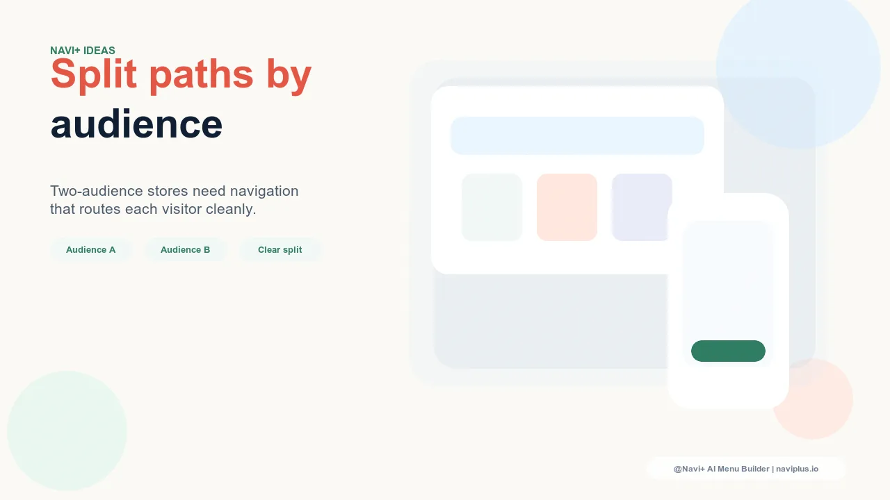
What Split-Panel Navigation Is
Most navigation follows a single unified hierarchy: one set of top-level categories, one menu, one path into the store for every visitor. Split-panel navigation breaks that assumption. Instead of a single entry point, it presents two (or more) distinct starting paths at the top level — each one designed for a different audience with different needs.
The patterns are recognizable: "For Home" vs. "For Business." "Women" vs. "Men." "Shop" vs. "Learn." "Professional" vs. "Consumer." Each path leads into a navigation system optimized for that audience's products, language, and priorities. The visitor chooses their path at the outset, and everything downstream is organized around that choice.
This is not a cosmetic difference from standard navigation. It is a structural decision about how the store is organized — and it carries real consequences for how different visitor types experience the store.
"We sell the same product line to interior designers and to homeowners. The designers need spec sheets, bulk pricing, trade account access, and lead times. The homeowners need room inspiration, product styling, and delivery estimates. Putting both in one flat navigation meant half our visitors immediately felt like the store wasn't for them. Splitting the navigation by audience — 'Trade' vs. 'Home' — solved it cleanly. Both groups now land in a navigation that speaks their language from the first click."
— A Navi+ customer, home furnishings brand
When Stores Actually Need It
Split-panel navigation earns its complexity when the store genuinely serves two audiences whose navigation needs are fundamentally different — not just slightly different, but incompatible. The test is simple: if you imagine Audience A browsing the standard navigation, how much of what they see is irrelevant noise? If the answer is "most of it," the store is a candidate for a split.
The use cases where split navigation consistently works well:
B2B and B2C in one store. Business buyers need volume pricing, account management, invoicing options, and technical specifications. Consumer buyers need inspiration, sizing guides, gift options, and simple checkout. Forcing either group through the other's navigation creates friction and miscommunication about who the store is for.
Gender-split fashion. Womenswear and menswear lines with distinct sizing systems, product categories, and editorial perspectives. When the overlap between the two lines is minimal, a split entry point lets each audience reach their relevant navigation immediately rather than filtering through a combined hierarchy.
Professional and consumer product lines. A camera brand selling both professional cinema equipment and consumer photography gear. A skincare brand with a clinical professional line and a consumer retail line. The products may share brand identity but serve buyers with entirely different decision criteria.
Education and product content. Some stores combine a product catalog with a substantial content or learning section — courses, certifications, guides — that represents a genuinely different destination with its own navigation logic. "Shop" and "Learn" as top-level split paths serve this pattern well.
When Split Navigation Doesn't Work
The split-panel pattern fails in predictable ways. The most common mistake is splitting navigation when there isn't a real audience split — when the store serves one primary audience with minor variation.
If analytics show that 80% or more of visitors fall into one segment, a split navigation imposes a choice on the majority that adds friction without benefit. A visitor who always shops womenswear doesn't need to select "Women" every time they arrive — that selection should either be remembered or the split should be abandoned in favor of prominent secondary access to the minority category.
The other failure mode is splitting when the two audiences' needs significantly overlap. If both Segment A and Segment B browse the same top categories frequently, splitting them into separate navigation trees means each audience loses access to relevant products that have been filed under the other path. The result is not better organization — it's invisible inventory.
Implementation Patterns
Full-screen audience selector. On first arrival (or on homepage), the visitor is presented with a full-screen or large-panel prompt to choose their path: two visually distinct panels, each representing an audience, each leading to a tailored navigation experience. This pattern communicates the split most explicitly and works well when the two audiences are genuinely distinct lifestyle groups. The risk is that returning visitors find it interruptive unless the choice is remembered via cookie or session state.
Tab Bar with two audience tabs. The Tab Bar sits at the top of the navigation system, with two tabs ("For Home" / "For Business," or "Women" / "Men") that switch the entire menu system between the two audience navigation trees. The active tab state makes it clear which path the visitor is on, and switching is a single tap. This is the most frictionless persistent split — it doesn't interrupt, but it makes the structure legible at all times.
Mega Menu with two differentiated sections. Rather than a full audience split, the Mega Menu itself is divided into two visually distinct halves — each half organized around one audience's primary categories. Color, typography weight, or divider lines signal the boundary. This approach works when the overlap between audiences is moderate and cross-navigation should be easy: a visitor who usually shops the consumer side can see the professional side is there without needing to switch navigation modes.
Slide Menu with a segment selector header. On mobile, the Slide Menu opens with a segment toggle at the top — two buttons representing the two audience paths — before displaying the relevant category links beneath. The segment choice collapses one set of links and expands the other. This keeps the mobile menu scannable without combining both audiences' categories into a single unwieldy list.
The UX Risk: Wrong-Path Selection
Split-panel navigation introduces a failure mode that single-hierarchy navigation avoids: visitors who self-identify incorrectly and enter the wrong path. A small business owner who thinks of themselves as a "home" buyer, not a "business" buyer, selects the consumer path — and never finds the bulk pricing or trade terms that would have converted them.
The mitigation is two-sided. First, label the paths with inclusive, behavior-describing language rather than identity labels. "Shopping for a project?" vs. "Shopping for your home?" performs better than "Professional" vs. "Consumer" because it meets visitors where their intent is, not where they categorize themselves. Second, make cross-navigation easy and visible. A persistent "Switch to Business" link in the footer or sidebar of the business navigation tree means a misrouted visitor can correct course without returning to the homepage.
Audit the wrong-path problem with analytics: measure the rate at which visitors navigate from one path's deep pages to the other path's entry point. A high rate of this cross-path navigation signals that a significant portion of visitors are either misidentifying initially or genuinely browsing both sections — both cases are worth addressing in the navigation design.
Visual Differentiation Between Panels
The visual language of the two panels should do work beyond decoration. Color, typography scale, and imagery should make it immediately clear which panel belongs to which audience — so that a visitor who has landed in the wrong section recognizes it quickly, and a visitor in the right section feels confirmed in their choice.
Effective differentiation uses one dominant variable: a different color accent for each section (the business section uses a navy/slate palette; the consumer section uses warm earth tones), or different typographic weight (the professional section uses tighter, more technical-feeling type; the consumer section uses looser, more editorial styling), or different imagery style (the professional section shows products in clinical, specification-oriented contexts; the consumer section shows lifestyle photography).
Avoid differentiating with so many simultaneous variables that the two sections feel like two different brands rather than two access points into one coherent store. The goal is distinction without disconnection.
Measuring Whether the Split Is Working
A split-panel navigation that isn't being used symmetrically is a signal worth acting on. If one path receives 90% of navigation traffic and the other receives 10%, there are two possible interpretations: the store's audience is genuinely 90/10, in which case the split adds complexity for minimal benefit; or the split labels are failing to attract the minority audience, in which case the labels need revision.
Useful analytics checkpoints: path entry rates (how often each audience tab or selector is chosen), bounce rate by path (does one path consistently lose visitors faster than the other), and conversion rate by path (does one audience convert at dramatically lower rates, suggesting the path is failing to serve them). The split should improve both audience groups' metrics relative to a single unified navigation — if it doesn't, reconsider whether the split is warranted.
Navi+ Tab Bar and Mega Menu for Audience Segmentation
Navi+ supports audience-split navigation through a combination of the Tab Bar and Mega Menu components. The Tab Bar can be configured with two audience tabs that each load a distinct set of Mega Menu navigation links, category images, and featured items — so switching the active tab switches the entire navigation tree, not just the label.
Each audience path can carry its own category images, featured product curation, and link structure within the same Mega Menu panel framework. Visitors on mobile see a Slide Menu with a segment toggle at the top that mirrors the Tab Bar logic. The visual differentiation between paths — color accents, imagery, featured content — is configurable per-path, so the two panels can feel distinct while remaining part of a coherent navigation system.
| Navigation Approach | Discovery for Segment A | Discovery for Segment B | Navigation Complexity |
|---|---|---|---|
| Single unified navigation | Mixed — relevant and irrelevant options visible together | Mixed — relevant and irrelevant options visible together | Low — one hierarchy for all visitors |
| Split-panel navigation (Navi+) | High — sees only their relevant categories | High — sees only their relevant categories | Higher — requires correct path selection upfront |
The tradeoff is explicit: split-panel navigation improves discovery for both segments by reducing noise, but it introduces complexity at the path-selection stage. That tradeoff is worth making when the audiences are genuinely distinct. It isn't worth making when the complexity costs more than the discovery gains — which is always the case when the split is artificial or when one segment dominates.
Try it free — no code, no developer needed
Install in minutes on Shopify, WordPress, or any website.