

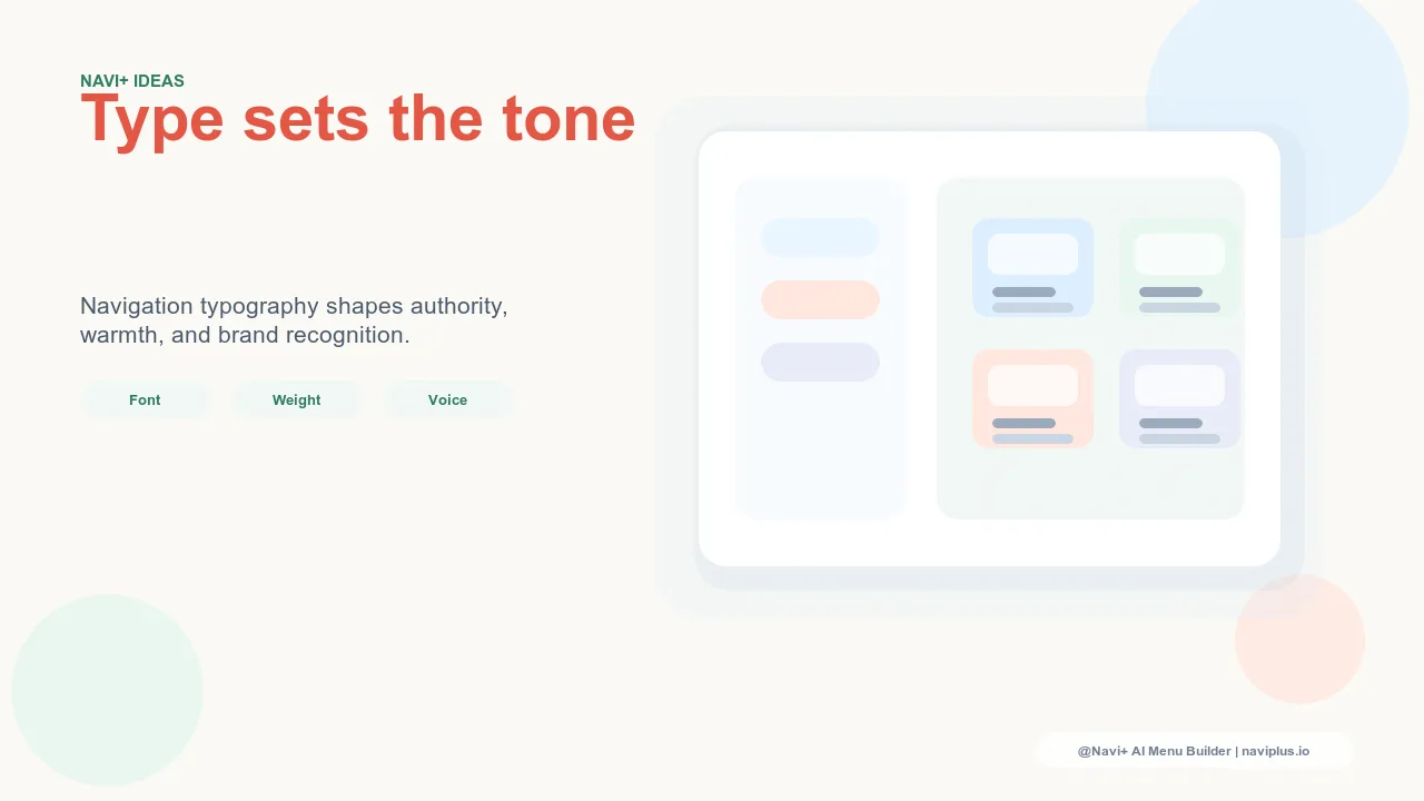
Navigation as Typographic Brand Expression
Typography in e-commerce is most carefully considered for brand headlines, product names, and editorial content — the places where the design team has the most control and the brand's voice is most directly expressed. Navigation typography receives comparatively less attention, despite the fact that navigation text appears on every page and is the most frequently read text in the store.
The visitor who opens a navigation menu reads the menu labels — the category names, the subcategory links, the featured destination names. These labels are read in the typeface and weight of the navigation component, which is often inherited from a theme default rather than specified as part of the brand's typographic system. The result is navigation that communicates brand tone through typography inconsistently — premium brand voice in the headlines, default system font in the menu.
For stores where brand identity is a primary purchase driver — luxury, lifestyle, fashion, beauty — consistent typography across all brand touchpoints, including navigation, is a meaningful differentiator. Visitors respond to typographic consistency as a signal of design quality and brand maturity, even if they can't explicitly identify it as the source of their impression.
"We use a custom serif for our brand headlines — it's been part of our identity since we launched. The navigation was using a system sans-serif because that was the theme default. When we extended the custom serif into the navigation labels, customers started commenting that the store felt more 'premium' and 'cohesive' without being able to say why. The only thing that changed was the navigation font. Typography in navigation carries more brand weight than most people give it credit for."
— A Navi+ customer, fine jewelry brand
Typographic Variables in Navigation
Navigation typography is controlled by several variables, each with distinct brand implications:
Font weight. Navigation labels at font weight 400 (regular) read as casual and approachable — appropriate for friendly, accessible brands. Labels at font weight 500–600 (medium/semibold) read as confident and clear — appropriate for most commercial contexts. Labels at font weight 700+ (bold) project authority and directness — appropriate for brands with a strong, assertive personality. Critically, the weight should not vary randomly between navigation levels — a consistent weight hierarchy (bold for top-level categories, medium for subcategories, regular for helper text) communicates the navigation structure typographically in addition to spatially.
Lettercase. UPPERCASE navigation labels project formality and luxury — the treatment used by most fashion and luxury brands for their navigation because it creates visual rhythm and a sense of editorial control. Title Case navigation (each word capitalized) reads as professional and clear — the default for most commerce contexts. Sentence case navigation (only first word capitalized) reads as approachable and conversational — appropriate for brands with a casual or friendly persona. Lettercase is one of the simplest typography decisions with the most immediate impact on brand tone.
Font size. Navigation text should be large enough to scan quickly — typically 13–16px for mobile navigation labels. Smaller navigation text requires more effort to read during the rapid scanning that characterizes navigation interaction. Navigation text that requires the visitor to lean in to read it creates friction that shouldn't be there. Larger navigation text, by contrast, typically reads as confident and accessible — appropriate for both usability and brand expression.
Letter spacing. Tight letter spacing (tracking) reads as modern and dense — appropriate for fashion and luxury brands that emphasize visual impact over readability in small doses. Wider letter spacing reads as airy and refined — appropriate for brands with premium-minimal aesthetics. Standard spacing is appropriate for most contexts where readability is the primary concern. In navigation, letter spacing interacts with lettercase significantly: uppercase labels with wider letter spacing is a classic luxury navigation treatment that reads as premium and considered.
| Typography Treatment | Brand Signal | Best For |
|---|---|---|
| Regular weight, title case, standard spacing | Accessible, friendly, commercial | General retail, accessible brands |
| Semibold weight, title case, standard spacing | Confident, clear, professional | Most e-commerce — versatile and readable |
| Medium weight, UPPERCASE, wide spacing | Premium, refined, editorial | Fashion, beauty, luxury — high brand signal |
| Light weight, sentence case, tight spacing | Modern, minimal, sophisticated | Premium-minimal brands; can compromise readability |
Extending Brand Typography into Navigation
Navi+ allows full control over navigation typography — font family (including custom web fonts loaded by the store's theme), font weight, size, lettercase, and letter spacing — for all navigation components including the Tab Bar, Slide Menu, and Mega Menu. This control makes it straightforward to extend the store's brand typographic system into the navigation layer rather than accepting theme defaults.
The starting point is to identify one typographic treatment from the brand's existing system — the headline weight and style, or the body copy style — and apply it consistently to navigation labels. Even a single typographic decision, consistently applied across all navigation components, creates the cohesion that makes a store feel designed rather than assembled. Navigation typography is not a finishing touch — it's part of the brand's visual identity, and it deserves the same intentional treatment as any other typographic element in the store.
Try it free — no code, no developer needed
Install in minutes on Shopify, WordPress, or any website.