

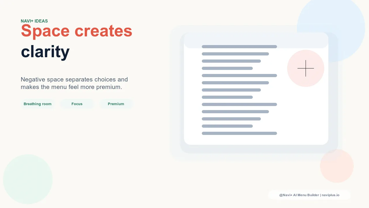
Whitespace Is Not Empty Space
When designers talk about whitespace in navigation, they don't mean unused space waiting to be filled. Whitespace is the spacing between navigation items, the padding around labels inside a menu panel, the margin between category columns in a Mega Menu, the vertical rhythm that separates one group of links from the next. It is active design space — space that is doing deliberate work in the composition.
Every navigation menu has a whitespace density, whether it was intentional or not. A menu assembled by accepting default theme values and adding every category the business wants to surface has a whitespace density that was never consciously chosen. A menu designed with brand tier and visual hierarchy in mind has a whitespace density that reflects a clear point of view. The difference is visible immediately, even to visitors who couldn't articulate what they're responding to.
The design principle is simple: whitespace signals that the brand is not trying to fit everything in. It signals confidence. A premium brand doesn't need to use every pixel to justify itself. The space itself is part of the message.
"We had a navigation menu that listed every category we carry — 24 top-level items, each subcategory visible. It felt like a directory. When we redesigned with proper spacing and fewer visible items, the store immediately felt more expensive. We hadn't changed a single product or price. The spacing was doing the positioning work."
— A Navi+ customer, premium home goods brand
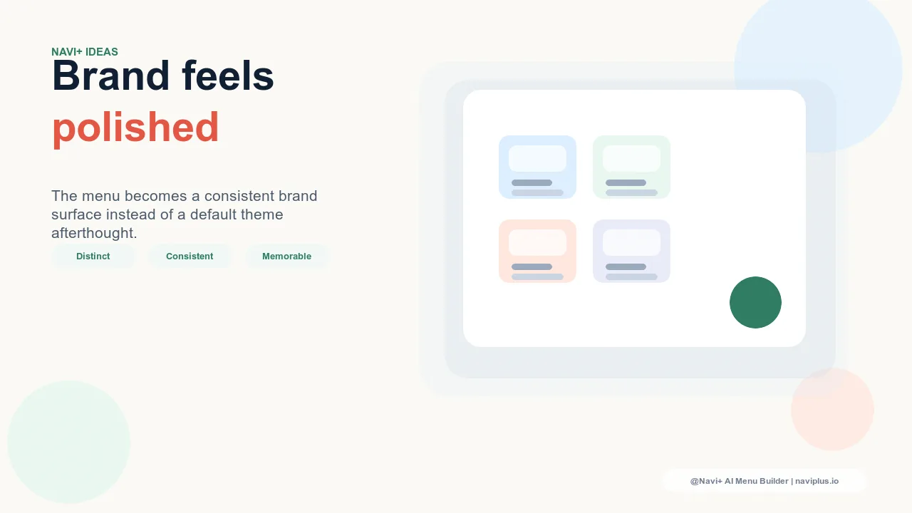
What Whitespace Communicates
Luxury brands use generous whitespace in navigation because it sends a specific brand signal: this brand doesn't need to fill every pixel to earn your attention. The space itself communicates that the brand is selective, confident, and not competing for attention in the way that discount or mass-market brands do.
Compare the navigation of a luxury fashion house to the navigation of a discount retailer. The luxury navigation is airy — category labels are widely spaced, there's generous padding around each item, and the menu panels have room to breathe. The discount retailer's navigation is dense — as many links as possible are visible at once, padding is minimal, and every available space is used to surface promotions or subcategories. Both are intentional approaches, but they communicate very different brand tiers.
This is not purely aesthetic. Whitespace in navigation communicates positioning just as clearly as price points, photography style, or brand copy. A store with beautiful product photography and thoughtful editorial voice but a cramped, dense navigation creates a contradiction that visitors feel without being able to name it. The navigation is whispering discount while everything else is speaking premium.

The Density Spectrum
Navigation density exists on a spectrum, and different brand tiers occupy different positions on that spectrum. Understanding where your brand sits — and aligning your navigation density accordingly — is one of the most direct ways to reinforce brand positioning through navigation design.
Discount and mass-market retail sits at the dense end of the spectrum. Navigation is designed to maximize the number of visible options because the shopping behavior involves broad category exploration and promotional discovery. Dense navigation supports this behavior by surfacing as many pathways as possible at once.
Mid-market brands occupy the middle of the spectrum. Navigation has enough whitespace to feel organized and readable, but density is kept moderately high to support the full range of categories without the visitor needing to navigate deeply before finding products.
Premium and lifestyle brands sit toward the spacious end of the spectrum. Navigation uses generous padding and spacing to signal design quality. Category selection is more curated, which means fewer items to display — enabling the spacing that communicates the brand tier.
Luxury brands sit at the spacious extreme. Navigation is almost empty-feeling by mass-market standards. Labels are widely spaced, menu panels are open, and the design actively uses white space as a compositional element. The navigation is an expression of the brand aesthetic, not just a utility for finding products.
Practical Whitespace Variables in Navigation
Whitespace in navigation is controlled by several specific variables. Understanding what each one does makes it easier to calibrate spacing intentionally rather than by trial and error:
Item padding. The space inside each navigation item — above, below, and to the sides of the label text. This is the primary control for how "open" a navigation list feels. Increasing vertical padding increases the height of each row, spreading items further apart and creating a more generous feel. This is usually the most impactful single spacing variable in a navigation menu.
Gap between items. Additional space between navigation items beyond what padding creates. Where padding is part of the item itself, gap is the space between items. Together, padding and gap determine how much visual territory each navigation link occupies.
Category group margins. In multi-level navigation with grouped subcategories — such as a Mega Menu with columns organized by category — the margin between groups creates visual separation that helps visitors parse the menu structure. Generous group margins make a complex menu readable; tight group margins make the same menu feel overwhelming.
Empty columns in Mega Menu panels. Premium navigation sometimes uses empty columns or generous empty space within Mega Menu panels to create an airier feel and to highlight featured content or imagery rather than filling every cell with links. The empty space is intentional — it's a design choice, not a failure to fill the panel.
Line height. The spacing between lines of text in multi-line navigation labels or descriptive text within navigation panels. Higher line height creates a more open, readable feel; tighter line height creates density.
Whitespace and Scan Speed
The functional argument for whitespace in navigation is clear: items with generous spacing are easier to scan than items packed tightly together. When navigation items are spaced generously, each label has clear visual territory — the eye can move from item to item without ambiguity about where one label ends and the next begins.
When items are packed tightly, labels compete for visual attention. The eye has to work harder to separate individual items, which slows the scanning process and increases cognitive load. The visitor who opens a dense navigation menu and needs to find a specific category is doing more work than necessary — not because the category isn't there, but because the spacing makes it harder to isolate.
This is not a minor difference. Navigation interaction is fast and task-oriented — visitors are typically in the menu for a few seconds at most before clicking a link or closing it. Anything that slows that scan translates directly into friction and, ultimately, into a higher rate of visitors who close the menu without navigating anywhere useful.
The Most Common Whitespace Mistake
The most predictable whitespace mistake in navigation design is reducing spacing in order to fit more items. The reasoning seems logical: we have many categories, we want visitors to be able to see them, so we compress the spacing to make more items visible at once. The result is the opposite of what was intended.
Hick's Law — a well-established finding in decision research — establishes that the time required to make a decision increases logarithmically with the number of choices visible. More visible options don't help discovery; they slow decision-making. A visitor confronted with a navigation menu that shows every subcategory at once often takes longer to find what they want than a visitor using a more curated menu with fewer visible options and clearer visual hierarchy.
The instinct to compress spacing in order to show more is a compression of the wrong variable. Better navigation discovery comes from clear hierarchy and generous spacing on a curated set of items — not from maximizing the number of items visible at minimum spacing.
Mobile Whitespace: Aesthetic and Functional
On mobile, whitespace in navigation is not just aesthetic — it is a functional requirement. Tap targets in mobile navigation need to be large enough to be reliably activated by a finger, which means a minimum of 44×44 points by Apple's Human Interface Guidelines (and equivalent guidance from Google's Material Design). Navigation items that are packed too tightly don't meet this minimum, which means visitors will regularly tap the wrong item — a frustrating experience that leads directly to abandonment.
Generous whitespace in mobile navigation solves both problems simultaneously: it makes the navigation feel premium and considered, and it makes the tap targets reliably large enough to use accurately. These goals reinforce each other. The spacing that feels right from a brand perspective also happens to be the spacing that makes the navigation functionally usable.
This alignment is not a coincidence — generous spacing is both an aesthetic ideal and a functional standard, which is why premium brands and usability guidelines converge on the same recommendation.
Calibrating Whitespace to Brand Tier
The practical question is: how much whitespace is right for your brand? The answer depends on where the brand sits in the density spectrum, and on the specific navigation components being configured.
As a calibration framework: budget brands should use tighter spacing — consistent with the density signals their customers expect and the density required to surface a broad product range. Mid-market brands should use moderate spacing — readable and organized, with enough space to feel intentional without projecting a premium positioning that doesn't match the product or price point. Premium brands should use generous spacing — noticeably more open than a default theme, with item padding that gives each link clear visual territory. Luxury brands should use very generous spacing — approaching what might feel, by mass-market standards, almost empty — with whitespace treated as a compositional element rather than as space to be filled.
| Navigation Density | Perceived Brand Tier | Scan Speed | Tap Accuracy (Mobile) |
|---|---|---|---|
| Dense spacing — minimal padding, tight item gaps | Discount / mass-market | Slower — labels compete visually | Lower — tap targets too small |
| Balanced spacing — moderate padding, clear separation | Mid-market / commercial | Good — items readable and distinct | Reliable — targets meet minimums |
| Generous whitespace — open padding, wide item gaps | Premium / luxury | Fast — each item has clear visual territory | High — comfortable, oversized targets |
Whitespace Controls in Navi+
Navi+ exposes explicit whitespace controls for all navigation components — Tab Bar, Slide Menu, and Mega Menu — so that spacing can be set intentionally rather than accepted from theme defaults.
In the Tab Bar, item padding controls the space around each tab label, and item gap controls the spacing between tabs. Both variables can be adjusted to match the brand's density preference — tighter for brands that need to fit more tabs in the bar, more open for brands where the tab bar is itself a brand expression.
In the Slide Menu, item padding determines the height and openness of each navigation row. This is the primary variable that distinguishes a dense slide menu from a premium-feeling one. Increasing item padding from a default value of 12px to 18–20px creates a noticeably more open feel with no other changes required.
In the Mega Menu, column spacing and group margin controls determine how open multi-column panels feel. For premium brands using a Mega Menu, using generous column spacing and intentionally leaving some panel space empty — rather than filling every cell with links — creates the airy panel design associated with premium navigation.
The starting point for calibration: set item padding first, judge the overall density against the brand tier target, then fine-tune item gap and group margins to create the visual rhythm that matches the brand. Whitespace calibration is faster than it sounds — the right spacing level is usually recognizable within a few iterations because it either feels right for the brand or it doesn't.
Try it free — no code, no developer needed
Install in minutes on Shopify, WordPress, or any website.