

The Problem
Your bestsellers convert at the highest rate of any page in your store. The social proof is built in — they're the items your previous customers chose, again and again. When a new visitor lands on your store and reaches one of these pages, the conversion probability is higher than almost anywhere else. The problem is that most of your mobile visitors never get there.
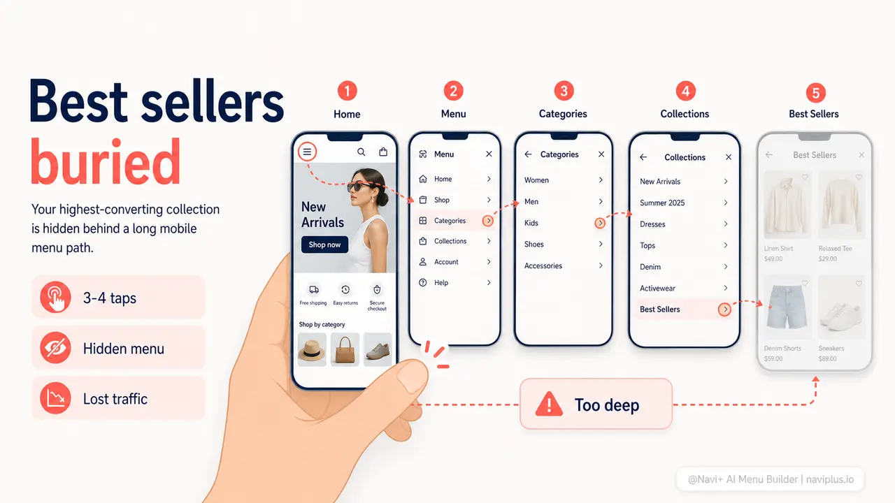
On a standard mobile store, reaching the bestsellers collection requires: tapping the hamburger icon in the top corner, waiting for the slide-out menu to appear, scrolling through a list of category names in plain text, identifying which one might contain your bestsellers, tapping it, and finally clicking through to the right collection. Three to four taps minimum. On mobile, where every interaction is a decision and patience is finite, the majority of visitors abandon that journey before completing it. They don't find your bestsellers — not because they're uninterested, but because the path is too long.
The tragic math: the collection most likely to convert is the hardest to reach. Your homepage gets one tap. Your cart gets one tap. Your highest-revenue products require three or four. This is the default state of nearly every Shopify and WooCommerce store running a standard theme, and it directly costs you sales every single day.
One tap vs. three
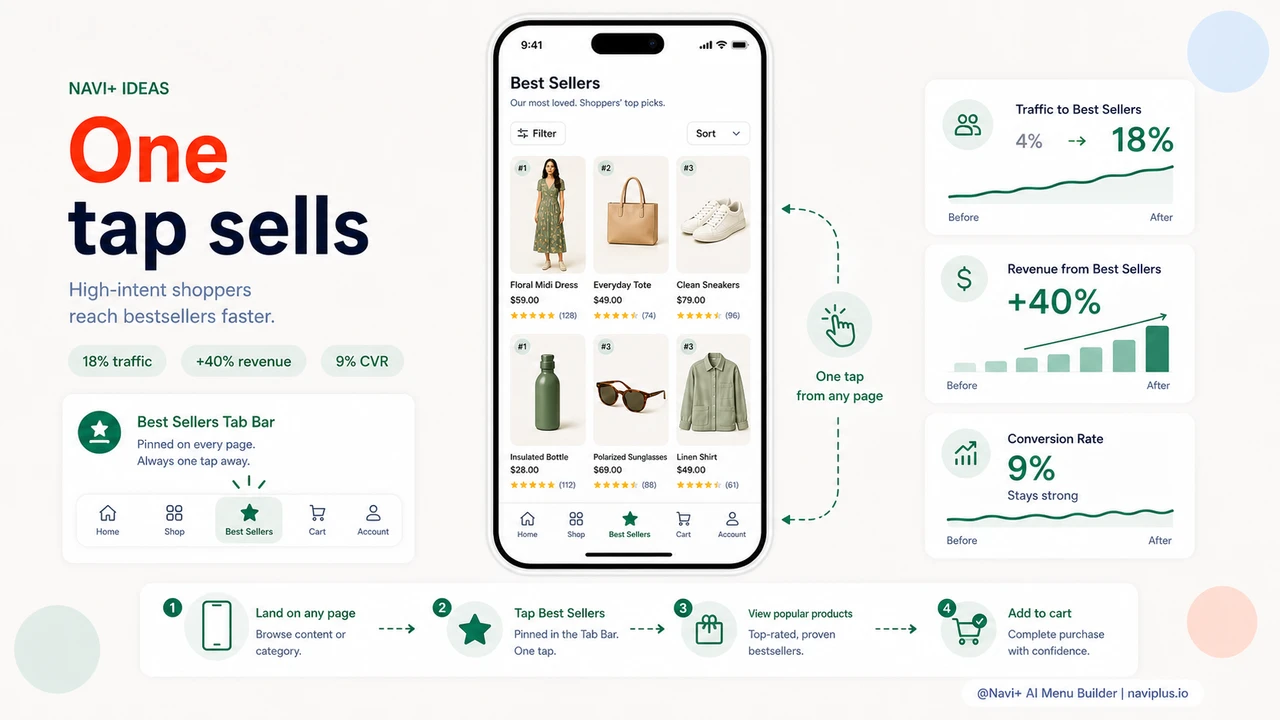
"Our bestsellers collection had a 9% conversion rate — our highest by far. But it got less than 4% of our mobile traffic because nobody could find it from navigation. We added it as a Tab Bar tab and within two weeks it was getting 18% of our traffic. Conversion stayed high. Revenue from that collection alone increased by over 40%."
— A Navi+ customer
Why tap depth costs you more revenue than you realize
Every additional tap required to reach a page reduces the percentage of visitors who arrive there. This is not a theory — it's the consistent finding of every e-commerce UX study done in the last decade, and it's intuitively obvious to anyone who has watched a real person shop on their phone. People don't methodically work through a navigation tree. They make two or three quick decisions, and if they haven't found something worth stopping for, they leave.
Your bestsellers deserve a direct path because they've already earned it. Every other product on your store is unknown to the new visitor. Your bestsellers have social proof baked in — they're the items your existing customers kept choosing. Getting a new visitor to a bestsellers page is not about promotion. It's about removing the obstacle between a visitor who is willing to buy and the products most likely to close that sale.
- High-converting pages with low traffic are a signal. If your bestsellers page converts at 8% but gets 3% of your mobile traffic, the bottleneck is navigation depth, not product quality.
- Mobile visitors decide fast. Most mobile shopping sessions are under four minutes. Every extra step between landing and product discovery reduces the window for a purchase decision to form.
- Your competitors are one tap away on mobile apps. Amazon's app puts bestsellers on the home screen. When your store requires three taps to reach the equivalent, you lose on experience before you even compete on product.
- Direct navigation drives higher-quality sessions. Visitors who reach your bestsellers collection directly have higher intent — they wanted to see what's popular. Give them that without friction.
- Tab Bar traffic doesn't cannibalize other channels. Adding a bestsellers tab doesn't reduce traffic to your other collections. It recovers visitors who were previously bouncing before finding anything.
How Navi+ AI Menu Builder solves this
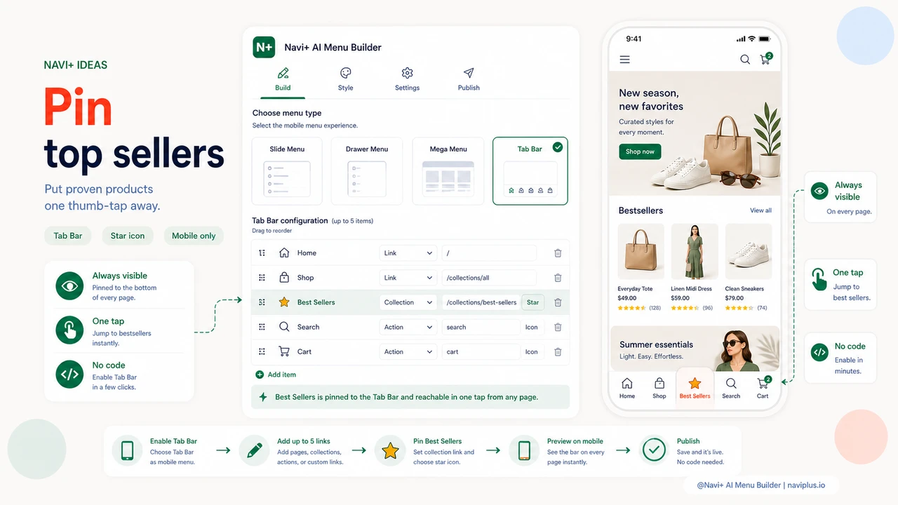
Navi+'s Tab Bar puts up to five links at the bottom of the screen on mobile — pinned, always visible, reachable from any page at any scroll depth. Unlike the hamburger menu hidden behind an extra tap, the Tab Bar is part of the page frame. Visitors see it the moment they land, without doing anything. One of those five slots can be your bestsellers collection. One tap, from any page, at any moment in the browsing session.
Setting it up takes under five minutes. In the Navi+ dashboard, you select Tab Bar as your mobile menu type, choose which links appear in the bar, select an icon for each tab from the built-in library, and publish. The bestsellers tab can have a star icon, a flame icon, or any other visual signal that tells visitors this is the good stuff. The link points directly to your bestsellers collection URL — no redirects, no extra hops.
The Tab Bar runs alongside your existing full menu rather than replacing it. Visitors who want to browse by category can still open the full navigation. But visitors who want the fastest path to your proven products have it — visible, always there, one tap. You run Navi+'s Mega Menu or Slide Menu on desktop for a full-featured navigation experience, and the Tab Bar automatically activates on mobile only. Both are configured from the same dashboard.
Default mobile navigation vs. Tab Bar with bestsellers
| Feature | Default / Without Navi+ | With Navi+ AI Menu Builder |
|---|---|---|
| Taps to reach bestsellers on mobile | ✗ 3–4 taps minimum | ✓ 1 tap from any page |
| Navigation visible without opening a menu | ✗ Hidden behind hamburger icon | ✓ Tab Bar visible on every page load |
| Bestsellers link always visible while scrolling | ✗ Disappears as visitor scrolls down | ✓ Pinned to bottom at all scroll depths |
| Custom icon for bestsellers tab | ✗ Plain text link only | ✓ Choose from built-in icon library |
| Different navigation on mobile vs. desktop | ✗ Same shrunk-down menu on all devices | ✓ Tab Bar on mobile, Mega Menu on desktop |
| No developer or code required | ✗ Theme edit or custom dev needed | ✓ Visual dashboard, live in minutes |
What you get
The immediate effect of adding a bestsellers Tab Bar tab is a measurable shift in traffic distribution. Pages that were previously hard to reach from mobile start receiving direct, high-intent visitors who tapped the tab because they wanted to see what was popular. These visitors arrive with fewer objections than those who found a specific product by search, because they haven't started with a specific product in mind — they're open to discovery, and your bestsellers are the right products to show them.
A practical setup that works well for most stores: name the tab "Best Sellers" or "Popular," use a star or flame icon, and link directly to your bestsellers collection. Keep the other four Tab Bar slots for Home, Shop All, Cart, and Search. This gives every mobile visitor the same one-tap access to your highest-converting collection that you currently only offer to visitors who already know exactly what they're looking for.
Over time, the compounding effect shows up in average order values and return visit rates. Visitors who find your bestsellers collection on their first visit are more likely to purchase and more likely to remember your store. Navigation that surfaces your best products proactively is navigation that works as a sales tool — not just an organizational chart.
Try it free — no code, no developer needed
Install in minutes on Shopify, WordPress, or any website.