

The Margin-Navigation Gap
Almost every Shopify store organizes its navigation the same way: categories reflect what sells most, featured slots go to bestsellers, and the Tab Bar surface area is spent on the product lines with the highest traffic. It's intuitive — you put the popular things front and center. The problem is that popularity and profitability are not the same thing, and in most stores they diverge significantly.
Your bestselling product by unit volume might carry a 20% gross margin. A slower-moving product in a buried subcategory might carry a 60% margin. Navigation built purely around popularity systematically suppresses the products that would most improve your financial position — not because those products are worse, but because navigation was never designed with margin in mind.
This is the margin-navigation gap: a structural mismatch between what your store promotes and what your store profits from. It persists invisibly because most analytics dashboards show revenue and units, not gross profit per navigation click. No alert fires when a high-margin product is buried three levels deep and receives a fraction of the traffic it could earn. The gap compounds quietly, session after session, while the store optimizes for volume instead of value.
The Math That Makes Navigation Worth Rethinking
Consider two products. Product A has a 20% gross margin and sells three units per day through its natural traffic. Product B has a 60% gross margin and sells one unit per day from its current buried position. Both products generate the same daily revenue if they're priced similarly — but Product B generates three times the gross profit per sale. Every time a visitor buys Product A instead of Product B, you've earned the same revenue and one-third of the profit.
Now add navigation visibility to Product B. If navigation placement increases its sales velocity by even 50% — from one unit to one-and-a-half units per day — you've improved daily gross profit by 50% on that product without spending more on acquisition. If navigation placement doubles its velocity to two units per day, it now generates twice the gross profit of the popularity-optimized Product A, while requiring the same traffic.
This is why navigation is a margin lever, not just a UX feature. The products that appear in your Tab Bar, your Mega Menu feature columns, and your FAB destination don't just get more clicks — they get a disproportionate share of your organic session value. Choosing which products receive that allocation is a financial decision, not just a merchandising one.
"We'd been pushing our most popular candle fragrance in the Tab Bar for two years. When we looked at the numbers, our seasonal wax melt collections had margins almost three times higher. We added a 'Our Favorites' slot pointing to those collections and within a month our gross profit per session was up meaningfully — same traffic, better mix."
— A Navi+ customer, home fragrance brand
Identifying High-Margin Products Worth Promoting
Not every high-margin product belongs in navigation — the goal is to surface products where margin and quality genuinely align. The identification process has three components:
Gross margin percentage. The basic filter: products with gross margin above your store's average are candidates. For most consumer product categories, anything above 45–50% gross margin is worth examining. The percentage alone isn't sufficient, but it identifies the candidate set.
Margin contribution per unit. A product with 60% margin on a $20 item contributes $12 per sale. A product with 40% margin on a $80 item contributes $32 per sale. Contribution per unit matters more than percentage for navigation prioritization, because navigation slots drive individual purchase decisions and the absolute dollar impact of each sale determines the return on that slot.
Current traffic and sales velocity. A high-margin product that already sells well doesn't benefit as much from navigation promotion as a high-margin product that's traffic-starved. The highest-leverage candidates are products with strong margin and below-average organic visibility — they have the most to gain from a better navigation slot and the clearest ceiling to grow into.
Cross-referencing these three filters — margin %, contribution per unit, and traffic underperformance — produces a short list of products that navigation placement can meaningfully move the needle on. These are your navigation promotion candidates.
Where High-Margin Products Usually Live (and Why)
When you audit most Shopify stores with an eye toward margin, a consistent pattern emerges: the highest-margin products are buried. They sit in third-level subcategories, in collection pages with no direct navigation path, in filter facets that only power users find. They're not there because they're worse products — they're there because navigation architecture is typically inherited from the store's launch structure, which was built around the original bestsellers, and updated incrementally as new products were added by the path of least resistance.
High-margin products are often newer, more specialized, or higher-priced — all attributes that make them less likely to accumulate the review volume and sales history that would naturally promote them through algorithmic merchandising. They're caught in a visibility trap: they don't sell as much because they're not visible, and they don't get visible because they don't sell as much. Navigation is one of the few levers that can break this loop from the outside.
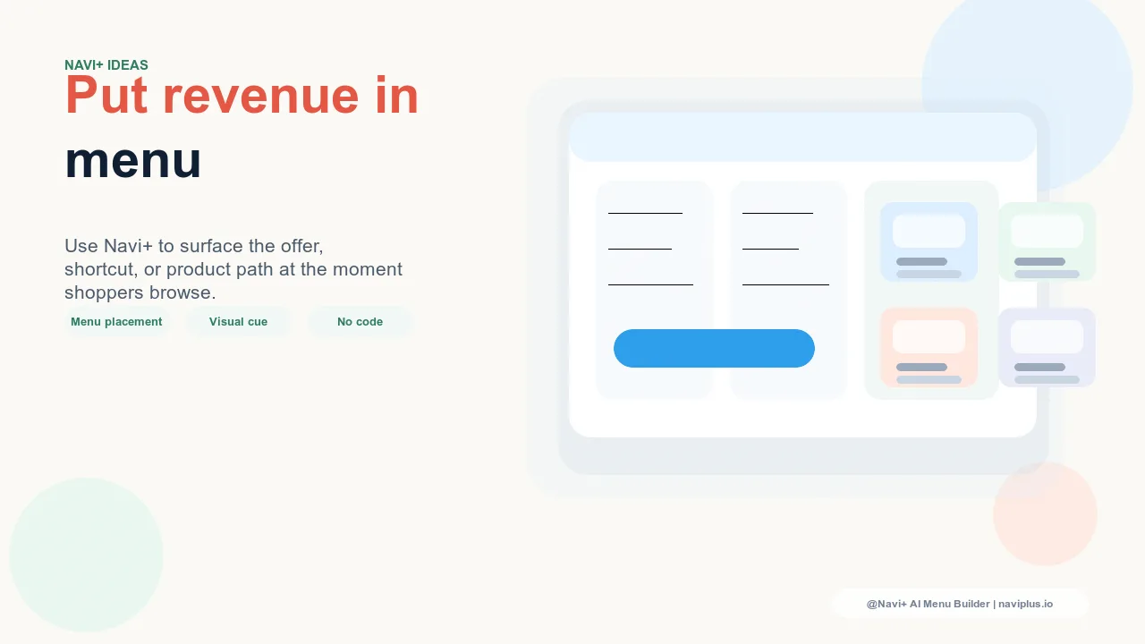
Navigation Tactics for High-Margin Surfacing
Once you've identified your high-margin promotion candidates, there are three navigation surfaces where visibility can be increased most effectively:
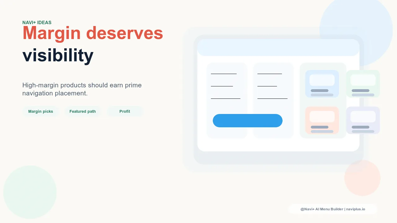
Dedicated Tab Bar slot. A Tab Bar slot labeled "Our Best" or "Staff Picks" pointing to a curated high-margin collection gives those products persistent, one-tap access from every page. The Tab Bar is your highest-visibility navigation surface — it's present on mobile across the entire shopping session. A dedicated slot costs one of your five or six Tab Bar positions, but if the collection it points to generates meaningfully higher margin per session than the slot it replaces, the trade is straightforward.
Mega Menu "Editor's Pick" feature column. Within each category's Mega Menu panel, a dedicated "Editor's Pick" or "Our Favorites" column can feature one to three high-margin products from that category alongside a link to the full curated collection. This gives high-margin products contextual surfacing — a visitor browsing the Women's Apparel category sees the margin-optimized products recommended within that context, not as a generic promotion but as a curated recommendation relevant to what they're already looking for.
FAB pointing to a curated high-margin collection. The Floating Action Button is a persistent, mobile-first surface that many stores use for promotions or new arrivals. Pointing the FAB to a curated high-margin collection — "See Our Picks" or "Shop Our Favorites" — gives that collection a constant, low-friction entry point without displacing primary navigation. Visitors who would never click into a buried subcategory will tap a prominent FAB if the label promises something worth seeing.
The "Staff Picks" Framing: Honest and Effective
There's a natural concern about navigation that's been deliberately organized around margin: does it feel manipulative? The answer depends entirely on how it's framed and whether the products actually deserve the promotion.
"Staff Picks," "Our Favorites," and "Editor's Picks" are framings that have existed in retail for decades. They communicate genuine curation — these are products someone at the store actually recommends — without implying that the curation is based solely on popularity or bestseller status. Visitors trust curated collections because the implicit promise is that a human has evaluated quality and is willing to put their name behind the recommendation.
This framing works for high-margin products because it's honest. If your staff actually does use and love a product, and that product also happens to have a strong margin, there's no manipulation in featuring it. The key constraint is the "and": the product must genuinely merit the recommendation. A "Staff Picks" label on a product that's only there because it has a high margin, and that staff would never actually recommend, destroys the trust the framing creates — and trust, once lost through a misleading navigation label, is disproportionately hard to rebuild.
Avoiding the Trap: Margin and Quality Must Align
The risk with any margin-informed navigation strategy is selecting products that are profitable but not genuinely good. High-margin products that generate buyer's remorse, high return rates, or negative reviews are not candidates for navigation promotion — the short-term margin gain is wiped out by returns and the long-term cost of eroding visitor trust.
Before adding a product to a high-margin navigation slot, verify that its review score and return rate are in line with or better than your catalog average. A product with a 70% gross margin and a 4.6-star rating is an excellent navigation candidate. A product with a 70% gross margin and a 3.2-star rating is not — the margin premium reflects a cost structure, not a quality premium, and promoting it through navigation will deliver worse outcomes than promoting a lower-margin product that customers actually love.
Margin-informed navigation done right is a quality filter applied on top of a margin filter, not a margin filter applied without any quality check. The result should be navigation that genuinely reflects your best products — products that happen to also be your most profitable ones.
The Compound Effect: Organic Traffic and Pure Profit
One of the most underappreciated aspects of high-margin navigation is what it does to the economics of organic traffic. Paid acquisition has an explicit cost that caps its margin contribution — every sale generated through a paid click is charged against a CAC that reduces what the high margin actually delivers. Organic traffic — SEO, social, word of mouth, direct — arrives with no marginal acquisition cost.
When high-margin products are prominently featured in navigation, they receive a share of every organic session that passes through that navigation surface. A visitor who arrived through an organic search for your category, or directly typed your URL, or clicked a social link — and then discovered a high-margin product through your "Our Best" Tab Bar slot — represents a sale where you capture the full margin contribution with no acquisition deduction.
This is the compound effect of margin-informed navigation: it improves your margin on every organic session, indefinitely, without additional spend. As your organic traffic grows through SEO and brand building, the margin-per-session improvement from navigation compounds alongside it. The lever is set once and it keeps working — pure structural improvement to the profitability of traffic you were already earning.
| Navigation Approach | Bestseller Visibility | High-Margin Visibility | Gross Profit per Session |
|---|---|---|---|
| Popularity-organized navigation | High — bestsellers dominate all slots | Low — high-margin products buried in subcategories | Baseline — optimized for volume, not value |
| Margin-informed navigation (Navi+) | Maintained — bestsellers retained where relevant | High — "Our Best" Tab Bar, Mega Menu Editor's Picks, FAB | Higher — better product mix per organic session |
Try it free — no code, no developer needed
Install in minutes on Shopify, WordPress, or any website.