

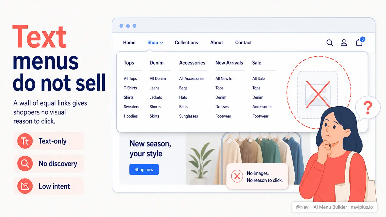
The Problem
Open almost any Shopify or WooCommerce store with a mega menu. Hover over a top-level category. What do you see? A grid of text links. "Women's Tops." "Men's Denim." "Accessories." "New Arrivals." Every item looks exactly the same — same font, same color, same weight. The menu tells visitors where things are filed. It does not show them anything worth stopping for.
The behavioral consequence is predictable. Customers open the menu, see a wall of text, scan for the one word that matches what they had in mind, and close it. There is no moment of discovery. No image that makes them think "I didn't know I needed that." The menu functions as a directory, not a sales surface. And a directory has never been responsible for an impulse purchase.
For stores with more than 50 SKUs, the text-only mega menu does something even more damaging: it forces the visitor to already know what they want before they open the menu. If they don't have a specific category in mind, the wall of equal-weight text links gives them nothing to anchor on. They bounce from the menu back to the homepage, or they leave. Your highest-traffic navigation element is sending people away instead of pulling them in.
First impressions in the menu
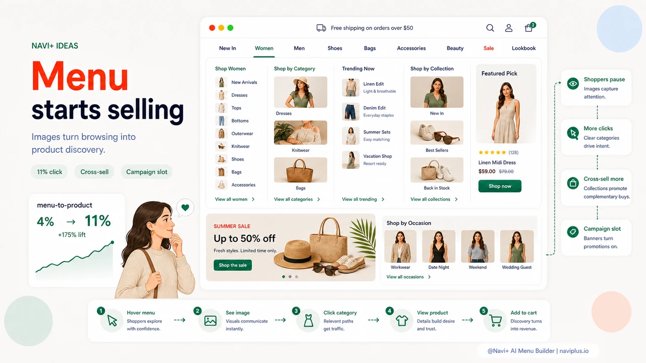
"We had 200 products and a mega menu that listed every category in plain text. Conversion from menu to product page was under 4%. The week we added category thumbnail images to each column, that number jumped to over 11%. The menu stopped being a list and started being a storefront."
— A Navi+ customer
Visual context in the menu matters more than you think
The decision to click a category link happens in under two seconds. That is not enough time to read a description, recall a previous purchase, or reason through which link is relevant. It is, however, enough time to recognize a product you like the look of. Images work at the speed of recognition. Text works at the speed of reading. In a menu — where attention is borrowed, not given — that difference is the difference between a click and a close.
Leaving a visual mega menu off the table costs you in several specific ways:
- Lower click-through from menu to category. Visitors who open a text-only menu and see nothing that grabs them will close it rather than guess their way through.
- Missed cross-sells during browsing. A shopper looking for jeans might not have considered jackets. A small jacket image in the menu makes the cross-sell without requiring a separate page or recommendation widget.
- Invisible promotional inventory. If your seasonal campaign has a visual identity — a color, a product family, an aesthetic — a text link cannot communicate it. An image can.
- Higher bounce rates from navigational dead ends. When someone opens the menu looking for inspiration and finds only a list, they have no entry point. They leave before they ever land on a category page.
- Competitor advantage. Any store that shows a product image in the menu the moment a visitor hovers is already further into the consideration process than your store — before the visitor has even clicked anything.
How Navi+ AI Menu Builder solves this
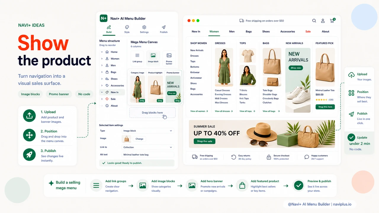
Navi+'s Mega Menu is built around the idea that navigation is a sales surface, not a filing system. In the Navi+ editor, each column in your mega menu can contain not just text links but image blocks — thumbnail-sized category images, hero product shots, or promotional banners. You position them by dragging. You update them by uploading a new image. No code, no developer, no waiting.
The practical workflow is straightforward. After installing Navi+, you open the Mega Menu builder and start adding sections. Each section can hold a mix of link groups and image blocks. Drop a 200x120 category image into the Women's column. Drop a "New Arrivals" banner into a dedicated image slot on the right side of the menu. If you're running a campaign — a summer edit, a gift guide, a clearance event — drop a campaign banner in place of a standard category image. When the campaign ends, swap it back. The edit takes under a minute.
For stores on Shopify, the Navi+ app connects directly to your existing collections, so your menu images can link straight to the right collection URLs without any manual copy-pasting. For WordPress and WooCommerce stores, the same drag-and-drop Mega Menu builder is available through the Navi+ plugin, with the same image slot support and the same one-click publish flow.
The result is a mega menu that behaves like a well-designed department store floor plan: the moment a visitor opens it, they see the store's visual identity, they recognize product categories from their imagery rather than just their names, and they have a reason to click something they hadn't already planned to click.
Text-only vs. visual mega menu
| Feature | Default / Without Navi+ | With Navi+ AI Menu Builder |
|---|---|---|
| Category images in menu columns | ✗ Text links only | ✓ Drag-and-drop image blocks |
| Promotional banners inside the menu | ✗ Not supported | ✓ Seasonal or campaign banners, swap in seconds |
| Featured product image slot | ✗ No dedicated slot | ✓ Dedicated image area per column or per menu |
| Cross-sell opportunity in navigation | ✗ No visual trigger for discovery | ✓ Adjacent category images drive unplanned clicks |
| Update menu images without a developer | ✗ Requires theme edits or custom code | ✓ Upload and publish in under 2 minutes |
| Campaign-specific menu branding | ✗ Same menu for every campaign | ✓ Swap images per season, holiday, or sale |
What you get
Once your Mega Menu includes images, you will notice the behavioral shift quickly. Visitors hover and pause rather than scanning and closing. Time-on-menu increases, and so does click-through to category pages. Cross-category traffic — the kind that comes from someone clicking a menu item they hadn't originally intended to visit — shows up in your analytics as direct evidence that the menu is doing work beyond organization.
The most immediate application for most stores is simple: add a 200x120 thumbnail to each category column in your existing mega menu. Choose images that show the product type clearly — not a lifestyle photo, not a brand banner, but a clean shot of what's in that category. That alone is enough to convert your menu from a list to a visual index.
The next step, once that's live, is to designate one image slot in your mega menu for a rotating promotional banner. This is the slot that shows your current campaign — a "30% off outerwear" banner in October, a gift guide image in December, a clearance banner in January. The banner links to your campaign landing page. You update it the same way you'd update any other menu image: upload, position, publish. It is the highest-visibility promotional placement on your site that most stores leave completely unused.
Try it free — no code, no developer needed
Install in minutes on Shopify, WordPress, or any website.