

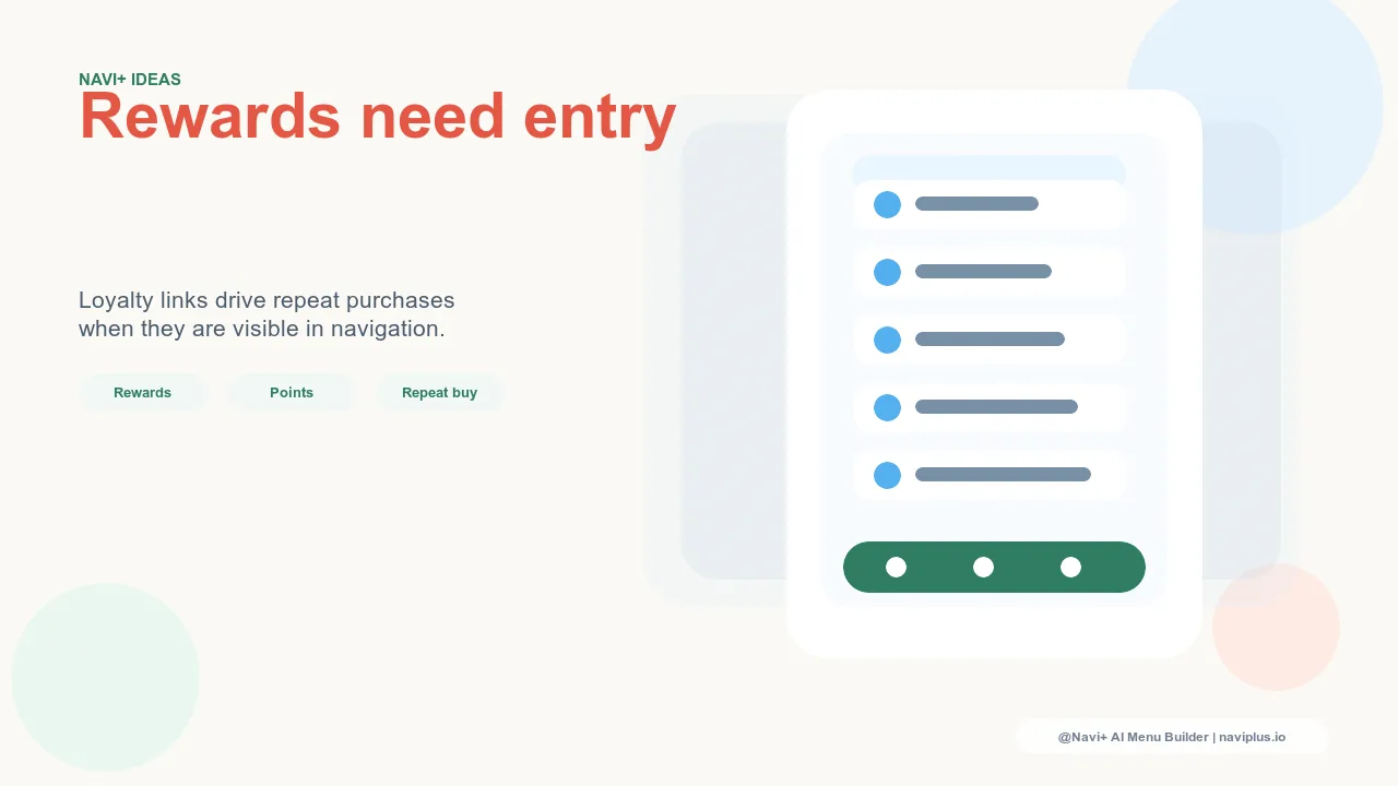
The Loyalty Navigation Gap
Most e-commerce stores that run loyalty programs make the same quiet mistake: they build the program, then bury it. The points balance lives somewhere inside the account dashboard, behind a login, two taps deep. The redemption link is in a footer email. The tier status is on a page customers have to actively remember to visit. The program exists — it just isn't visible where it would actually change behavior.
The result is a loyalty gap that quietly undermines program ROI. Members who enrolled with genuine interest gradually stop thinking about their points. They shop, they accumulate, but because nothing in the navigation reminds them that rewards are waiting, they don't redeem. They don't feel the satisfaction of using their points. They don't form the "I'm getting something back" mental association that makes loyalty programs work as a retention mechanism. The program costs money to operate — points issued, email automation, rewards inventory — but the loop that was supposed to close never closes.
Loyalty navigation is the fix. It's the set of navigation decisions that keep the program visible to enrolled members during every session, not just when a monthly email happens to land at the right moment.
"We had over 12,000 members with unredeemed points — some had been accumulating for more than a year. When we added a points balance to the Account Tab Bar so members could see it on every visit, redemption rate went from 31% to 58% within 90 days. The members hadn't lost interest. They just didn't know the points were there."
— A Navi+ customer, beauty and skincare brand
Why Low Redemption Rate Is a Warning Sign, Not Just a Metric
A low redemption rate is easy to misread as a sign that members aren't interested in the rewards. The more accurate interpretation is almost always the opposite: members who don't redeem are members who aren't being reminded that they have something to redeem. And that gap has consequences beyond the redemption metric itself.
Unredeemed points represent deferred revenue — value that has been promised but not yet exchanged for a purchase. In the best case, that value eventually converts when a member finally checks their balance. In a meaningful number of cases, it never converts at all: the member churns, the account goes dormant, and the promised reward never influences another purchase. The program spent its acquisition cost on a member who didn't get the behavioral nudge the program was designed to deliver.
More fundamentally, a member who doesn't remember they have points isn't getting the emotional benefit of the loyalty relationship. The feeling of "I'm a valued customer here, I'm accumulating something, this store rewards me" — the feeling that drives repeat visits — only exists when the member is aware of their status. A hidden points balance produces none of that. The program is running, but the loyalty loop isn't closing.
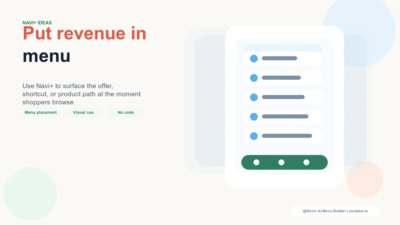
Where Loyalty Navigation Should Appear
The principle is straightforward: loyalty touchpoints should appear in navigation wherever a member is likely to be making a purchase decision or beginning a session. The goal is not to flood the interface with points messaging — it's to make rewards visible at the moments when visibility changes behavior.
Account Tab Bar slot. For logged-in members, a persistent "Account" or "Rewards" Tab Bar slot is the highest-value loyalty navigation placement. It gives members one-tap access to their points balance, redemption options, and tier status on every session. Members who can glance at their balance at the start of a session are more likely to factor it into the session's purchase decision. The Tab Bar is persistent — it doesn't require scrolling or searching, it's always there, and for stores with significant repeat purchase volume it's the most reliable loyalty reminder in the interface.
Slide Menu "Rewards" link near the top. In the Slide Menu, a "Rewards" link positioned near the top — above category links, not buried at the bottom — ensures that members who open the menu see the program. The positioning signals that rewards are a primary feature, not an afterthought. On mobile, where the Slide Menu is the primary navigation surface for many visitors, this placement reaches members across every session.
Mega Menu "Members: X pts" display. For desktop visitors and stores with Mega Menu navigation, displaying a logged-in member's current points balance directly in the Mega Menu header — "Members: 340 pts" alongside the member's name — makes the loyalty program present without requiring a separate tap or click. The member sees their balance while browsing categories, which reinforces the program association every time they use the menu. This passive visibility is what builds the "I'm getting something back" feeling that drives loyalty.
FAB for point-earning announcements during promotions. The Floating Action Button (FAB) is an effective channel for time-sensitive loyalty messaging — double-points weekends, bonus point events, limited-time redemption opportunities. A FAB that appears during a promotion with a message like "Earn 2× points this weekend" reaches members mid-session when they're already in a buying context. It doesn't require a separate email to be opened; it's in the interface where the purchase decision is being made.
The Point-Earning Trigger at Checkout
One of the highest-leverage placements for loyalty navigation is the cart and checkout phase — precisely where purchase decisions are being finalized. A navigation message or announcement that surfaces "Earn points on this purchase" during the checkout flow reinforces program value at the moment when it's most relevant to the decision being made.
For a member who is on the fence about completing a purchase, the reminder that this transaction will add to their balance provides a concrete, immediate benefit beyond the product itself. It answers an implicit question — "what do I get for buying here instead of somewhere else?" — with a tangible answer. Loyalty programs that surface this message at checkout consistently see higher cart completion rates among enrolled members than programs that don't surface it.
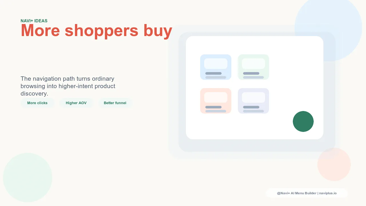
Tier-Based Navigation as a Motivation Mechanism
For programs with Bronze, Silver, Gold (or equivalent) tier structures, navigation that surfaces tier status and progress creates a motivating display effect that drives upgrade behavior. Showing a member "Gold Member — 200 pts to Platinum" in the Account Tab Bar or Mega Menu turns their current tier into both a status signal and a progress nudge.
The psychology here is well-established: people are more motivated to complete a goal when they can see their progress toward it. A member who knows they're 200 points from Platinum and that Platinum includes free shipping on all orders has a concrete reason to make the next purchase sooner rather than later, and perhaps to increase the order value to reach the threshold faster. Navigation that makes this progress visible — rather than requiring the member to log in and navigate to a status page — turns every session into a potential tier-upgrade opportunity.
Tier display in navigation also functions as status reinforcement for members who have already reached a top tier. Seeing "Gold Member" in the navigation on every visit confirms the status and reinforces the identity association that makes top-tier loyalty members some of the highest-retention segments in any program.
The Referral Link in Navigation
Loyalty programs with referral components represent an acquisition channel that is often underutilized because the referral mechanism is hard to find. A member who would gladly refer a friend — especially if they receive points for doing so — may not remember the referral program exists between email campaigns.
Adding a "Refer & Earn" link to the Slide Menu or Mega Menu, positioned near the top of the loyalty navigation cluster, converts loyal members into an active acquisition channel. The link surfaces the referral opportunity during sessions when the member is already engaged, rather than waiting for an email to prompt the behavior. Members who refer actively tend to be higher-retention themselves — the act of recommending a store reinforces their own commitment to it. Referral navigation is therefore both an acquisition mechanism and a retention signal.
What Happens When Loyalty Navigation Is Invisible
The cost of invisible loyalty navigation compounds over time. Redemption rates below 40% are a consistent indicator that the program lacks navigation visibility — members are enrolling but not being reminded to engage. Member retention weakens because the emotional payoff of the loyalty relationship never materializes: the points are there, but the satisfaction of using them isn't. And the program's economics deteriorate: it costs money to issue points, operate the platform, and send loyalty emails, but if the navigation doesn't close the loop, the repeat purchase lift that justifies those costs doesn't materialize.
The program becomes a liability that looks like an asset on the dashboard — membership numbers are up, points issued are up — while the actual outcome the program was designed to produce (repeat purchases driven by reward anticipation and redemption) underperforms. Loyalty navigation is the mechanism that converts a running program into a functioning loyalty loop.
| Metric | Loyalty with strong navigation integration | Loyalty with no navigation integration |
|---|---|---|
| Member Redemption Rate | 55–70% | 25–40% |
| Repeat Purchase Rate (enrolled members) | High — members return because rewards are top of mind | Moderate — members return for product reasons, not program reasons |
| Program ROI | Positive — repeat purchase lift justifies program cost | Marginal or negative — program costs without behavioral lift |
How Navi+ Supports Loyalty Navigation
Navi+ provides the specific navigation placements that make loyalty programs visible where visibility matters:
Account Tab Bar slot gives logged-in members persistent one-tap access to their points balance, tier status, and redemption options on every session — no scrolling, no searching, always visible.
FAB for reward announcements surfaces time-sensitive loyalty messages — double-points events, bonus earn promotions, redemption reminders — directly in the interface during sessions when members are making purchase decisions, without waiting for an email to be opened.
Mega Menu member display shows logged-in members their current points balance or tier status in the Mega Menu header, making the loyalty program passively visible on every menu interaction during a desktop session.
Together, these placements ensure that loyalty program members encounter their rewards status throughout every session — not just when they happen to visit the account dashboard — and that the behavioral nudges the program is designed to deliver actually reach members at the moments when they change purchase decisions.
Try it free — no code, no developer needed
Install in minutes on Shopify, WordPress, or any website.