

Every Store Has Price-Sensitive Visitors — the Question Is How to Serve Them
Price sensitivity is not a niche segment. Across virtually every product category and price tier, a meaningful share of visitors arrive with value as a primary purchase criterion. Some are comparison shopping across several stores and will buy from whichever offers the best combination of price and confidence. Others are specifically deal-motivated — they arrived because of a promotional email, a "brand name + sale" search query, or a social post about a bundle offer. Still others are full-price buyers who nonetheless check the sale section before committing to a purchase at full price.
The instinct of many brand-conscious store operators is to minimize price-oriented navigation — to avoid signaling that the store competes on price. This instinct is understandable but leads to a navigational failure: price-sensitive visitors who can't quickly find a sale, bundle, or clearance path don't patiently browse the full-price catalog. They leave. They came with value as a frame, and if the navigation doesn't speak to that frame within the first few seconds, they conclude that this store isn't for them and move on.
The real design challenge is not whether to serve price-sensitive visitors, but how to do so without making value-seeking the dominant signal in the navigation experience for visitors who arrived without that frame.
How Price-Sensitive Visitors Navigate
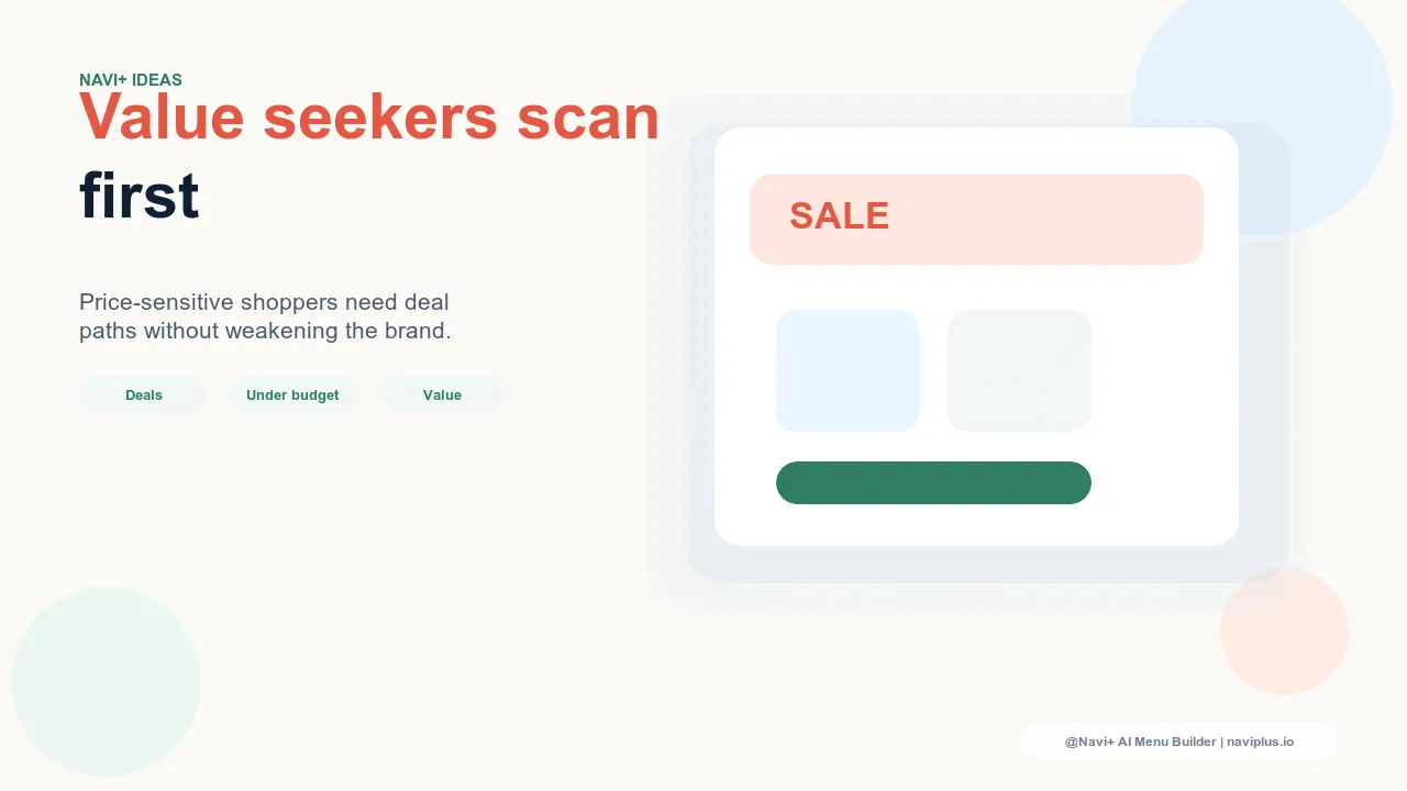
Price-sensitive visitors follow a predictable navigation pattern: they scan for the value entry points first. In the Tab Bar, they look for a "Sale," "Deals," or "Bundles" tab. In the Mega Menu, their eye moves to the columns or labels that signal discounts or savings. In the Slide Menu, they scroll quickly looking for a section header that reads "Sale," "Clearance," or "Bundle & Save." If they find it, they follow it. If they don't find it within a few seconds, the majority leave rather than browsing the full-price catalog in search of value.
This behavior is documented clearly in session recording data: price-motivated visitors show much lower dwell times on full-price category pages and much higher exit rates when a sale or bundle section is not immediately accessible. The value scan happens fast — often within the first two to three seconds of arrival — and the navigation either passes or fails it in that window.
Understanding this pattern reveals the design opportunity: price-sensitive visitors don't need the entire store to be organized around value. They need a clear, accessible path to the value content that exists. Once they find it, they convert at high rates — bargain-motivated visitors in a sale or bundle section often outperform the average conversion rate of the full-price catalog.
"We added a 'Bundle & Save' tab to our Tab Bar alongside our core category tabs. It took less than a minute to configure in Navi+. Within the first week, bundle page sessions more than doubled — and the visitors who went through the bundle tab converted at nearly twice our store average. They were already in a value mindset and the bundles met them there."
— A Navi+ customer, home goods brand
The Containment Principle: A Dedicated Path, Not a Dominant Signal
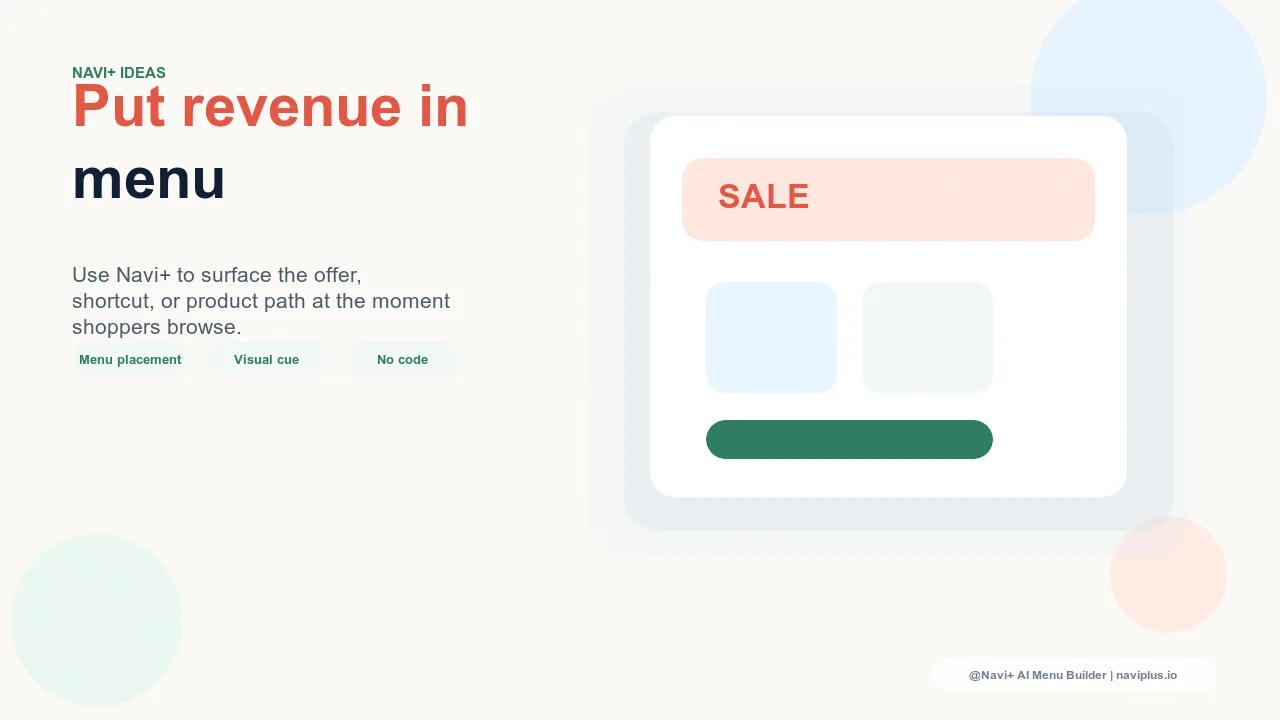
The solution that serves both price-sensitive visitors and brand positioning is what can be called the containment principle: give value-seeking visitors a dedicated, efficient navigation path while ensuring that path is proportionate rather than dominant in the overall navigation hierarchy.
Containment means that "Sale," "Bundles," and "Clearance" exist as real, discoverable navigation destinations — but they occupy one slot among several, not the most prominent position in the layout. A visitor who is looking for value finds it quickly. A visitor who arrived to browse a specific category or editorial collection encounters that content first, and notices the sale option as one of several available paths rather than as the defining identity of the store.
This is a navigational balance, not a compromise. Both segments get what they came for. Neither segment's experience is degraded by serving the other. The store neither hides its value offerings nor leads with them as its primary identity.
Tab Bar Design for Mixed Audiences
The Tab Bar is the most prominent persistent navigation element on mobile — visible on every page, always in view. Its slots represent the store's navigational priorities in their most concentrated form. For a store serving a mixed audience, the Tab Bar configuration communicates a lot about brand positioning before a visitor has read a single product description.
A Tab Bar with five slots — Home, Shop, New Arrivals, Bundle & Save, Account — gives price-sensitive visitors a clear, permanent entry point to value content while placing it in equal proportion with full-price category access, new arrivals (a premium signal), and account functionality. No single slot dominates. The "Bundle & Save" tab serves the price-sensitive visitor without telling the full-price visitor that this is a discount store.
Contrast this with a Tab Bar where two of five slots are value-oriented ("Sale" and "Deals"), or where the value slot is the first item in the bar. Both configurations weight the navigation toward a discount identity in a way that full-price visitors notice and internalize — even if they don't consciously register it.
Language Choices That Serve Both Segments
The words used in value-oriented navigation links carry significant brand signal. The same destination can be labeled in ways that preserve quality perception or in ways that undermine it, and price-sensitive visitors can find the destination either way — the difference is in what the label communicates to everyone else who sees it.
"Best Value" instead of "Cheapest." Value is a quality signal as much as a price signal — it implies that something is worth what it costs, or worth more. "Cheapest" is a pure price signal that anchors the perception of the entire product category downward.
"Bundle & Save" instead of "Discount." Bundling is a curation signal — it implies that products have been thoughtfully paired together for a purpose. "Discount" implies that the price has been reduced from a real price, which is accurate but carries a clearance-rack connotation that undermines premium positioning.
"Members-Only Pricing" instead of "Sale." For stores with loyalty programs or email subscriber lists, framing discounted pricing as exclusive access rather than a general sale preserves the full-price value of the standard catalog while giving price-motivated visitors a path to better pricing through a value-exchange mechanism.
These language choices are low-effort to implement and high-impact in how they shape the store's navigational identity for visitors who are not specifically value-seeking.
What Not to Do: Value-Dominant Navigation
The failure mode on the opposite end of the spectrum from hiding value content is making price-based navigation dominant — a large "SALE" link treated as primary navigation, sale content featured before editorial collections in every menu, or an entire Tab Bar organized around discount categories. This configuration serves price-sensitive visitors efficiently but sends an unambiguous signal to every other visitor: this is a discount store.
The brand positioning consequences of value-dominant navigation are not superficial. Premium buyers, who are often the highest-margin segment, are especially sensitive to discount signaling — they interpret prominent sale navigation as evidence that full-price products are overpriced relative to their true market value. Once this perception sets in, it is difficult to reverse. Visitors begin to wait for sale periods rather than buying at full price, the proportion of full-price transactions decreases, and the store finds itself in a dynamic where it needs perpetual promotions to maintain volume.
Value-dominant navigation also affects the quality of the traffic the store attracts over time. Algorithmic content distribution and word-of-mouth recommendation both respond to the signals a store sends — a store that leads with sale content attracts more price-sensitive visitors, which reinforces the discount positioning, which attracts more price-sensitive visitors. Breaking out of this cycle requires deliberate navigation design choices before the pattern is established.
The Slide Menu as the Right Home for Value Content
The Slide Menu — the comprehensive navigation drawer that expands to show the full catalog structure — is the natural home for value-oriented navigation that serves price-sensitive visitors without imposing itself on every casual browser. A visitor who opens the Slide Menu is actively navigating; they're looking for something specific and are willing to scan a more complete list of options to find it. This is exactly the behavior pattern of a price-sensitive visitor who is doing a value scan.
Including "Sale," "Bundle & Save," and "Clearance" as clearly labeled sections in the Slide Menu — perhaps grouped under a "Deals" section header — ensures that the price-sensitive visitor who opens the menu finds what they're looking for efficiently. The Slide Menu doesn't impose this content on visitors who haven't opened it, which means it doesn't function as a brand-defining signal for the casual browser the way a Tab Bar slot or a Mega Menu column does.
For stores where value navigation is important but shouldn't be the headline, Slide Menu placement is often the right primary location — supplemented by a single Tab Bar slot for mobile visitors who rely on the Tab Bar for primary navigation.
Mega Menu for Premium and Value Balance
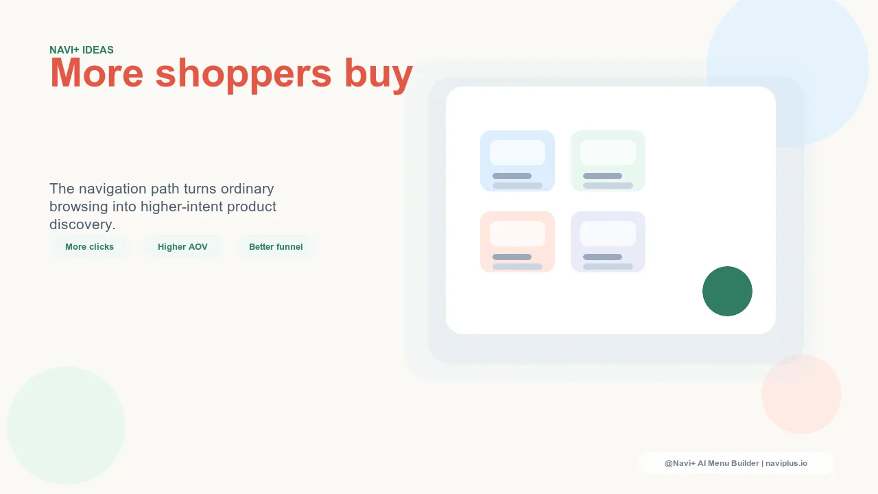
In a Mega Menu with multiple columns, column placement and ordering communicate priority. A Mega Menu that places editorial collections and featured products in the first two columns — with a "Deals" or "Bundle & Save" column on the right side — signals a store that leads with product quality and curation while making value content clearly accessible to visitors who look for it.
Adjacent columns in a Mega Menu create a comparison effect: visitors see both the premium editorial content and the value options in the same view. For full-price buyers, this adjacency signals range — the store has depth across price points and curation styles. For price-sensitive visitors, it makes the value column immediately visible without requiring additional navigation steps. The same configuration serves both segments' needs through layout rather than requiring different navigation experiences.
What to avoid in Mega Menu configuration is leading the first column with sale or discount content — the first column is what every visitor sees first when the menu opens, and leading with discounts defines the store's primary navigational identity as value-oriented regardless of what the subsequent columns contain.
Navigation That Balances Premium and Value
| Navigation Approach | Price-Sensitive Visitor Satisfaction | Premium Visitor Perception | Brand Positioning Signal |
|---|---|---|---|
| Value content hidden (footer, buried subcategory) | Low — value path not found, visitor leaves | Neutral — no discount signal | Incomplete — abandons a real segment |
| Value-dominant navigation (SALE as primary nav) | High — value path immediately visible | Negative — reads as a discount store | Discount-oriented — repels premium buyers |
| Balanced navigation (Navi+ Tab Bar + Slide Menu) | High — dedicated slot and menu section | Positive — premium content leads | Full-range — serves both segments well |
| Mega Menu with editorial-first + value column (Navi+) | High — value column visible on menu open | Strong — editorial leads, value is additive | Premium with range — strongest positioning |
The stores that navigate this balance most effectively treat it as an ongoing configuration task rather than a one-time setup decision. Price sensitivity varies by season, promotion cycle, and traffic source mix — a navigation configuration optimized for a sale period may be overweighted toward value content during a new-product launch period. Navi+ makes these adjustments fast enough that they can track the actual state of the store's inventory and promotional calendar rather than being set once and left in place.
Try it free — no code, no developer needed
Install in minutes on Shopify, WordPress, or any website.