

The Psychology of Always-Visible Cart Access
The moment a visitor adds a product to cart, they've made a micro-commitment. Behavioral economics research consistently shows that people who have taken an initial step toward a goal are more likely to complete it — but only if the path to completion remains easily visible and accessible. When that path disappears — when the cart icon scrolls off the screen and accessing it requires scrolling back to the top — the micro-commitment weakens with each scroll. Out of sight doesn't just mean out of mind; it measurably reduces the likelihood of checkout completion.
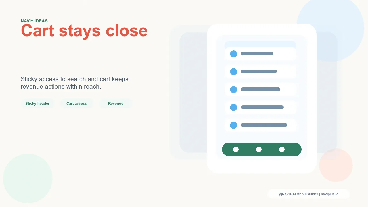
A sticky header — one that remains fixed at the top of the viewport as the visitor scrolls down — keeps cart access persistently visible. The cart icon, cart item count, and the path to checkout are always present, regardless of how far down the page the visitor has scrolled. This persistent access has a well-documented effect on conversion: stores that implement sticky headers with visible cart access see measurably higher cart-to-checkout rates, particularly on long-scroll pages like product pages with detailed descriptions or category pages with many products.
"Our products have detailed descriptions — buyers need to read through ingredient lists, usage instructions, and certifications before they're comfortable buying. Our product pages scroll long. Before we had a sticky header, we saw a significant drop-off between add-to-cart and checkout. With Navi+'s sticky header in place, that drop-off narrowed considerably. Keeping the cart visible while they read made a real difference."
— A Navi+ customer, natural supplements brand
Why Standard Shopify Headers Often Scroll Away
Most Shopify themes include a standard (non-sticky) header by default. When a visitor scrolls down, the header — and with it the navigation, search bar, and cart icon — disappears from view. The theme may include a "sticky on scroll-up" option where the header reappears when the visitor scrolls back up, but this is not the same as always-visible: it requires the specific action of scrolling upward to re-engage with cart and navigation.
Some premium themes include sticky header options, but the implementation quality varies. Some sticky headers are visually heavy — a full-height header that occupies significant screen real estate while scrolling. Others are thin but omit the cart icon or cart item count, providing navigation access without checkout reinforcement. The optimal sticky header configuration is compact (minimal vertical space), always visible, and includes the cart with an item count that updates when products are added.
The Tab Bar as Mobile's Answer to the Sticky Header
On desktop, the sticky header achieves persistent navigation and cart access through a fixed top bar. On mobile, the ergonomics are different: a sticky top header on mobile occupies precious vertical space on a small screen and puts cart access in a corner that requires a grip shift to reach. The mobile equivalent of the sticky header — providing the same always-visible, always-accessible navigation and cart access — is the bottom Tab Bar.
A Tab Bar that includes a cart slot delivers the same persistent cart access that a sticky header provides on desktop, but in a thumb-accessible location that doesn't compete with page content for screen real estate. The combined effect of a sticky header on desktop and a Tab Bar with cart access on mobile is persistent checkout reinforcement across both device types — keeping the path to purchase visible at every scroll depth, on every device, throughout every session.
| Navigation Pattern | Cart Visibility While Scrolling | Impact on Cart-to-Checkout Rate |
|---|---|---|
| Standard scrolling header | Disappears on scroll down | Baseline — path to cart is hidden |
| Sticky header, no cart icon | Header visible, cart not shown | Marginal improvement |
| Sticky header with cart + count | Cart always visible with item count | Measurably higher checkout initiation |
| Mobile Tab Bar with cart slot (Navi+) | Cart always visible, thumb-accessible | Higher mobile cart-to-checkout rate |
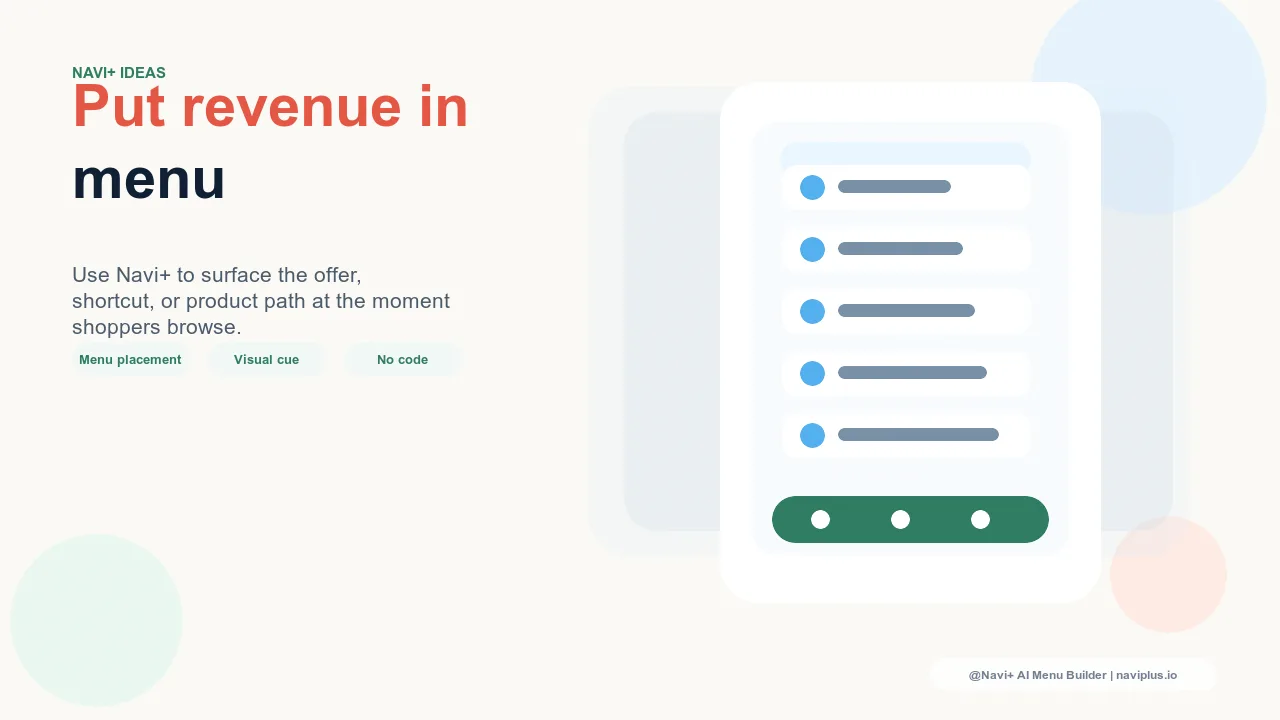
Configuring for Maximum Cart Visibility
The optimal configuration combines Navi+'s sticky header on desktop — compact, always-visible, with a cart icon that shows item count — with a mobile Tab Bar that includes a dedicated cart slot. This covers both device types with the right ergonomic pattern for each: a persistent top bar on desktop, a persistent bottom bar on mobile.
The cart slot in the Tab Bar should always display the current item count when the cart is non-empty. A visual indicator that says "2 items in cart" serves as a purchase intent reminder — every time the visitor's thumb passes over the cart tab, they're reminded that they have products waiting. This reminder effect is subtle but cumulative: across a browsing session, the visual presence of a non-empty cart gently reinforces the decision the visitor already made when they added the first item.
Navi+ installs in minutes. Sticky header and Tab Bar cart configuration are available immediately after setup, with no code changes required.
Try it free — no code, no developer needed
Install in minutes on Shopify, WordPress, or any website.