

The Subscription Discovery Problem
Subscription products are among the highest-value items a store can sell. A subscriber who renews three times over a year delivers three to four times the lifetime revenue of a customer who buys once. Despite this, most Shopify stores treat subscription products as a payment option rather than a product category — burying them in the same navigation as one-time purchases, with no dedicated placement, no differentiated label, and no visible signal that a subscription exists at all.
The result is a predictable discovery failure. A visitor searching for a product finds the one-time purchase option first — it's what the navigation surfaces. If a subscription variant exists, they may encounter it on the product page after they've already anchored to the individual purchase price. In many stores, the only mention of a subscription is a small note in the product page purchase widget, below the fold, discovered only by visitors who are already committed enough to scroll that far. Many visitors never see it at all.
The stores generating serious recurring revenue from subscriptions don't have better subscription programs — they have better subscription navigation. When subscriptions have dedicated navigation placement, they are discovered by visitors who were planning to buy one-time but are open to the subscription model once it is clearly presented and positioned as a value upgrade, not an afterthought.
"We had a subscribe-and-save program that was essentially invisible. The only way to find it was to land on a product page and notice the purchase option toggle — which most visitors skipped. We added a Subscribe & Save Tab Bar slot and a dedicated Mega Menu column. In the first 90 days, subscription sign-ups doubled. The program hadn't changed at all. The navigation had."
— A Navi+ customer, health and nutrition brand
Where Subscription Navigation Works
Subscription products benefit from navigation placement at every level of the menu hierarchy. The most effective configurations with Navi+ AI Menu Builder are:
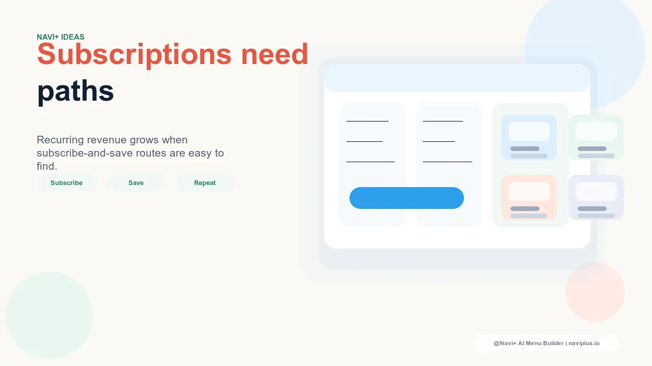
Dedicated "Subscribe & Save" Tab Bar slot. A persistent Tab Bar entry labeled "Subscribe & Save" gives subscription products a permanent, always-visible entry point at the top of every page. Visitors who wouldn't otherwise know a subscription program exists are exposed to it from the first moment they engage with navigation — not after they've already committed to a one-time product page. This is the highest-impact single navigation change for stores with a subscription offering.
Mega Menu "Subscribe & Save" column. For stores with category-level Mega Menu panels, a dedicated subscription column within each relevant category panel surfaces subscription-eligible products alongside their one-time purchase equivalents. A visitor browsing the skincare category encounters the skincare subscription option in context — at the moment they're actively evaluating products, before they've committed to a specific item or purchase type. This contextual placement converts browsers to subscribers before they reach the product page.
Subscription-filtered collection page. Navigation that leads to a collection page filtered to subscription items creates a deliberate subscription browsing experience. Visitors who click "Subscribe & Save" arrive at a curated view of everything available on subscription, with each product's subscription terms clearly displayed. This reduces the cognitive load of discovering which products have subscription options — the collection page does that work for them.
The Psychology of Subscription Navigation
How subscription access is framed in navigation has a measurable effect on how visitors perceive the subscription offer. Two navigation labels point to the same subscribe-and-save program but produce different conversion outcomes:
"Subscribe & Save" frames the subscription as a payment mechanism — a way to pay less. It is accurate and widely understood, but it positions the subscription as a financial transaction optimization rather than an elevated product experience.
"Members" or "Member Pricing" frames subscription access as a privilege. Navigation that reads "Members get 20% off every order" positions the subscriber as someone who has joined a preferred tier, not someone who set up auto-billing. This framing increases the perceived value of the subscription — the visitor is evaluating membership access, not evaluating a payment option. For subscription programs with genuine loyalty benefits (exclusive products, early access, free shipping), membership framing in navigation consistently outperforms transactional framing.
The navigation label is the first impression visitors have of your subscription program. It is worth testing deliberately, not defaulting to whatever language the subscription app uses by default.
Subscription-Only Products Deserve Prominent Placement
Some stores offer products that are only available on subscription — either because the product economics only work at recurring volume or because the product is designed as a sustained-use program (a 90-day course, a monthly curated box, a replenishment service). These products occupy a fundamentally different position in the product catalog: they are not a variant of a one-time purchase; they are a distinct offering with no one-time alternative.
Subscription-only products are frequently treated as a niche product type and placed deep in navigation hierarchies — a subcategory under a broader category, or a separate page linked from a banner. This placement makes no sense when these products are often high-margin, high-retention items that represent the most valuable acquisition in the store.
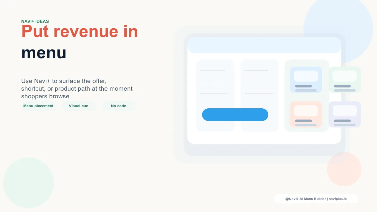
With Navi+ AI Menu Builder, subscription-only products should be surfaced as top-level navigation destinations — a dedicated Mega Menu item, a Tab Bar slot, or a featured column in a high-traffic category panel. The discovery path for a subscription-only product should not require visiting a specific product page. Visitors should be able to find and evaluate the subscription offering from navigation, before they've committed to exploring individual products.
Managing Subscription and One-Time Navigation Together
Most stores offer both subscription and one-time purchase options for the same products. The navigation challenge is presenting both options without creating confusion about which products are available on which terms — while still emphasizing the subscription option for its higher lifetime value.
The most effective hybrid approach leads all product navigation to collection pages, not individual product pages. Collection pages that clearly label subscription-eligible products — with a "Subscribe & Save" badge on product cards — allow visitors to browse normally while making the subscription option discoverable in the product grid rather than only on individual product pages.
Within the navigation itself, the hybrid approach means maintaining separate navigation paths: standard category navigation for visitors who want to browse by product type, and a dedicated "Subscribe & Save" path for visitors who want to understand and evaluate the subscription program. These two paths serve different visitor intents and should not be collapsed into a single navigation structure that tries to serve both simultaneously.
The "Manage My Subscription" Navigation Entry
Subscription navigation isn't only for acquisition — it matters for retention too. Existing subscribers need periodic access to their subscription management portal: to pause, skip, change frequency, update payment information, or add products. If this portal is hard to find, subscribers who encounter friction in managing their subscription are more likely to cancel rather than adjust.
A "Manage Subscription" navigation entry — visible to logged-in subscribers, positioned in the account or utility navigation area — reduces the support volume associated with subscription management and reduces cancellations that stem from frustration in finding the management interface. Subscribers who can effortlessly access their subscription settings are more likely to pause or modify than to cancel. The navigation link that saves a subscription from cancellation is one of the highest-ROI navigation elements in the store, measured purely by recurring revenue preserved.
Measuring Subscription Navigation Contribution
Navigation changes for subscription products are measurable in the same way any navigation change is measured — by tracking what percentage of new subscriptions originate from a navigation entry point versus arriving at a product page directly.
Stores that add dedicated subscription navigation consistently find that a meaningful share of new subscriptions — often 30 to 50 percent — trace their session origin to a navigation click on the subscription entry point. Without the navigation entry point, those subscriptions would not have occurred: the visitor would have purchased one-time or exited without purchasing, because the subscription option was not visible in their browsing path.
To measure this, track sessions that include a click on the subscription navigation element and segment new subscriber orders by whether that session included a subscription navigation click. The difference between the subscription conversion rate for sessions that engaged subscription navigation versus sessions that did not is the most direct measure of subscription navigation contribution. For most stores that implement dedicated subscription navigation for the first time, this contribution is significant enough to justify the navigation configuration effort within the first billing cycle of subscriber data.
| Navigation Approach | Subscription Discovery Rate | Subscriber Conversion Rate | Revenue per Session |
|---|---|---|---|
| Subscription hidden — only visible on product page toggle | Very low — requires reaching a specific product page | Below potential — most visitors never see the option | One-time purchase average only |
| Subscription-prominent navigation (Navi+) | High — discoverable from any page via Tab Bar or Mega Menu | Substantially higher — subscription framed as a destination, not a toggle | Higher — recurring subscribers acquired in addition to one-time buyers |
Try it free — no code, no developer needed
Install in minutes on Shopify, WordPress, or any website.