

Why Navigation Is an Underused Urgency Surface
The psychology of urgency in e-commerce is well established: when visitors believe that what they want might not be available, or that a favorable price won't last, they are more likely to act now rather than defer. This mechanism is the engine behind countdown timers, low-stock notifications, limited-time pricing banners, and flash sale announcements. Stores invest significantly in placing these signals on product pages, in pop-ups, and in promotional emails — and see real conversion lifts as a result.
But navigation is a surface that carries urgency signals to every page of the store, and most stores don't use it that way. The Tab Bar is visible on every page. The Slide Menu is available everywhere. The Floating Action Button is persistent across sessions. These components appear before the visitor has reached a product page, creating an opportunity to prime urgency awareness earlier in the session — at the navigation level, before the visitor has even chosen what to look at. The stores that use navigation as an urgency signal surface compound their conversion tools rather than concentrating all urgency communication in one place.
"We run a monthly 48-hour sale on a rotating product category. We used to rely entirely on a homepage banner and an email blast. When we added a 'Sale — Ends Sunday' label with an accent red background to the Tab Bar during the sale window, revenue from the sale period went up by about 28% compared to our average for that type of sale. The Tab Bar was visible the moment anyone opened the site, and it communicated 'this is time-limited' before they saw anything else. That early signal changed how visitors navigated — they went to Sale first instead of browsing first."
— A Navi+ customer, lifestyle and wellness brand
Urgency Signals That Work in Navigation
Urgency in navigation operates differently from urgency on product pages. Navigation urgency is category-level rather than product-level — it communicates "this area of the store has time-sensitive value" rather than "this specific product is running out." The most effective navigation urgency signals:
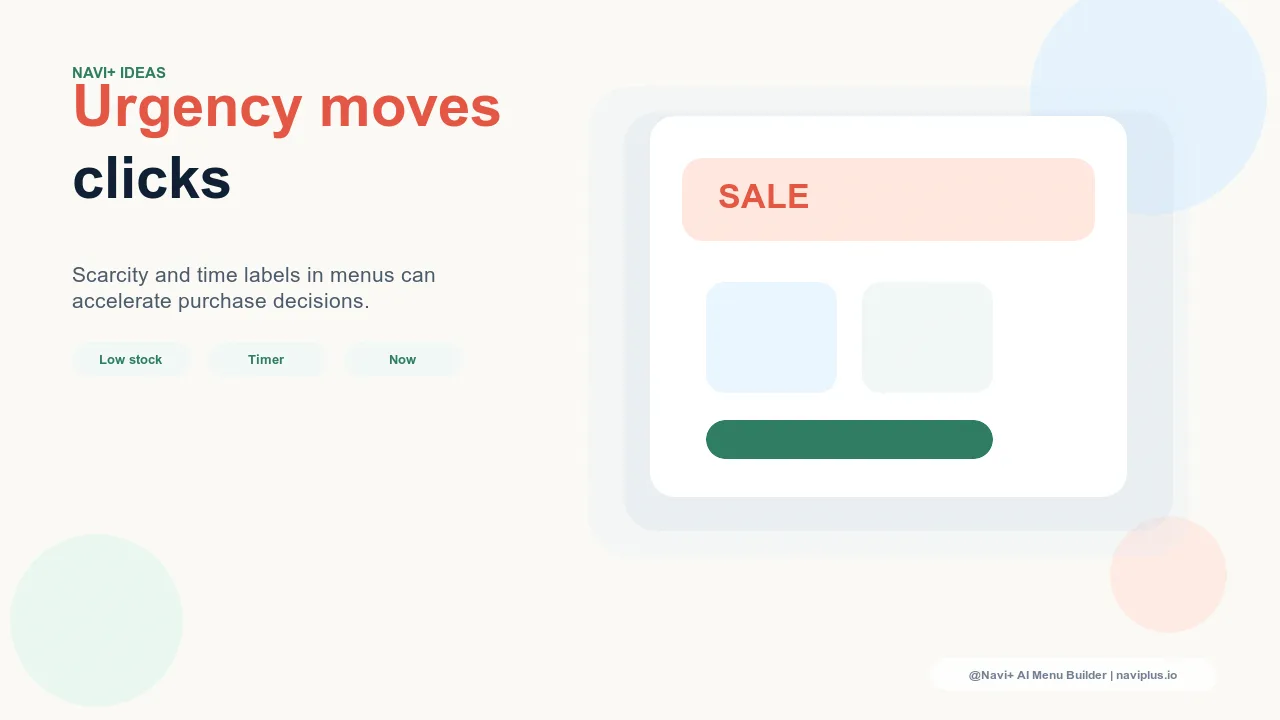
Accent-colored sale or limited-time labels in the Tab Bar. A Tab Bar slot for "Sale" or "Ends Tonight" in an accent color (red, orange, or a high-contrast brand color) is immediately visible on every page. The color differentiation communicates that this destination is different from the regular navigation — it has heightened salience. Visitors who might not have clicked on a neutral "Sale" label will click on an accent-colored one because the visual signal pre-communicates that this is worth seeing. The label should be specific enough to imply time limitation: "Sale — Ends 48h" outperforms "Sale" in click rate because it adds a reason to act now.
Promotional banners in the Slide Menu header. The header area of the Slide Menu — the first thing visible when the menu opens — is prime real estate for time-limited messaging. A thin banner reading "Free shipping ends midnight" or "Last 24 hours: 20% off sitewide" communicates the urgency to every visitor who opens the Slide Menu, regardless of which category they came to browse. This placement reaches visitors who are actively engaged with navigation — a higher-intent state than passive browsing — making urgency messaging here more effective per impression than homepage banners seen by lower-intent visitors.
Featured links with countdown-style labels in the Mega Menu. For desktop visitors using a Mega Menu, a featured link column labeled "Limited Time" or "This Weekend Only" with a curated selection of promotional products creates a dedicated urgency surface within the navigation. Visitors browsing a specific category through the Mega Menu encounter the promotional column while navigating, creating an additional urgency touchpoint without interrupting their primary browsing behavior.
Floating Action Button pointing to the current promotion. The FAB is the highest-visibility element in mobile navigation — it floats above all content and is always accessible. During a sale or limited-time promotion, configuring the FAB to point directly to the promotional collection (rather than its default destination) creates a persistent entry point to the promotion on every page. The FAB's visual weight, combined with the urgency label on the promotional landing page, creates a two-step urgency signal that follows the visitor throughout their session.
| Urgency Signal Location | Visitor Reach | Best For |
|---|---|---|
| Accent-colored Tab Bar slot | Every page, every visitor | Sitewide sales, flash sales, time-limited events |
| Slide Menu header banner | Every visitor who opens the menu | Free shipping thresholds, loyalty bonuses, promo codes |
| Mega Menu featured column | Desktop visitors using Mega Menu | Category-specific promotions for large catalogs |
| FAB redirect to promotion | Mobile visitors on every page | New product drops, 24-hour flash sales |

The Principle of Proportionate Urgency
Urgency signals in navigation work because they are relatively rare — the navigation is usually calm and informational, so a time-limited accent label stands out. If every Tab Bar slot has an accent color, none of them communicate urgency; they communicate chaos. The principle of proportionate urgency says: reserve visual emphasis in navigation for genuinely time-limited events, keep the rest of the navigation calm, and the contrast between the two creates the urgency signal. One accent-colored label in a four-slot Tab Bar is salient precisely because the other three slots are neutral. Navi+'s individual slot color configuration makes this restraint easy to implement — you can accent one element without touching the others, preserving the contrast that makes urgency communication work.
Try it free — no code, no developer needed
Install in minutes on Shopify, WordPress, or any website.