

The Problem
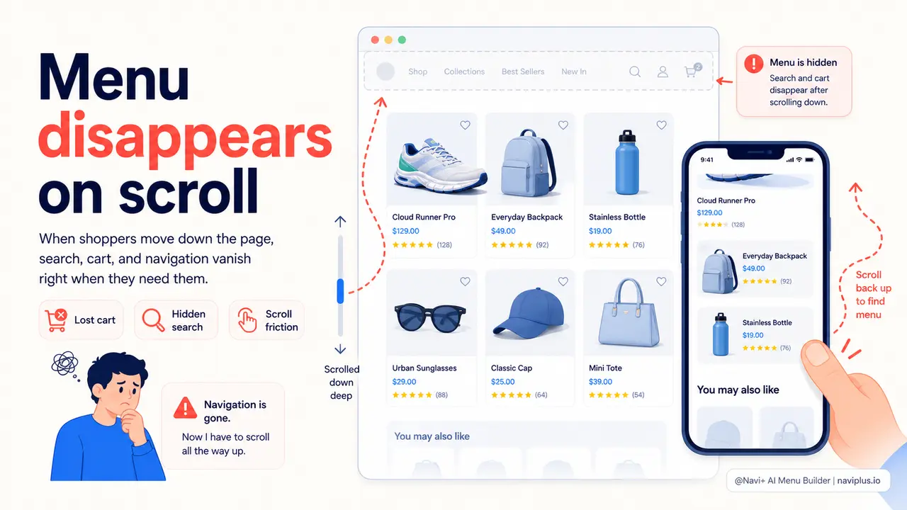
A shopper lands on your store after clicking an ad. They scroll through the product images, read the description, check a few reviews. At some point — halfway down the page, deep in the review section — they want to explore another category. They look for the menu. It's gone. The header disappeared when they scrolled past it, and now there's no way to get anywhere without scrolling back to the top.
On desktop this is an inconvenience. On mobile, it's a conversion killer. Phones have small screens, long pages, and impatient users. The moment a visitor decides they want to go somewhere else and realizes they can't do it from where they are, you've introduced friction at exactly the wrong time. Many visitors will close the tab rather than hunt for the menu.
The cart icon disappears with the header too. So does your search. A visitor who wanted to compare two products — or add a second item to the cart — has to scroll all the way up first. That interruption breaks the purchasing flow. The impulse to buy cools. The sale is lost.
"I watched a session recording where a customer spent three minutes on a product page, clearly reading and engaged, then spent another thirty seconds scrolling up and down looking for the cart. They left without buying. The cart icon was right there — just hidden. That one session recording changed how I thought about navigation."
— A Navi+ customer
Friction at the moment of decision costs more than you think
Navigation accessibility isn't an aesthetics question — it's a revenue question. Shoppers make purchasing decisions at unpredictable moments during a browsing session. When the cart, search, and menu are only available at the top of the page, you're forcing every visitor to scroll up before they can act on a decision. Here's where that friction shows up in your numbers:
- Impulse purchases die mid-scroll. The impulse to buy something is a moment. If the cart icon isn't visible when that moment happens, the visitor has to take additional steps — and each step gives them time to reconsider.
- Cross-sells get skipped. A visitor reading about one product who wants to check another category will leave the page entirely rather than scroll up to navigate. That's a missed upsell on every single session where this happens.
- Search gets abandoned. Visitors who can't immediately find what they want on the current page often try the search bar. If it's not visible, many give up rather than scroll back to find it. They leave and find a competitor's store instead.
- Mobile bounce rate rises. Long-scroll product pages on mobile — with no accessible navigation — feel like a dead end. The back button becomes the default escape route.
- Repeat visitors lose trust. Someone who has been to your store before expects navigation to work like an app. If scrolling down means losing the menu, the store feels unpolished and untrustworthy. Brand perception suffers alongside conversion rate.
How Navi+ AI Menu Builder solves this
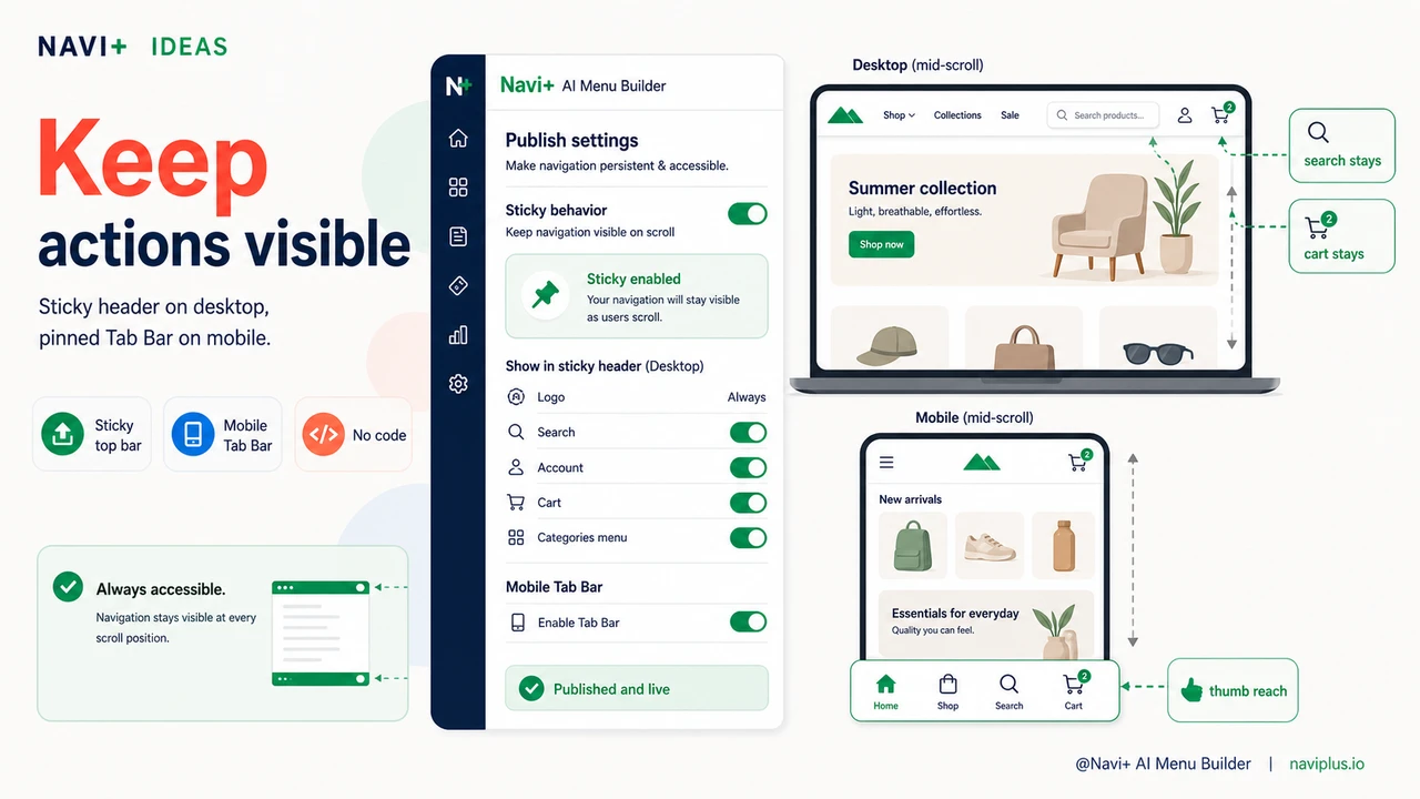
Navi+ gives you persistent navigation that stays on screen regardless of scroll position. For desktop, the header locks in place as a sticky top bar the moment a visitor starts scrolling — with a smooth slide-in that doesn't interrupt reading. The logo stays visible. The cart stays visible. Search stays visible. On mobile, the Tab Bar pins permanently to the bottom of the screen — always within thumb reach, never disappearing.
Setup takes minutes, not days. In the Navi+ dashboard, go to Publish settings and enable sticky behavior for your navigation. You control exactly which elements appear in the sticky bar — cart icon, search icon, account link, category shortcuts — and you style them to match your brand without writing CSS. The Tab Bar for mobile is a separate menu type you configure independently: choose your icons, set your destination URLs, pick your colors, and publish. Both work simultaneously: sticky top bar on desktop, Tab Bar pinned at the bottom on mobile.
For stores with a large catalog, you can also pair the sticky nav with a Mega Menu dropdown or a Slide Menu — so visitors have both instant access to key areas (Tab Bar) and deep navigation into all categories (the full menu) without ever losing their place on the page.
| Feature | Default / Without Navi+ | With Navi+ AI Menu Builder |
|---|---|---|
| Navigation visible while scrolling | ✗ menu disappears on scroll | ✓ sticky nav always visible |
| Cart icon accessible at any scroll depth | ✗ only at top of page | ✓ pinned in sticky bar or Tab Bar |
| Search accessible without scrolling up | ✗ requires scroll-up on most themes | ✓ visible at all times |
| Mobile bottom navigation | ✗ not available by default | ✓ Tab Bar pinned to screen bottom |
| Customization without a developer | ✗ requires theme edits or code | ✓ visual editor, no code needed |
| Works across all pages | Inconsistent across templates | ✓ applied globally, every page |
What you get after switching
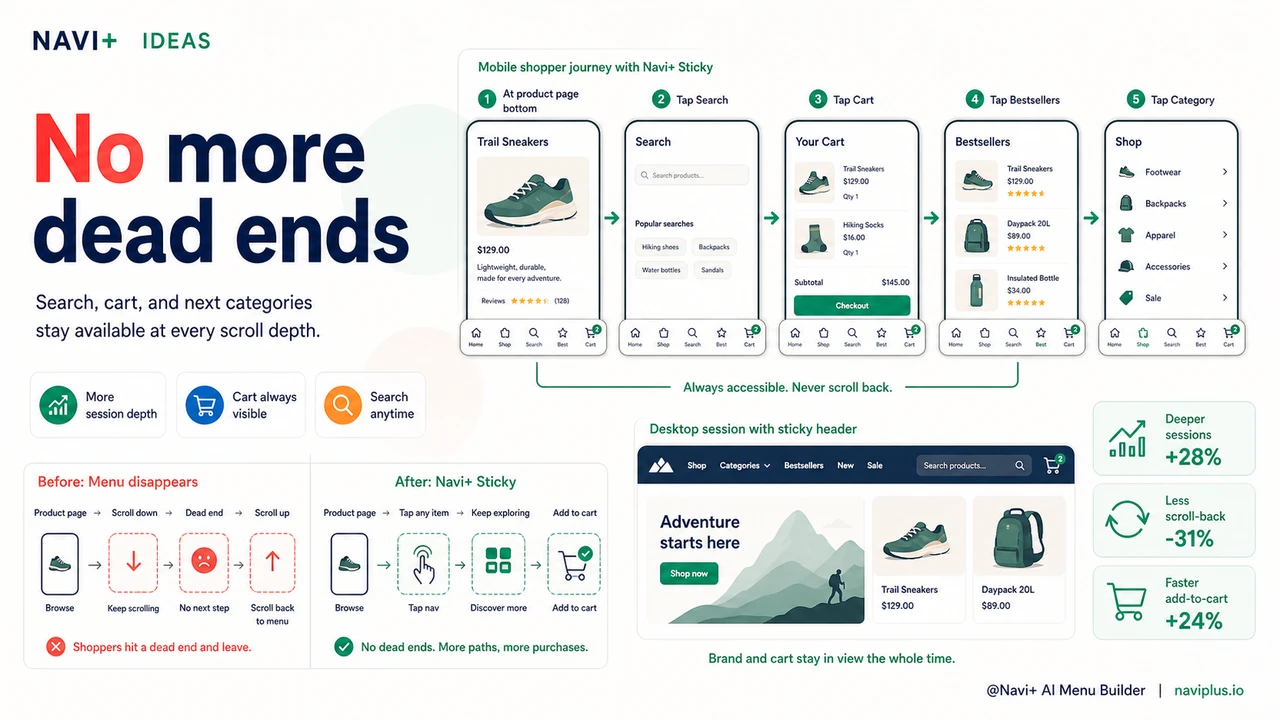
The most immediate effect is on mobile sessions. Once the Tab Bar is in place, visitors no longer dead-end at the bottom of a product page. They tap to the next category, tap to the cart, tap to search — all without scrolling. Session depth typically increases because navigation is no longer a barrier between pages.
On desktop, the sticky header means your brand stays visible throughout the entire shopping session. The cart icon is always in the upper right corner. Add-to-cart actions convert at higher rates when visitors don't have to scroll up to confirm the item was added.
A practical starting point: enable sticky navigation for your existing header menu first, then add a mobile Tab Bar with four links — your most visited category, your bestsellers collection, search, and cart. That combination covers the majority of navigation needs for most stores without overwhelming visitors with options.
Try it free — no code, no developer needed
Install in minutes on Shopify, WordPress, or any website.