

The Problem
Open your store on a phone and pretend you've never seen it before. Your logo is at the top. Next to it, a small hamburger icon. You tap it. A drawer slides in from the side with a list of category names in plain text — no icons, no visual hierarchy, no sense of where you are. You scroll through the list, find nothing that grabs you, and close it. Within ten seconds, you're back on a blank screen with no obvious next step.
That's what your mobile visitors experience every day. The hamburger menu was designed for desktop browsers shrunk down to a small screen. It was never a great solution, and on modern phones it's actively worse than doing nothing — it hides your navigation behind an extra tap, removes any sense of context, and gives no visual reward for opening it. Customers open the menu, see a wall of text, and close it. They don't bounce because your products are bad. They bounce because finding those products requires more effort than they're willing to spend.
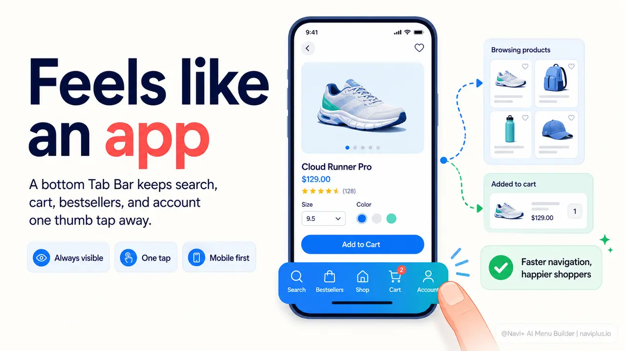
Meanwhile, every app your customers use daily — Instagram, Amazon, Spotify, the banking app — has a Tab Bar at the bottom of the screen. Five icons, always visible, always one thumb-tap away. Customers know what it is. They know how to use it. When your store doesn't have one, it signals something subtle but damaging: this place is harder to navigate than the apps I trust.
The gap your customers feel every time they open your store
"I kept getting lost every time I tried to browse on my phone. The menu was buried behind a hamburger icon and I couldn't figure out how to get back to the main categories without scrolling all the way back to the top. After adding the Tab Bar with Navi+, customers started spending noticeably longer on the site — and I stopped getting 'how do I find X' messages."
— A Navi+ customer
Navigation friction costs more than you think
Poor mobile navigation isn't just a UX inconvenience — it has direct, measurable consequences on your store's revenue. Consider what happens at each stage when a visitor can't find their way:
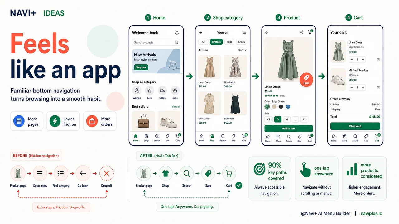
- High bounce rates on mobile. If the first ten seconds don't give a visitor a clear path forward, they leave. A hamburger menu requires a deliberate tap before any navigation is visible. Many visitors never take that tap.
- Low pages-per-session. Every extra step between a shopper and a category page is a drop-off point. Stores with obvious, always-visible navigation see visitors browse more pages per visit — more exposure to products, more chances to convert.
- Cart abandonment before intent forms. A shopper who can't easily return to browsing after adding an item to the cart loses the rhythm of the session. They leave the cart without completing the journey.
- Wasted ad spend. If you're running paid traffic to a store where mobile navigation is confusing, you're paying for clicks that leave within seconds. The ad targeting doesn't matter if the landing experience breaks trust immediately.
- Repeat visitors don't return. The app-like expectation is set by the apps people use every day. A store that feels clunky on mobile doesn't become a habit. Customers who could have returned simply don't.
The irony is that most store owners invest heavily in product photography, copy, and advertising — and leave navigation as whatever the theme defaults to. Navigation is the skeleton of the shopping experience. When it doesn't work on mobile, nothing else can fully compensate.
How Navi+ AI Menu Builder solves this
Navi+ AI Menu Builder gives your store a persistent Tab Bar that sits pinned at the bottom of the screen on mobile — exactly where a native app would put it. It shows up on every page, at every scroll depth, always within reach of the thumb. Visitors don't have to hunt for navigation. They don't have to scroll back to the top. The five most important destinations in your store are visible from the moment the page loads.
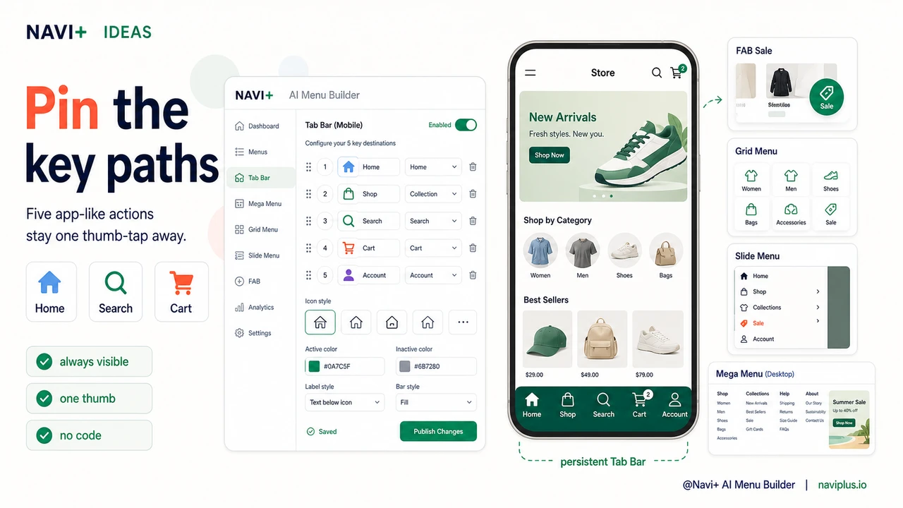
Setting it up takes minutes, not days. In the Navi+ dashboard, you choose which links go in the Tab Bar — Home, Collections, Cart, Search, Account, or any custom page. You select an icon for each tab from a built-in library, pick your brand colors, and publish. No code. No theme modifications. No developer required. The Tab Bar renders on mobile automatically and stays out of the way on desktop, where it's replaced by whichever desktop menu type you've configured — a Mega Menu for large catalogs, a Slide Menu for content-heavy stores, or a standard sticky header for simpler layouts.
Beyond the Tab Bar, Navi+ offers a full toolkit for mobile navigation: a Floating Action Button (FAB) for a single high-priority link like "Shop Sale" or "Book Now," a Grid Menu for visual category browsing with images, and a Slide Menu for stores with deep category trees. Each menu type can be configured to show on specific devices, pages, or URL patterns — so your mobile visitors get a mobile-optimized experience, and your desktop visitors get something entirely different, all from one dashboard.
What default navigation gives you vs. what Navi+ gives you
| Feature | Default / Without Navi+ | With Navi+ AI Menu Builder |
|---|---|---|
| Bottom Tab Bar on mobile | ✗ Not available | ✓ Pinned, always visible, fully branded |
| Navigation visible without tapping | ✗ Hidden behind hamburger icon | ✓ Visible at all times, no tap required |
| One-tap access to key pages | ✗ 2–3 taps minimum | ✓ Single tap from any page, any scroll position |
| Different menus for mobile and desktop | ✗ Same menu shrunk down | ✓ Tab Bar on mobile, Mega Menu on desktop |
| Setup without code or a developer | ✗ Requires theme editing or custom dev | ✓ Visual dashboard, live in minutes |
| Works on Shopify, WordPress, and web | ✗ Theme-dependent, platform-specific | ✓ One tool, all platforms |
What you get after switching
The most immediate change visitors notice is that navigation is always there. They don't have to think about how to get from a product page back to a category. They don't have to scroll up. The Tab Bar is at the bottom, where their thumb already is, and the icon they need is right there.
A practical setup that works well for most stores: Home icon, a "Shop All" or primary collection icon, a Cart icon, a Search icon, and an Account icon. That covers 90% of where mobile shoppers need to go. If you run a store with a single hero category — say, a brand that sells one type of product in multiple variants — replace the "Shop All" tab with a direct link to that collection. The Tab Bar becomes a shortcut to your highest-intent page.
For stores running promotions, the FAB is worth adding alongside the Tab Bar. Configure it as a floating button in the corner that links to your current sale collection or a time-limited offer. It stays visible as visitors scroll product pages and acts as a persistent nudge without interrupting the browsing session. Together, the Tab Bar and FAB cover persistent navigation and in-session promotion — two things your store's default menu cannot do simultaneously.
The result is a store that behaves like the apps your customers already use. That familiarity lowers the cognitive load of shopping. Lower friction means more pages viewed, more products considered, and more orders completed.
Try it free — no code, no developer needed
Install in minutes on Shopify, WordPress, or any website.