

The Problem
A visitor lands on a product page from an ad or a Google search. They read the description, look at the photos, and decide — for any number of reasons — that this particular product isn't quite right. Maybe the size is wrong, the color isn't what they pictured, or the price is higher than they expected. They're not ready to leave your store. They're still in browsing mode. They just need a next step.
And here's where most stores lose them: the page offers nothing but a "Back" button or a scroll back to the top to find the navigation. On mobile, that means locating a hamburger icon, tapping it, waiting for the menu to open, and trying to remember which category they were in. By that point, the momentum of the shopping session has broken. The visitor hits the back button and is gone — not because they didn't want to buy, but because the path forward required more effort than staying.
This is what a dead-end page costs you: not a visitor who was never going to buy, but a visitor who was open to buying something — just not that specific thing. The gap between "I don't want this product" and "I'm leaving your store" should be bridged by navigation. In most default setups, it isn't.
"We had strong add-to-cart rates on certain products but terrible conversion on mobile. When we mapped the journey, we found shoppers were hitting product pages, not converting, and leaving — never making it to related categories. Adding a persistent Tab Bar with Navi+ changed that. Session depth went up significantly within the first week."
— A Navi+ customer, home goods store
Why dead ends are so damaging — and so common
A dead-end page isn't a broken page. It loads correctly, shows the product, functions fine. The problem is structural: the page assumes the visitor will either buy or leave, and provides no path for the third option — continuing to browse.
This assumption was reasonable when most online shopping happened on desktop, users had mice with scroll wheels, and navigation menus were always visible at the top of the screen. On a laptop, finding your way back to the category page from a product page takes one second. On mobile, it takes three to five deliberate actions: scroll all the way up, find the hamburger, tap it, wait for the drawer, navigate back. Each of those actions is a micro-friction point. Enough micro-friction and the session ends.
The dead-end problem compounds in specific scenarios that every store encounters regularly:
- Out-of-stock products — A visitor arrives at a product that's sold out. The page should make it trivially easy to browse similar alternatives. Without persistent navigation, most visitors leave the store entirely rather than finding their way to related categories.
- High-price pages — A visitor lands on a premium product they're not ready to commit to. Persistent navigation lets them organically discover lower-priced options. Without it, price shock = exit.
- Search-traffic landing pages — Visitors arriving from long-tail search queries often land on very specific product or collection pages. Once they've evaluated that page, they need an obvious next step into your broader catalog. Without it, they return to Google instead.
- Ad campaign landing pages — Paid traffic lands on a dedicated page, engages with the offer, and doesn't convert on first touch. The navigation that's visible at that moment determines whether the visit generates any second-touch value at all.
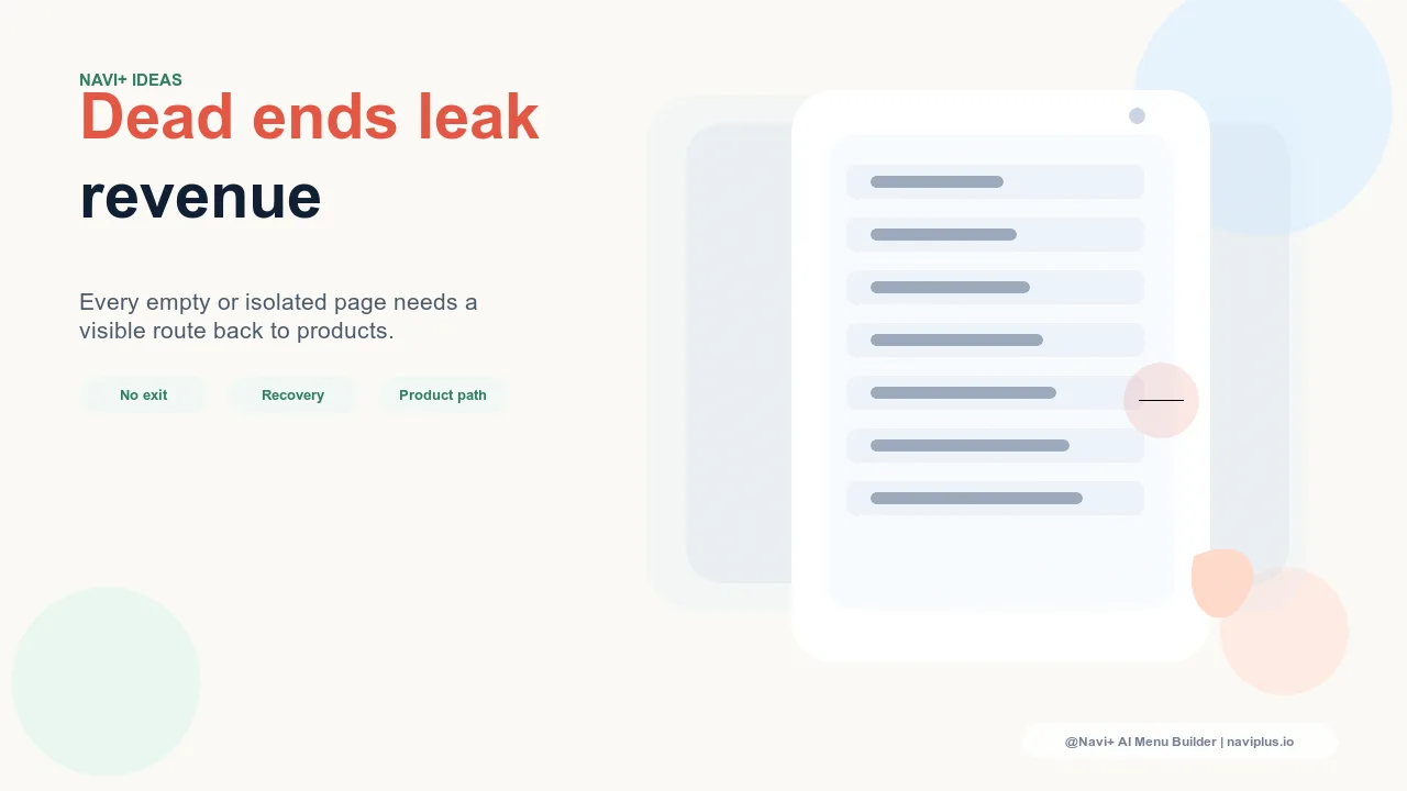
How Navi+ removes dead ends from every page
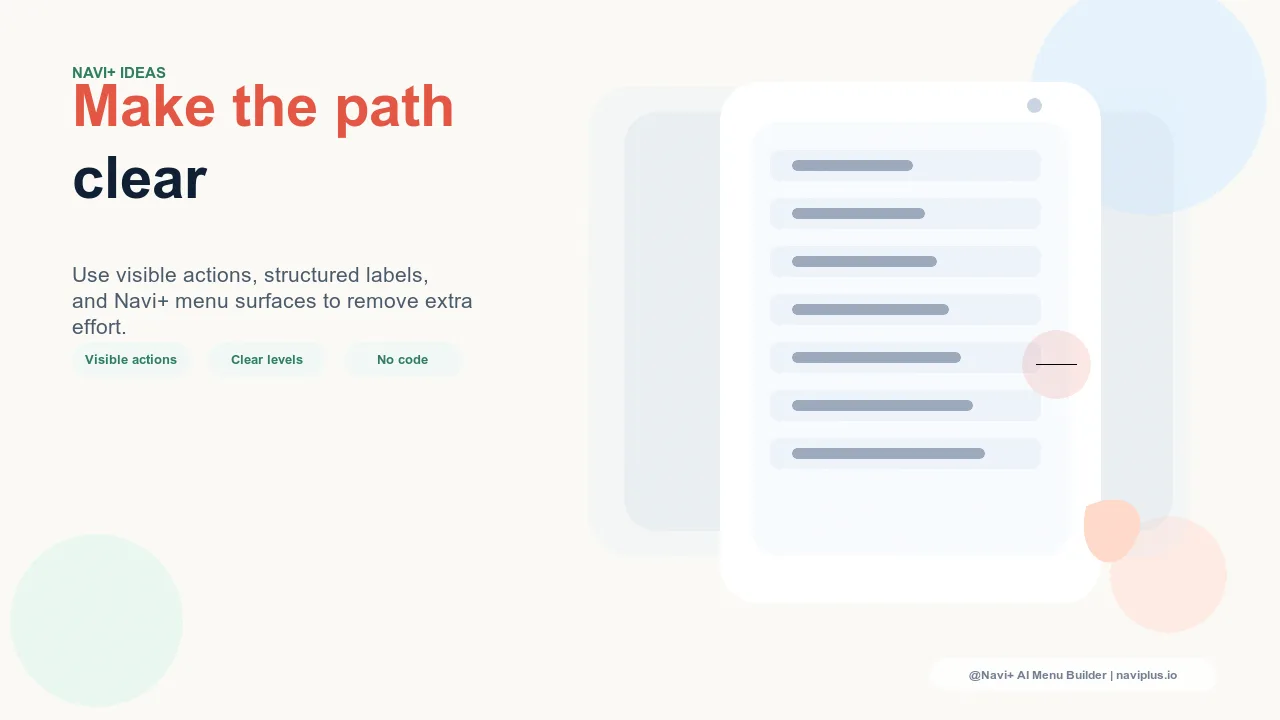
Navi+ AI Menu Builder solves the dead-end problem structurally, not page by page. Instead of requiring you to manually add "Related products" or "You might also like" sections to every page in your store, Navi+ adds persistent, always-accessible navigation that's visible at every scroll depth on every page.
On mobile, the Tab Bar sits permanently at the bottom of the screen — the position where a visitor's thumb naturally rests during scrolling. No matter how deep into a product description a visitor has read, the Tab Bar is there: Home, Shop All, Search, Cart. Leaving the current page to explore something else requires a single tap. The dead end becomes a junction.
On desktop, the Sticky Mega Menu stays visible as visitors scroll down long product pages. By the time they've finished reading about a product they've decided against, the full category structure is still displayed in the header — they can navigate to a related category without any scrolling.
For stores with a wide catalog, the Slide Menu provides a comprehensive browsing panel that visitors can open at any point during their session — a full tree of your store's categories, accessible from every page. Visitors who are in "discovery mode" rather than "purchase mode" can use it to explore broadly without losing their place.
The FAB (Floating Action Button) adds a persistent shortcut to your highest-value category or current promotion — visible at all times, on all pages, at all scroll depths. For stores running campaigns, this is the single most effective way to keep sale-related traffic within the store rather than sending it back to Google when the landing page doesn't convert immediately.
| Scenario | Without Navi+ | With Navi+ AI Menu Builder |
|---|---|---|
| Visitor doesn't buy current product | Navigation buried — exits store | Tab Bar visible — one tap to next category |
| Out-of-stock product page | No clear path to alternatives | Persistent navigation keeps visitor browsing |
| High-price item, visitor not ready | Price shock → exit | Easy path to lower-price categories still visible |
| Ad traffic doesn't convert on first visit | Visitor returns to ad platform | Persistent nav creates second-touch browsing value |
| Long-tail search landing pages | Single-page visit, then back to Google | Slide Menu or Tab Bar leads into broader catalog |
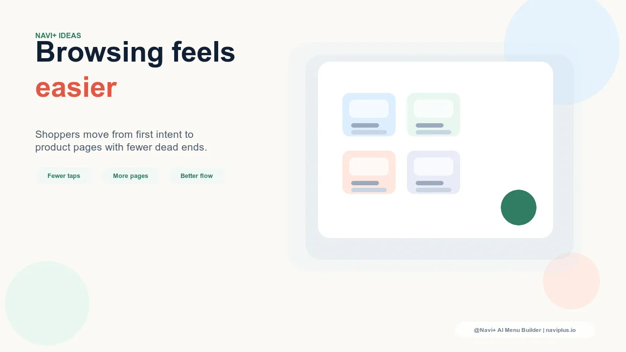
Turning dead ends into browsing journeys
The clearest signal that a store has a dead-end problem is a high rate of single-page sessions combined with low average session duration. Visitors are arriving, looking at one thing, and leaving. The products might be excellent; the navigation isn't giving them a reason to stay and look at more.
Fixing this doesn't require a site redesign or a development project. It requires navigation that's always present — that doesn't disappear when a visitor scrolls, doesn't require extra taps to access on mobile, and is structured clearly enough that a visitor who has decided "not this" can immediately see what "something else" looks like.
Navi+ installs in minutes. Once the Tab Bar and Mega Menu are live, every page in your store stops being a potential dead end and starts being a potential entry point to the next purchase journey. The visitor who doesn't buy today, but who spends twelve minutes browsing four categories, is a very different outcome from the visitor who bounces in under a minute — even if today's conversion metrics look the same.
Try it free — no code, no developer needed
Install in minutes on Shopify, WordPress, or any website.