

The Problem
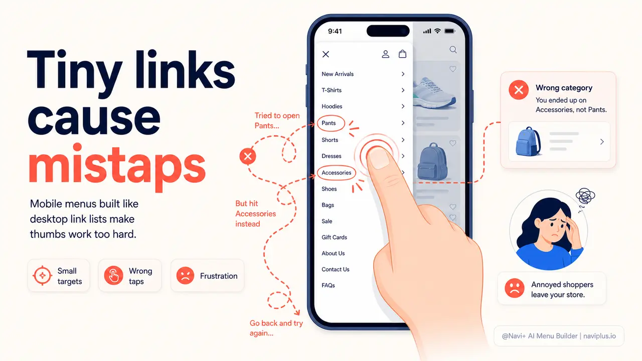
You know the feeling. You're on your phone, trying to tap a menu link, and you hit the wrong one. You try again, more carefully this time. Or you accidentally close the entire menu and have to reopen it. It happens on your own store to your visitors every day — and they don't tell you about it. They just leave. The friction is invisible to you in your analytics, but completely real to the people experiencing it.
Theme menus were built for desktop, then scaled down. The link height is whatever the desktop theme produces — often 32 to 38 pixels, with minimal padding between items. On a 6-inch phone screen, where thumbs are the primary input device, that's not a tap target. It's a target-practice exercise. The browser knows this — Google's own material design guidelines specify a minimum touch target of 48×48 pixels. Most Shopify and WooCommerce themes don't come close.
The consequence is a pattern that shows up in every mobile e-commerce session study: visitors who encounter navigation friction don't retry until they get it right. They lower the phone, decide the site is annoying, and move on. You never see them hesitate. You never see the mis-tap. You only see the bounce rate — high, stubbornly high, even when your products are good and your prices are competitive. The navigation is the invisible barrier between them and a purchase.
The friction you can't see in your analytics
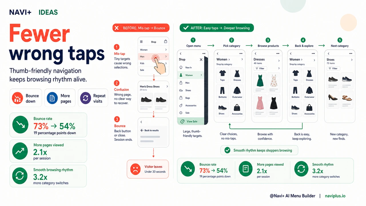
"Our mobile bounce rate was 73%. I kept blaming page speed or ad targeting. Then I actually watched session recordings and saw how many people were tapping the wrong menu item, getting confused, and leaving. We switched to a Navi+ slide menu with proper link spacing and the bounce rate dropped to 54% within a month. Same products, same traffic source, same prices."
— A Navi+ customer
Touch target size matters more than most stores realize
Mobile interaction is fundamentally different from desktop interaction. A mouse cursor is pixel-precise. A thumb is not. The average adult thumb covers 40 to 60 pixels of screen when pressed. When your menu links are 32 pixels tall with 4 pixels of padding between them, every tap is a coin flip. And unlike a mouse, a thumb provides no visual confirmation of where it's about to land before the tap registers.
The costs of undersized tap targets stack up across a browsing session in ways that compound quickly:
- First impressions of quality. A menu that's difficult to tap signals that the store was built for someone else's device. Visitors form quality judgments about a store within seconds. Navigation that fights the thumb reads as low-effort, and low-effort navigation reads as low-effort store.
- Mis-taps disrupt browsing flow. Every incorrect tap is a micro-interruption. The visitor had a mental model of where they were going. When they end up somewhere else, they have to reorient — and the next category tap they were planning is already forgotten.
- Frustration compounds across the session. One mis-tap is an accident. Two is an inconvenience. Three makes the visitor feel incompetent — and people who feel incompetent using something stop using it. The feeling transfers to the store itself.
- Mobile bounce rates stay elevated even when everything else is good. Store owners who optimize page speed, imagery, and copy often find their mobile numbers still lag behind desktop. Navigation friction is frequently the remaining factor.
- Repeat visits decline. A store that's annoying to navigate on mobile doesn't become a habit. Customers with a good first-tap-to-product experience come back. Those with a mis-tap-and-confused experience don't.
How Navi+ AI Menu Builder solves this
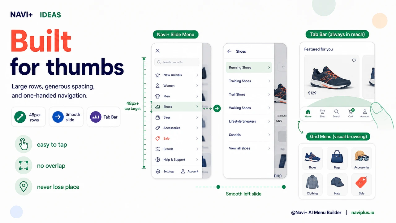
Navi+'s mobile menu types — Slide Menu, Tab Bar, and Grid Menu — are built from the ground up for thumb navigation. Link heights meet the 48-pixel minimum that Google recommends and human thumb anatomy requires. Padding between items is generous enough that adjacent links don't compete for the same tap. Tap targets are sized for real mobile usage, not desktop designs that were scaled down.
The Slide Menu is the most common fix for stores replacing a cramped theme hamburger menu. It opens from the left with a smooth animation — no jarring jumps, no disorienting transitions. Categories are grouped with clear section labels and displayed at a touch-friendly size. The menu closes by tapping outside it or swiping back, both of which are natural gestures on a phone and work reliably. For stores with many categories, the slide menu can include nested sub-menus that expand in-place rather than navigating to a new page — so visitors never lose their place in the menu structure.
For stores that want navigation to be even more accessible, the Tab Bar eliminates the need to open a menu at all. The five most important links live at the bottom of the screen, always visible, spaced and sized for single-thumb operation. Visitors never have to tap a hamburger icon, wait for a menu to open, or hunt for a category link. The tab they need is right where their thumb already is.
Default mobile menu vs. thumb-optimized navigation
| Feature | Default / Without Navi+ | With Navi+ AI Menu Builder |
|---|---|---|
| Tap target height for menu links | ✗ 32–38px, below Google's 48px minimum | ✓ 48px+ tap targets throughout |
| Padding between adjacent links | ✗ Minimal, adjacent items compete for taps | ✓ Generous spacing, clear separation |
| Menu open/close animation | ✗ Abrupt, often disorienting on mobile | ✓ Smooth slide animation, natural gestures |
| Navigation visible without opening menu | ✗ Everything hidden behind hamburger icon | ✓ Tab Bar option shows links permanently |
| One-handed operation | ✗ Top-left hamburger requires reach or two hands | ✓ Tab Bar sits at thumb-reach bottom of screen |
| Mobile-specific layout, separate from desktop | ✗ Same menu shrunk to phone size | ✓ Distinct mobile menu configured separately |
What you get
The most measurable outcome of fixing mobile navigation tap targets is a reduction in bounce rate. Visitors who can navigate your store without friction stay longer, view more pages, and convert at higher rates. The change is not dramatic in any single session — it's the removal of dozens of micro-frictions that were silently accelerating exits. When those frictions disappear, sessions that would have ended at the navigation step continue into product browsing.
The behavioral pattern that emerges is also different. With properly sized tap targets and smooth menu transitions, visitors develop a rhythm in their browsing — open menu, pick category, browse, tap back, pick another category. That rhythm is what turns a visit into a purchase. When the menu interrupts the rhythm with a mis-tap or a confusing transition, the rhythm breaks and often doesn't restart.
A practical starting point for most stores: install Navi+ and switch your mobile navigation to a Slide Menu with default settings. The improvement in tap target size alone will be immediately visible to anyone who tests the store on a real phone. From there, you can configure the visual design — colors, section headers, icons — to match your brand. If most of your revenue comes from mobile, consider the Tab Bar as your primary mobile navigation. It removes the menu-opening step entirely and puts your four or five most important destinations at permanent thumb reach.
Try it free — no code, no developer needed
Install in minutes on Shopify, WordPress, or any website.