

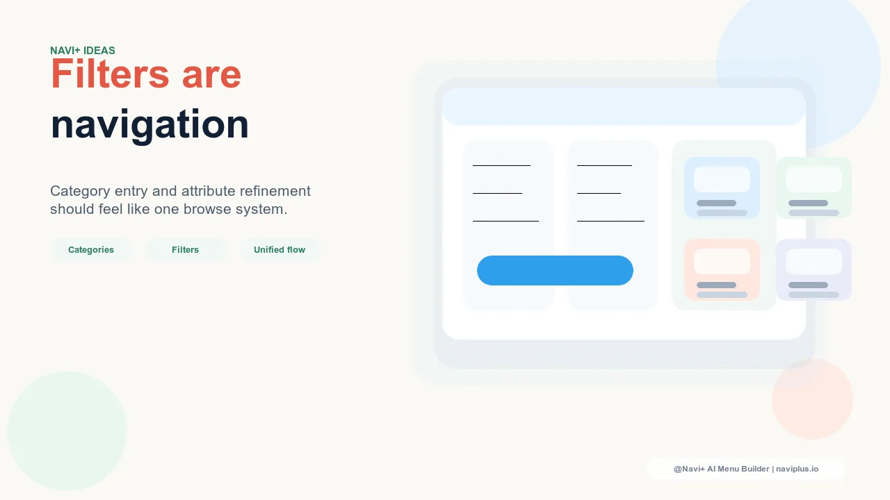
The Artificial Divide Between Navigation and Filters
Most e-commerce platforms treat navigation and filters as separate systems — navigation lives in the header or mobile menu and organizes the store's top-level structure, while filters appear on category pages as a side panel or drawer that refines the product list within a category. This separation reflects the technical architecture of most platforms: navigation is a site-wide setting, filters are page-level attributes. But for the visitor, navigation and filtering are continuous steps in the same goal: finding the right product.
The consequence of treating them separately is a navigation experience with a seam: the visitor uses global navigation to reach a broad category, then switches to the filter system to narrow down within it. If this handoff is clumsy — if the filters are hard to find, slow to load, or poorly organized — visitors who need to filter before they can evaluate products often abandon rather than filter. They don't experience the filter failure as a filter problem; they experience it as "this store doesn't have what I'm looking for."
For stores with large or complex catalogs — multiple product types, sizes, colors, price ranges, use cases — the filter-navigation handoff is one of the highest-leverage browse experience improvements available. A catalog that looks overwhelming when browsed without filters can look well-curated and manageable when filtering is fast, prominent, and appropriately organized.
"Our catalog had 400+ SKUs across 12 categories. Visitors who made it to a category page and used filters had a 9% conversion rate. Visitors who reached the same category pages but didn't filter had 2.1%. The difference wasn't the products — it was whether visitors found the filter system and used it. When we moved filter access higher on the page and made it available from the Tab Bar, filter engagement went up and category-level conversion followed."
— A Navi+ customer, home furnishings brand
Where the Navigation-Filter Handoff Breaks
Several specific failure patterns account for most navigation-filter handoff breakdowns:
Filters below the fold on mobile. On mobile devices, the filter panel or filter button often appears below the first few product tiles on a category page. Visitors who land on a category and see products immediately may begin browsing without realizing filters are available. If they don't find a product they want in the first scroll, they leave — without ever engaging the filter system that might have surfaced exactly what they needed.
Filter labels that don't match the visitor's decision criteria. Filters organized around internal product attributes (SKU codes, warehouse categories, manufacturer specifications) rather than the buyer's evaluation criteria ("Occasion," "Works for," "Size range") are filters that visitors don't use because they can't parse them. The filter system should be designed around how buyers decide, not how products are cataloged internally.
Pre-navigation filtering opportunity missed. Some visitor segments arrive with specific attribute requirements before they select a category: "I need something waterproof" or "I'm looking for gifts under $50." These visitors would benefit from the ability to filter before entering a category — a "Shop by Budget" or "Shop by Use Case" navigation destination that pre-filters the catalog before presenting category options.
Integrating Filters into the Navigation System
Treating filters as part of the navigation system rather than a separate page-level element has specific implementation implications:
Navigation links that pre-apply filters. Mega Menu and Slide Menu links can point to filtered collection URLs — "Women's Dresses — Under $100" or "Skincare — Travel Size" — rather than only unfiltered category pages. These navigation destinations do the filtering work before the visitor lands on the page, removing the friction of the filter engagement step entirely for visitors with clear attribute requirements.
Attribute-based Tab Bar slots during relevant periods. A Tab Bar slot for "On Sale" or "New This Week" is effectively a pre-applied filter navigated to directly. For stores where price or recency is a primary browse driver, this Tab Bar slot converts more than an equivalent category link because it matches the attribute-first decision pattern of bargain shoppers and trend-motivated buyers.
| Filter Integration Approach | Visitor Effort to Filter | Filter Engagement Rate |
|---|---|---|
| Standard side-panel filters below fold | High — requires scrolling, finding, engaging | Low — most visitors don't reach it |
| Filter button prominent at top of category page | Medium — one tap, always visible | Moderate — visible but still a separate step |
| Pre-filtered navigation links in Mega Menu (Navi+) | Zero — filtering done in navigation | 100% — visitor lands on filtered view |
Building the Navigation-Filter Bridge in Practice
The most effective approach combines both sides of the bridge. Use Navi+'s Mega Menu to include navigation links that pre-filter for the most common attribute combinations — this serves the largest visitor segments with zero friction. Ensure that on-page filters are accessible and visible immediately on category page load — this serves visitors with less common requirements who need to filter after landing. The result is a browse experience that feels fluid from navigation entry to product-level refinement, without the awkward handoff that currently causes most catalog-intensive stores to lose visitors mid-browse.
Try it free — no code, no developer needed
Install in minutes on Shopify, WordPress, or any website.