

Who Actually Scrolls to the Footer
Most visitors never see your footer. They land, they browse, they click something — or they leave. The footer is only reached by visitors who have either read an entire page from top to bottom, or scrolled past all the content while searching for something they could not find elsewhere. Both profiles represent a distinct and highly committed audience segment.
The visitor who has read your entire page and then scrolled to the footer is someone who is informed and interested but has not yet taken action. They want to go deeper — they are looking for a trust signal, a policy detail, a way to contact you, or a secondary category you didn't highlight above the fold. The visitor who scrolled to the footer without engaging with the page content is using the footer as a rescue mechanism: primary navigation didn't give them what they needed, and they are trying one more time before leaving.
In both cases, the footer is a high-intent interaction point. The visitors who reach it are not passive scrollers — they are looking for something specific, and they are willing to work to find it. A footer designed for this audience delivers measurably better outcomes than a footer treated as an afterthought or a copy of the main menu.
The "Second Chance" Function
Primary navigation serves the majority of visitors who arrive with a clear or semi-clear intent. Category pages, a search bar, and a handful of top-level menu items handle the common paths. But every store has a segment of visitors whose needs don't map neatly to those paths — visitors looking for a size guide, a shipping policy, a wholesale inquiry form, or an FAQ that answers a specific question before they are willing to buy.
For these visitors, the footer is the last resort before an exit. It functions as a second chance to catch the visitor who was about to leave — and the content that succeeds in the footer is almost never the same content that succeeds in the primary nav. What catches the frustrated visitor is not another link to your main categories. It is the utility link they have been silently looking for the whole time: a returns policy, a contact option, a size chart, an FAQ anchor.
This is why footer navigation and primary navigation serve fundamentally different purposes even though they occupy the same site. Treating them as interchangeable layers — filling the footer with the same links as the header — fails both functions simultaneously. The primary nav is diluted by redundancy, and the footer fails the visitor who needed something the primary nav didn't offer.
"We had 'Collections' in our header, our mobile menu, and our footer — all pointing to the same place. When we looked at the footer analytics, nobody was clicking it. The clicks that were happening went to Returns Policy and Contact Us. We removed the redundant links, added our loyalty program FAQ and a size guide, and footer engagement nearly doubled. The people clicking the footer were not the same people using the main nav."
— A Navi+ customer, apparel brand
What Footer Navigation Should Actually Contain
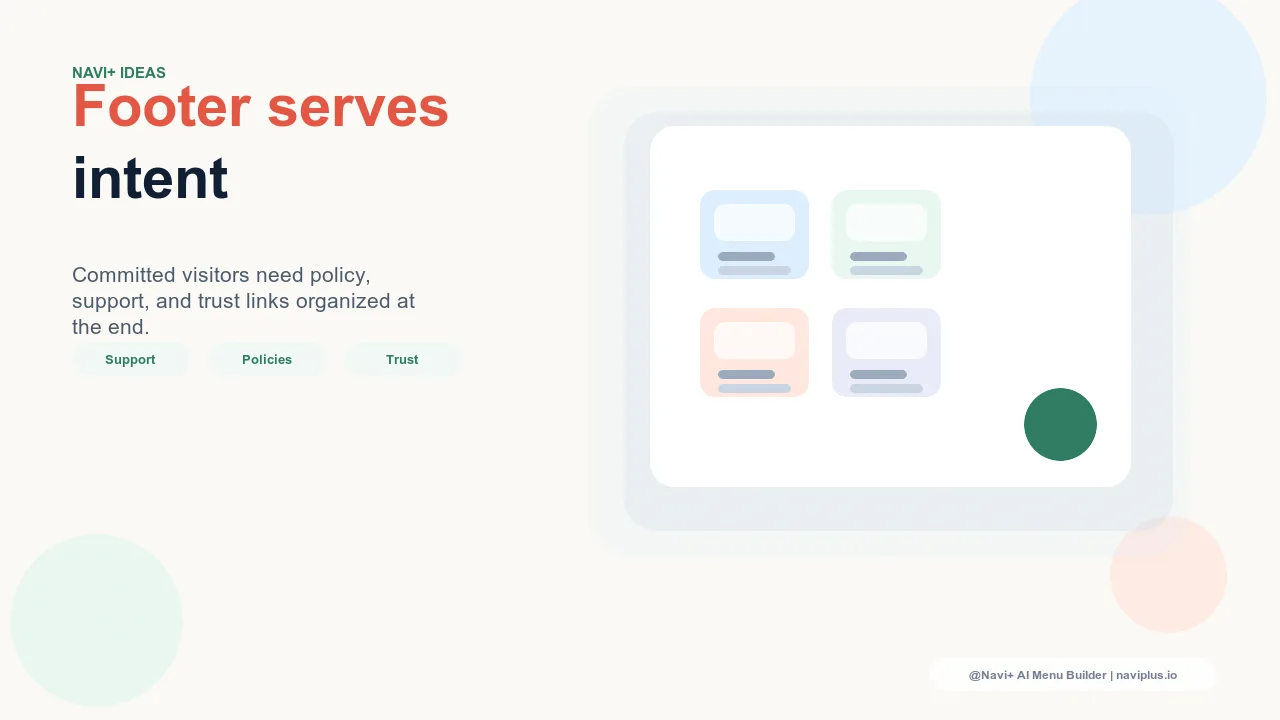
Footer navigation has a clear job: serve the utility needs that primary navigation is not designed to handle. The categories that consistently generate footer clicks share one trait — they answer a concern rather than propose a discovery. Visitors who click footer links are resolving a doubt, not exploring a possibility.
Policy pages. Returns, shipping, privacy, terms of service — these are among the highest-clicked footer links on any e-commerce store. Visitors who are close to purchasing, or who have purchased and have a question, look for these in the footer first. Making them easy to find in the footer directly reduces support tickets and pre-purchase hesitation.
Support and contact. Contact forms, live chat links, help center links, and FAQ pages perform strongly in the footer. A visitor who reached the footer looking for help is in the exact right state of mind to use a help center — they have already determined that they need assistance, which is the hardest part of the support funnel.
Secondary categories. Categories that are real but not prominent enough to earn a slot in the main menu — outlet sections, gift guides, collaborations, loyalty programs — are legitimate footer content. They serve visitors who already know the store well and are looking for something beyond the standard catalog.
Newsletter and community CTAs. The footer is a reasonable place for a newsletter signup or a social media link cluster. Visitors who reach the footer are engaged — they have shown the patience and intent to read or scroll through an entire page — and they are more likely to subscribe or follow than the average visitor who encounters a popup on first load.
What Analytics Says About Footer Links
Footer click rate data consistently shows a clear hierarchy. Policy pages and contact links generate the highest click rates — typically two to five times higher than any other footer element. These clicks carry immediate conversion value: a visitor who successfully finds and reads a returns policy is measurably more likely to complete a purchase than one who cannot find it.
Social media links in the footer generate moderate engagement, concentrated on visitors who are already fans of the brand and are looking to connect outside the store context. These clicks have indirect value — brand community building rather than direct conversion — but they are genuine signals of brand affinity from visitors who have shown commitment by reaching the footer.
Duplicate main category links in the footer generate the lowest click rates of any footer element, often approaching zero. Visitors who want the main categories use the main navigation — that is what it is for. The footer placement adds no value and consumes space that could serve the utility needs that only the footer can address.
Common Footer Mistakes
Duplicating the main menu. The most common footer mistake is also the most consequential. A footer that contains the same top-level categories as the header provides zero additional utility to any visitor. It wastes the one navigation layer specifically positioned to serve visitors the main menu could not help.
Empty or near-empty footers. A footer with only a copyright notice and a logo is a missed opportunity at the one moment when visitors are actively looking for something. The visitors who reach the footer are not passively scanning — they want a link. Not providing one sends them to a competitor.
Link overload. The opposite error is equally damaging. A footer with forty links across six columns creates the same problem as a main menu with too many items: visitors cannot find what they need quickly, and the cognitive load of scanning the footer causes them to give up. Footer utility links work because they are findable — five to twelve well-labeled links outperform thirty poorly-organized ones.
Mobile Footer: What Frustrated Visitors Tell You
On mobile, footer scroll rates are significantly lower than on desktop. Most mobile visitors browse, tap a product, or leave — they rarely reach the footer unless something has gone wrong with their session. A mobile visitor who reaches the footer is almost certainly a frustrated visitor: someone who could not find what they needed through primary navigation, could not find it through search, and is now making one final attempt before exiting.
This behavioral pattern has two implications. First, the mobile footer must be ruthlessly focused on utility — policy pages, contact links, and FAQs, with nothing else competing for attention. A visitor who is already frustrated with the navigation experience does not want to parse a complex footer layout. Second, the fact that mobile visitors only reach the footer when frustrated is a signal about your primary navigation. If your mobile footer contact link is getting significant clicks, it means a meaningful percentage of your mobile visitors could not find the contact option in the primary flow — which is a navigation problem, not a footer problem.
Tracking mobile footer engagement separately from desktop footer engagement reveals which links are solving real problems versus which are simply present. A contact link that generates high mobile clicks is flagging a gap in your primary mobile navigation. Addressing that gap — surfacing the contact option higher in the mobile experience — reduces visitor frustration and the exit rate that accompanies it.
How Navi+'s Tab Bar Changes the Footer's Role
In a standard Shopify store, the primary navigation is a top header menu — visible on desktop but reduced to a hamburger on mobile, which means mobile visitors must actively open a menu to navigate. This structure puts significant navigational responsibility on the footer for mobile users, because the header navigation is less accessible and category discovery requires deliberate menu interaction.
Navi+'s Tab Bar replaces this model with a persistent bottom navigation bar on mobile, always visible, always accessible without any menu interaction. Primary categories, search, cart, and account are available at a thumb's reach on every page of the store. This changes the footer's role fundamentally: because primary navigation is handled persistently by the Tab Bar, the footer is freed entirely for utility content. There is no navigational gap for the footer to fill — visitors who need to browse use the Tab Bar, and visitors who reach the footer are there specifically for utility links.
The result is a cleaner information architecture. The Tab Bar handles navigation. The footer handles utility. Each layer does exactly one job, and neither layer is forced to compensate for the other's limitations.
Three Footer Strategies Compared
| Footer Strategy | Unique Value Added | Support Traffic Reduction | Brand Completeness |
|---|---|---|---|
| Utility-Focused Footer Policy pages, contact, FAQ, secondary categories, newsletter |
High — serves needs the main nav cannot | High — policy and FAQ links resolve pre-purchase doubts | Strong — trust signals visible without scrolling main content |
| Mirror-of-Nav Footer Same top-level categories repeated from header |
None — redundant with existing navigation | Low — no utility content to reduce inbound support | Partial — categories present but trust signals absent |
| Minimal Footer Logo and copyright only |
None — no actionable links | None — increases support tickets from visitors who can't find policies | Weak — no legal links, no contact, incomplete brand impression |
The utility-focused footer is not complex to implement — it requires fewer links than a mirror-of-nav footer and less design effort than a heavily branded footer. Its advantage is specificity: every link serves a distinct visitor need that no other navigation layer addresses. The visitors who use it are already committed. The only question is whether the footer gives them something worth clicking.
Try it free — no code, no developer needed
Install in minutes on Shopify, WordPress, or any website.