

The Problem with Mega Menus Used Without Justification
Mega menus are among the most visible features in e-commerce navigation — wide, multi-column dropdowns that reveal a store's full category structure in one interaction. Brands often add them because they look impressive, or because competitors have them, or because they want every product category to be accessible from every page. These are understandable motivations, but none of them are sufficient justification for a mega menu. When a store with 80 products and four categories adds a mega menu, the result is navigation that communicates complexity the store doesn't have — visitors sense the mismatch, and trust is fractionally diminished.
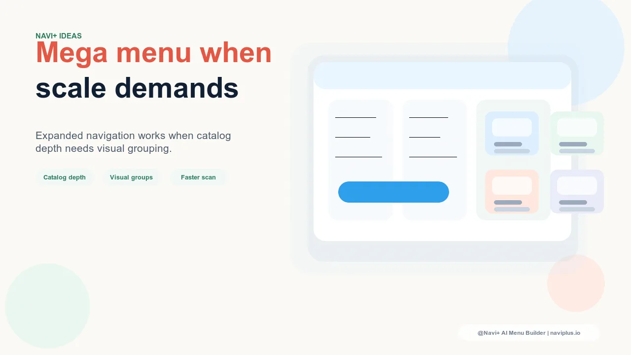
A mega menu is a tool for managing genuine complexity. When a store's product range spans many categories, each with meaningful subcategories, a mega menu solves a real problem: it makes a large, complex catalog comprehensible at a glance, enabling visitors to understand the store's breadth and navigate directly to the specific area that serves their need. Used in this context, a mega menu improves conversion by shortening the path from landing to product. Used in any other context, it adds visual weight and interaction cost without adding navigation value.
"We added a mega menu early because we wanted to look like a serious retailer. At the time we had about 120 SKUs across six categories. The mega menu made the site feel cluttered and slightly overwhelming — customers would hover, see more than they needed, and either click the wrong thing or close it. When we switched back to a simple Slide Menu, bounce rate on landing pages dropped noticeably. We added the mega menu back two years later when we had 800 SKUs across 14 subcategories. At that point it genuinely helped."
— A Navi+ customer, specialty kitchenware brand
The Right Conditions for a Mega Menu
Several factors indicate that a mega menu will improve rather than complicate your navigation:
Catalog depth: multiple meaningful subcategories per top-level category. A mega menu creates value when each top-level category contains multiple subcategories that visitors genuinely need to navigate. If your top-level categories are "Men," "Women," and "Kids," and each contains subcategories like "Tops," "Bottoms," "Shoes," "Accessories," and "Sale," a mega menu lets visitors navigate directly to "Women — Shoes" without a two-click journey through the menu hierarchy. If your categories are flat — "Products," "Bundles," and "Gift Cards" — a mega menu reveals nothing a simple dropdown couldn't handle more elegantly.
Category count: typically 5+ top-level categories with 3+ subcategories each. As a rough guide, a mega menu becomes useful when the total number of distinct navigation destinations exceeds around 15–20. Below this threshold, a well-organized slide menu or dropdown provides the same access with less visual complexity. Above it, particularly when the categories are meaningfully different (not just variations of the same product type), a mega menu's ability to show the full map simultaneously provides genuine orientation value.
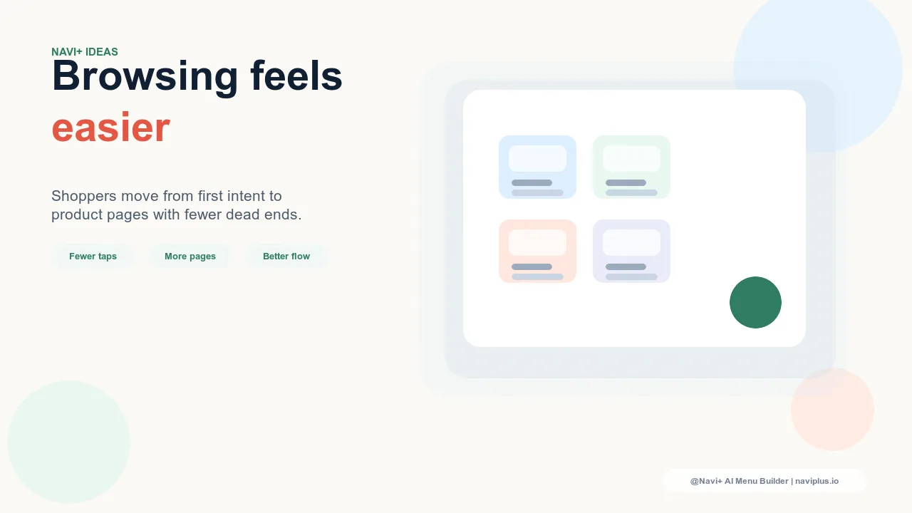
Cross-category browsing: visitors who shop multiple sections per session. Analytics can confirm whether your visitors browse multiple categories in a single session. If a significant portion of sessions include navigation across more than two top-level categories, your store benefits from an always-visible category map — which is what a mega menu provides. Stores where visitors typically navigate to one category and browse within it (rather than cross-category browsing) see less mega menu benefit, because the persistent "here's where everything is" function isn't needed for single-category sessions.
Featured content value: ability to include images, promotions, or curated links. A well-designed mega menu is more than a navigation tree — it's a merchandising surface. Stores that can meaningfully fill the visual columns of a mega menu with category photography, featured products, seasonal promotions, or editorial links get more from a mega menu than stores whose categories would produce empty-looking columns. The visual richness of a mega menu should be proportional to the richness of the content that populates it.
| Store Profile | Recommended Navigation | Reason |
|---|---|---|
| Under 200 SKUs, 2–4 top-level categories | Slide Menu or simple dropdown | Catalog complexity doesn't justify mega menu overhead |
| 200–500 SKUs, 4–6 categories with subcategories | Either — depends on subcategory structure | Use mega menu if subcategories are meaningful and distinct |
| 500+ SKUs, 6+ categories with 3+ subcategories each | Mega Menu | Catalog depth benefits from simultaneous category overview |
| Any size, single product type with variations | Filters + simple navigation | Attribute filtering serves variation browsing better than hierarchical menus |
Designing a Mega Menu That Works
When the conditions are right, the mega menu's design determines whether it clarifies or overwhelms. The principles that separate effective mega menus from counterproductive ones:
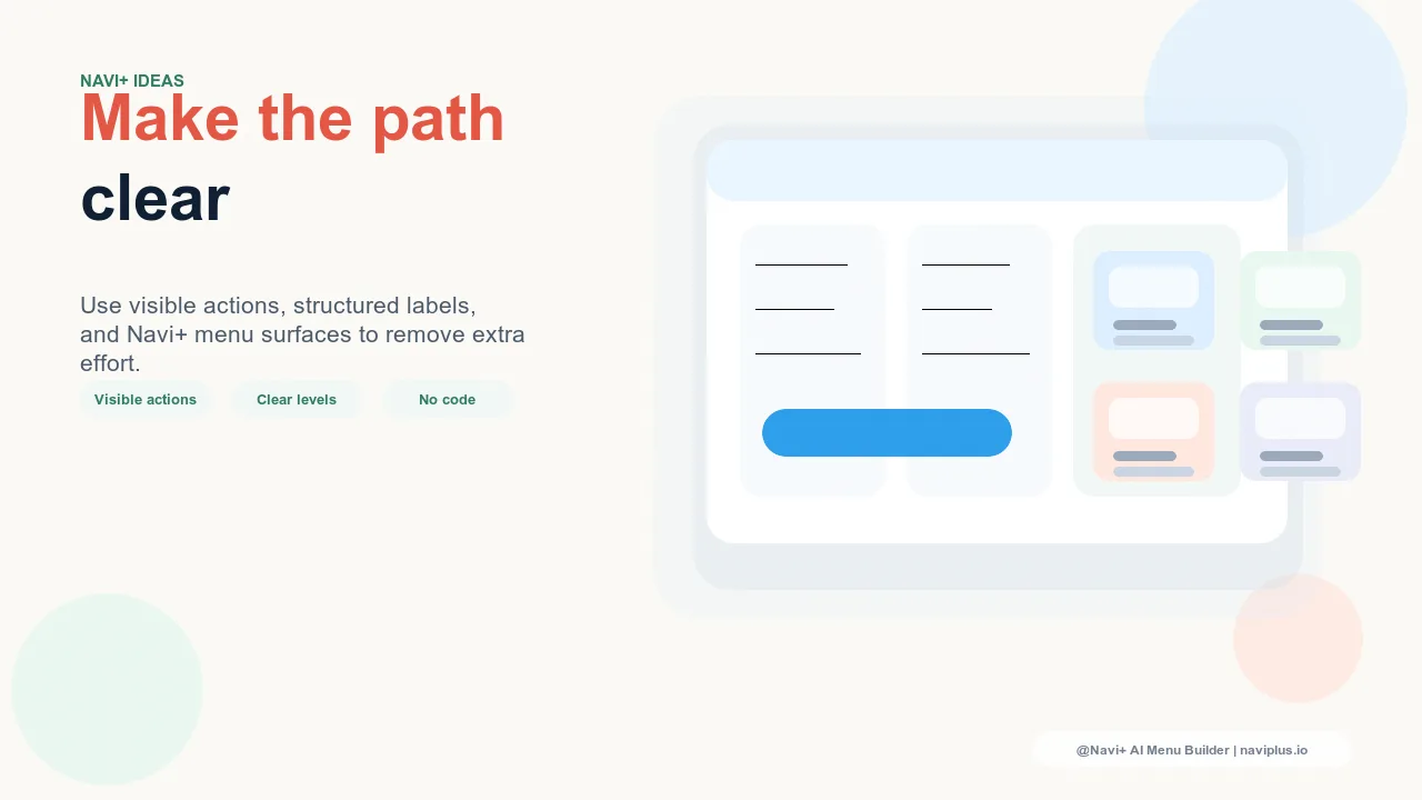
Limit columns to what you can fill meaningfully. A three-column mega menu where one column has two links looks worse than a two-column mega menu. Column count should match content volume — every column should have enough links to justify its existence.
Use category imagery where it adds navigation value. Product photography in mega menu columns accelerates category identification for visual product types (fashion, homewares, food). For categories where images don't add categorical clarity — professional services, software, commodity products — text labels alone are faster to scan.
Include a "View All" link for each category. Some visitors will want to see everything in a category without filtering by subcategory. A "View All [Category Name]" link at the top of each column serves this pattern and provides a clear escape hatch from the mega menu's subcategory structure.
Navi+'s Mega Menu component allows all of these configurations — column count, category photography, featured link sections, and visual hierarchy — with the specificity needed to build a mega menu that works with your catalog structure rather than against it. The question isn't whether to have a mega menu; it's whether your catalog earns one.
Try it free — no code, no developer needed
Install in minutes on Shopify, WordPress, or any website.