

The Mobile Traffic Reality Most Store Owners Haven't Acted On
Shopify publishes platform-wide data on traffic sources, and the consistent finding over the past four years is that more than 70% of Shopify storefront traffic comes from mobile devices. For stores with active social media marketing, that number frequently exceeds 80%. The visitor who sees your Instagram Reel, clicks through to a product, and browses your store is almost always on a phone — not a desktop.
Yet the navigation on most Shopify stores was designed with a desktop interaction model in mind: a horizontal top navigation bar with dropdowns triggered by mouse hover, a hamburger icon that opens a slide-out menu, and category structures that prioritize comprehensiveness over thumb-reachability. These are desktop patterns. They work tolerably on mobile — but tolerably is not the standard against which the best stores compete.
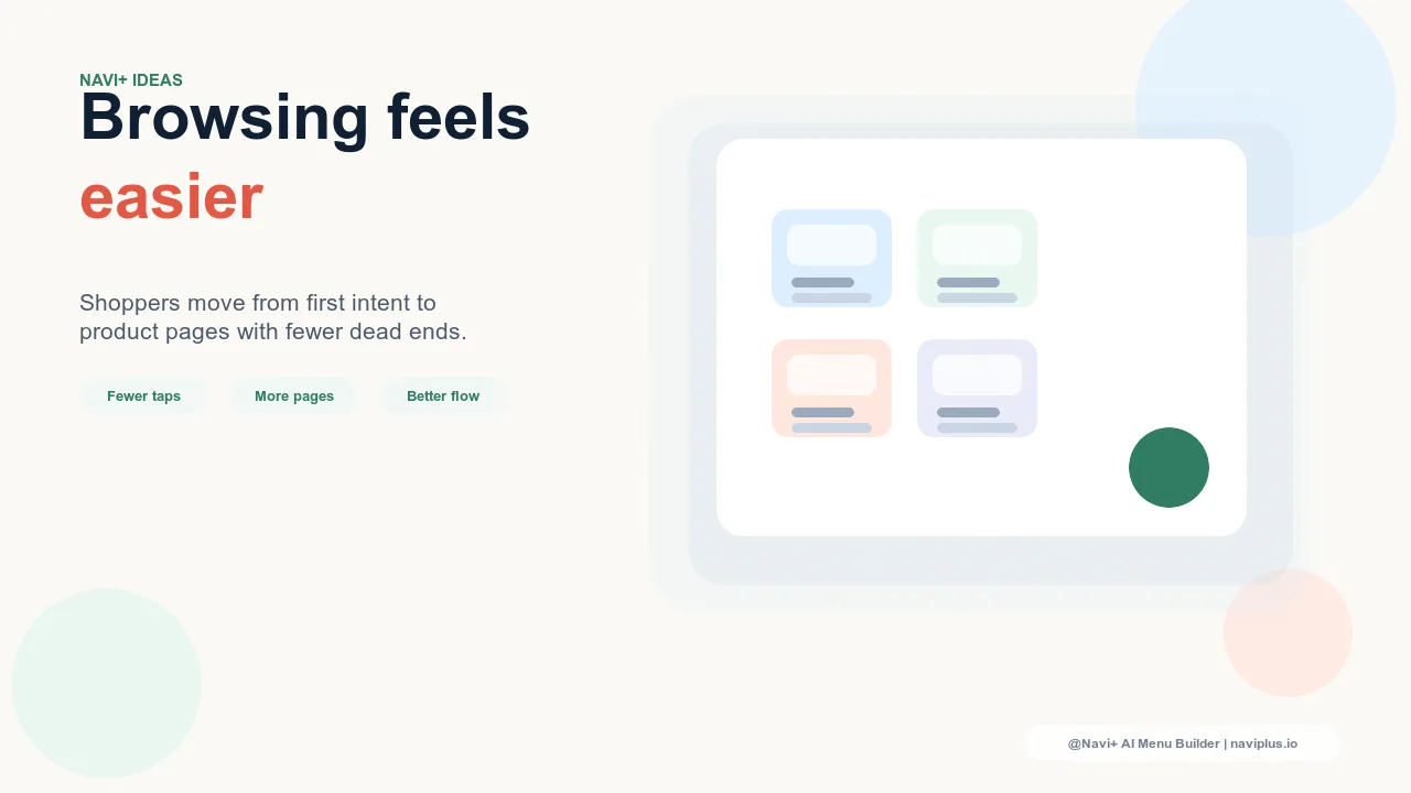
The gap between desktop-first navigation (tolerable on mobile) and mobile-first navigation (genuinely excellent on mobile) is not a small design detail. It's the difference between a visitor who finds what they came for in two taps and a visitor who abandons after struggling with a tiny hamburger menu and an accordion navigation that requires too many interactions to reach a product category. Abandonment is quiet and permanent — the visitor doesn't tell you why they left.
"We redesigned our entire store twice — new theme, new photography, new copy — and our mobile conversion rate barely moved. When we finally focused on the mobile navigation specifically and added a Tab Bar with Navi+, we saw a 23% lift in mobile conversion within the first month. The rest of the store hadn't changed. Just the navigation."
— A Navi+ customer, apparel brand
What Makes Navigation Genuinely Mobile-First
Mobile-first navigation is not simply navigation that renders correctly on a small screen. Any responsive theme achieves that. Mobile-first navigation is designed around how people actually interact with phones: held in one hand, navigated primarily with the thumb, with a dominant-hand thumb reach zone that doesn't extend to the top corners of the screen.
On a standard smartphone held in one hand, the top-left and top-right corners of the screen are the hardest areas to reach without shifting your grip. This is precisely where most Shopify themes place their navigation — a hamburger icon in the top-left, a search icon and cart in the top-right. Every navigation interaction requires either a grip shift or a second hand. For a visitor browsing casually in a relaxed posture, this creates friction that isn't consciously noticed but accumulates across a session.
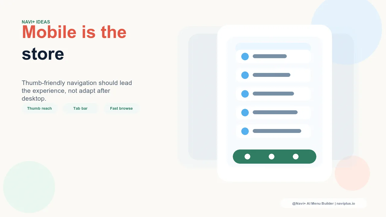
Genuinely mobile-first navigation places primary navigation controls within the natural thumb arc. The bottom of the screen — specifically a fixed Tab Bar — is the most ergonomically accessible area on a phone. App designers have understood this for over a decade, which is why every major mobile app (Instagram, TikTok, Gmail, Apple Maps) uses bottom Tab Bar navigation as the primary navigation paradigm. E-commerce stores that adopt the same pattern are borrowing from a pattern shoppers already know and are already comfortable with.
The Components of a Mobile-First Navigation Stack
A complete mobile-first navigation approach addresses several layers of the shopping experience:
Tab Bar for primary destinations. Five slots at the bottom of the screen, always visible, covering the highest-frequency destinations: Home, Shop/Categories, Search, New Arrivals or Sale, and Cart. Every visitor can reach these destinations with a single thumb tap from any page in the store without shifting their grip.
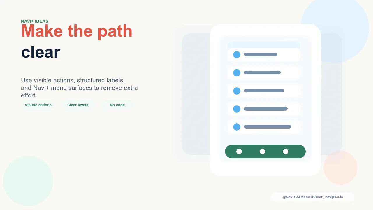
Slide Menu for full catalog access. When visitors need to navigate into specific categories, a left-edge slide menu that opens from a thumb-friendly trigger point covers the full catalog depth. The menu should open with large touch targets — minimum 44px tap height per platform guidelines — and avoid hover-triggered dropdowns that don't translate to touch.
FAB for high-priority single action. A Floating Action Button positioned in the bottom-right corner (the most natural thumb-reach point) creates a persistent, always-accessible shortcut to one high-priority destination: a current sale, the bestseller collection, or the most-converted category. The FAB requires zero navigation steps — one tap from anywhere.
| Navigation Pattern | Desktop-First Default | Mobile-First with Navi+ |
|---|---|---|
| Primary navigation placement | Top bar, hard to reach on mobile | Bottom Tab Bar, thumb-accessible |
| Menu open trigger | Top-corner hamburger icon | Ergonomic placement, large tap target |
| Persistent shortcut access | None — must navigate from top | FAB at bottom-right, always visible |
| Cart access | Top-right corner only | Tab Bar slot, one-tap from anywhere |
Mobile Navigation as Competitive Advantage
The stores that win on mobile aren't just the ones with better products or better prices — they're the ones where the shopping experience on a phone is genuinely pleasant. In a market where the same product category is available from dozens of stores, user experience is a differentiator. A visitor who finds your store frictionless to navigate on mobile is more likely to complete a purchase, more likely to return, and more likely to recommend the store to someone else.
Navi+ installs in minutes and adds a fully configurable mobile Tab Bar, Slide Menu, and FAB to any Shopify theme. The configuration is done through the Navi+ admin interface — no code changes, no theme editing, no developer required. Mobile-first navigation is available the same afternoon you decide to invest in it.
Try it free — no code, no developer needed
Install in minutes on Shopify, WordPress, or any website.