

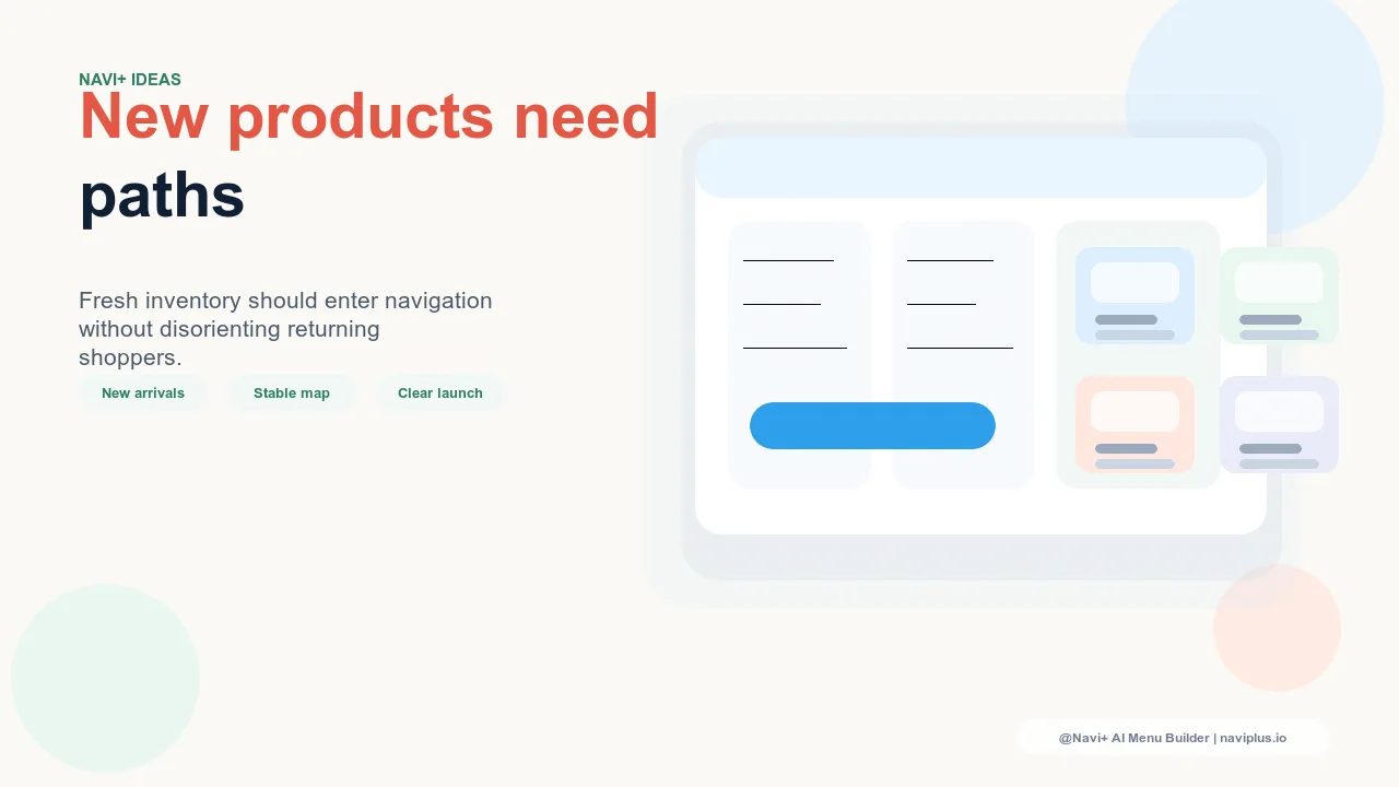
The Returning Customer Problem
Loyal visitors don't browse your store the way a first-time visitor does. They've built a mental map: they know that apparel is in the second tab, that sale items are always at the end, that accessories live under the category they'd expect. This mental map is one of the most valuable things a returning customer carries — it lowers the effort of every future visit and makes your store feel familiar and trustworthy.
When you add a new product line, you're not just adding an entry to a menu. You're modifying a map that loyal customers have already memorized. If a new top-level tab appears where none existed, or if a category they relied on gets renamed to accommodate new products, returning visitors experience disorientation. They hesitate. They second-guess where things went. In analytics, this shows up as increased bounce rates and shorter session durations from your highest-value segment — the people who've already proven they buy from you.
This doesn't mean you shouldn't expand. It means expansion requires a deliberate integration strategy, not just "add it to the menu and see what happens."
"We launched a new skincare line and added it as a top-level tab. Traffic from returning customers dropped 14% in the first two weeks — not because they weren't interested, but because they couldn't orient themselves in a menu that had changed shape. We moved it into a Mega Menu feature column first, and retention recovered."
— A Navi+ customer, beauty and wellness brand
Three Integration Patterns
There are three ways to add a new product line to an existing navigation structure. Each involves a different trade-off between visibility for new visitors and disruption to returning ones.
Add to an existing category. The new product line becomes a subcategory or collection link within a category that already exists — a new candle range added under "Home," a new protein flavor added under "Supplements." This is the lowest-disruption approach: the top-level navigation shape doesn't change at all. Returning visitors continue navigating exactly as before and discover the new product line when they enter the relevant category. The cost is visibility — the new line isn't immediately obvious to visitors who don't already browse that category.
Create a new subcategory. A new subcategory is added within an appropriate existing top-level category, visible as a link inside a Mega Menu or Slide Menu panel. This is the middle-ground approach: returning visitors see that something has been added within a familiar category, but the overall navigation structure hasn't changed shape. Visibility is better than a buried collection link, and disruption is moderate — the top-level tab count stays the same.
Create a new top-level category. A new tab or top-level link is added to the primary navigation. This is the highest-visibility approach and the highest-disruption one. Every returning visitor will notice the change immediately. This option is appropriate when the new product line is genuinely a different category from what you sell today — a different audience, a different use case, a meaningfully different purchase context — not simply an extension of what already exists.
When to Add at Top Level vs. Within Existing
The decision between top-level and subcategory addition comes down to one question: is this new product line a genuine category expansion, or is it a catalog extension?
A genuine category expansion serves a different visitor intent than your existing categories. A sportswear store adding formal workwear is a genuine expansion — the buyer's occasion, decision criteria, and browsing behavior are all different from athletic apparel. Top-level placement is defensible because it signals a meaningful difference to the visitor. A sportswear store adding a new colorway range to its existing athletic line is a catalog extension — the buyer is already in the athletic category, and a subcategory or collection link within that existing structure is sufficient.
When in doubt, err toward subcategory first. Promoting a subcategory to top-level is low-friction — you add a tab and visitors see it. Demoting a top-level tab back to subcategory is higher-friction — visitors notice that something disappeared, which is more disorienting than something appearing.
The Transition Period
Even a well-placed navigation addition requires a period of adjustment for returning visitors. The first two to four weeks after any structural navigation change are when confusion-driven exits are highest. Two tactics reduce this friction:
Temporary "NEW" badges. Adding a visible label to the new category entry — in the navigation link itself, not just on the collection page — signals to returning visitors that the addition is intentional and recent. It tells them: "this wasn't here before; that's not your memory failing." This alone measurably reduces the disorientation effect because it validates the visitor's perception instead of leaving them to wonder if they missed something.
Featured positions in existing panels. For subcategory additions, featuring the new product line prominently at the top of the Mega Menu panel for that category — before it settles into alphabetical or default order — ensures that returning visitors who enter that category see the addition without having to hunt for it.
What Not to Do: Renaming Existing Categories
The most disorienting navigation change isn't adding something new — it's renaming something that already exists. When a store renames "Accessories" to "Accessories & Lifestyle" to accommodate a broader product range, returning visitors who knew where "Accessories" lived now face a menu item that doesn't match their memory. The contents may be functionally identical, but the label mismatch triggers uncertainty.
Renaming also affects search behavior: visitors who type the old category name into your site search may get different results, and any bookmarks or saved links to the old category structure break. The disruption extends beyond the visit in which it happens.
If the new product line genuinely requires a broader category name, treat it as a full category restructuring project rather than a cosmetic label change — with appropriate redirects, transition messaging, and enough time to measure the impact on returning visitor behavior before calling it a success.
The Cannibalization Test
After any navigation addition, run a cannibalization check before treating the addition as successful. Pull navigation engagement data for the period before and after the new category was added and compare total navigation interactions, not just interactions with the new category.
If the new category is driving engagement that comes entirely at the expense of existing categories — without growing total navigation interaction — the addition isn't creating new browse paths; it's redirecting existing ones. This often means the new product line is competing for the same visitor intent as existing categories, and the navigation structure is now more fragmented rather than more useful.
A healthy addition grows total navigation engagement. Visitors explore more because there's more to explore in an organized way. If total engagement is flat or declining while the new category gains clicks, the integration pattern needs to change — usually by collapsing the new addition back into the existing structure with better internal linking, rather than keeping it as a separate destination.
Using Mega Menu for New Product Introduction
One of the most effective staging strategies for new product lines is to introduce them as featured content within an existing Mega Menu panel before promoting them to a top-level tab. A new product line can appear as a featured image column in the Mega Menu for its closest existing category — "New: Outdoor Collection" featured inside the "Apparel" panel — giving it visual prominence without changing the top-level navigation shape.
This serves two purposes. First, it exposes the new line to the visitors most likely to be interested in it — those already browsing the adjacent category — rather than to all visitors regardless of intent. Second, it creates a natural performance test: if the featured column in the Mega Menu drives strong engagement with the new product line, that's evidence it deserves top-level promotion. If engagement is low, the featured column can be removed without leaving any visible scar in the navigation structure.
Navi+'s configuration flexibility makes this pattern practical. Navigation structures can be adjusted, tested, and revised without developer involvement — a featured column can be added to a Mega Menu panel, run for a defined period, and either promoted or removed based on actual engagement data. This removes the all-or-nothing pressure that often causes stores to over-commit to top-level additions before they've proven their value.
Choosing the Right Integration Approach
| Integration Approach | Visibility | Returning Visitor Disruption | Removal Ease if Underperforming |
|---|---|---|---|
| Top-level addition (new tab) | High — visible to all visitors immediately | High — changes the navigation shape returning visitors know | Low — removal is as noticeable as addition |
| Subcategory addition (within existing category) | Moderate — visible to visitors who enter the parent category | Low to moderate — top-level shape unchanged | High — can be removed without affecting global navigation structure |
| Mega Menu feature (image column in existing panel) | Moderate — prominent within category panel, not at top level | Low — existing navigation structure fully intact | Very high — featured columns can be swapped out in minutes |
The right starting point for almost every new product integration is the Mega Menu feature or subcategory approach. Promote to top-level only after the product line has demonstrated enough demand to justify the disruption it imposes on returning visitors. Loyal customers are your highest-value segment — protect their navigation experience while still making room for growth.
Try it free — no code, no developer needed
Install in minutes on Shopify, WordPress, or any website.